Map UI – The Most Popular Layouts and Design Tips
Maps are integral to app design, shaping how users interact with location-based services. From ride-sharing to local discoveries, intuitive map UIs make these experiences seamless and user-centric. As the intersection of geographical data, UI map design, and digital evolution unfolds, mastering the art of Map UI becomes essential for modern products.
Key takeaways:
- Effective Map UI design bridges complex geographical data with an intuitive user experience.
- Balancing aesthetics with functionality is pivotal for user engagement and satisfaction.
- Adapting to various screen sizes and ensuring accessibility is essential for broad usability.
- Customization options in tools like Mapbox and Leaflet allow for brand-specific map experiences.
- Interactivity, such as panning, zooming, and layer toggling, enhances user navigation and exploration.
Design intuitive map UIs with UXPin’s advanced interactive prototyping features. Sign up for a free trial and design experiences your customers will love with UXPin.

What is a Map UI?
A Map UI, or Map User Interface, is a visual component displaying geographical information. Location-based services are pivotal in modern digital products–from hailing rides to discovering nearby restaurants–so making them accessible, interactive, and user-centric is essential.
As digital products evolve, so does the demand for visually appealing and functionally robust maps. Balancing aesthetics with functionality, a well-designed Map UI allows users to navigate, explore, and engage with their environment seamlessly. It bridges the gap between complex geographical data and an intuitive user experience, making it crucial for modern digital products.
What are Popular Map UI Layouts?
Full map
A full map covers the entire viewport of a device or screen. It’s immersive, offering users a complete view of the geographical scope. For example, navigation apps like Waze or Google Maps use full maps to ensure drivers get an unobstructed view of their route and surroundings.
Partial map
A partial map occupies only a section of the user interface, typically combined with other UI elements such as text, images, or filters. Travel blogs might use this layout to show a specific location while providing content or insights alongside the map.
Reference map
Reference maps display natural and human-made landmarks without emphasizing specific data. For example, a city tourism app might employ a reference map to show general locations of attractions without going into detailed analytics about each spot.
Embedded map
Designers integrate embedded maps within a larger content structure, often within articles or product pages. For example, an online article about the best coffee shops in New York might use an embedded map to pinpoint locations, allowing readers to visualize the spots within the article’s context.
The Basics of Map UI Design

Understanding map UI elements
- Labels: Textual annotations on maps help identify locations or features. For example, city names, street labels, or landmarks ensure users can easily recognize and navigate areas.
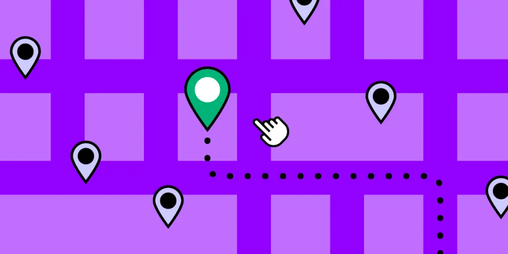
- Points of Interest (POIs): Specific locations or landmarks users find helpful or intriguing. POIs could be tourist attractions, restaurants, or historical sites.
- Routes: Visual representations of paths or directions from one location to another. Routes are essential in navigation apps to show users how to reach their destination.
- Overlays: Data layers placed over a base map to provide additional context or information. For example, weather maps show rainfall or temperature variations across regions using overlays.
Map scales and zoom levels
Ensuring the correct scale and zoom level is pivotal for map utility. Scale dictates how much of the real world is represented on the map, impacting detail and clarity.
Zoom allows users to access granular information, like street names, and zoom out for broader views, like city overviews. Consistent legibility, irrespective of zoom, guarantees user confidence in navigating and utilizing the map.
Cross-platform considerations for map UIs
When designing Map UIs across platforms, understanding the nuances of each is crucial to ensuring a consistent and optimized user experience for mobile applications and desktops.
- iOS: Apple’s Human Interface Guidelines offer a clean and minimalist approach. Focus on native components, maintaining consistent iconography, and leveraging features like Force Touch for map interactions.
- Android: Adhere to Material Design principles, capitalizing on Google’s extensive tools and resources. Consider device fragmentation and ensure map elements scale effectively across screen sizes and resolutions.
- Web: Prioritize responsive design to accommodate both mobile and desktop views. Given the diversity of browsers and devices, testing is essential to ensure map functionalities work seamlessly and consistently.
How to Design Maps for Different Use Cases

Navigation apps
In navigation tools, the prime focus is routes and the user’s current location. It’s essential to provide clear, unambiguous pathways, minimizing distractions. Dynamic updates, such as traffic alerts or alternative route suggestions, enhance user experience. Designers ensure the user’s current position remains prominently visible, facilitating real-time navigation.
Local business directories
When designing for business directories, it’s pivotal to spotlight businesses and relevant reviews. The map should clearly indicate business locations using distinct icons. Integrating review scores or popular tags directly on the map lets users quickly decide which establishment to visit without switching user interfaces.
Event and festival apps
For events or festivals, maps are vital in guiding attendees and assisting with health and safety. These maps must pinpoint stages, facilities, restrooms, and emergency exits. Visual hierarchy, aided by color coding or icons, can help attendees quickly locate what they need, ensuring enjoyment and safety.
Real estate platforms
Displaying properties requires filters like price range, property type, proximity, and amenities. Designers emphasize clear location markers and only show properties based on users’ filters to streamline the search process.
Travel apps
Travel maps cater to explorers, highlighting landmarks, popular tourist spots, and suggested tour routes. These designs should offer rich visuals, using custom icons for different attractions. Additionally, directly integrating quick-access info or audio guides on the map can elevate the tourist’s exploration experience.
How to Approach Map UI Layout and Composition
Adapting to screen sizes
- Mobile: Prioritize essential functions, use widgets where necessary, and streamline controls for touch.
- Tablet: Utilize larger screen real estate but remain touch-optimized.
- Desktop: Offer expansive view with detailed controls, capitalize on hover interactions.
Positioning map controls
- Zoom: Place in an easily accessible location, typically bottom right or left corner.
- Map Type: Allow toggling between satellite, terrain, and standard views with clear icons.
- Orientation: Provide intuitive rotation or compass tools, especially vital for mobile users.
Balancing information density:
- Prioritize essential info: Surface the most relevant data to the user’s current task.
- Use layers: Allow users to toggle between different layers of information.
- Streamline visuals: Use distinct markers and icons to avoid overloading with text.
Responsive map layouts:
- Portrait: Stack controls and ensure key map regions remain visible.
- Landscape: Utilize width for broader map views and reposition controls for easy reach.
How to Design Map Interactions
Here are some typical map UI interactions and how designers should approach mobile app vs. desktop/web design.
Panning and scrolling
Panning lets users explore different regions on a map, while scrolling ensures fluid navigation within a digital product.
- Mobile: Implement touch-drag for smooth panning; consider a locked map mode to prevent unintentional scrolls.
- Desktop: Utilize click-and-drag for panning and ensure the scroll wheel doesn’t interfere with page scrolling.
Zoom in/out:
Zoom functionality lets users go closer or further to a specific location.
- Mobile: Implement pinch gestures for zooming and provide visible “+” and “-” buttons for touch functionality.
- Desktop: Use the scroll wheel for zooming in/out and include “+” and “-” controls as an alternative.
Click/tap interactions
Direct interactions allow users to access more information or perform specific tasks on the map.
- Mobile: Ensure touch targets are large enough and provide immediate visual feedback upon tapping.
- Desktop: Highlight clickable areas with hover effects and employ cursor changes to signify interactivity.
Routing and waypoint setting:
Users often need to visualize routes or set specific points using location markers on maps, especially in navigation apps.
- Mobile: Enable touch-and-hold to set waypoints and use clear icons and visual paths for route displays.
- Desktop: Implement click-to-set waypoints and provide drag-and-drop flexibility for adjusting routes.
Layer toggles
Layers allow users to customize their map view, displaying only relevant information.
- Mobile: Use intuitive icons for layers and ensure toggles are easily accessible without cluttering the user interface.
- Desktop: Position layer controls on the map’s periphery and use tooltips to describe each layer’s content.
What are Map UI Design Techniques for Accessibility

Color contrast and legibility
Effective map design ensures that all users can digest information and complete tasks. Optimal color contrast ensures that labels, routes, and points of interest are visible against their backgrounds. Prioritize high-contrast color schemes and routinely test legibility across different devices and lighting conditions.
VUI and screen reader compatibility
Not every user interacts with map apps visually or with constant internet; offline functionality is essential. Integrating voice user interface and screen reader compatibility ensures visually impaired users can access and understand map data. To optimize for these tools, use semantic markup, provide descriptive alt text, and regularly test with leading screen reader technologies.
Keyboard navigation
Some users rely solely on keyboards for navigation. Guaranteeing that all map functions–panning, zooming, selecting waypoints–are keyboard-accessible is pivotal. Use focusable elements, provide clear visual feedback for keyboard selections, and follow best practices for keyboard shortcuts.
What are Some Tools and Platforms for Designing Map UIs?
Mapbox
Who uses it?:
- Instacart home delivery service
- General Motors in-car navigation
- Rivian electric vehicles
- AllTrails hiking app
- AccuWeather weather app
Mapbox stands out for its flexibility and customization options. It lets designers create unique map experiences tailored to specific brand identities or user needs. With its suite of design tools and a robust API, Mapbox suits those who need more than the standard map look and crave deep integration capabilities.
Google Maps API
Who uses it?:
Too many to mention! Most home delivery, ride-sharing, and automotive applications.
A familiar choice for many, the Google Maps API allows seamless integration of Google’s vast map database into apps and websites. Designers often opt for it due to its extensive documentation, widespread user familiarity, and rich feature set. It’s ideal for projects that benefit from Google’s vast Points of Interest database and street view functionalities.
Leaflet
Who uses it?:
- Foursquare cloud-based location technology platform
- Pinterest social media application
- Facebook social media application
- Evernote productivity app
Leaflet is the go-to web service for designers searching for a lightweight, open-source option. It’s particularly valuable for embedding interactive maps with custom layers into web projects. With its plugin-rich environment and compatibility with various mapping services, Leaflet is preferred for projects that demand performance without overhead.
How to Design Better Map User Interfaces With UXPin
Maps are highly interactive, with many microinteractions and animations. With UXPin’s advanced features, designers have many triggers and user actions, including mobile devices and desktops, to create realistic map UI prototypes. For apps requiring complex data integration behind map interfaces, platforms like DreamFactory can provide the governed API access to backend data sources needed to power these interactive experiences.
UXPin’s interactive prototypes enable design teams to test complex UI patterns and components, including maps, to solve more usability issues during the design process.
Go beyond static UI kits and enhance your design process with the world’s most advanced digital product design tool. Build an interactive map prototype with UXPin. Sign up for a free trial.


