These Storybook Examples Will Inspire Your Component Library
Now that UXPin has a Storybook integration that breaks down design-dev inconsistencies and makes it easier than ever to manage your UI components library, you might want to take some time to look at Storybook examples.
Plenty of world-renowned websites use Storybook. Look at some of the best Storybook examples that you can use as inspiration for developing your digital products.
Take UI components directly from Storybook and import them to UXPin. Design interactive and visually stunning layouts without extensive design skills. Discover UXPin Merge.

What is Storybook?
Storybook is an open-source tool for developing UI components in isolation for React, Vue, Angular, and other frameworks. It allows developers to build, test, and document components in a standalone environment outside of the main application, promoting better modularity and reusability.
It enhances the efficiency of UI development by providing a focused environment for creating, testing, and documenting UI components, making it easier for developers to build consistent and robust user interfaces.
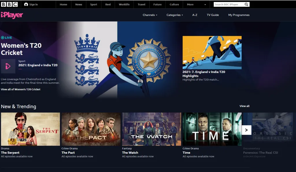
BBC iPlayer Web
BBC iPlayer Web switched to Storybook when it needed more custom components. Preview their Storybook here: BBC iPlayer Storybook.
A growing number of movie and television show producers now have streaming platforms that let people watch specific content when they like. BBC iPlayer Web makes it incredibly easy for viewers to find specific types of content by title, category, or topic.
When the streaming service started, it built its back end with Node.js. It didn’t take long, though, before the development team decided to make the migration to React. React components were an obvious improvement as the platform grew.
Around 2019, though, the team realized that its approach didn’t work as well as expected. The UX professionals and developers didn’t have a common language that helped them work toward goals. They also found it difficult to locate the components they needed to add content and update the website’s appearance.
Ultimately, the BBC iPlayer Web team realized that they were spending way too much time maintaining their component library.
Storybook became a significant tool that helped them address these problems.
BBC iPlayer Web has a public design system, so you can look at it to learn a few tricks and find inspiration when you feel stuck on a project.
The design system includes everything from iconography to navigation.
Spend some time browsing BBC iPlayer’s Storybook example. Then, visit the website. You will immediately see how the designers and developers combined components to create a tool that works exceptionally well for viewers.
Related reading: Top 9 Design System Examples
The Guardian
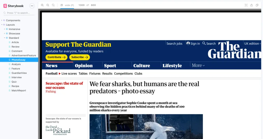
The Guardian publishes a tremendous number of articles daily. It’s often one of the first news outlets to report on breaking news. It also has frequent articles about sports, culture, and lifestyle topics. Considering that The Guardian covers events all over the world, it needs a fast, reliable way to turn written text into published web pages.
The Guardian Storybook components library (access the Guardian Storybook here) streamlines the design and publication process. Building the design system, however, must have taken quite a bit of time because it includes every component that the well-designed website could possibly need. It even features slightly different versions of designs. For example, the CaptionBlockComponent Story includes:
- with defaults
- PhotoEssay using html
- when padded
- with width limited
- with credit
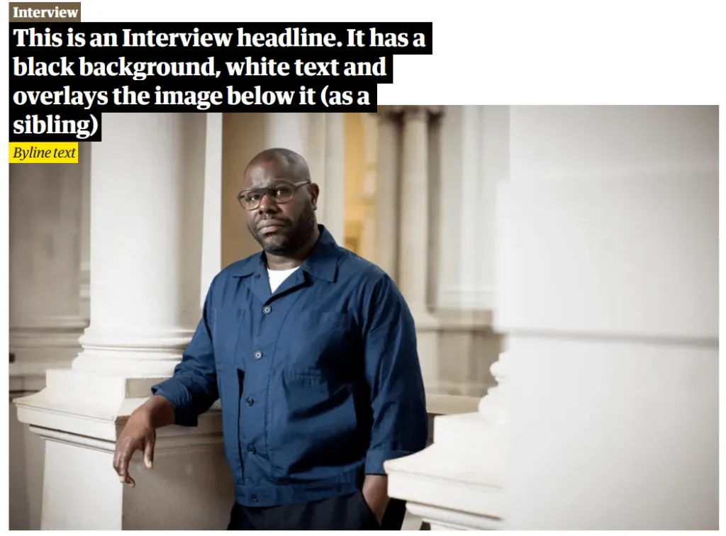
- when overlayed
No matter what type of caption block the designers want to include, they just have to search the component library, choose the correct option, and add text for the specific story.
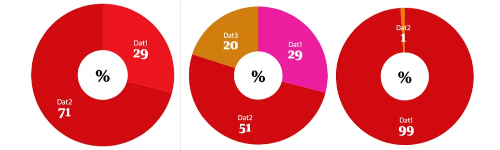
The design team even created multiple donut graphs to fit unique circumstances.
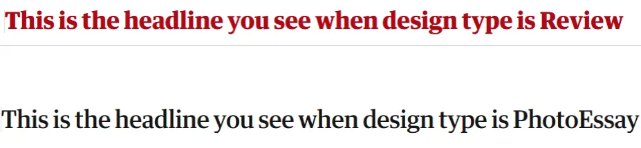
Of course, The Guardian also maintains designs that help readers identify what type of content they’re reading.
A Review headline doesn’t look the same as a Photo Essay headline.
Again, it took a lot of effort to build this Storybook design system. Now that The Guardian editors and publishers have it, though, they can quickly publish coherent content that keeps readers informed without misdirecting them.
Here’s a great video about The Guardian’s Storybook component library.
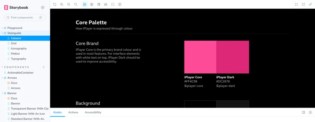
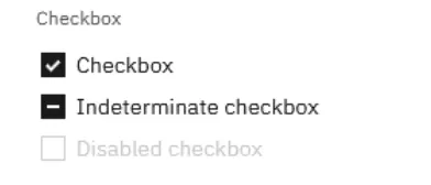
IBM‘s Carbon Design System in Storybook
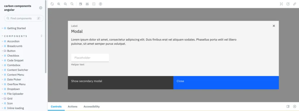
Carbon, the design system used by IBM, primarily gets used to build digital products with specific functions, such as adding files to a project, submitting reports, and tracking an activity’s progress. IBM uses Carbon for internal and external products, so you might recognize some of the components in the Storybook UI design system.
This Storybook example contains countless components. You’ll find everything from tabs to pagination. The company just wants to make sure that it has functional tools that share an aesthetic.
The components in Carbon’s design system also tend to have extensive Stories that let coders make subtle changes when necessary.
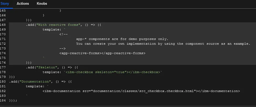
Even the Basic Checkbox component has 184 lines of JavaScript code in its Story.
A significant advantage of using Storybook is that designers and developers can see how components respond to interactions.
Three interactions with the select button:
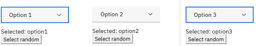
The designer or developer can see all of these interactions result from within the same environment. They don’t need to export it to a prototyping app or add it to a designing app. The interactions happen right there to save time and meet expectations.
Salesforce Lightning Design System for React
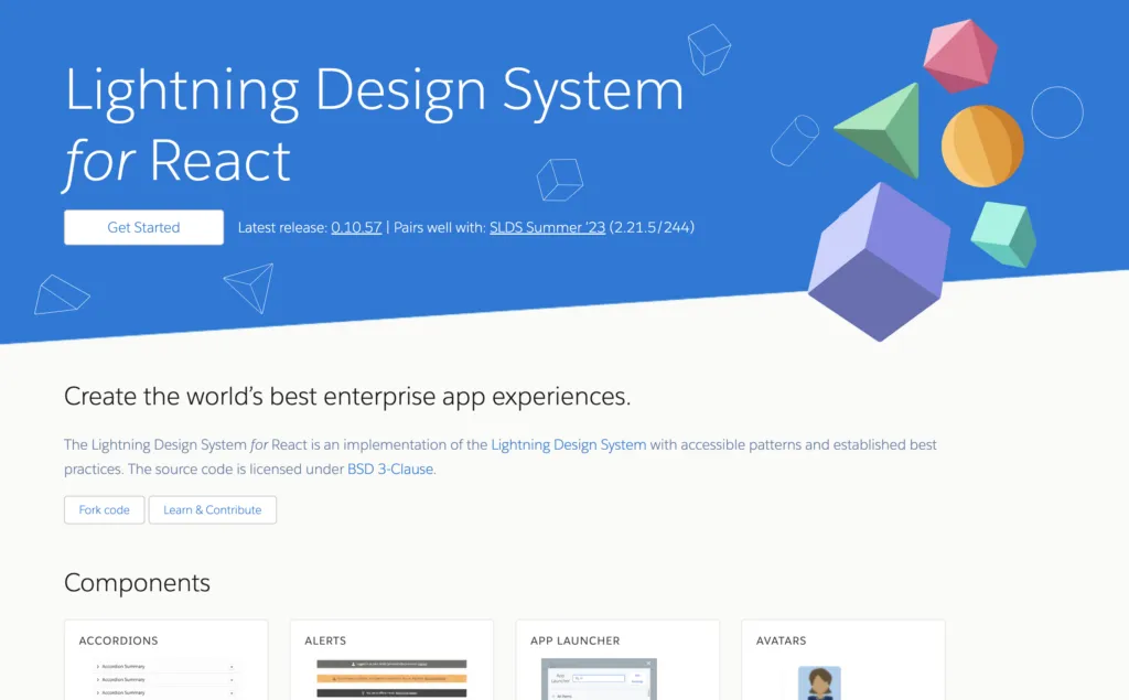
You can also find a Storybook with components of one of the best design systems – Salesforce Lightning. This design system is based in React, a JavaScript library, which is commonly used for building user interfaces. React is a popular front-end library developed by Facebook that allows developers to create interactive and dynamic UI components.
When we talk about React in the context of design systems, it usually means using React to implement the components and design guidelines provided by the design system.
By leveraging the Salesforce Design System, developers and designers can create applications that not only look great but also provide a consistent and intuitive user experience, ultimately leading to increased user satisfaction and productivity. Additionally, adherence to the design system ensures compatibility and seamless integration with other Salesforce products and services.
Salesforce Lightning Design System was created to be framework agnostic, yet it is still compatible with other front-end frameworks, and developers have the flexibility to choose the technology stack that best suits their needs and preferences.
This Storybook example is based on React and it has UI components such as a data table, checkbox, button, card, carousel, and more.
Audi UI React
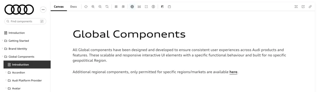
Another React-based Storybook is a design system by Audi. Crafted with precision, the Audi Design System serves as the ultimate beacon of truth for our global teams dedicated to crafting Audi’s finest offerings.
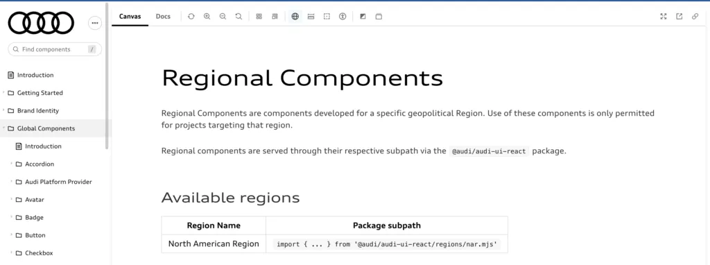
From insightful Getting Started guides to indispensable Core Components, this Storybook example empowers every team member, ensuring a unified approach across all Audi products worldwide. The Audi Design System embodies the essence of precision, innovation, and seamless collaboration that the design team at Audi chose as its defining qualities.
It sets the standard for design systems in the automotive industry and beyond. Check out its Storybook to see for yourself. It has navigational, input, text, and many other useful components.
FAQ
1. What is Storybook used for?
Storybook is an open-source tool used for developing, testing, and documenting UI components in isolation. It provides a sandbox environment where developers can create and showcase components independently from the main application. This helps in building components that are reusable, consistent, and well-documented.
Storybook is particularly useful in the development of design systems and component libraries, as it allows developers to visualize and interact with components outside the context of the application, ensuring they function correctly and look as expected. It also supports a range of add-ons for accessibility, responsive design, and performance testing, making it a versatile tool for front-end development.
2. What are some advanced Storybook examples?
Advanced Storybook examples demonstrate the tool’s capability to handle more complex scenarios and enhance the development experience. Here are a few examples:
- Component Interactions: Using Storybook’s Controls add-on, you can create interactive components that respond to user input directly in the Storybook UI. This is useful for testing props and states dynamically.
- Composite Components: Showcase components that are composed of multiple child components, such as a form with inputs, buttons, and validation messages. This helps in understanding how components work together in a real-world context.
- Data Fetching and Mocking: Demonstrate how components behave with data fetching by using tools like MSW (Mock Service Worker) to mock API requests within Storybook. This is particularly useful for testing components that depend on external data sources.
- Theming and Styling: Create stories that demonstrate how components adapt to different themes or styles. This is especially useful for design systems that support dark and light modes or multiple branding themes.
- Accessibility Testing: Use the a11y add-on to automatically check for accessibility issues in your components and display the results directly in Storybook. This ensures your components are usable for all users, including those with disabilities.
3. What are public Storybooks?
Public Storybooks are Storybook instances that are accessible to the public over the internet. They are typically hosted on platforms like GitHub Pages, Netlify, or Vercel, allowing anyone to view and interact with the documented UI components. Public Storybooks are often used by companies and open-source projects to showcase their component libraries or design systems, providing developers and designers with a comprehensive reference for how each component should look and behave.
By sharing a public Storybook, teams can improve collaboration, provide clear documentation, and promote consistency across different projects. Public Storybooks are also valuable for onboarding new team members and for providing external contributors or users with insights into the UI components available within a project.
4. What is the difference between Storybook for React and Storybook for Angular?
Storybook is a versatile tool that supports multiple frameworks, including React and Angular, but the way it integrates and functions with each framework can differ slightly due to the inherent differences between React and Angular themselves.
Nevertheless, the core purpose of Storybook remains the same across both frameworks: to provide a powerful environment for developing, testing, and documenting UI components in isolation. Both Storybook for React and Storybook for Angular offer robust features that cater to the unique needs of their respective frameworks, ensuring that developers can maintain a consistent and efficient workflow.
5. How can I use Storybook with UXPin Merge?
Using Storybook with UXPin Merge allows you to import your React components directly from Storybook into UXPin, enabling a seamless integration between design and development. This integration ensures that designers are working with the exact same components that developers are using in production, leading to more accurate and efficient design processes. Here’s how you can use Storybook with UXPin Merge:
- Set Up Storybook: Ensure that your React components are documented and organized in Storybook. You should have a well-structured Storybook instance with all the components you want to use in UXPin.
- Sync Components: Integrate Storybook with UXPin and use UI components in your UXPin design projects, allowing designers to drag and drop components into their prototypes while maintaining full functionality and interactivity.
- Design and Iterate: With the components imported from Storybook, designers can create high-fidelity prototypes in UXPin that are consistent with the development environment. This integration helps streamline the design-to-development workflow, reducing the risk of inconsistencies and ensuring that both teams are aligned.
Using Storybook with UXPin Merge is a powerful way to bridge the gap between design and development, ensuring that your UI components are consistent, reusable, and accurately represented across all stages of product development.
Try UXPin Merge and Storybook integration for fast prototyping
Use Storybook components to build interactive prototypes 8.6x faster than with vector-based tools like Figma. Import them to UXPin via our integration with Storybook and build products quickly. UXPin Merge’s Storybook integration lets you import your components within one minute. It doesn’t even require any technical knowledge, especially when you maintain a public Storybook design system. Discover UXPin Merge.


