How Storybook Helps Developers With Design Systems?
Storybook has become THE DevOps tool for developing and maintaining design systems. The platform’s excellent documentation, intuitive UI, built-in testing, and collaborative features make it the perfect tool for building and releasing components.
Understanding how Storybook works can help designers collaborate with front-end devs better and leverage the platform’s features to improve prototyping and testing.
One of Storybooks best features for design teams is its ability to sync a component library with UXPin using Merge technology. Merge creates a drag-and-drop design environment for assembling layouts fast. Discover UXPin Merge.

What is Storybook?
Storybook is an open-source tool for building, developing, and testing UI components in isolation. It provides a dedicated environment where designers and developers can create, preview, and document components without dealing with the complexities of integrating business logic or data. This isolation allows teams to focus on designing UIs, exploring edge cases, and ensuring consistency across projects.
Storybook integrates with various tools, making it a versatile solution for component-based workflows in React, Vue, and Angular—ideal for teams using UXPin to build comprehensive design systems.
Why Do Devs use Storybook for Design Systems?
These are a few reasons why Storybook Design Systems are so popular among developers.
Reason #1: Developing and testing components in isolation
Storybook enables engineers to develop UI components in isolation. This development workflow is great for design systems and component-driven front-end frameworks like React–which many organizations use for their component libraries.

Before Storybook, engineers would use sandbox platforms like CodePen and CodeSandbox to build and test components in isolation. Storybook offers this sandbox-style development environment with an intuitive user interface for engineers and stakeholders to view, test, and approve UI elements. They can also combine components and build little prototype patterns for testing.
Reason #2: Quality Assurance
Developing in isolation also benefits design system quality assurance. Engineers can invite designers, product managers, and other stakeholders to test and submit feedback on new UI elements before release.
Reason #3: Documentation
Documentation is crucial for component libraries, but it’s often the last thing anyone wants to think about because it’s time-consuming.

Storybook’s DocsPage is a “zero-config default documentation” that automates basic doc creation. Product and engineering teams can expand this documentation to create usage and guideline information.
Reason #4: Single source of truth
Managing the codebase for cross-platform applications is challenging. Storybook provides a single source of truth for testing components and patterns for each platform from a centralized environment.
This centralized environment maximizes consistency, as engineers can view components and patterns side-by-side and collaborate with developers responsible for each platform–iOS, Web, Android, etc.
Reason #5: Accessibility
Storybook’s A11y Accessibility add-on enables engineers to automate accessibility testing. The add-on creates a new Accessibility tab for each element showing WCAG standards in three categories:
- Violations: accessibility issues to resolve
- Passed: standards met
- Incomplete: A checklist of accessibility to-dos
How Do Devs Work With a Design System in Storybook?
Storybook’s docs outline a standard five-step design system workflow:
- Build
- Document
- Review
- Test
- Distribute
Build Storybook Design System
Once engineers have set up Storybook and connected to a GitHub repository, they begin developing each component and its variants. For example, a button might have several states, sizes, types, etc.
During the build process, engineers can install Storybook add-ons to automate workflows, integrate with other tools, or enhance the Storybook environment.
Document Storybook Design System
Engineers can add comments to components during the build process to enrich the automatically generated documentation. This example from Storybook’s docs demonstrates how these comments appear in your Storybook UI.
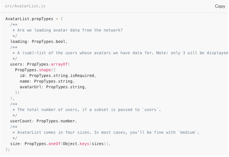
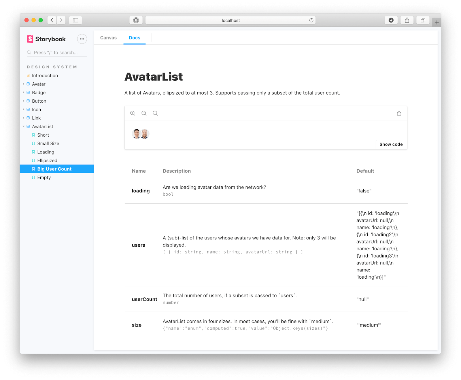
This documentation is crucial for the next step, Review, because it shows stakeholders how front-end developers interpret designs and what each ‘prop’ represents.
Review Storybook Design System
The component is now staged and ready to be promoted to the design system. Engineers can invite designers, product managers, and other stakeholders to review the element to ensure it meets interactive and aesthetic expectations.
Traditionally, engineers would have to create a staging environment or meet with stakeholders to present the component. With Storybook, it’s as easy as visiting a website, making the review process more accessible. Stakeholders can log in on their own time, interact with the component, read the docs, and leave feedback.
If there are any changes, engineers may iterate steps one to three until the new components meet all stakeholder’s expectations.
Test Storybook Design System
Jest and Playwright power Storybook’s framework-agnostic testing. When engineers commit the component, Storybook tests its code to ensure there are no programming errors, including:
- Visual tests (visual regression tests): creates screenshots of every commit and compares them to catch UI inconsistencies.
- Accessibility tests: runs code against WCAG standards and reports any issues.
- Interaction tests: checks interactivity and states to ensure there are issues with links or functionality.
- Test coverage: examines code against industry standards, including conditions, logic branches, functions, and variables.
- Snapshot tests: identifies markup changes by comparing rendered code to the baseline.
Distribute Storybook Design System
The final step is to update the design system package on GitHub. Once complete, it’ll automatically sync the changes to npm. Engineers can install the updated npm package to use the new component(s).
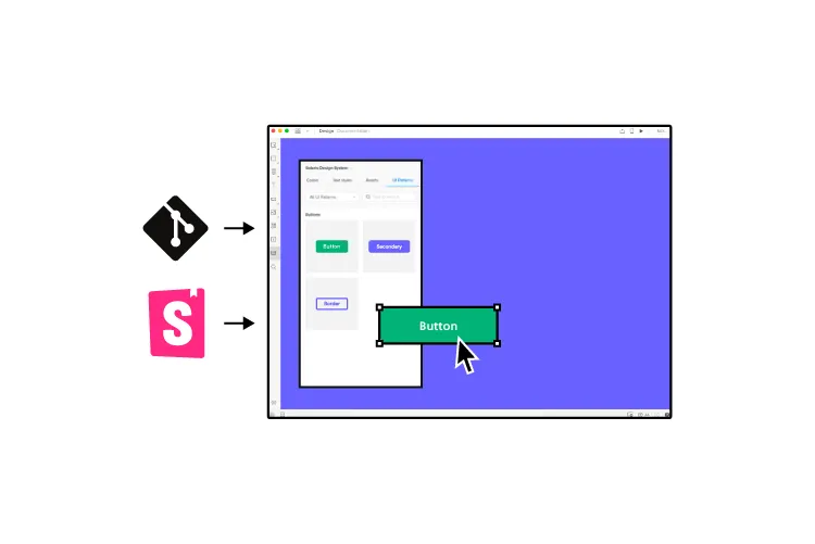
Syncing Design With Storybook Through UXPin Merge
If your design team works with UXPin Merge, these engineering changes will also be distributed to UXPin’s design editor and notify team members of the latest design system release.
UXPin’s Version Control allows designers to change to the latest release whenever they choose and switch to earlier versions of the design system.
How to Sync Storybook Design System with UXPin
- Prepare Your Resources
- Ensure you have access to UXPin’s Merge technology.
- Obtain your Storybook URL (either public or private).
- Integrate with UXPin
- Open a UXPin prototype and go to the Design System Libraries.
- Click + New Library and select Import Components from Storybook.
- For Private Storybook
- Install
@uxpin/storybook-deployer:bashSkopiuj kodyarn add -D @uxpin/storybook-deployer npm install @uxpin/storybook-deployer --save-dev - Deploy using:bashSkopiuj kod
npx uxpin-storybook-deployer -t TOKEN -s path/to/your/storybook
- Install
For more details, visit UXPin Storybook Integration.
What is UXPin Merge?
UXPin Merge is a technology that bridges (or Merges) the gap between design and development. Organizations can sync a design system hosted in a repository to UXPin’s design editor so designers can use the same component library as engineers to build fully functioning prototypes.
Merge components are fully interactive and include React props (or Args for Storybook) defined by the design system, including colors, typography, states, sizes, etc. These props appear in UXPin’s Properties Panel so designers can adjust components to meet prototyping requirements while maintaining absolute consistency and zero drift.
Enhanced testing and stakeholder feedback
Merge prototypes look and function like the final product because they use the same components. For example, a button in Storybook will render exactly the same in UXPin, including interactivity and styling.
Usability participants and stakeholders can interact with these UI elements and Merge prototypes like they would the final product, giving design teams accurate, actionable testing insights.
“It’s been so helpful for us to have these high-fidelity prototypes built with UXPin. We build high-fidelity prototypes much quicker, and we get immediate feedback after the session. If there’s something we can fix immediately, we make that change before the next participant and get feedback much faster than before.” Erica Rider – UX Lead EPX at PayPal, talking about how UXPin Merge enhances user testing.
Scaling component libraries with UXPin Patterns
Design systems evolve as products grow and scale. The design system team is constantly making changes and promoting new UI elements and patterns.
UXPin Patterns enables design teams to create new patterns for the design system–as one-offs or as a best new practice. Designers can combine UI elements (atoms and molecules) from the design system to create new patterns or use UXPin’s npm integration to import components from open-source libraries if the current library doesn’t support their needs.
Designers can save and share these patterns across the organization, so teams can continue prototyping while they wait for the DS team to follow governance procedures to develop and release the new component–following the five-step Storybook development process outlined above.
Stage four design system maturity with UXPin Merge
Iress achieved stage three design system maturity in 2017. For the next few years, the design system team searched for a design tool to take them to the next and final maturity level–Stage Four – Fully Integrated:
- Design in (no) code
- No design drift
- Consistent design
- Seamless (no) handoff
Merge solves these four design system challenges by default.
- Designers use ready-made components with styling and interactive properties–no designing from scratch. Drag and drop UI elements to design new products.
- No code development. Engineers install a package and copy prototypes that use the exact same UI library. UXPin renders JSX for each component, so engineers copy/paste to apply styling and interactivity.
- Drift is nonexistent when everyone uses the same component library (design and engineering teams) with the same constraints.
- Using the same components with built-in constraints ensures ultimate consistency across design teams.
- With Merge, there’s a seamless handoff because designers and engineers use the same single source of truth. Designers don’t have to explain UIs or provide endless documentation explaining their prototypes–they already look and function like the final product.
UXPin reduces the four stages of design system maturity to just two.
- Design your library using UXPin’s design editor.
- Convert designs to code components, add them to a repository, and sync back to UXPin using Merge. Iterate to scale.
Take your product development to the next level by Merging the two best design and engineering tools for design systems. Request access to UXPin Merge.


