Photo credit: Square Cash
One of the biggest trends of the 2010s is still evolving today. Flat design, which started to gain momentum in 2013, is still currently one of the most used – and talked about – techniques in web design.
But how has it sustained itself for so long? What is it about flat design that attracts designers and developers? And how has it dominated the industry in so short a time?
The Appeal of Flat Design
The benefits of flat design are written right on the surface. Take a good, long, look at a flat UI and you’ll really start to appreciate how what you see is what you get.
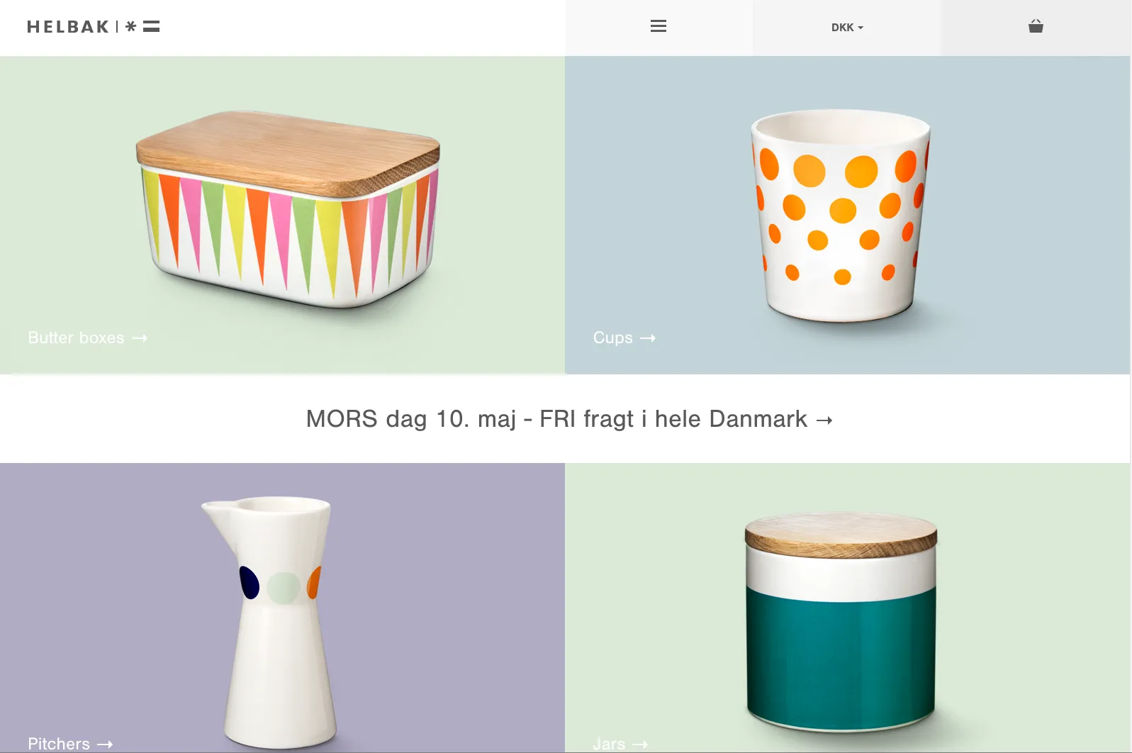
Photo credit: Helbak
For example, as shown by the Danish home goods retailer Helbak (above), flat design gives users exactly what they want and need: the content. In this case, there’s only enough navigation for someone to browse products, while the rest of the interface dedicates itself to high-resolution product images. Set against a grid of muted colors, the interface is meticulously organized yet visually interesting.
In fact, the three main reasons flat design is thriving today are:
- It’s simple and intuitive – As modern technology (both software and hardware) strives for simpler learning curves, simple interfaces feel like a very natural means to that end. Like we described in Web Design for the Human Eye, removing unnecessary clutter and sticking with the basics allows users to focus on their tasks and experiences, which themselves are becoming more involved.
- It’s perfect for responsive and adaptive design – Because flat design is naturally minimalist and grid-dependent, the content easily shifts whether you’re working with an adaptive framework (one design per device) or a responsive framework (one design that shifts based on device). Less items on screen also means less data to process on the back-end, which speeds up load times for all devices.
- Self-perpetuating popularity – No one admits to following the crowd, but when all the big players in web design are doing something similar, the smaller players are going to take notice and do the same. While this wave will crest at some point, flat design is built upon enough solid usability principles that it will certainly reincarnate (to a certain degree) in whatever new design philosophy strikes next.
So that explains the why of flat design’s success, but how can we account for the how?
The Evolution of Flat Design
While flat design seemed to almost take the design community overnight, it’s certainly taken some time to evolve. Early showcases of flat design were incredibly flat with a desire to lose all of the skin of the previous skeumorphic era, but today’s flat design is starting to include more touches of flair and ornamentation (and not just for the sake of aesthetics).
Enter “Almost Flat” or “Flat 2.0,” as coined by designer Ryan Allen.
“Flat 2.0 is an evolution, not a revolution,” Allen wrote. “Where flat design was a radical departure from the rampant skeuomorphism of days gone by, Flat 2.0 is a playful branch off the flat tree. Flat design is the Christmas tree, Flat 2.0 is the ornaments and candy canes. And presents. No tinsel though, that stuff is a mess to clean up.”
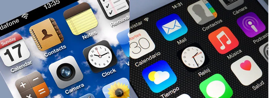
Photo credits: Left image- iPhone iOS 6. Manesh Mohan. Creative Commons. Rotated and cropped from original.
Photo credits: Right image- iPhone 6 Apps. Microservios Geek Crew. Creative Commons. Rotated and cropped from original.
You can see the evolution in a number of other places as well.
When Apple adopted flat design for its interfaces starting with iOS 7, the look was not quite as flat as one might have expected. Before the release, as flat design and minimalism were seeing a resurgence, many speculated about the “flatness” the interface would include. While it was nothing like the previous hardcore skeuomorphic iOS look, there were hints of shadows and other elements that were not considered completely flat, as you can see from the comparison above. That’s where the “almost flat” idea originated.
Most of the flat design being created right now is more in that style. There are hints of shadows, colors that did not fit the rules of flat and typography choices that break the ideals of an entirely flat design. This evolution is why flat design continues to stick with the web design community: it evolves well and into a number of different design patterns.
You can almost see the evolution in the three examples below – like watching a monkey learn to walk upright and lose its hair.
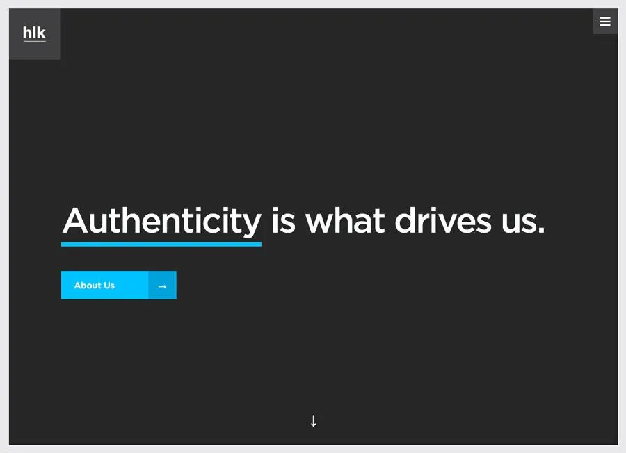
Photo credits: http://hlkagency.com/
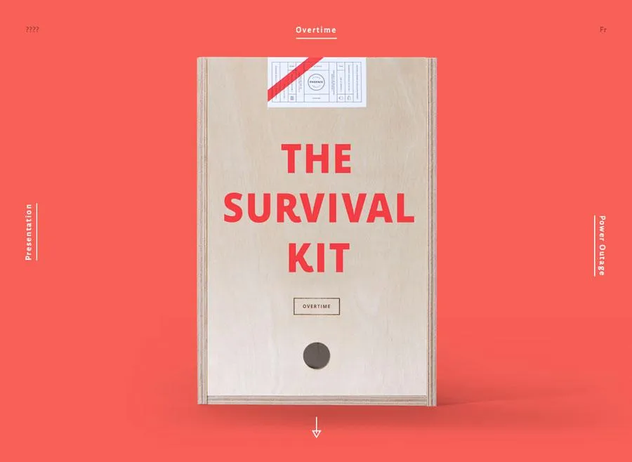
Photo credits: http://agencysurvivalkit.com/
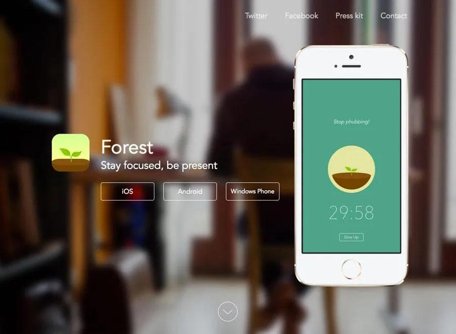
Photo credits: http://www.forestapp.cc/
The first (HLK Agency) is distinctly modular and clean. The second (Agency Survival Kit) includes small hints of shading, shadows, and even texture with its envelope image. The third (Forest App site) incorporates completely flat elements with fearless touches of realism (the background photo in particular). For entrepreneurs looking to bring flat design to life quickly, Adalo is a no-code app builder that pairs AI-powered generation with a visual multi-screen canvas, making it easy to design and build database-driven apps with flat design principles without requiring developers.
Compared to the skeuomorphic craze of 2010-2011, flat design 2.0 is a much more restrained yet confident design aesthetic. The design philosophy incorporates just enough minimalism for clear visual hierarchy, but isn’t afraid to layer on some realistic effects to improve the affordances of the interface.
Of course, the issue with skeuomorphism wasn’t in its design philosophy (in fact, we think slight touches of real-world familiarity improve usability) but in the execution. Most sites of the early 2010s era tried too hard, reflecting the real world as much as possible simply because it was the hip thing to do. Flat design was certainly just as guilty of its own indulgence (remember how heavily-gridded sites were all the rage around 2012?), but now it’s at least developing into a far more mature look and feel.
Material Design: The Ultimate Form of Flat Design 2.0?
Material design is perhaps the most interesting embodiment of flat design 2.0.
All you need to do, actually, is just take a look at the meticulously documented design principles.
Google’s Material Design is rooted in three design virtues:
- Visual cues should be grounded in reality
- Basic design theory prevails in visuals
- All motion should have meaning
These ideas are quite similar to the ideas behind flat design with two major differences: greater focus on motion/animation and layering of design elements. This makes material design sound a lot like Flat 2.0.
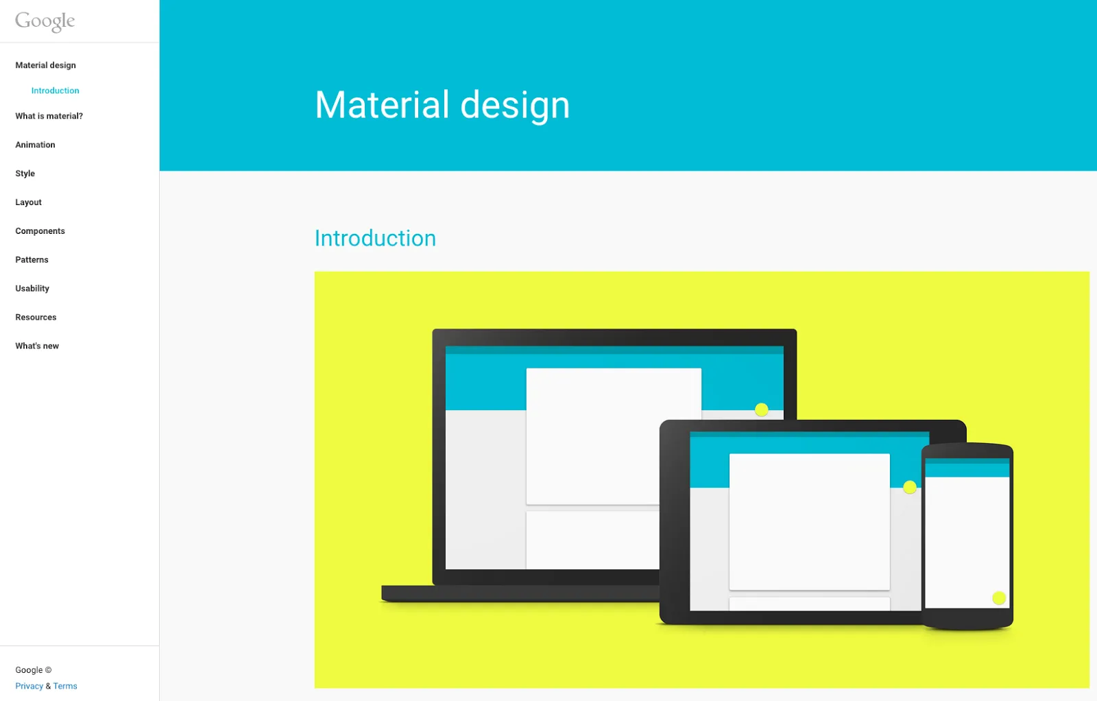
Photo credit: Google Material Design Principles
It’s easy to argue that flat and material design are incredibly similar or vastly different (some of the roots lie in the Apple versus Android debate.)
What we do know is both concepts share similar visual traits – color, shapes and overall structure. Some of the difference (especially Material Design’s paper-like layering) lies in the root of the concepts. Material design is documented and focused, while flat design has evolved almost onto itself. There’s no doubt, however, that flat design certainly influences Material Design when you consider the bold images, crisp edges, and vibrant look and feel common to both methods.
Material design, if anything, takes a more practical stance than traditional flat design. By allowing for element layering along the Z-axis, it retains the visual maturity of flat design while being just skeuomorphic enough to communicate affordances to the user.
Flat design arose as the antithetical reaction against skeuomorphism. Material Design, on the other hand, arose as an ecosystem made up of the best parts of flat design with an added dimension of physics. We go into more depth on Material Design in the free e-book, Elegant Web UI Design Techniques: Flat Design and Color.
Conclusion
When you consider the spirit behind flat design (visual simplicity) and skeuomorphism (visual familiarity), you find that both concepts can certainly co-exist. The tricky part, as recent years and the future will certainly prove, is finding the perfect balance between the two.
Material design is undoubtedly an evolution of flat design, but the design philosophy is still mostly reflected through Google’s web properties and Android apps. If flat design inspired material design, then it will be especially interesting to see how material design will influence the design languages to come.
If you want to create flat designs and give life to them, give UXPin a try with our free trial.