5 Best React Component Libraries of 2024
Modern websites and apps rely on front-end frameworks to develop, maintain, and scale user interfaces. React’s Javascript library is arguably the most popular front-end framework with many component libraries to build digital products.
We’re going to explore the top React UI libraries and how to choose the right one for your next project.
With UXPin Merge, you can sync any React component library and assemble production-ready layouts super fast. Check out the build-in MUI, Ant design, and React Bootstrap components that are available for free in UXPin’s editor. Drag and drop them on the canvas and simplify React UI design. Try UXPin Merge.

What is React Component library?
A React component library is a collection of pre-built UI components specifically designed for use with React applications. These libraries contain reusable components that cover a wide range of UI elements, such as buttons, forms, modals, navigation bars, cards, and more.
React component libraries aim to streamline the development process by providing ready-made components that adhere to best practices in terms of design, accessibility, and functionality.
What to consider when choosing a React component library
Below are six things to consider when choosing a React library for your next project. This is by no means an exhaustive list, and some of these factors may not apply to the product you’re building.
1. Popularity
GitHub’s star rating allows you to quickly compare each React UI library’s popularity. The weekly downloads on npm also show how many people use the component library. Generally speaking, a React library’s popularity means it’s well established and serves its purpose.
2. Issues
Like star rating, a library’s GitHub issues can tell you a lot about its popularity and how well it’s maintained. Even if the library has minimal issues, do any of these affect the product you’re trying to build?
3. Documentation & Support
Documentation is an important consideration when choosing a React UI library. You want to avoid running to Stack Overflow every time you run into trouble or want to know how to use specific components. Good documentation is updated regularly and gives you a comprehensive understanding of the library.
You also want to know if the React library has support directly from the creators or via a dedicated community forum. There are times when you need expert advice to overcome challenges. The ability to reach out for help (even if that means paying) is crucial to get issues sorted quickly and keep the project moving.
4. Customization
One of the downsides to using a component library is its constraints and lack of customization. For some projects, customization isn’t a factor, but if you’re looking to develop a unique UI, the ability to build your own design system is vital.
Explore the library’s documentation to see if they offer instructions for customizing the components and how easily you can achieve your desired results.

5. Browser or Device Compatibility
Depending on the app you’re designing, you’ll want to know the component library’s browser and mobile compatibility. The quickest way to research browser/device compatibility is by searching GitHub’s issues or Stack Overflow.
6. Accessibility
Accessibility is a time-consuming but necessary consideration for digital product design. If a React library hasn’t considered accessibility when designing components, then it’s something you’re going to have to do yourself, which takes us back to points 3 and 4–documentation and customization.
Which is the best React component library?
The best React component library for your project depends on your specific needs and preferences. It’s recommended to evaluate each library based on factors such as documentation quality, community support, active development, and alignment with your project requirements before making a decision.
Comparing the libraries involves assessing various aspects such as design philosophy, component offerings, theming capabilities, documentation, community support, and ecosystem. Take Material-UI (MUI) and Ant Design as examples.
Material-UI provides a comprehensive set of React components following the Material Design system. It includes components like buttons, cards, forms, navigation, and more, with a wide range of customization options.
Ant Design offers a rich collection of components tailored for enterprise applications, including layouts, forms, navigation, data display, and more. It provides components specific to data visualization and business logic.
5 React Component Libraries
These are our five best React UI libraries for 2024.
Note: Information regarding GitHub stars and NPM downloads are accurate as of March 2024.
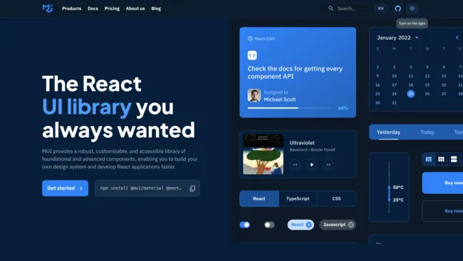
MUI (Material-UI)
- GitHub Stars: 91.3k
- Weekly NPM Downloads: 3.4M
- Official website: mui.com
MUI is one of the most comprehensive and widely used React component libraries. The library is built on Google’s Material Design UI, one of the most extensive UI kits in the world.
MUI – Components
MUI has a massive component library for designers to build everything from mobile and web applications, websites, and even wearable apps.
MUI Core features fundamental UI components you see in everyday digital products, while MUI X offers a list of advanced React components for building complex user interfaces, like data tables, data pickers, charts, and more.
For those of you who would like to try design with MUI code components, sign up for a UXPin trial and get 14-day access to UXPin. Read more about MUI 5 Kit in UXPin.
MUI – Theming & Customization
One of MUI’s biggest appeals is the ability to theme and customize components. Designers can use MUI as a foundation to scale designs fast but also adapt the library to build a custom design system for their product or organization.
Designers can also take advantage of Material Design and MUI’s comprehensive guidelines to avoid usability issues when customizing components.
MUI also has a template marketplace to purchase React theme templates for dashboards, eCommerce websites, landing pages, and more.
MUI – Documentation
MUI’s documentation is as detailed and comprehensive as its component library. Its curators have taken great care to provide designers and developers with step-by-step instructions and guidelines for installation, usage, customization, accessibility, and more.
There are also tons of videos on YouTube from MUI’s large community of users and contributors offering best practices, tutorials, tips and tricks, how-to guides, and more.
Where to get MUI components from?
You can get MUI components from the following sources:
- UXPin’s Built-In MUI Kit: Access pre-built MUI components directly in the UXPin Editor.
- MUI Website: Download components and get design inspiration from the official MUI library.
- AI Component Creator: Use UXPin’s AI tool to generate custom MUI components from text prompts or images.
These options provide flexibility whether you need ready-made components or custom-coded solutions.
How to generate MUI components with AI?
You can use AI to generate MUI components that you need. The AI Component Creator by UXPin is an advanced tool that helps designers generate fully coded UI components from images, text prompts, or existing elements. It supports React-based libraries like MUI.
By leveraging AI, this tool bridges the gap between design and development, streamlining workflows and eliminating the need for manual coding. It’s perfect for creating consistent, scalable UI components in seconds.
To generate MUI components using UXPin’s AI Component Creator:
- Get an OpenAI API Key from the OpenAI website.
- Enable the AI Component Creator by contacting UXPin support if you have the Merge AI plan or Merge enabled.
- Open the AI Component Creator from the Editor’s Quick Tools panel.
- Paste your API key in the Settings tab.
- In the Prompt tab, write a description of the component you want or upload an image.
- Select MUI as your library, and let the AI generate your MUI component!
For more details, visit the documentation.
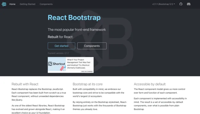
React-Bootstrap
- GitHub Stars: 22.2k
- Weekly NPM Downloads: 1.3M
- Official website: react-bootstrap.github.io
Founded in 2011, Bootstrap is one of the oldest and most popular open-source CSS frameworks for websites and web applications. Bootstrap was one of the first CSS frameworks to prioritize mobile-first web development, allowing designers to build and scale responsive websites quickly.
React-Bootstrap replaced Bootstrap Javascript while ditching resource-heavy dependencies like JQuery to build a comprehensive but simplistic React component library.
React-Bootstrap – Components
If you’re familiar with Bootstrap, then you’ll instantly recognize React-Bootstrap’s generic-looking component library. Like its CSS predecessor, React-Bootstrap features UI components that favor web design rather than mobile applications.
React-Bootstrap – Theming & Customization
React-Bootstrap is very generic with minimal styling, making it easy for designers to tweak and customize. Bootstrap’s defined classes and variants make it easy to select and customize components using CSS.
Due to Bootstrap’s long history and wide usage, you can find tons of free and premium React-Bootstrap themes and templates for everything from admin dashboards to multiple purpose websites, eCommerce, landing pages, and more.
React-Bootstrap – Documentation
React-Bootstrap has excellent documentation, albeit not as detailed and comprehensive as MUI. React-Bootstrap’s simplicity and naming convention make it one of the easiest React libraries to understand, use, and customize.
Bootstrap is also featured extensively on Stack Overflow, so you’ll likely find answers to most issues. There are also loads of blogs and YouTube videos offering advice, tutorials, design projects, and more.
Where to Get React-Bootstrap Components
You can get React-Bootstrap components from the following sources:
- UXPin’s Built-In React-Bootstrap Kit: Access pre-built React-Bootstrap components directly within the UXPin Editor.
- React-Bootstrap Website: Explore and download components from the official React-Bootstrap library.
- AI Component Creator: Use UXPin’s AI tool to generate custom React-Bootstrap components from text prompts or images.
These options provide flexibility, whether you need ready-made components or custom AI-generated solutions.
How to Generate React-Bootstrap Components with AI
You can leverage AI to create React-Bootstrap components easily with UXPin’s AI Component Creator. This tool converts images, text prompts, or static elements into fully coded React-Bootstrap components, simplifying the design-to-development process.
To generate React-Bootstrap components:
- Get an OpenAI API Key from the OpenAI website.
- Enable the AI Component Creator by contacting UXPin support if you have the Merge AI plan or Merge enabled.
- Open the AI Component Creator from the Editor’s Quick Tools panel.
- Paste your API key in the Settings tab.
- In the Prompt tab, write a description of the component you want or upload an image.
- Select React-Bootstrap as your library, and let the AI generate your component!
For more details, visit UXPin’s AI Component Creator documentation.
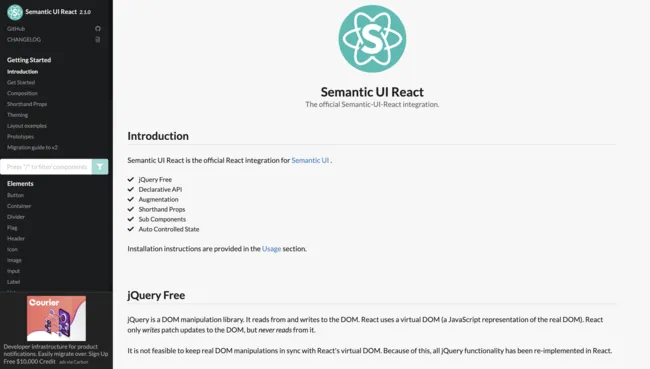
Semantic UI React
- GitHub Stars: 13.2k
- Weekly NPM Downloads: 253k
- Official website: react.semantic-ui.com
Semantic UI React is a popular alternative to React-Bootstrap. Like React-Bootstrap, Semantic UI started as an open-source CSS framework that its contributors used to build React components.
Semantic UI React – Components
Semantic UI React offers an extensive range of UI components for websites and web applications. The components provide cleaner, more modern styling than Bootstrap while remaining minimalist and simplistic.
Semantic UI React uses the FontAwesome icon set, including over 1,600 free icons and 7,864 Pro (paid).
Semantic UI React – Theming & Customization
Semantic UI uses an intuitive, straightforward naming convention that makes it easy to customize components. The documentation also provides a step-by-step guide for theming with Semantic UI React. Unlike MUI and React-Bootstrap, Semantic has very few template options.
Semantic UI React – Documentation
Semantic UI React’s interactive documentation provides you with CodeSandbox examples to inspect the code and play around with components.
The docs also allow you to switch between an example, code, and props to visualize the component from multiple angles.
Ant Design (AntD)
- GitHub Stars: 89.9k
- Weekly NPM Downloads: 1.2M
- Official website: ant.design/docs/react/introduce
Ant Design (AntD) is another popular, widely used React component library developed by Ant Group–parent company to Alibaba, China’s biggest online marketplace. Like MUI, AntD offers a vast component library for both web and mobile applications.
AntD is the only React library featured in this article that uses TypeScript – a form of Javascript.
Ant Design – Components
AntD has a massive component library for desktop and mobile, including UI patterns like infinite scroll and pull-to-refresh for mobile devices. Ant Design ProComponents offers a range of advanced React UI elements ( similar to MUI X) for building complex interfaces.
You can also find a vast library of pre-made templates and scaffolds to kick start your project and build UIs much faster.
Ant Design – Theming & Customization
AntD uses design tokens or variables for devs to customize and theme components. The UI library uses Less and provides a complete list of all AntD variables in GitHub.
Ant Design – Documentation
AntD’s comprehensive documentation provides step-by-step instructions for using and customizing. You can also inspect each component in CodeSandBox, CodePen, or StackBlitz.
Where to Get Ant Design Components
You can get Ant Design components from the following sources:
- UXPin’s Built-In Ant Design Kit: Access pre-built Ant Design components directly within the UXPin Editor.
- Ant Design Website: Download components and explore design inspiration from the official Ant Design library.
- AI Component Creator: Use UXPin’s AI tool to generate custom Ant Design components from text prompts or images.
These options allow you to choose between ready-made components or custom AI-generated solutions to meet your project needs.
How to Generate Ant Design Components with AI
You can easily generate Ant Design components using UXPin’s AI Component Creator. This tool leverages AI to convert images, text prompts, or static elements into code-backed Ant Design components—eliminating manual coding and streamlining design-to-development workflows.
To generate Ant Design components:
- Get an OpenAI API Key from the OpenAI website.
- Enable the AI Component Creator by contacting UXPin support if you have the Merge AI plan or Merge enabled.
- Open the AI Component Creator from the Editor’s Quick Tools panel.
- Paste your API key in the Settings tab.
- In the Prompt tab, write a description of the component you want or upload an image.
- Select Ant Design as your library, and let the AI generate your component!
For more details, visit UXPin’s AI Component Creator documentation.
Chakra UI
- GitHub Stars: 36.4k
- Weekly NPM Downloads: 523K
- Official website: chakra-ui.com
Chakra UI is a Nigerian-based React component library founded by Segun Adebayo. You can choose between Chakra’s free component library or Chakra UI Pro, which offers pre-made complex UI components to build interfaces faster.
Chakra UI – Components
Chakra UI’s component library caters to web-based applications and websites. The library offers the choice between TypeScript or Javascript React components, depending on your preference. Chakra’s designers follow WAI-ARIA standards, so every element is accessible.
The stylish UI components look similar to Semantic UI, with dark and light options available.
Chakra UI – Theming & Customization
Chakra’s designers created the UI library to be fully customized using variables to meet product and brand requirements. Charka also integrates with Create React App, Framer Motion, React Hook Form, and React Table to extend the library’s usage and customization.
Chakra UI – Documentation
Chakra UI has excellent documentation with guides, video tutorials, examples, FAQs, links to connect with core team members, and an active Discord community.
Chakra’s users are extremely passionate and enthusiastic about the React library, and there’s always someone to connect with to ask questions.
Design Using React Components With UXPin Merge
One of the challenges of using a React library is that only few tools allow you to design UIs with real components. UXPin Merge allows you to assemble layouts with React components from Git repo, Storybook, or npm. See how it works. Discover UXPin Merge.


