Top 6 npm Packages for Component-Driven Prototyping
Component-driven prototyping with UXPin Merge allows designers to build accurate replicas of the final product. Unlike other design tools that render static graphics, UXPin is powered by code so that designers can create high-fidelity, fully functioning prototypes.
UXPin’s npm integration gives designers the freedom to import components and patterns from open-source design systems. They may need a single UI element to create a new pattern for an existing design system or use the npm integration to build a fully functioning MVP during a design sprint.
Discover how UXPin Merge can help you build interfaces with React components from npm. Discover UXPin Merge.

About Prototyping with npm Components
Before we dive into UXPin’s npm integration and the packages you can import for prototyping, it’s important to understand Merge–the technology that makes component-driven prototyping with npm libraries possible.
Merge enables companies to sync a design system hosted in a repository to UXPin’s design editor so designers can build prototypes using the same component library as engineers.
These “ready-made” UI elements include properties and interactivity defined by the design system’s code. A component in Merge looks and functions the same as the final product because it’s an exact replica.
Designers use Merge components like building blocks, dragging and dropping to build new UIs, and fully functioning prototypes. They can also use Patterns to combine UI elements and build new components.
Merge’s strongest feature is its ability to sync design and development, creating a genuine single source of truth across the organization via the design system’s repository. Any changes to the repo automatically sync to UXPin, notifying product teams of the change.
1. Ant Design
Ant Design is an open-source design system developed and maintained by the Chinese tech giant Ant Group. The component library is available for React, Angular, and Vue and includes Ant Design Mobile for building cross-platform and mobile applications.
Ant Design is a fantastic “all-rounder” with components for B2C products, enterprise applications, websites, and cross-platform apps. The design system also features an icon set, dark mode, animations, and interactivity.
Importing the Ant Design npm Package
Ant Design npm integration Library settings:
- Library name: Ant Design NPM – The Library name has no impact on the import
- Package details: antd – must correspond to the Ant Design npm registry
- Assets location: antd/dist/antd.css – required for styling Ant Design React props
Leave everything else as default and click Save Changes.

Further reading: Check out this step-by-step guide for importing Ant Design components via the UXPin npm integration.
2. Bootstrap
Bootstrap is one of the oldest and largest responsive front-end frameworks. Engineers often use Bootstrap for basic CSS styling and Javascript functionality when building website and web application prototypes.
UXPin’s npm integration uses the React Boostrap, which includes the same out-of-the-box features and functionality as the original Bootstrap. We recommend React Bootstrap for prototyping responsive websites and web applications.
Importing the React Bootstrap npm Package
React Bootstrap npm integration Library settings:
- Library name: Bootstrap NPM Integration – The Library name has no impact on the import
- Package details: react-bootstrap – must correspond to the React Bootstrap npm registry
- Dependency package name: bootstrap – React Boostrap requires the Bootstrap dependency to work in UXPin
- Assets location: bootstrap/dist/css/bootstrap.min.css – required for styling React Boostrap props
Leave everything else as default and click Save Changes.

Further reading: Check out this step-by-step guide for importing React Bootstrap components via the UXPin npm integration.
3. MUI
MUI is a React library built based on Google’s Material Design UI. The comprehensive design system features everything you need to develop an array of digital products, plus more than 2,000 Material Design Icons.
Due to its comprehensive component library, MUI is a popular choice for enterprise products, cross-platform applications, and MVPs.
Importing the MUI npm Package
MUI npm integration Library settings:
- Library name: MUI NPM – The Library name has no impact on the import
- Package details: @mui/material – must correspond to the MUI npm registry
Unlike React Boostrap and Ant Design, MUI doesn’t require dependencies or assets to work in UXPin. Leave everything else as default and click Save Changes.

Further reading: Check out this step-by-step guide for importing MUI components via the UXPin npm integration.
4. Semantic UI
Semantic UI is an excellent alternative to Bootstrap. The Semantic UI React framework has a more modern aesthetic, simple features, and highly customizable components. Semantic UI includes FontAwesome built-in–the most extensive icon library in the world.
Like Bootstrap, Semantic UI is best for prototyping websites and web applications.
Importing the Semantic UI React npm Package
Semantic UI React npm integration Library settings:
- Library name: Semantic UI – The Library name has no impact on the import
- Package details: semantic-ui-react – must correspond to the Semantic UI React npm registry
- Dependency package name: semantic-ui-css – Semantic UI React requires the Semantic UI CSS dependency to work in UXPin
- Assets location: https://cdn.jsdelivr.net/npm/semantic-ui@2/dist/semantic.min.css – required for styling Semantic UI React props
Leave everything else as default and click Save Changes.

Further reading: The Library settings are similar to React Bootstrap. Follow the Bootstrap tutorial for a step-by-step guide, and use the Semantic UI React docs to replace library and component settings accordingly.
5. Carbon Design System
Carbon is a design system developed and maintained by IBM with React, Angular, and Vue versions. The simple yet comprehensive design system includes a large component and pattern library, an icon set, pictograms, motion, and instructions for theming.
Carbon is an excellent design system for B2B and enterprise product design. Carbon’s data visualization documentation makes it the perfect choice for product teams developing dashboard and report user interfaces.
Importing the Carbon Design System npm Package
Carbon Design System React npm integration Library settings:
- Library name: Carbon NPM – The Library name has no impact on the import
- Package details: @carbon/react – must correspond to the Carbon Design System npm registry
- Assets location: https://unpkg.com/carbon-components/css/carbon-components.css – required for styling Carbon Design System’s React props
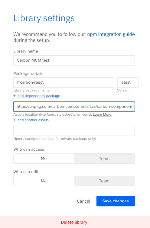
Leave everything else as default and click Save Changes.
6. Grommet
Grommet is a React-based framework that is great for building mobile-first prototypes that are accessible and responsive. Used by Netflix, Uber, Hewlett Packard, this design system is easily themable and you should definitely give it a shot.
Importing the Grommet npm Package
Grommet npm integration Library settings:
- Library name: Grommet NPM
- Package details: grommet – must correspond to the Grommet npm registry
- Assets location: https://v2.grommet.io/components
Leave everything else as default and click Save Changes.
When we add that Semantic UI button to the canvas and select it, those same properties appear in UXPin’s Properties Panel. We can adjust these properties to change the button’s styling instantly.
How to Import npm Components to UXPin
Merge npm integration gives design teams the control and flexibility they needed to import and manage React components in UXPin without engineering support.
Using the Merge Component Manager (MCM), designers can import individual components and their properties via the library’s npm package. There’s no code required, and setup takes a few minutes.
Designers can use these open-source components to build new patterns for an existing design system or create a minimum viable product (MVP) using fully functioning UI elements.
Using Merge Component Manager (MCM)
Merge Component Manager (MCM) is where designers manage npm imported component libraries.
You must follow the library’s documentation and naming conventions when importing components, or the import won’t work. UXPin’s npm integration must find a component and its properties using the repository’s naming convention, so if you reference the React props incorrectly, MCM can’t locate it.
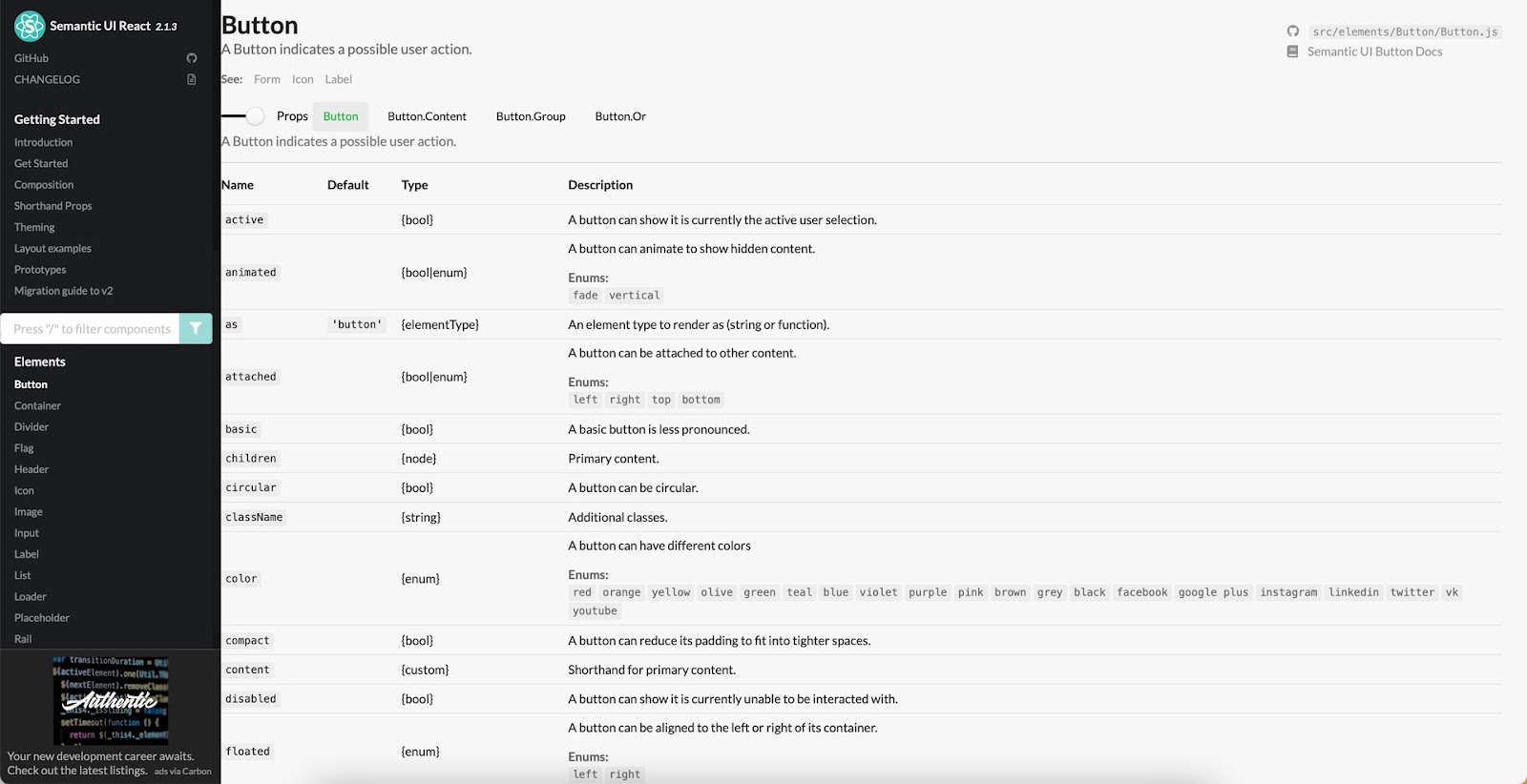
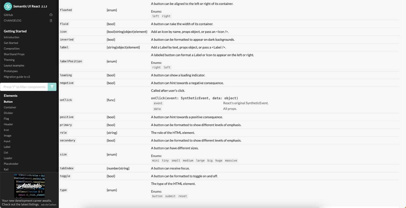
We’ll use a Semantic UI button to illustrate how to reference React props when importing components. You’ll find these React props in the design system’s documentation.
When importing a component’s property, the Property name in MCM must match the React prop name from the documentation.

In this case, we’re importing the children prop, which gives a Semantic UI button its label.

The Display name is what designers will see in UXPin’s Properties Panel.

We’ve imported children, circular, color inverted, secondary, size, and type, which you can see in this screenshot.

Those MCM Property names correspond to Semantic UI’s documentation which you see in the two following screenshots.
Rules for Choosing an npm Components
- It’s important to note that designers can only use the npm integration to import design systems with React component libraries, and it must have an npm package.
- The design system must serve your product’s needs. Are you designing a B2B product? Are you prototyping a web, mobile, or cross-platform application? Do you want to complement an existing design system or build something from scratch? For example, if you’re building a website or web application, Bootstrap or Semantic UI are excellent choices, whereas Ant Design is probably better for mobile and cross-platform digital products.
- It’s worthwhile researching open-source design systems to ensure the library has the UI elements you need. The library must also have documentation with setup instructions and a list of the available React props. These props will allow you to change a component’s properties like color, shape, interactivity, size, icon, etc.
Design with npm Components in UXPin
Here we outlined 6 npm component libraries that you can try with UXPin Merge. Ready to start prototyping with one of these design systems? Try npm integration to test those packages and experience what component-driven prototyping can give you. Discover UXPin Merge.


