The Ultimate Guide to An Effective UI Design
Did you know that as many as 88% of users will not come back to an app or site after just one bad experience? This only goes to show the importance of UI design, which goes way beyond aesthetics and has a crucial impact on user experience.
In the following guide, we’ll cover everything you need to know when designing a user interface – from explaining “what is UI?” and discussing the key elements, all the way through to sharing the newest UI trends for 2022 and beyond.
What is UI design?
UI design which stands for User Interface design refers to the process of creating a digital product’s graphical layout to support the final look and feel of the application. It includes a variety of elements that users interact with such as images, animations, sliders, text fields, buttons, etc. Good UI design translates into a friendly user experience, which is why it should be part of every software development process.
Let’s now take a look at the elements that you can use while designing an interface.
UI Design – UI Elements that Every Designer Should be Familiar With
There are a variety of UI elements, which you can use while designing a user interface. We can split them into three categories:
Input elements
Input elements are the most popular category. They require users to provide all sorts of information, such as, their age, reason for purchasing, etc. The input can come in a variety of formats including text, graphics or audio. Input elements can take the form of:
- Dropdowns
- Combo boxes
- Buttons
- Toggles
- Text/password fields
- Date pickers
- Checkboxes
- Radio buttons
- Confirmation dialogues
Output Elements
Output elements are the outcome of the actions you take with input elements. Their character is never neutral – they display alerts, warnings, success or errors. For instance, if you upload an image whose format is unsupported, you’ll get a message saying “unsupported image” and you’ll immediately know that you have to provide an image in a different format.
Helper Elements
The third category falls into an umbrella term for all the elements that can’t be placed within the output or input categories. As the name indicates, they assist the user in understanding the contents of a site and/or finding their way around the interface.
Helper elements can be further broken down into three subcategories:
- Navigational, that helps you navigate through the interface. Some examples include menus, breadcrumbs, link lists, etc.
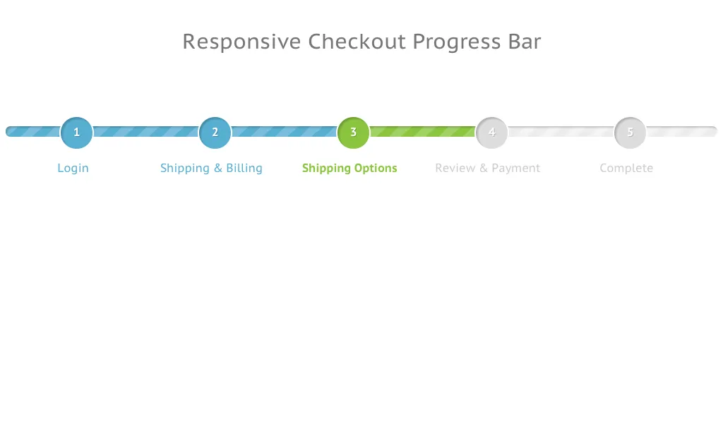
Informational, that tells you which step of the user journey you’re currently at, or which processes the website is currently running. Progress bars, icons, and toolbars are all great examples.
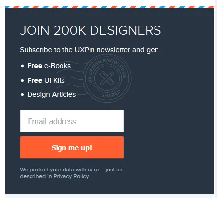
- Containers/groups, which keep various UI components together. These elements most often come in the form of pop-ups, side bars, and widgets. A great example are newsletter sign up boxes like the one on the image below:
Why is it important to understand the differences among UI design elements?
As you can see from the three groups above, output, input, and helper elements all serve different purposes. That being said, UI designers should also properly distinguish among elements falling within the same group.
To give you an example, let’s imagine you’re adding a filter on an online grocery store page. You want your search results to display “vegan” products only.
From a UI standpoint, you could be looking at a number of input elements:
- Radio button list, which lets you tap on the right option
- List, where you can find the fitting element and click on “vegan”
- Dropdown, where you scroll and tap on the right product tag (usually, the options will be listed in alphabetical order)
- Checkbox, where you can choose “vegan”, but potentially also other elements, like “sugar-free” or “fair trade”.
To know which one to choose for your UI, you need to understand the goals of your users, and make it as simple and convenient for them to complete them!
Speaking of user goals and simplifying interactions, this leads us to the next section:
Best Principles of UI Design
What is UI design? Making life easy for your users.
That’s the key principle to successful UI design. By making users central to your ongoing design processes, you can increase engagement and retention. It’s about understanding how users think while using data to learn how they act. The result is a more refined product that meets your users’ needs and expectations.
And expectations are high. As users spend tons of time online, they have become more demanding than ever before. They know what a great user interface looks and feels like – even if they don’t realize it or call it ‘UI design’.
Because what happens when a user struggles to navigate your app or site?
They X out. It’s uninstalled.
So, it’s business-critical that you apply the right principles to simplify the user journey. To start, you should:
1. Minimize Actions and Steps Per Screen
Users should be able to get where they need to go in as few clicks or taps as possible. This is especially important when designing a user interface for devices with smaller screens, where space is at a premium and navigational techniques need to be big and bold, and thumb-friendly.
Keep designs focused – both in aesthetic and intent. It should be clear what the page or screen is about, what users need to know, and what they need to do. Take the Amazon checkout page as an example. The focus is on your items and price, your details and delivery options are auto-filled, and all you need to do is hit ‘buy’.
Time is precious, and with so many firms vying for a user’s attention, you can’t risk ‘losing the crowd’ to competitors without streamlining tasks and actions.
2. Reduce Cognitive Load
Remember the Million Dollar Homepage? It’s an incredible example of cognitive overload. Your eyes flicker across blobs of bright colors and barely legible words. You might be able to pick out a business – a casino, maybe, or a small retailer – but not before another flashy pixel ad else catches your eye, and you’ve forgotten everything that came before it.
Cognitive load is the amount of information taking up bandwidth in your brain. And the goal, when designing an interface, is to cut back on distractions your users don’t need, while making it easy to interact or parse the information they do need.
A common example is switching the color of a link a user has already clicked on. Instead of having to remember which pages they’ve visited, a user can see at a glance where they’ve been.
Great UI design means people don’t have to think. The action is intuitive, with users unaware of your savvy behind-the-scenes design skills that enable them to complete their tasks.
3. Ensure Dialogs Should Result in Closure
Think of the last time you bought an item online. There was a clear ‘narrative arc’ in three acts. In the beginning, you’re browsing different products. In the middle, you’ve selected your product and you run through the checkout. In the end, you receive an order confirmation.
That’s satisfying – our brains get a big kick out of cause and effect because it’s the easiest way to make sense of the world. If I throw this ball against the wall, it will bounce. If R2D2 holds the blueprints, then Luke can destroy the Death Star. If you click ‘buy’, you’re notified that the product is in your basket.
Apply the ‘three-act structure’ to user actions, adding feedback, like ‘Added’ notifications, at each step.
4. Provide a Clear Next Step
How often have you scrolled to the end of a webpage, only to find it as barren as Arrakis? Your journey has abruptly stopped, leaving you to scroll up, click back, or close the tab.
Make sure your app or site doesn’t make the same mistake. You’ve helped users get where they wanted, but what happens next?
A core part of UI design is guiding users through a journey. Subtly (or not-so-subtly) telling them where to go next, or what to do. Consider the location and function of call-to-action buttons. Use the data to focus on user intent and placement to maximize engagement.
Find out more in our guide The Basic Principles of User Interface Design
Top 3 User Interface Design Mistakes and How to Avoid Them
Designing a user interface also comes with a set of risks and potential mistakes. As many of them can be easily avoided, we’ve reached out to several experts, asking them to share their observations. Here are three of the eleven user interface design mistakes we’ve gathered.
1. Putting Creativity over Usability
Josh Wright, CEO of CellPhoneDeal said that frequently businesses try too hard to stand out which has a negative impact on usability. While it’s recommended to design a UI which is memorable, cluttering it with too many images or animations is never a good idea. It can make your app or your website too hard to use. And instead of attracting attention, it might discourage users from using it, and push them into the hands of competitors. Focus on usability instead, and make sure that your UI is not only pleasant to the eye but also intuitive.
2. Relying too Heavily on Design Trends
Deepasha Kakkar, Founder at CRACKITT quite rightly pointed out that companies often fall victim to trends. And as we all know, trends come and go, which is why following them blindly without any initial evaluation is a mistake. Take a look at your performance metrics and see if it’s necessary to make any changes; if it’s not then don’t do it just because everyone else does. If you decide to modify your product based on a newest trend, then first check if there is any data which supports it, otherwise you might waste a lot of time and money.
3. UI Design Style over Substance
Another common obstacle is putting “style over substance”, as told us by Arek Nowakowski, Product Designer at spacelift.io.
Throughout his career, Arek has seen quite a few examples of designers wrapping up a useless (or non-existent) UX into beautiful branding. Such projects are set up for failure, as they only ‘look’, and do not ‘perform’.
A good analogy is thinking of a car without wheels – the jaw-dropping exterior and interior won’t matter if the vehicle can’t do the very basic thing it’s intended to and take you places.
To tackle this mistake, Arek suggests starting off with the website or app’s flowchart, and validating your hypotheses among potential clients. If your assumptions are proven true, you can then consider including them into your UI. The key here is to be consistent. So, what does design consistency mean? Let’s discuss this next.
Best design consistency practices for UI and UX designers
What is Design Consistency?
Design consistency is all about keeping visual and functional elements uniform across all platforms. You might even call it ‘design predictability’ – when your user performs X action, Y always occurs, whether on mobile, tablet, or desktop.
A simple example: your app places a green ‘Yes’ on the right and a red ‘No’ on the left of a dialog box. Users become familiar with this, the action becomes – as every UI designer craves – instinctive. But on certain screens, the placement is flipped. Suddenly, the user is selecting the wrong option. They eye every future choice with suspicion, thumb hovering a second too long over each interaction.
Inconsistent design shatters the contract between you and your user.
Best Design Consistency Practices
1. Perform User-Centric UI and UX Design Research
Begin your research by answering two questions.
- What does your user want?
- What does your user expect?
Before you can design a solution, you need to get into the user’s mindset. They’ve downloaded your app, clicked on your site. But why? UI and UX is awash with a cocktail of data and empathy.
Once you’ve identified the user’s need, focus on the user’s expectation. This means building on design familiarity. Google determined how we search online. Facebook influenced how we connect with friends. Amazon defined how we shop.
Where’s the homepage button on this page? Top left. No hesitation. Pure online consistency.
2. Define Product Design Patterns
The ‘rule of three’ helps you maintain consistency. You want to keep user actions down to a minimum. That means no more than three taps or clicks from where they are to where they want to be. You can do this in several ways.
- Design hierarchy: direct users’ attention, making the most-used sections stand out.
- Branding: your branding is what makes you stand out, from your color palette to your tone of voice. It’s all you, always.
- Components: the various interactive elements should behave uniformly. A progress bar is always a progress bar.
- Template: standardize layouts across all platforms, templates are an efficient way to maintain consistency.
3. Build Consistent Actions
You want users to just know how your product works. Consistent actions create an easy-to-use design flow – once a user knows that X action results in Y, they take that knowledge across your product. They won’t even need to think about it. Draw on existing influences and your own designs when building consistent actions.
4. Create Consistent Content
Keep your copy consistent. The way you ‘talk’ to users should be maintained across the product, especially when you’re using specific terminology. Consistency creates clarity, maintaining the user’s flow. On the branding side, it prompts users to remember they’re with you, not someone else.
Content should be presented and behave in a standardized way. When designing these, place user goals to the center.
5. Maintain Communication
The value of communication just can’t be understated. When users perform an action, they like acknowledgment – a chime, for example, when making a selection. The progress bar is the perfect example. The internet has taught us that patience is a virtue, if it isn’t instant, users want to know what’s going on.
Users shouldn’t be left wondering whether they’ve ‘done it right’, or if the product’s behaving correctly. Wondering leads to wandering.

Consistency also depends on internal communication. Everyone on the team is working towards a single vision – and how their roles help to build it. Strengthen your design consistency from ideation to implementation using code-based UI tools like UXPin. These allow cloud collaboration between designers crafting experiences with the same ‘live code’ elements used by your devs, so the product matches your vision.
Learn more about maintaining a consistent design in our Design Consistency Guide: Best Practices for UI and UX Designers
What does ‘good UI design’ mean according to experts
Now that we’ve covered the principles of UI design and discussed some common mistakes, let’s look at what characterizes good design according to experts:
Designing a User Interface Requires Responsiveness
Technical Lead at ExaWeb Corporation emphasizes the importance of responsiveness, especially after Google made mobile indexing part of their top search ranking factors in 2019. While building an app or a website, it’s absolutely vital to make sure that it adjusts to different screen sizes to guarantee a good user experience irrespective of the device. Responsiveness, however, goes beyond screen size optimization, and also involves speed and performance. For this reason it’s key to abide by Google standards, and make sure that your UI design meets them on every device.
UI Design Needs to be Empathetic
Greg Findley, Designer at Mantra Design, says one of the most important good UI design traits is empathy towards the users’ needs. While one might think that it’s primarily a UX-related issue, he argues that we can’t forget that it’s the UI users interact with – not the processes behind it.
Greg says that the UI needs to reflect common people behavior, for instance, our ever-shortening attention spans. If the interface or its messaging is too focused on conversion, the user might abandon the site or app, feeling pushed towards the purchase way too early in their journey.
He suggest asking yourself the following:
- How does the interface make our users feel when they first see it?
- How do they experience it the second, tenth, and fiftieth time around?
- How does the UI support maintaining empathy in all the stages of the product life cycle?
In essence, as Greg sums up, how an interface feels and resonates emotionally can make all the difference between a decent and great UI design.
These were just a few of the good UI characteristics designers have told us about – be sure to give our dedicated piece a read for more.
Good UI Design Should be Minimalistic
Karla Fernandes, UX/UI & Digital Product Designer at Vitamina K says that the purpose of every product should be to help users resolve a problem or achieve a goal which was identified during the user experience research. A minimalistic UI design will do so by using colors, font, and proportions that not only have visual hierarchy, but also promote user attention and reduce informational overload. This, among others, can be achieved by spacing and a careful selection of images and animations.
Karla also underlines that people love familiarity. When you use a repetitive pattern or element, you can rest assured that they’ll know how to find their way around. In the end, this positively impacts your product’s usability and reassures its role in peoples’ lives.
For more advice from experts, give our dedicated good UI design piece a read.
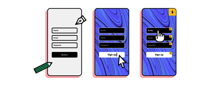
Best Practices for Mocking Up User Interfaces Fast
1. Sketch it
Time – we never seem to have enough of it, so you don’t want to waste it digitally working up concepts that may be doomed to fail (or totally unworkable, anyway). Sketching is quicker and cheaper, ideal for creating faster UI mock-ups. Just grab a pen and paper. It may be low-fidelity, it won’t look, feel, or function like the finished product. But it’ll give the team a clear idea of your vision, and how best to approach it.
2. Mobile-First
Start small – in this case, the small screen. Mobile is where a huge chunk of your audience is, so it makes sense from a business perspective. However, the mobile-first approach brings practical design benefits, too, whether you’re making mock-ups, prototypes, or wireframing your latest brainchild.
By creating for mobile-first, you’re including only the most important content (because space is at a premium). You’ll then find it easier to scale up, adding additional content for larger screens, rather than cutting, which usually leads to back-tracking and complicating designs.
3. Grid Systems
Grid systems remain somewhat controversial, like all the best things in life. But there’s no denying they’ve grown in popularity in recent years, becoming an essential tool for designers who need to build efficient and consistent mock-ups. Grids let you bring order to what might otherwise be chaos. The organized grid system helps you determine the best spacing, sizing, and hierarchy of your content. Horizontal grids are most common, but if you’re concepting typography, you may find it handy to implement a vertical grid.
Get more tips by reading our article on the 19 Best Practices for Faster UI Mockups and in our ebook on Web UI Design Best Practices.
Responsive Design or Adaptive Design: Which is Best?
What is Responsive Design?
Responsive design fluidly adapts to whatever screen size the user is on. It uses multiple CSS media queries to determine the display or size of the device and alters the style in response.
What is Adaptive Design?
Adaptive design presents a static layout based on breakpoints. So, if your user is on a 760-width screen, they’ll always see the 760 layout. Most adaptive design teams create adaptive designs for six screen sizes:
- 320
- 480
- 760
- 960
- 1200
- 1600
Pros and Cons of Responsive and Adaptive Design
Adaptive designs need more work to start – designers need to design for at least six screen sizes. But responsive design comes with complications, vulnerable to display issues if the proper media queries aren’t used.
This is most notable when sites deliver the full desktop experience. We’ve all come a cropper of this one. If we’re lucky and the site loads, it slows to a crawl. Deploying media queries can help, but responsive sites are never as quick as one designed specifically for a mobile screen size.
When taking the adaptive path, choose a UI tool like UXPin, which lets you introduce multiple breakpoints to maintain on-screen consistency across devices. You can see how easy this is yourself with a free trial.
What’s Better – Adaptive or Responsive Design?
With all that in mind, what’s the best choice for designers?
Your design choice starts with your users. Answer: Who are your users? What devices do they use? Equipped with this knowledge, it’s easier to create a design that meets their needs. When most of your users are accessing your site on a 960 screen, you know which screen width to prioritize and optimize the content.
Your decision will also be influenced by whether or not you have an existing site. In the design world, responsive has become the go-to choice – adoption rates almost match dedicated mobile sites, with around 1/8 sites running a responsive design.
But popular doesn’t always mean good. One pretty clever test showed out-of-the-box responsive designs seriously impact your site load times. That means rigorous optimization is an absolute necessity. Adaptive designs require more investment, but will typically be the better choice for any mobile-first operation, since it only loads what the user will see, precisely how the user should see it. Find the right design choice for you in our showdown Responsive Design vs. Adaptive Design: What’s the Best Choice for Designers?
Now, we have a pretty clear idea of using the principles of UI design and responsiveness to efficiently craft brilliant user journeys. So, it’s time for a more granular look at how to perfect your mobile and landing page UI.
Mastering Mobile UI
What is Mobile App Design?
The mobile UI is everything displayed on the mobile screen. If a user can see it, tap it, swipe it, or do anything else, then it’s part of the mobile user interface.
There are almost 17 billion mobile devices operating worldwide. Over 300 million smartphone users in the US, spending more than $330bn a year. It’s a huge market that can’t be ignored, and in the high-competitive (dare we say, cut-throat?) digital space, it’s vital to make the right impression.
Mobile design isn’t without its challenges. With smaller screens and touch-based interaction, the principles for designing an interface on mobile diverge from traditional desktop design.
Tips for Designing a Mobile Interface
1. Present a Clear Vision
Every project should start with a vision. A clear objective communicated to the team and key stakeholders. Be specific, and use visual aids where possible.
Everyone working on the project should leave that meeting understanding what your vision is and what’s required of them to deliver it. Counter any factor that might influence the end-product at this stage. For example, how will your idea gel with the brand colors, or the development tools you use?
Kicking off your project this way helps make the design and development process more efficient; the end goal isn’t a shifting interpretation filtered through multiple departments, with more and more features added with every regeneration.
2. Iterate Your Designs
‘Progressive enhancement’ describes the way you continually refine a design to its perfect point.
Creating a product takes up just about every resource a business can spare (and a few they can’t). Instead, you want to iterate an idea, working it up into a high-fidelity prototype the same way devs progressively develop modules. It’s a lot easier to start small, see what works (and what doesn’t), and build a product that really matches that initial vision.
UI design software like UXPin’s Merge offers a great way of achieving efficient progressive enhancement. No more endless back-and-forths or redesigning elements every time. By using fully interactive ‘live code’ components, designers can create designs that look, feel, and function exactly the way the final product will.
3. Stay Uniform
Mobile interfaces need to feature consistent designs. You could even argue that mobile design consistency is more important than it is in desktop design – at least our brains are switched when we’re sitting at a computer.
Keep buttons, icons, and colors uniform. The placement of key actions should also remain consistent. When we’re scrolling through our phones, half-watching the TV, we don’t want to think about what our thumbs are tapping. It should be instinctive. Find out more about Mobile UI.
Understanding Landing Page UI
How to Create a User-Friendly Landing Page UI
- Trigger emotions
Your brand colors, tone, and imagery are a core part of your business personality. They’re what makes you you. Whether you’re a start-up or a veteran firm, these should all hold meaning for the user – and they should be reflected on your landing page.
At the earliest stage of design, determine:
- The message to communicate
- The emotions to convey
- The personality to present
Your answers will inform the shape of your design.
Let’s say you offer online meditation services. Your landing page needs calming colors, soothing tones, a lightweight design with plenty of breathing space.
Don’t dismiss the power of color psychology, either. According to Canva, ‘85% of consumers believe color is the biggest motivator when choosing a particular product, while 92% acknowledge visual appearance as the most persuasive marketing factor overall.’
- Use images
Images are insanely powerful when you want to attract your users’ attention. We’re drawn to images – it’s part of our DNA. Moving vehicles and human faces are especially effective at catching (and holding) the eye. So effective, in fact, that users will naturally follow the gaze of a person in a photo.
Use these tricks in your landing page designs to direct a user to look somewhere, or perform an action. However, make sure your image placement doesn’t break the compositional flow of the page.


- Run A/B tests
A/B tests are one of the best ways to gauge the user-friendliness of your landing page. This sees you create two versions of your page, with different call-to-action copy, for example. Half your users will see page A, the other half will see page B. Now, you can see which generates more clicks or sign-ups, and so on.
Once you have a winner, you can continue creating A/B tests, refining the design as you go until you have an unstoppable landing page. For additional user testing, run your designs through a focus group of other UI designers and average users.
Check out our guide on Landing Page UI.
Choosing Your UI Design Software
Best UI Design Tool Features
1. Image-based or Code-based
When selecting your software, you’re likely to come across a lot of image-based tools. They’re pretty common in the design world because designers can mock-up interfaces fast. It’s the software equivalent of a pad and pencil; great for getting that initial spark of an idea out of your head and onto the screen.
But they can’t go much further than that. You’re dealing with images, not functional elements. They only look awesome, too raw to develop into a tangible product.
Code-based UI software lets you craft sweet designs just like an image-based tool. But it uses UI components built from the same code used by your developers. Designs retain consistency from start to finish, and by easing the design and development process, deployments are faster.
2. Functional Fidelity
Struggling through handoffs with the devs? Tired of explaining ‘but it needs to look like this…’? Embarrassed seeing a finished product that’s only more or less like what you envisioned? Then it’s a sign you need to boost the level of functional fidelity in your designs.
Low-fidelity designs only give a sense of appearance. This makes it difficult for developers to translate into a working model – assuming it’s feasible.
High-fidelity designs, like those created in UXPin, look and act like the real thing. By harmonizing the components used by both design and development, everyone’s on the same page. The vision – along with everything else – remains consistent.
3. Working Together
In our connected world, communication and collaboration have never been easier to accomplish. Make sure your UI software isn’t the odd one out.
Your tool should be geared towards making it simpler than ever to work together, share the latest updates, and chat about projects. Cloud-based design tools bridge the gap within teams and across departments. Emphasizing the collaborative approach, UXPin enables teams to work on the same designs in real-time, access shared libraries, collect feedback, and conduct remote brainstorming sessions. From mock-up to handoff, you’re able to manage the whole design process in a single online tool.
To make an informed choice, read our guide on UI Software Tools.
Top UI and UX Trends in 2022
What does 2022 hold for UX and UI design? See top trends in the user interface design industry.
1. Lottie Animation
The popularity of Lottie Animation continues to rise. One study shows searches for the animation technique rocketing 2300% over the last four years.
Lottie Animation is an open-source, JSON-based tool that lets you make animations really quickly. But don’t mistake these for mere GIFs. Lotties are smaller, while featuring far better image quality. It also offers greater control over your designs, letting you build and test each one before you display them on your site.
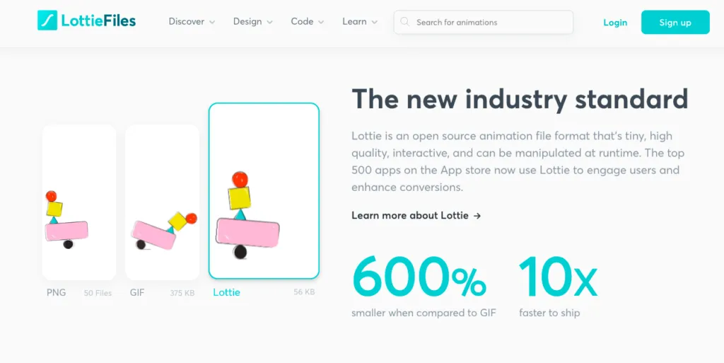
With animation experiencing a resurgence in UI design recently, and businesses keen to irresistibly attract users’ attention, expect Lottie’s user-base to grow.
2. Code-based tools
Design and development teams don’t always see eye to eye, right? Design wants a product that looks like this, but development knows it won’t work that way…
Ironing out these issues, especially when working remotely, is tricky since often it’s a case of communication breakdown. No one’s talking in the same language.
Because of frustrations in the process, teams are shifting to code-based design tools. Unlike image-based software, which can only accurately represent the look of a product, code-based UI tools use live code components. Designers are free to craft interactive, high-fidelity prototypes using elements built with the same code used by your developers. This means prototypes behave just like they would on your site or app, and devs are already familiar with how each element functions.
3. Voice UI
It’s easy to think of UI and UX in strictly visual terms – that’s where it manifests itself most commonly, after all. But don’t sleep on voice user interface.
Google, Amazon, and Apple have all helped mainstream VUI with their AI-powered smart speakers. Almost every modern smartphone now has voice capabilities. And by 2025, the speech and voice interface market will hit nearly $25 billion.
Designing for an audio audience is a major shift, bringing fresh opportunities (and a few challenges). However, users are increasingly familiar with and comfortable using voice UI. 2022 might be the right time to explore a new approach for interacting with your product.
Design User Interfaces in UXPin
While designing an interface can be a challenging process, it’s crucial for creating good experiences for your users (and so, your brand’s success). The good news is, this guide has given you all you need to know to begin on your UI design journey!
If you’re looking for a tool that will support your designers and developers in their product development, be sure to check out UXPin!

