Responsive design is now the industry standard for web design. But it wasn’t always that way.
Today, we’ll take a quick trip through time to 2014. We’ll dive deep into the design and launch of the world’s first responsive airline site. You’ll see every detail and decision that lead to one of the most influential web projects in the past couple years. The best practices still ring true today.
Alaska Airlines chose to partner with Work & Co, a new company of fewer than a dozen people at the time. The results of their collaboration?
Bottom-line results and awards for the first ever responsive airline website, and explosive growth for Work & Co, now a team of more than 100 who still work with Alaska Airlines.
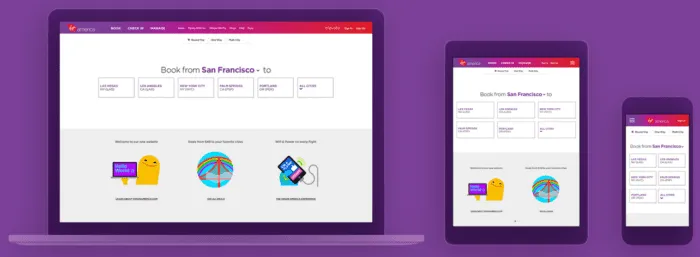
Photo credit: Work & Co
We spoke with Felipe Memoria, Work & Co’s Founding Partner, about one of the agency’s most popular projects. This is the story of how collaborative design helped push Alaska Airlines to a successful IPO.

Ongoing: Designing for the Extremes
During all stages of the project, one clear goal guided everything: sell more tickets.
“The beautiful part of the entire process is that we were able to focus on the one thing that mattered the most – not just from a business standpoint but from a user standpoint,” said Felipe Memoria, Founding Partner of the agency.
Rather than designing based on edge cases and all the flows associated with them, the Work & Co team, working collaboratively with the Alaska Airlines team, focused on one core use case: a single traveler buying a round-trip ticket. The team decided that if they could get the process right for this one use case, they would have a solid baseline to start from.
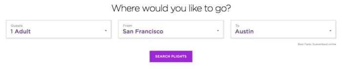
Photo credit: Alaska Airlines
In addition, in contrast to the movement towards “mobile-first” design, the entire Alaska Airlines project was dictated by an “extremes-first” approach. Rather than starting with the smallest viewport and then scaling up to the desktop, the team worked with extremes – designing mobile and desktop views simultaneously – and then converging towards the in-between viewports.
Step 1: Setting One Clear Goal
The project was intended to move Alaska Airlines from having a website to a digital platform that could respond to modern travel needs and behaviors. Based on an analysis of their website and revenue, Work & Co recommended that they prioritize rethinking their booking experience in order to improve conversion rates, repeat visits and mobile engagements.
“Really, when you think about it, an airline booking flow is just one big form,” Memoria said. “So we set out to create something different–not just a better form, but one that was actually enjoyable to use. Thinking about our project in this holistic way let us start designing immediately.”
Step Two: Collaborative Concepting
Throughout the process, the project was defined by a collaborative, multi-disciplinary approach.
Work & Co built its agency around this very concept, where everyone has particular strengths but can also serve different roles on the team. For example, someone might be an analytics master, but they might also be a great project manager. In fact, Work & Co has no account managers at all–everyone has technical skills and the soft skills needed to manage projects and client expectations.
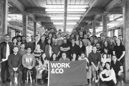
Photo credit: Work & Co
Over the course of the Alaska Airlines project, three product strategists, three designers, and four developers collaborated directly with C-level stakeholders at Alaska Airlines. Beyond just close collaboration with the immediate clients, the team also brought in other critical parts of the organization, such as legal and operations, into the design process. This helped ensure that ideas could be implemented and sustained successfully.
The concepting phase was spent entirely on solving the one core scenario of a single traveler booking a round trip. For two weeks, three designers with different backgrounds worked on this one issue, which is in stark contrast to a typical project’s division of labor. One designer, for example, was a classic UI designer who thought in terms of grids and colors. Another was more of a new generation of hybrid designer/developer who could build prototypes.
“Getting more heads thinking about concepting made a huge difference to our project,” Memoria said. “It gives us a higher chance to design something far superior. There is no reason to focus on tangential use cases–by testing and iterating just on the main experience, we can come up with something more pure.”
The team would only formally check in once a day. Sometimes they might switch off on designs to help solve roadblocks. The team actually worked in a meeting room at Alaska Airlines headquarters, with Memoria moving his family from New York to the San Francisco Bay Area to be physically present and immersed with the client.
Because they were all travelers and Alaska Airlines customers, they were able to quickly draw from existing customer research provided by the client. The team had noticed in the collective research that booking a flight was really all anyone wanted to do, so they had further validation that they were solving the right problem.
After just two weeks of focused workshops and co-design, the team was ready to present their design strategy to executive stakeholders.
Grab design ebooks created by best designers
All for free


Do you want to know more about UI Design?
Download 'Real-Life UX Design Processes' FOR FREE!
Download e-book for freeStep Three: Designing the System
For the first design review, the team presented two rough wireframes, one static mock-up, and one detailed prototype.
At the end of the day, the Work & Co designers, developers, and the client came together around the design they felt had the most promise to create the simplest, most powerful experience possible.
Single Scroll Experience
Much to the team’s surprise, it was the lowest-fidelity wireframe of them all that captured the heart of their work: the overall flow of a smooth scroll, one linear motion for the entire purchasing and checkout process. While the wireframe lacked fidelity, it showcased the essence of the flow and top-to-bottom motion that the entire site would be built around.
Memoria adds: “We were able to put our ideas together and pull from them this big insight that informed everything we did from then on.”
Contextual Choices
By all focusing on the one flow at hand, they identified the key insight that would make the Alaska Airlines website unique. Because the airline flew a select number of cities, there was no need for huge, confusing pull-down menus. Instead, the site used geolocation to deliver a handful of contextually relevant routes (with an added option to browse all cities).
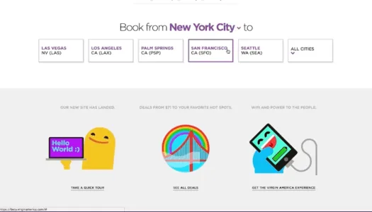
Photo credit: Work & Co
“One golden UX rule is that the more you expose things, the more likely users are to see and click on them,” said Memoria. “By exposing travel options right away on the Alaska Airlines site, we were able to usher in a whole new type of responsive navigation. We were able to change the paradigm of a funnel flow, and make it easy to scroll through without endless back buttons and refreshes.”
Delightfully Consistent Tone
From a visual standpoint, the team used cheeky illustrations instead of stock photos of cityscapes. The decision aligned perfectly with Alaska’s fun brand.
For example, destinations were represented by icons instead of dots on a map.
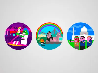
Photo credit: Illustrations for Work & Co by Build
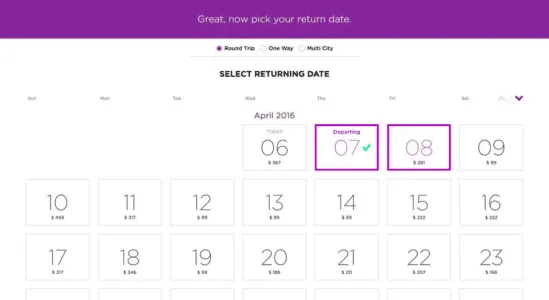
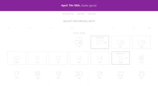
To match the lighthearted visual tone, the team carefully crafted casual microcopy to deliver conversational feedback to users.
For example, when selecting a departure and arrival date, the following messages overlay at the top of the screen.
After selecting departure date
After selecting arrival date
Bridging the Offline Gap
To ensure a consistent customer experience even after using the site, the team also considered the experience of printing a boarding pass. After all, an easily lost or unusable printed boarding pass would certainly contradict the expectations set by the new website.
Based on user research (and their own experiences), the team carefully designed a 4-quadrant boarding pass to fit easily inside a back pocket. This design has since set a new standard for printed boarding passes.
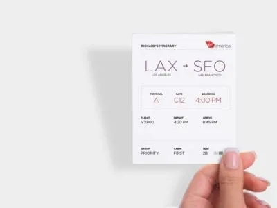
Photo credit: Work & Co
Digestible Form Elements
To improve overall user comprehension, the team followed the UX best practice of chunking out content.
For example, to make the interface even more stimulating and usable, the team designed the calendar as an entire view, saving additional user input requirements for later down the flow.
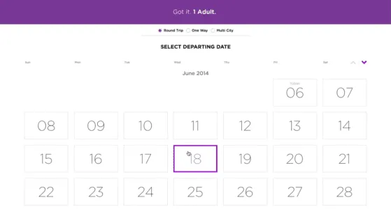
Photo credit: Work & Co
“We were inspired by the simplicity of effective PowerPoint presentations,” said Memoria. “Just like how seeing just one point per slide makes it easier to understand a presentation, isolating each part of the form made it clearer and easier to digest.”
In the end, the booking flow took the team about 6 weeks of iteration to arrive at one cohesive multi-device design system. Over the course of that time, they continued to collaborate, testing coded prototypes in four user testing sessions with a total of 100 people.
Step Four: Development
Perhaps the biggest challenge the team faced was the technology behind the solution. Given that this was the first ever fully responsive airline website in 2014, careful and collaborative implementation was required to bring the design to life.
“We could not have produced this website if we weren’t working with developers every single step of the way,” Memoria said. “Because our technology team was involved from the beginning, they understood what was required to make this work in real-life. Together, we had to ensure our concepts could actually work when confronted with cases that were exceptions rather than the norm. But hard is good, and working in parallel, we came up with an original and effective responsive site.”
As explained in a Forrester case study, the team followed a carefully phased beta rollout:
- Step 1 – Dogfooding the design and testing with a small batch of friends outside the company.
- Step 2 – Testing the design with a small segment of loyal Alaska customers.
- Step 3 – Testing the design with more Alaska customers, members of the media, and selected business thought leaders.
Not only did a phased testing schedule help build momentum for the new design, it also helped the team adapt to edge-cases and any functionality gaps.
After iterating the new design based on beta insights, the reinvented AlaskaAir.com was released. Two quarters later, Alaska Airlines announced its IPO.
The redesigned site exceeded performance goals in the following areas:
- More than 10% increase in conversion rate.
- More than 20% decrease in web-related support calls.
- At 2 seconds, it remains the fastest loading airline website.
Continuing the Gold Standard
The website ultimately became the inspiration for many more Alaska Airlines projects both online and off, from billboards in Times Square to their look and feel in airports.
In the years since, the site itself has won rave reviews, UX design awards and most of all, has delivered bottom-line ROI for the company.
The Work & Co Alaska Airlines project is a great example of the outcomes resulting from:
- An extremes-first approach, where design for the smallest mobile and largest desktop viewports at the same time and let the rest flow in.
- One team that is closely collaborating, between designers, developers, and clients.
- Laser focus on designing for one high-value user scenario (buying a single-seat, round-trip ticket).
If you enjoyed this post, download the free e-book Real-Life UX Processes. The guide explains the secret sauce behind the products of companies like Slack, Autodesk, 3M, and others.