Interaction is what gives life to products.
It captivates and surprises—and it promises us experiences uniquely responsive to our decisions and actions. In many ways, interaction design is the soul of UX design … but what exactly is it?
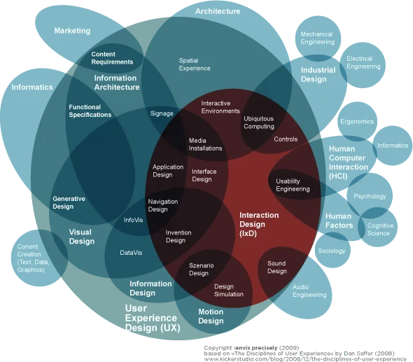
Image Credit: “Interaction Design Disciplines”, Wikipedia. Creative Commons 2.0
This article will introduce you to the core concepts of interaction design, explaining how to use them to breathe life into your product.
What is Interaction Design?
Interaction design—often shortened to IxD—is a field dedicated to making human-to-computer interfaces feel more like human-to-human communications. This “human” connection with your digital product leads to positive experiences for your users: more enjoyability, deeper comprehension of usability, faster learnability, deeper personal connection, and an increased likelihood of repeated use.
Central to the practice of IxD is the concept of increasing this sense of human connection by adding the right elements into an interface. Features like animations, copy, colors, visuals, timing, and layout all affect how the user feels, meaning these specific responses can be strategically generated. Whether you’re building a web application, mobile app, or custom solution, Adalo’s no-code app builder demonstrates how thoughtful interaction design can be embedded from the start, letting teams design database-driven apps with intuitive interfaces without requiring extensive coding.
The 5 Pillars of Interaction Design
The foundations of IxD knowledge comprise 5 “pillars” of focus that lead to increased effectiveness.
1. Goal-driven Design
Good UIs make it easy for users to accomplish their goals. This sounds simple enough, but all too often, designers place greater emphasis on furthering their own business goals or developing flashy-but-unnecessary features.
The key to goal-driven design is understanding what your users want and their preferences for getting there—in short, knowing them on a deep level. The best way to do this is through data-generating research you can use to create documents like personas, user scenarios, and customer journey/experience maps.

(For more on these documents, read our free UX Design Process Best Practices.)
2. Usability
The very foundation of IxD is usability: an interface must be usable before it can be good. Usability is typically measured by how much effort the user puts in to accomplish tasks; the most usable interfaces are those with the lowest degree of friction. Designers can increase usability by:
- Removing unnecessary steps
- Designing according to user flows (as described below)
- Organizing controls and features visually (e.g., color-coding)
- Using a visual hierarchy to draw attention to important areas.
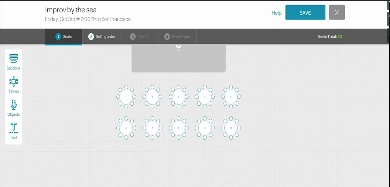
Photo credit: EventBrite
EventBrite illustrates exemplary usability. They’ve streamlined a system that organizes reserved seating, simplifying an otherwise daunting task that could easily become convoluted or confusing.
Grab design ebooks created by best designers
All for free
Do you want to know more about UI Design?
Download ‘Interaction Design Best Practices’ FOR FREE!
3. Affordances and Signifiers
Affordances and signifiers are a great shortcut for improving the other pillars of IxD.
An affordance is a feature’s evident function (e.g., a video affords playing), whereas signifiers are visual cues suggesting that feature’s affordance (e.g., a play button within a screen signifies that it’s a playable video).
Drawing on the user’s previous experience with similar sites and apps (as with UI Patterns), signifiers give the interface an intuitive feel. They’re meant to seem familiar to the user, like they’ve used them before.

Photo credit: The Onion
For this reason, designers shouldn’t deviate too far from convention; for example, a right-facing triangle almost always represents a play button. The more a signifier deviates from convention, the more effort it takes to decipher what it is.
5. Learnability
The time it takes for a user to figure out an interface and its controls is what’s called “learnability.” Learnability is important for more than just convenience — if the learning curve takes too long, they’ll likely give up and abandon the product.
The two main components of learnability are:
- Consistency — The interface behaves the same way on each page and area, including visuals
- Predictability — The user can correctly guess the purpose of features, whether through signifiers, UI patterns, or conclusions based on previous experiences with the product.
If your interface is inherently confusing and difficult to learn, you can increase learnability through onboarding. (For more information, our free UX Design 2015 & 2016 guide is a great resource and covers best practices on the topic.)
5. Feedback (and Response Timing)
Without feedback, there is no interaction. Think of it as a conversation between the user and the interface: the interface “speaks” in response to the user’s actions, meaning the user is no longer talking to themselves. At minimum, feedback is the task being performed, but going beyond this is an opportunity to improve UX, from subtle microinteractions like a cute sound effect alert, to grandiose animations that supplant the actual task as the reason to click.
![]()
Photo credit: Gmail
Whenever dealing with feedback, it’s essential to keep response time in mind. Feedback should come almost instantaneously—ideally within 0.1 seconds—to make the user feel in control of the interface. Anything longer than that destroys the illusion of control and detaches the user from the system. Consider how frustrating it would be to play a guitar but not hear the notes for a full second after you plucked the strings.
How to Improve Your Interaction Design
Here are 4 general techniques that can be applied to any project to improve the interaction design.
1. Test Early and Often with Prototypes
Regular testing is the surest way to stay on track. Ideally, you’ll want to test during each iteration since you’ll be able to incorporate feedback every time you move forward. Prototypes are not something to be ignored or only done at the end of a project.
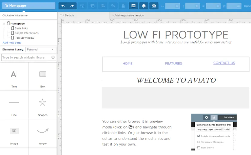
Photo credit: UXPin
Low-fidelity prototypes, such as paper prototypes or interactive wireframes made in UXPin, test issues like flow and navigation early on (before changes become too difficult to implement). In the later stages, high-fidelity prototypes test overall functionality of a near-finished product, as well as visual interactions and the success of signifiers.
2. Create User Flows to Understand User Behaviors
User flows map out the step-by-step, standard actions a user takes to accomplish a goal. They’re wonderful forms of documentation that can help designers better understand user behaviors and modify the interface accordingly. User flows also help by revealing unnecessary steps, highlighting places to reduce friction.
We generally recommend two types of user flows: the written approach (best explained by Jessica Downey) is more detailed and can aid constructive thinking, whereas the shorthand approach (described by Basecamp’s Ryan Singer) is better for quick organization.
3. Proactively Use White Space
Don’t be fooled into thinking empty space is wasted space. As part of a complete composition, white space is itself a visual element—not a blank canvas to be filled. Painters and visual artists have known the power of white space for years, something designers are also working to their advantage:
- Improving Comprehension — Proper spacing between objects helps users process what they’re seeing more quickly. This doubly applies to text, where adequate white space increases legibility by up to 20%.
- Creating Connotations — Grouping elements together and adding more space between groups can suggest similarities within groups. For example, a clickable button close to other buttons suggests that all are clickable.

Photo credit: Leen Heyne
- Attracting Attention — As a general rule, the more white space surrounding an object, the more it draws the eye. It’s also a powerful technique for establishing visual hierarchy, and is one of the cornerstones of minimalism.
To learn more about spacing, read the free Web UI Design for the Human Eye: Volume I.
4. Apply the Practical Benefits of Animation
Animations are often used as flourishes or “that little something extra,” but they have a few practical benefits, as well:
- Smooth transitions — Sudden and abrupt changes in visuals can be jarring or distracting; animated effects can ease such disruptions and create a smoother, more immersive experience.
- Draw attention — In contrast, animations can also be used to draw attention. Consider a bouncing icon that informs users of an alert in real time.
- Scrolling — With the popularity of long scrolling and single-page sites, animations like parallax effects are visually stunning alternatives to otherwise bland actions.
- Loading distractions — Animations are also commonly used as a distraction from inconvenient loading times. Not only do they entertain, they can also show how much time is left until completion.
Further Reading
Keep in mind that these are just the basics of interaction design, but you can put its powerful concepts to use right away. With new studies coming out all the time, IxD can help you improve your product and gain insights into your users.
For a complete treatment of IxD, download our free Practical Interaction Design Bundle. This collection includes three full ebooks on the topic, with over 250 pages and more than 60 examples from companies like AirBnB, Netflix, Etsy, and more.
This bundle even includes our exclusive series, Interaction Design Best Practices: Volumes I & II. One of our most popular ebook series, these books thoroughly analyze the 5 pillars of IxD and how they can improve your UX, plus, they cover best practices for utilizing each, as suggested by UX experts.