What’s old is new again. At least when it comes to website design, anyway.
Design concepts borrowed from decades ago are making an impact in digitally today. Many of the ideas and designs were originally created for print campaigns that are making a comeback in the digital space.
What makes retro design styles work is the sense of nostalgia they invoke with users visually. Pair that emotion with a modern interface and user patterns and you’ve got a combination that’s hard not to interact with.
Modern retro design is so popular that The New York Times even gave it a mention:
“While millennials and members of Generation Z — those born in the years from the mid-1990s to the early 2000s — may not remember what the web looked like in the era of AltaVista and GeoCities, the retro designs tap into the current cultural revival of all things ’90s. (See the return of “Twin Peaks,” “Will & Grace” and concert T-shirts.)
“For those who are older, these sites recall the improvised internet of their youth, in the days before mobile optimization and beta-tested user interfaces brought a sleek uniformity to modern web design.
“Nostalgic websites meant to mimic the days of dial-up modems are cropping up in artsy and tech-geek corners of the web.”
So what does the modern retro design trend look like? Let’s take a look.
Throwback Decades
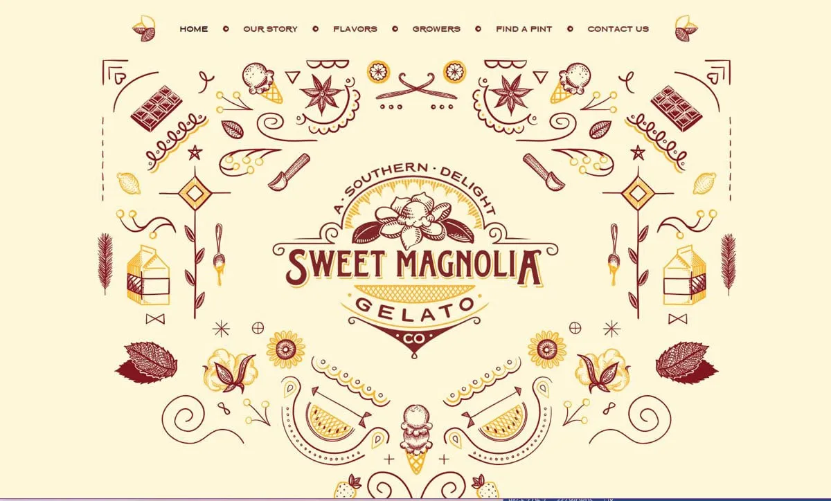
http://www.sweetmagnoliagelato.com/
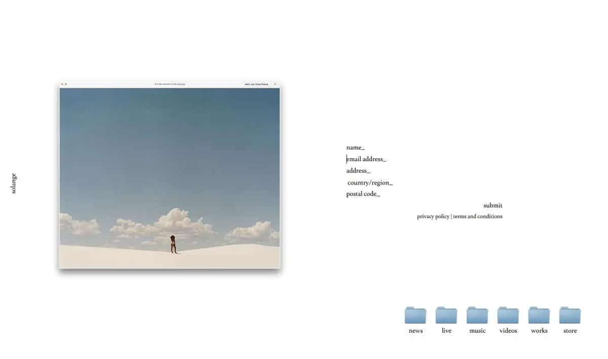
http://www.solangemusic.com
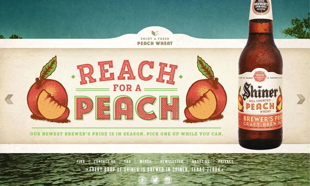
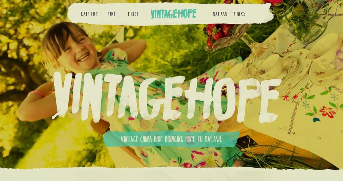
Retro can actually refer to a lot of things. The modern retro designs that are most popular now include styles that are most reminiscent of the 1980s and 1990s. (Which for some of us might not seem like that long ago at all.)
Designers are also borrowing a few influences from the 1970s, particularly in terms of color.
What’s appealing about retro design is that it pulls from early computer influences as well as print, fashion and events of the time:
- 1990s: This era was both bold with lots of animation color and moving parts or stripped down versions of designs that provided pure information. Designers were trying to find their way in the new digital age of visual and graphic design.
- 1980s: Pixels were OK and the bright neon culture of MTV and video games had a distinct influence on design elements of the time.
- 1970s: Muted color and bold typefaces help draw users into designs that were still primarily in print (aside from television screens).
To make any of these retro styles work, the interface must meet modern usability standards. In many of the examples, you can actually see the juxtaposition of old and new — a muted color palette with a familiar hamburger-style navigation menu or a pixelated game with simple swipe actions.
Old-School Typography
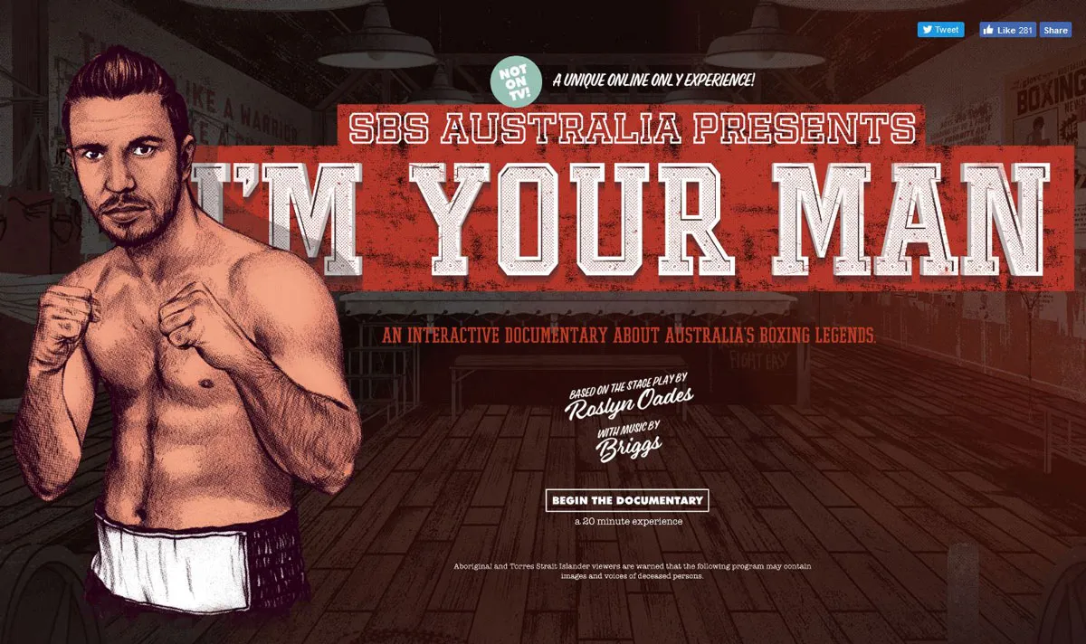
http://www.sbs.com.au/imyourman/
Big, block-style lettering with elaborate strokes and coloring will take users back in time in an instant. The same can be said for more cursive styles with heavier lines and roughed up edges.
Both styles have found new success because of resurgence in retro typography styles. Many of these website designs pay homage to print with an almost movie-poster style that demands attention.
To make the most of these vintage style typefaces, keep the rest of the typography palette simple. Opt for one retro typeface for display purposes and use a simple serif or sans serif for the main body copy to ensure readability.
Consider pairing this style of typography with old-style visuals as well. (Some of these typefaces can look a little odd with super modern imagery. Remember one of the keys to a retro style is to evoke the emotion of the era.) Both examples above use a dot-grain filter for images that connects typography to the design style of the 1970s and 1980s when photography and videography had that same dotted look.
Less Bright or Brighter Color Choices
Flat design and material design led to a resurgence in bright, bold color options. Modern retro styles pull color trends the other way with more muted hues and color overlays.
Reds, yellows and oranges are especially popular. As can be subtle blues and greens when you are going for a 1970s or 1980s vibe. Many of these color choices are paired with illustrated imagery, rather than actual photographs.
Color sometimes isn’t enough to move you to another time though; it can take other visual cues.
Consider neon colors, which have an early 1990s feel: With the right animation – harsh flashing rather than subtle movements – users know exactly what decade they are in. The same colors though are popular today without the nostalgia, making it important to use color with some other visual cues, most often typography or texture and gradients.
Texture and Gradientts
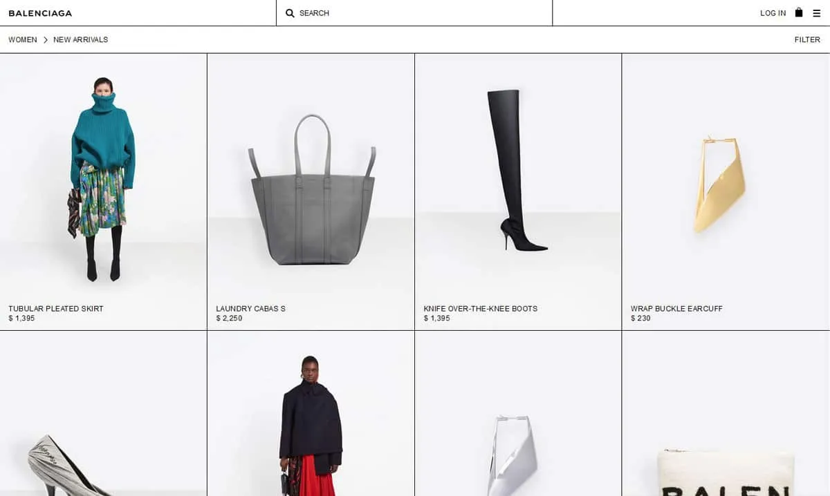
https://www.balenciaga.com/us/women/new-arrivals
Background patterns can be a huge visual cue when it comes to creating a time-period connection. Remember getting away from skeuomorphism just a few years ago?
There are two distinct styles when it comes to texture and gradients:
- Plenty of texture in the design so that websites have a realistic (kind of) look
- Lack of all styling for an easy, minimal, stripped down style
Both options are usable and either style can work in a number of ways. But they take on very different feels – warm and cozy with plenty of high-design texture or more stark and cold with the minimal option.
Video-Game Style
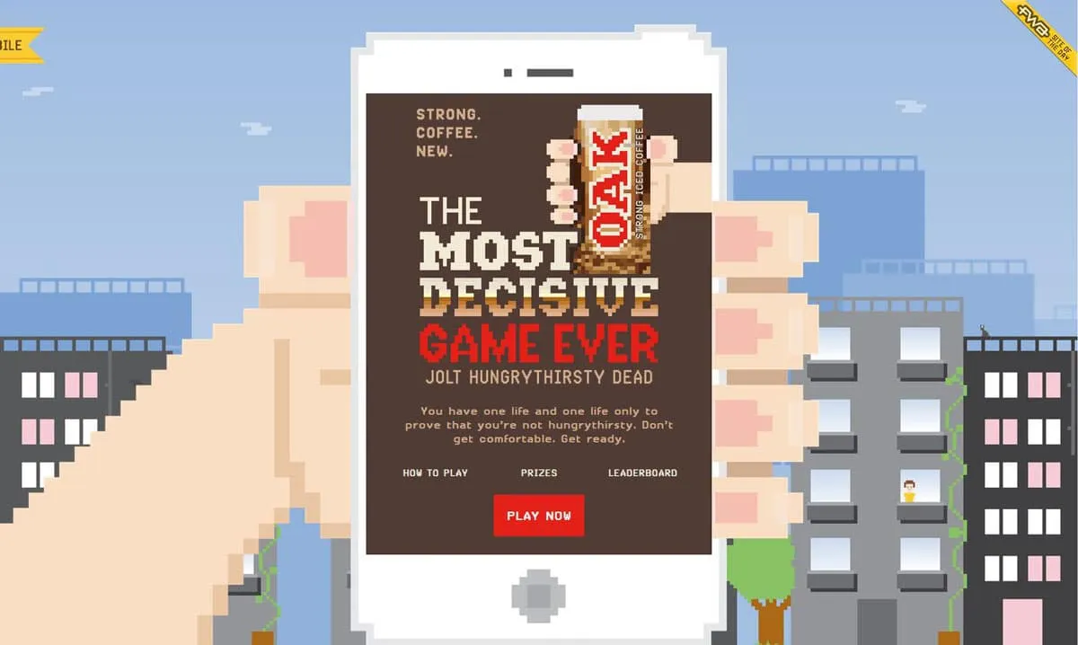
http://mostdecisivegame.com/
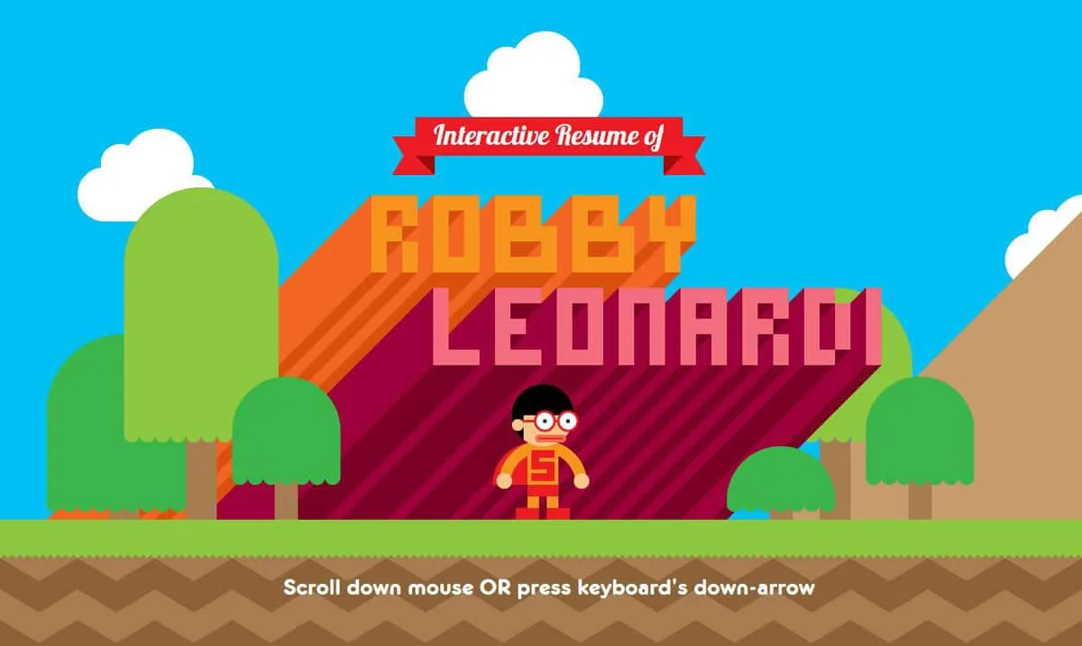
http://www.rleonardi.com/interactive-resume/
How many of you think “Super Mario Bros.” when you think of video games? This is a common connection and the video-game style retro design pattern is popular because of that.
In a high-def everything world, an intentional, more pixelated style actually starts to stand out.
The examples above showcase two very different ways of drawing on that video game nostalgia. The Most Decisive Game is a fully block style design that looks old (but does not have old-school interactions). Leonardi’s portfolio uses the color and mood of the classic Mario Bros., but with smoother, cleaner lines for the artwork (that’s the modern touch).
The combination of old and new works well for both sites and really exemplifies what modern retro is all about.
“Obnoxious” Graphics
We went through a lot of bad website design before we got to some of the more polished styles that users are accustomed to now. But are some of those obnoxious graphics actually appealing?
They can be for some users.
The old flicker TV really can take you back to the past in an instant. It’s at the heart of why designers can make style like this work. There are a lot of users that connect to the imagery.
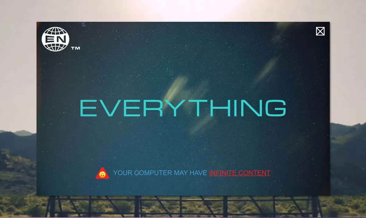
What keeps the designs fresh is that connection to yesteryear and a desire to go back in time with click and touch actions and navigation and user elements that are very now. Everything Now is packed with videos to watch, iTunes and Spotify downloads and concert dates and ticket sales that are just one click away.
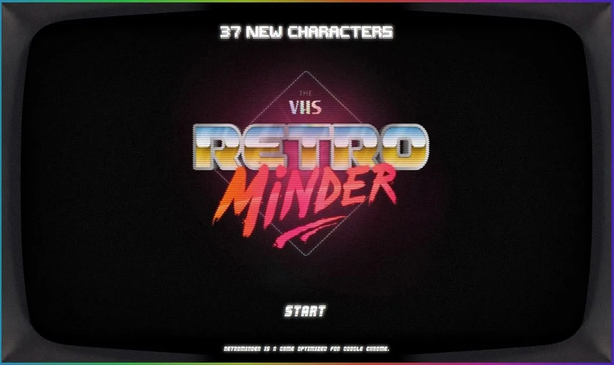
Retro Minder TV is a fast-paced speed trivia site, which uses images of the past with modern gamification and appeals to a desire for instant gratification (a common user behavior).
Pull it All Together
Modern retro is a bit of a quirky design trend.
The trick to a retro design is adding enough modern flair so it doesn’t just look old. (You don’t want the next Million Dollar Homepage.)
Make sure to use imagery and design styles that invoke the type of brand nostalgia that works with your messaging. Then build the design on a modern framework so that users feel an emotional draw and understand how to interact with and use the design.
If you plan to go the retro route, pick a specific look and decade to pull from. You probably want to avoid mixing and matching all of the styles noted in the examples above. One distinct piece of retro design is more than enough.
It’s also important to consider that not all modern retro styles will work for extended periods or for every brand, making this trend ideal for a smaller brand page or microsite. Some of today’s trends might just be the next retro style and it is important to stay on top of those changes so that your vintage style is appropriate.
You can design graphics in this style using an app like Glorify. It’s the perfect balance between Canva and Photoshop with simple tools for beginners as well as advanced features for professionals. You can try it out for free.
As per web design, create fully interactive prototypes in UXPin. Test them with real users and build iterations on the spot. UXPin is a full-stack design tool. Try it for free.
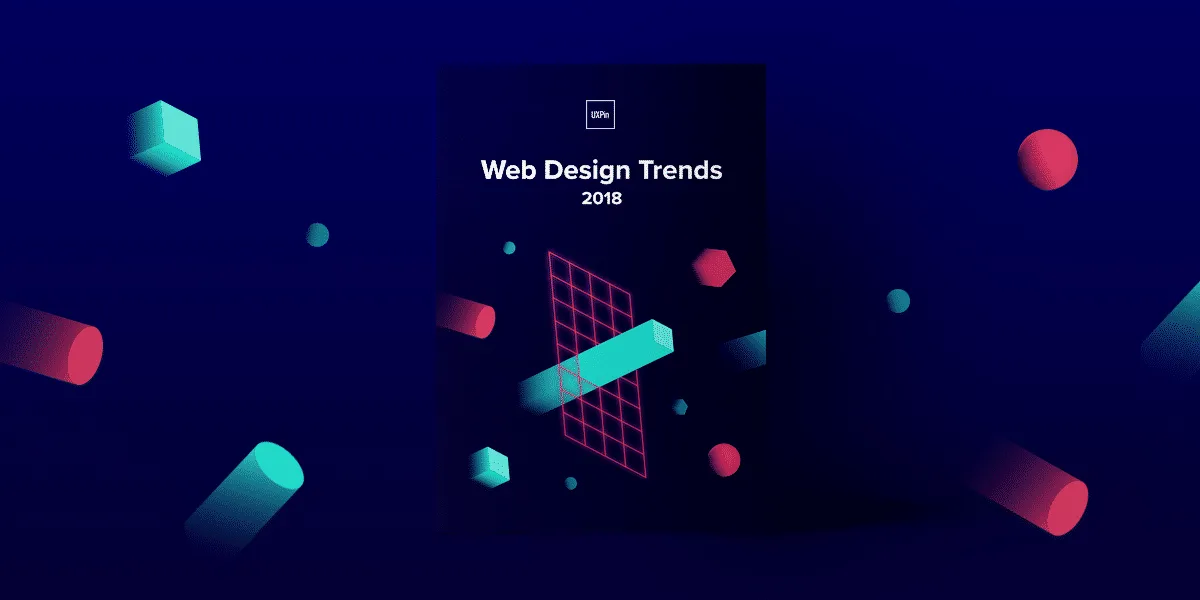
For more advice and dozens of examples, download the 78-page free ebook Web Design Trends 2018.