Why You Should Switch to Code-Based Design

Why You Should Switch to Code Based Design

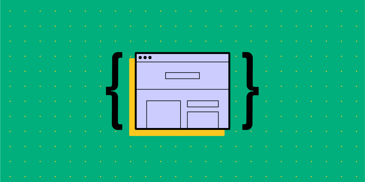
Since the very beginning of digital product design, the default way of designing user interfaces has been image-based.

Designers have been drawing different states of the mobile app or web designs using graphic design tools – GIMP, Fireworks, Sketch, or now Figma, Invision, Adobe XD (which you can in Adobe Creative Cloud) – and then the development teams have been writing code that would replicate what has been drawn.

Over the years this method has proved to have considerable limitations. What limitations are those and is there an alternative? Read on to find out.

Drive design process improvements, take care of operations, and boost collaboration with engineers with UXPin Merge. Request access to see if this design technology is for you. Discover UXPin Merge.

Reach a new level of prototyping

Design with interactive components coming from your team’s design system.

The Problems with Image-Based Design

In the image-based design approach, designers produce a set of static artboards representing different states of the interface and forward them to software developers to code interactive interfaces on their basis. This brings about a lot of troubles for not only the UI design but also the whole product development process – let’s have a closer look at them.

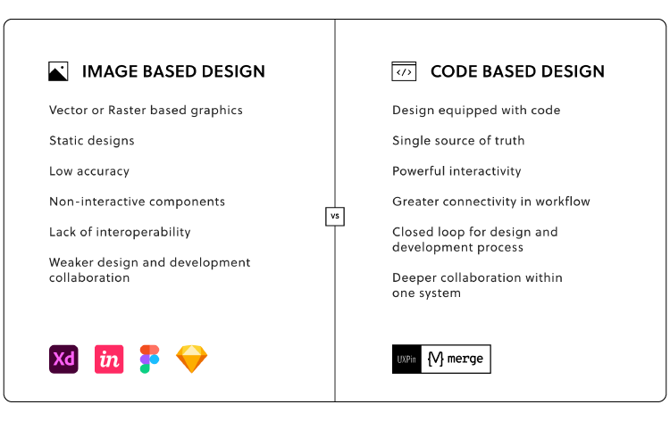
  • Lack of interoperability: There is virtually no connection between designers’ and developers’ universes. Designers work outside of the constraints set up in code and therefore, unknowingly, create things that are very difficult and expensive to code. 
  • Lack of accuracy: As the image-based tools use completely different methods for rendering the result of the designers’ work, texts, gradients, and colors that have been carefully chosen look different in code when an engineer applies the same specs. Some details are missing and some ideas that looked great on a static image are simply impossible to recreate on an actual working product. The handoff then turns into a nightmare. 
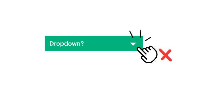
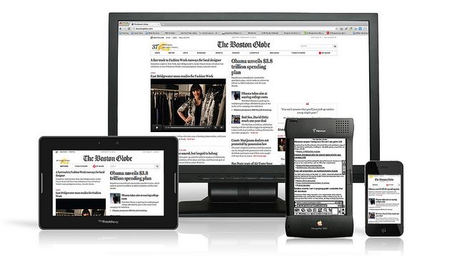
  • Static designs: Image-based design only allows for building static artboards, so even simple behaviors (e.g. expanding a dropdown) quickly become unmanageable. Interactive components can’t be reused and there’s no way of setting states of elements, defining variables for content, or using conditional logic. There are prototyping tools out there that fake the interactions but none actually use the ultimate language that creates the clickable elements in real life – the code. 
  • Weak design-engineering collaboration: Even if you use a style guide or a design system, image-based design tools are completely separate from the engineering processes. They’re rather abstract and – unlike technologies used by developers – can’t be experienced by users as the final product. This lack of interactions or having very limited ones, and the inability to import components from code keeps engineers and designers disconnected and frustrated with one another. As a result, not only the handoff drift appears, but also the final user experience suffers.

The benefits of code-based design 

This alternative approach to product design allows designers to render their design intent directly in code… without even knowing how to code! Whenever they draw something, the tool creates relevant HTML, CSS or Javascript, and engages the browser, showing the result visually. This totally flips the entire software designing process, making it more efficient and beneficial for everyone involved. The benefits are as follows.

Code-Based Design Ensures High-Fidelity and Interactivity

Unlike image-based tools, the code-based approach provides 100% match between the intent of a designer and a code-able result. That’s because code-based tools use the same technology as those used in web development to render all of the design projects. As a result, designers can benefit from the full power of code without any coding expertise.

Code-based design tools allow for drawing objects that move, interact, and create complex patterns – on the highest level of interactivity. Before coding the final version, software developers can fully experience the product instead of just imagining how it should work.

There’s no redundant code, so the software works quickly and it’s easy to maintain it. And as the provided designs reflect the approved standards for software development, the final products created by a given company or a software house are consistent with one another. 

Code-Based Design Bridges Gap Between Design and Development 

The code-based design establishes a common language for both designers and software developers. Since everyone involved in the process uses the same technology, there are fewer misunderstandings between teams, especially on the handoff stage.

ou can even go a step further and use a technology such as Merge which allows you to take components that have already been coded by engineers and import them into your code-based design tool. It uses elements that can actually be coded – because those ready and interactive components come from developers.

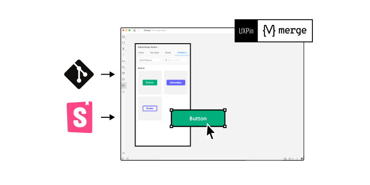
This establishes a single source of truth for your entire software project – all the components and documentation are stored in a components library like Git (importing React components), npm or Storybook and designers and engineers are connected in one collaborative, creative process, preventing misunderstandings and frustrations from building up.

Also, it helps to avoid inconsistencies in the user interface, code, and documentation – which in the long run saves a lot of time and money by optimizing the design process.

Code-Based Design Provides Endless Possibilities 

Code-based design allows you to have richer prototyping options. And with the aforementioned Merge tool you can greatly extend them.

You can create your own components that can be reused all across interfaces of different products you work on. This saves your entire team a lot of time and effort on designing, coding, and testing particular elements – you only need to do it once. And this also means there are fewer bugs in your products.

Code-Based Design Allows for Powerful Interactions

Using code-based design allows you to create prototypes that look and behave exactly like the final product built by developers. Instead of linking artboards, code-based design tools use the most advanced interactions on the components level, allowing designers to create highly reusable interactive design systems.

Simply put: designers draw interfaces with text fields that can be clicked in, checkboxes that can be checked and unchecked, and so on. Goodbye, static artboards!

PayPal and Code-Based Design

Don’t just take our word for it – some of the top UX designers in the industry corroborate what we say. UX Design team at PayPal did a test of Merge, our new technology in our code-based design tool. Our solution has accelerated their work while giving them the power to easily create their own beautiful high fidelity prototypes consistent with their Developer Console standards.

When compared with an image-based tool, the design quality was much better and there were fewer errors. Also, unlike the competing image-based software, the drop-downs, calendar buttons, and data table controls made using UXPin Merge were interactive. And the entire designing process took less than 1/6th of the time spent doing the same job using the competing software!

Try it Out!

As you can see, switching from image-based to code-based design is a no-brainer. It can only save your team time, effort – and frustrations. To unleash the power of merging the design and development workflows, request access to UXPin Merge.

Make Words Your Greatest UX Weapon

UX content

That’s what Copywriters are for right? Content Strategists? Definitely! However, words are part of the user experience and at minimum, the first pass, belongs to UX Designers.

Not only do clients appreciate seeing the first look of their product with copy that isn’t in Latin, but users appreciate it too. I’ve walked out of many usability tests and realized that 4 out of 5 issues could be solved with copy edits, whether it’s misleading button text, a confusing headline or confusion during sign up. No matter the language or place, words and conversation are universal. They are our secret weapon and one of the most valuable tools in our toolbox.

Your leading H1 hero copy shouldn’t read like Shakespeare*

*exceptions may be made for a poetry based product

You can be direct, speak with human language, and still have sophistication and a brand voice.

When someone visits the hero of a landing page on a website or web app, we give them a first impression as to who we are as a company – through a combination of words, color, graphics, imagery. First impressions are extremely important, not just in social settings. They set the tone for the entire user experience. As an H1 writer, take lessons from journalism. The two clear goals when creating H1s are:

  1. The user immediately knows what the product is and offers
  2. The user engages by learning more or signing up

When you ‘Call To Action’ make the action crystal clear

CTA copy is arguably the most important copy on the page. It’s the engagement point where we ask users to buy, sign up, join a cause, etc. It takes wordsmithing and is not easy (how ironic). A CTA should have three important qualities:

  1. Honest. For example, don’t use ‘complete’ or ‘submit’ and then ask for more information. Humans feel a sense of relief when they finish something. If they’re then told they aren’t actually finished, they’re unhappy.
  2. Concise. This article is about words but the irony is that people scroll past words. They like things to be short and sweet. Use the minimal amount of words needed to help the user understand what the button beckons for.
  3. Clear. No guessing as to what the button is for. Users are much more likely to click a button if they know where it goes.
microcopy dos and donts

Use Microcopy in these 3 places to increase your product engagement

Microcopy, or small bits of copy, throughout your site or product can make or break the user experience. These bits of copy should have these 5 important qualities:

  1. Add value
  2. Don’t overpower other words and visuals on the page
  3. Flow with the brand tone and voice of the product
  4. Short and sweet, never longer than necessary
  5. Provide the user with answers and not raise more questions

1. Increase engagement by pairing icons with words

Using words with an icon is a better user experience and a more accessible design. It’s clear what the icon means and takes all of the confusion off the table. Many icons are used for multiple purposes, like the calendar icon.

UX copy dos and donts

Some icons, such as search, are commonly known. However, using words we can make the search functionality more clear. Some search queries only allow one word searches, and other more sophisticated queries (like Google) allow phrases, questions and ideas.

UX writing dos and donts

2. Take the frustration out of transactional flows

The best UX example for this is including the password rules before the user submits a password that doesn’t have a special character. However, there are more subtle ways to improve that aren’t just best practice UX. During transactional flows, users give up personal information such as emails, credit card numbers and addresses. Many people are skeptical. However, giving a simple nod to the fact that tech can be creepy can make users feel a lot more comfortable.

transactional copy email form

3. Leave no questions unanswered

Users have great expectations. Delight them by telling them what to expect next, so they don’t have to guess and get frustrated. I always joke that part of my job is mind-reading. We must guess how people will respond to the things we show them– this is how we can respond to some of those guesses.

UX writing best practices

Words are part of the process

I start every project with pen and paper – jotting down ideas. These ideas are always a combination of words and sketches dancing around each other. Just as we walk away from user testing and stakeholder reviews with a list of changes to visuals, also consider how words can elevate the design. When preparing to test, review and ultimately launch, always ask these questions:

  • Where might a user need extra help?
  • How can this be more clear?
  • What are all the points a user could become confused?
  • Where can we delight and elevate with copy?

Join the world's best designers who use UXPin.

Sign up for a free trial.

2019’s Greatest Web Design Hits – Free eBook

From layering with interactivity to bright colors, know the trends that will influence 2019… and beyond.

Is orange the new black? How much animation is too much animation? Will 2019 be the year of Euclid? Whether you want to follow the trends or stand out in the crowd, this web design eBook will give you an idea of what to expect in 2019.

Written practically for designers of every level, this hot off the press guide includes 60+ pages of solid advice and 60+ current examples. Think of it as equal parts look book and instruction manual.

For each trend, the guide explains:

  • What does the trend look and feel like?
  • Why is this trend useful?
  • How can you adapt it to your own work?

web design trends for 2019

Join the world's best designers who use UXPin.

Sign up for a free trial.

Why Data Science and UX Design Need to Become Best Buds

Data Science and UX Design

Long gone are the days when design used to rely almost solely on the creativity of designers.

Technologies are sophisticated, subsequently rendering users more demanding. UX design has been blurring the line between art and science. According to Adobe, 38% of people will stop engaging with a website if its layout or content is visually unappealing. A similar percentage of website visitors will bounce if images take ages to load.

Enter data science to help you avoid death by bad, unintuitive design.

Eliminate educated guessing  

Successfully executed UX design has a strong scientific basis. You must make informed decisions. So before you start designing, it’s essential to go through 6 steps that mimic the scientific method:

  • Ask a question
  • Do research
  • Develop a hypothesis
  • Run experiments
  • Analyze your findings
  • Make an informed decision and implement it

Never throw darts in the dark and make assumptions on what will get website visitors to stay longer and convert. There’s a sea of information for you to dive into and find what you need. The problem, however, isn’t to collect all that vast data on user preferences. It’s to process and analyze it in a systematic manner to provide you with ready-to-use insights.

Unrightfully neglected by UXers, Google Analytics (GA) can make your life easier. This free tool helps you learn valuable information about visitors: what they’re doing and looking for on your website, where they come from, how much time they spend on each page, whether they engage with certain content, or whether mobile visitors behave differently than desktop visitors, among many other things.

How to make the most of Google Analytics:

Optimize your Bounce Rates

Assess which pages have the best and worst bounce rates. Apart from allowing you to access the report for each individual page, GA offers analyzing your landing pages and establishing the sources from which visitors enter your website.

Improve your Average Time on Page metrics

As the name suggests, this report shows you how much time a visitor spends on a particular page engaging with content. A lower average time indicates that visitors don’t react to your content particularly well, especially if that page features a lengthy blog post. This is a sign to optimize it. In certain cases though, a visitor quickly leaving means they easily found the information they were looking for.

Get to the bottom of Device Usage

This is a metric that has become increasingly important over recent years. Bear in mind that mobile traffic is expected to grow 7-fold from 2016 to 2021, according to the Cisco Mobile Forecast! With this report, find out how your visitors access your website. If you notice that your mobile sessions are extremely short, then fix things and take a multi-device friendly approach.

Obtain insight into Demographics

Gender, age, interests, level of education, income, location, and other information are crucial to understand the requirements of your target audience and their preferences when it comes to user experience and satisfaction.

Data Science + UX Design = More Conversions

Based on relevant metrics, you can build a website with UX design capable of capturing visitors’ attention and prompting them to fill the form or make a purchase. By having access to a huge volume of processed data, you’ll be able to pinpoint what exactly to do to make your design appealing and functional.

Fine-tune your layout

A/B testing has long been the most effective way to determine the performance of each element on your web page. However, this hit-and-miss method is time-consuming. Hence, a dynamic website design with adapts based on visitors’ interactions is the way to go. Heat map analysis is another tactic to boost conversions. By monitoring the eye or mouse cursor movement, you can get an idea about what colors, fonts, buttons, or types of content make your visitors tick. Since this can be pretty challenging, check out the works of acclaimed agencies specializing in web design to pick up some tricks of the trade.

Polish your content

As you know, content still reigns supreme. However, it won’t do much if visitors can’t locate a useful piece on their topic of interest. That’s why a search box is a must. This tiny element not only helps your visitors navigate your website easily, but also sheds a light on whether the results people get correspond with what they’re searching for. As a result, you can make your content more valuable and meet their expectations.

Personalize your website

Relevant visitor data is crucial for tailoring your content and giving each visitor a unique and personalized experience. The point is to avoid one-size-fits-all messaging and addressing your target audience in a bland, generic manner. Instead, connect with them on a deeper, more personal level by displaying adaptive CTAs, messages, or visuals. With segmentation, you can target different audience groups with suitable messaging and imagery, and avoid the redundant information they don’t care for.

Analyze your traffic

New leads are the lifeblood of every business. In order to understand how to optimize lead generation process, you need to identify what the most effective methods are and insist on them. Evaluate every acquisition channel and leverage those which bring the most qualified traffic. Spying on your competitors is another way to steal some of their thunder and copycat their successful tactics for your own benefit.

Maximizing Your Data’s Value

Insanity is doing the same thing over and over again and expecting different results.

This quote, mistakenly attributed to Albert Einstein, perfectly sums up the importance of trying a variety of things to create the best UX design. Sometimes a seemingly small and irrelevant change can make all the difference.

A few things to bear in mind when you’re assessing your data:

A/A testing is as equally useful as A/B testing

It’s used to prevent a false positive result which occurs due to an error in data reporting. False positives account for a whopping 80% of all A/B test results. But, if you show two random groups the same landing page or CTA, instead of two different variations, you can ensure the quality of execution as well as of your analysis tool.

Watch out for a novelty effect

Sometimes, the early performance of a redesigned website might show a sharp upward trend. Not because of the improved UX design, but because of the interest in its changed appearance. This quickly wears off, and you’re presented with a more realistic situation.

Beware of Twyman’s law

It can mislead you into believing that an interesting and unusual stat is correct. This glitch can be the result of a certain bias, data errors, or even bad design or test circumstances.

The instrumentation effect is another threat to the validity of your UX design research

This occurs if you change the instrument, observers, or measurement device during the process. So, make sure that your experiment is tested before it goes live. This means that you should use different browsers, devices, and an extra pair of eyes to help you prevent any issues.

In conclusion, data science can be vital to the success of your UX design. It holds the key to your visitors’ behavior and expectations, but you must learn to use it and be aware of its potential pitfalls.

Join the world's best designers who use UXPin.

Sign up for a free trial.

Reflections on UXPin’s 8th Birthday

On November 11th, UXPin turned eight!

Time flies! In 2010 I was 24, working as a UX Manager at a thriving Polish eCommerce company and, after several unsuccessful attempts to start a tech business (the youthful energy!), I took a break from any serious side projects. However, I still wanted to channel my energy towards something productive; 9 to 5 was never really an option for me. Instead of pursuing dreams of a tech breakthrough, I decided to team up with two friends and enjoy exploring the problem that bothered us for years — design — engineering collaboration. Without any business goals in mind, we started to think about helping designers and engineers work better together. The problem was very close to our hearts, we just didn’t know what the solution could be.

Freed from the constraints of a firm idea, we considered multiple options. A workshop or conference? A book? Some sort of software? Physical product? We casted a wide net.

After couple of months of creative explorations, we settled on the idea of… a paper prototyping notepad.

We believed that if designers and engineers could use the same tool, they could find the common ground for collaboration. Paper seemed to be the solid foundation for what we wanted to accomplish. After all, everyone is familiar with paper and can use it for creative purposes. The only issue? Not everyone can draw. Somebody who isn’t comfortable sketching will likely be terrified of sketching in front of others. We decided to eliminate this fear by providing designers and engineers with a set of predefined, generic user interface elements printed on sticky notes. Instead of drawing interfaces you could simply pin (yes! This is why we’re called UXPin!) elements to paper. Anyone can do it!

Early visualization of the first UXPin product. November 2010.

Fast forward a couple of months of prototyping and testing our tool, searching for the right manufacturer and waiting for the production to finish — on November 10th (one day ahead of schedule!) we were ready to launch UXPin!

Well… almost ready.

The one thing that we were missing was our… website. Ridiculous, taking into account that, in this entire project, building a website was the one thing that we felt really comfortable doing. We had no experience building physical products, but building a website? We certainly knew how to do that. And perhaps that’s why we left it at the very bottom of our list of tasks. To launch on 11th, we had to fix this mistake… and fast.

On November 10th we pulled a true all–nighter. We started designing and coding after our full–time jobs and finished at 4am. The first version of uxpin.com was the most impromptu thing that we’ve ever created. Once the website was ready, we had to wait until sunrise to take pictures of our notepads. After all, people had to see the product! I remember moving my desk as close to the window as possible to catch the first beams of sun. We were exhausted.

The original UXPin Website. November 11th 2010.

After all this hard work, our approach to the launch was as simplistic as it was anticlimactic. We announced UXPin on Twitter.

Our marketing was unbeatable 😎 . First tweet about UXPin.

We got our first order 2 minutes later. Another followed 5 minutes later… 48 hours in and we were completely sold out, deprived of sleep (massive adrenaline rush!) and unsure what actually happened (and how!). Over 400 notepads sold in 48 hours in dozens of countries. UXPin became the talk of the design town.

First UXPin pictures. Definitely worth waiting for the sun!

Some months later, All Things Digital — A Wall Street Journal tech publication, published an article about UXPin (likely the first “startup” from Poland covered by WSJ). A year later, we had turned our notepad into a SaaS application and raised our first round of funding. Soon, awards for the best startup in Central and Eastern Europe and even MIT 30 under 30 statuses followed. There was a rapid growth in number of designers and engineers using UXPin all over the world. This led to the decision to move part our business to Silicon Valley and learn to take this unexpected success even further. After months of fundraising we became one of the first Polish companies to raise capital in Silicon Valley and established our second office in Mountain View.

The legend of the web — Chris Messina was an early adopter.

Much growth, many changes, successes and failures later… here we are today. Almost everything is different. Design is more important than ever and UXPin is among the leaders in the design tools market. Thousands of companies, including world leaders of tech, automotive, finance and entertainment, rely on our platform.

One thing did not change, however: we’re still on the mission to merge design and engineering into one, unified, product development process.The task that emerged from our passions in 2010 pushes us to innovate still, 8 years later. We’re chasing the ideal software production process and that may never change. Perfection is impossible to reach, but always worth fighting for. That’s why our mission is so broad and ambitious — to push us beyond the limits of our abilities and discourage ever slowing down.

One thing did not change, however: we’re still on the mission to merge design and engineering into one, unified, product development process.

These past 8 years were nothing short of amazing. We met and teamed up with some exceptional folks (our first engineers are still with us!) and stormed through both joy and pain — always getting stronger. The experience of maturing together with your team, product and market is something that I’m going to be forever grateful for. Thank you!


Our exceptional team is always at your service! This article was originally published on Medium here.

Join the world's best designers who use UXPin.

Sign up for a free trial.

M-Dot Sites Are Dying Long Live Responsive Design | UXPin

It’s official: the internet lives on mobile.

With mobile browsers overtaking desktop, a mobile-friendly site is no longer just a “nice to have”. This requires a shift in the web design process that M-dot sites just can’t sustain in the long term.

Illustration of responsive web design.

Source: “Boston Globe responsive website, featuring Apple Newton.” Antoine Lefeuvre. Creative Commons.

In this article we’ll explain why M-dot sites aren’t future-proof, and why responsive design is the responsible way to build mobile-friendly websites.

The Vulnerability of M-Dot Sites

Back when mobile browsing was new, M-dot sites made a lot of sense. Their faults could have been chalked up to inexperience — designers were scrambling to keep up with users before the mass proliferation of mobile devices.

Now, some years later, mobile devices became more complex, thanks to tablets and varying screen sizes.

So what exactly is mobile? Smartphone, tablet… watch, glasses? Even limiting it only to smartphones, what size screen? The diversity of mobile devices has grown exponentially since M-dot sites were first used.

This isn’t just our speculation, either. Pure Oxygen Labs reports that last year M-dot sites fell 20%, from 79% in 2013 to 59% in 2014, while responsive and adaptive (dynamic serving) sites rose 37% collectively. Of course, some stalwarts remain (like Facebook and Zappos, who maintain a M-dot site mostly for site load advantages), but it’s fairly safe to say that M-dot sites are generally dying out.

Screenshot of the Zappos website.

Photo Credit: Zappos

Let’s explore some of the reasons to abandon M-dot sites:

  • Users visit the full site anyway — Research from Web Performance Today shows that about a third (35%) of users choose to go to the full site if given the option.
  • Users spend more time on the full site — The same research states users spend 5.5 times longer on full sites than M-dots.
  • Full sites yield more revenue — The study also calculated that 79% of revenue from mobile sales came from users on the full site.
  • SEO/Google trouble — According to Google’s own guidelines, responsive sites will likely rank better. Not using an M-dot is a automatic boost in SEO.
  • Redirect time — While M-dot sites load faster in theory, the extra time of redirecting from your full site to the M-dot (unless the user types the M-dot’s URL) is unnecessary. Alongside the other drawbacks, is it worth it?
  • Social sharing problems — M-dot links opened on a desktop are, at best, ugly. Given how this is not even an issue with responsive design, the path to better social settings is clear.
  • Expensive maintenance — When you add an extra codebase, you also add more maintenance cost in the long-run. You’ll either need to deal with twice the work or use a server-side solution, both of which are more expensive than a responsive site.
  • Mobile devices aren’t a single screen size — It’s ironic that what was once the greatest strength of M-dot sites is now its greatest weakness. M-dot sites are designed for a specific screen size, but mobile devices range from 320×240 for some smartphones up to 768×1024 (and beyond) for tablets. It just doesn’t make sense to serve the same layout to all those screens.

Add them all up and you start to see the cracks.