Want to keep your design and development teams aligned? Start with great design system documentation.
Here’s how you can create documentation that’s clear, consistent, and easy to use:
- Set Clear Goals: Know your audience (designers, developers, etc.) and tailor content to their needs.
- Use a Consistent Structure: Organize sections like design guidelines, technical details, and accessibility requirements uniformly.
- Detail Components Thoroughly: Include usage examples, props, states, and accessibility info for every component.
- Add Visuals and Interactive Demos: Show components in action to improve understanding and usability.
- Manage Versions: Use tools and changelogs to keep documentation up-to-date as your design system evolves.
- Encourage Collaboration: Involve designers, developers, and writers to ensure accuracy and relevance.
- Review and Update Regularly: Schedule reviews and use automation to maintain quality.
Why it matters: Clear documentation reduces errors, speeds up onboarding, and ensures consistent product development. Follow these steps to make your design system a reliable resource for your team.
Managing Design System Documentation
1. Set Clear Documentation Goals and Audience
Creating effective documentation begins with defining clear goals that align with your audience’s needs. Each team member has unique requirements – developers might need detailed technical specs and code examples, while designers often look for visual guidelines and component usage instructions. Recognizing these differences ensures your documentation works well for everyone.
For example, Razorpay improved their documentation by using focus groups and hosting office hours to gather feedback. This approach helped them create resources tailored to their diverse teams’ needs.
Here’s how you can approach it:
- Identify your users: Understand their skill levels and how they’ll interact with your documentation.
- Use straightforward language: Write in a way that matches your audience’s expertise.
- Make it easy to navigate: Ensure information is simple to find.
- Plan for upkeep: Set up processes to keep your documentation up to date.
To measure success, consider tools like:
- User surveys
- Usage data
- Feedback from your team
These insights will help you refine and improve over time. Regularly reviewing these metrics ensures your documentation stays useful and relevant for everyone involved.
Once you’ve nailed down your objectives and audience, you can move on to building a consistent structure that supports these goals.
2. Use a Consistent Structure and Format
A clear and organized documentation format is key to building an effective design system. eBay found that adopting a consistent structure greatly boosted both work quality and team collaboration.
Creating this structure means organizing your documentation thoughtfully across various types. Here’s how some companies tackle it:
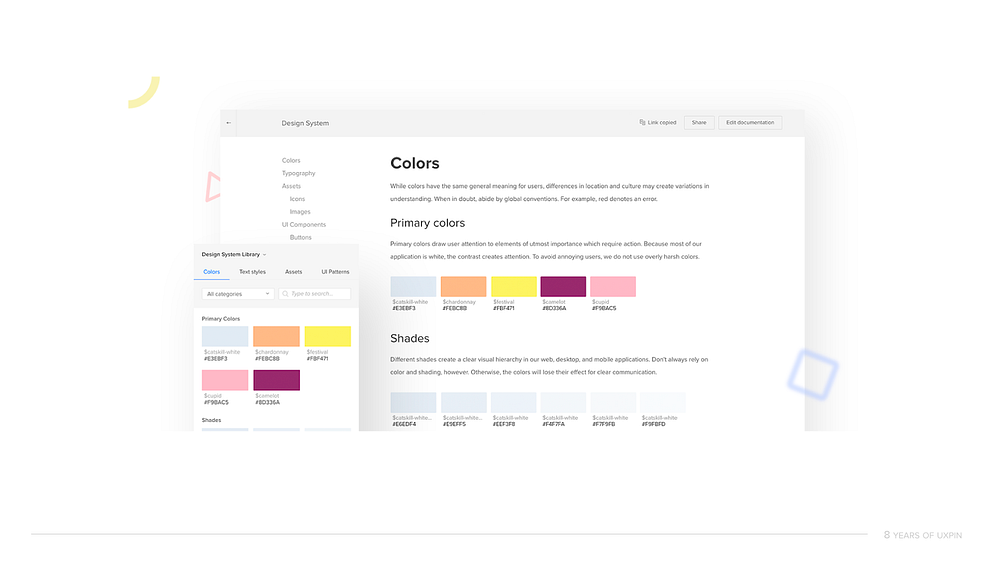
Component Documentation Structure
Eventbrite organizes its documentation by meaning rather than function. This ensures that terminology is consistent and accessible to every team member. Their documentation typically includes:
- Design principles and guidelines
- Component specifications
- Implementation details
- Usage examples
- Accessibility requirements
Pinterest takes a different approach by using standardized templates in JIRA. This keeps documentation updates consistent and encourages team involvement.
Tools and Implementation
Popular tools for documentation include:
- Figma for organizing design files
- Storybook for interactive development documentation
- Zeroheight for creating centralized design systems
Documentation Management
To keep things streamlined, use templates, version control, and clear contribution guidelines. This helps maintain a centralized and easily searchable documentation hub.
Once you have a consistent structure, the next step is making sure every component is documented with clear, actionable details.
3. Detail Components Thoroughly
“Documenting the usage and guidelines of a component is crucial.” – Geri Reid, former NewsKit Design and Accessibility Lead
When documenting a component, it’s essential to cover the following areas to ensure clarity and usability:
Component Anatomy & Technical Details
Break down the component into its HTML structure, visual hierarchy, and how its elements interact. For developers, include:
- Props: List all types, required or optional parameters, and default values.
- State Management: Explain how the component handles internal states.
- Event Handling: Specify events the component listens to and their triggers.
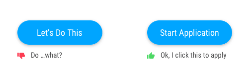
Usage Guidelines
Define when and how to use the component. For example, Material Design recommends using a Floating Action Button (FAB) only for a screen’s primary action to maintain consistency across platforms.
Accessibility Requirements
Ensure your documentation includes information about accessibility, such as:
- How the component behaves with screen readers and keyboard navigation.
- Guidelines for color contrast.
- Specifications for touch target sizes.
“High-quality documentation requires planning, effort, and process to make examples and guidelines that make a difference.” – Nathan Curtis, EightShapes
Component States
List and describe all possible states of the component, such as default, hover, active, disabled, error, or loading. eBay uses interactive demos to showcase these states, helping teams avoid confusion and misunderstandings.
By thoroughly documenting components, you create a strong foundation for your design system. This approach ensures teams work with clear, consistent guidelines. For example, Figma combines usage instructions with interactive prototypes, making it easier for teams to implement components accurately.
Once your components are well-documented, you can take it a step further by using visuals and interactive demos to deepen understanding.
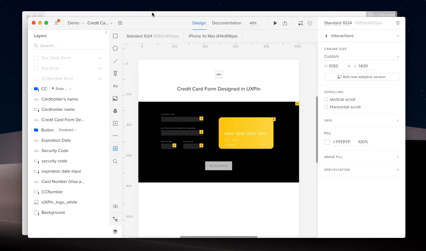
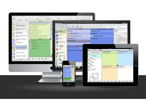
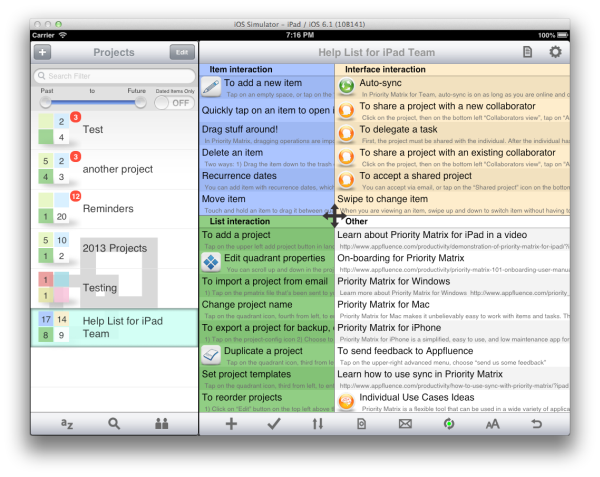
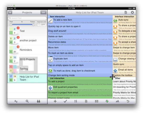
4. Include Visuals and Interactive Demos
Visuals and interactive demos can make design system documentation more engaging and easier to grasp. By showcasing components in action, they help users understand and implement them effectively. In fact, TrustRadius research shows that interactive demos influence buyer decisions by 88%.
Interactive Demo Best Practices
Companies like Digital Ocean and IBM Instana set great examples in this area. Digital Ocean offers step-by-step guides, while IBM Instana integrates practical scenarios, helping users see how components work in real-world contexts.
Tools for Interactive Documentation
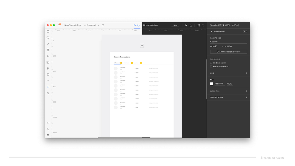
Tools like Figma, Storybook, and UXPin are widely used to create interactive and accessible documentation. These platforms make it easier for teams to build and maintain demos that align with their design systems.
The Impact of Interactive Demos
Interactive demos have driven a 90% increase in adoption, highlighting their importance in modern documentation. Companies like Maxio and Lattice use them effectively to cater to specific use cases. For example, Lattice employs click-through demos and customized product tour, improving how users engage with their components.
Key Tips for Implementation
When adding interactive demos to your documentation, consider the following:
- Ensure compatibility across various devices and browsers.
- Provide clear and concise instructions alongside the demos.
- Regularly update demos to reflect any changes in the design system.
- Include feedback options to gather user input.
For instance, Maxio and Lattice use interactive tooltips to add context to their demos, tailoring them to different user roles. This approach not only enhances usability but also boosts component adoption rates.
With visuals and interactive demos in place, the next step is ensuring your documentation evolves alongside your design system.
sbb-itb-f6354c6
5. Manage Versions and Changes
Keeping your documentation up-to-date is crucial as your design system evolves. Without proper version control, teams can face confusion and inconsistencies across projects.
Semantic Versioning
Semantic versioning (major.minor.patch) is a straightforward way to track updates. Major versions signal breaking changes, while minor and patch versions cover smaller updates and fixes.
Tools and Platforms
Tools like Figma, Supernova, and UXPin come with built-in version control features. These include branching, release notes, and file history, making it easier to track and manage changes over time.
“Maintaining a changelog for a design system is an essential practice that promotes collaboration, transparency, and effective communication.” – Zeroheight Team
Change Management and Documentation
eBay’s team takes a structured approach to maintain consistency. They use a custom linter to catch errors, host office hours and focus groups for feedback, and rely on automation to identify outdated documentation. This method ensures their design system evolves in a controlled and efficient manner.
Razorpay uses detailed changelogs, regular feedback sessions, and clear migration paths to manage updates. This approach keeps stakeholders informed and ensures smooth transitions while maintaining accurate documentation.
Best Practices for Version Control
- Use automated validation checks to catch errors early.
- Keep a detailed changelog to document all updates.
- Provide clear migration paths for breaking changes.
- Collect regular feedback from users and stakeholders.
- Automate the process of flagging outdated content.
6. Encourage Team Collaboration
Great design system documentation thrives when the whole team gets involved. By bringing in different perspectives, you keep your documentation relevant, accurate, and useful for everyone.
Set Clear Contribution Guidelines
Use tools like Notion or Confluence to make collaboration simple. These platforms allow real-time editing, version control, and centralized storage, helping your team stay consistent while making it easier for everyone to pitch in.
Build Feedback Loops
Schedule regular team reviews and send out surveys to spot gaps or areas for improvement. This keeps your documentation evolving and ensures it stays aligned with your team’s needs.
Define Team Roles and Responsibilities
Each team member brings something different to the table:
- Designers handle visual guidelines.
- Developers focus on technical details.
- Content writers refine structure and terminology.
- Product managers offer business insights and set priorities.
This mix ensures the documentation is helpful for everyone involved.
Promote Cross-functional Collaboration
Encourage designers and developers to work together. This ensures the documentation meets both technical and visual requirements. Regular cross-team reviews are a great way to keep everything accurate and relevant.
Use Documentation Champions and Tools
Assign documentation champions to oversee updates, ensure accuracy, and train team members on processes. Tools like Zeroheight and Frontify make collaboration smoother by offering:
- Comment and feedback features
- Version tracking
- Integration with design and development workflows
These tools help streamline the process and keep everyone on the same page.
7. Update Documentation Regularly
Keeping documentation up-to-date is crucial for ensuring it stays relevant and usable for your team.
Use a Version Control System
Set up workflows that automatically sync documentation updates with changelogs. This helps track changes and keeps everyone informed. Pairing this with design tools can make updates seamless when designs evolve.
Plan Routine Reviews
Organize quarterly reviews to check for accuracy and completeness.
“Regular reviews ensure documentation remains accurate and useful for teams.”
Keep an Eye on Documentation Health
Focus on these areas to maintain quality:
- Component updates and new features
- Usage instructions and practical examples
- Technical details and API modifications
- Design token revisions
Simplify Updates with Automation
Leverage tools like Storybook and Supernova to make updates easier and more consistent. Create a clear process for documenting changes, reviewing them for accuracy, notifying relevant teams, and testing updates to ensure everything works as intended.
Measure the Effectiveness of Your Documentation
Track these metrics to gauge success:
- Reduction in support tickets related to design system questions
- Improved team adoption and smoother onboarding
- Increased engagement and usage of the documentation
Conclusion
Design system documentation plays a key role in connecting design and development teams. By following these seven practices, organizations can create documentation that meets the needs of their teams and stays relevant over time.
Using structured methods, such as eBay’s component status tables, helps keep documentation accurate and adaptable. A good balance between centralized management and team involvement ensures quality while encouraging collaboration across teams.
Strong documentation can lead to fewer support tickets, better team adoption, consistent designs, and faster onboarding. Looking ahead, integrating documentation directly into workflows—powered by solutions like DreamFactory for seamless API access to underlying data sources—can make it easier to adopt and keep updated, ensuring it remains useful for everyone involved.
To achieve this, teams should make updating documentation a standard part of the component development process. Regular reviews and feedback loops are also essential to keep it reliable and up to date. These steps help ensure that documentation stays a practical and dynamic resource for all stakeholders.
FAQs
Here are answers to some common questions teams encounter when working on design system documentation.
How should you approach writing documentation for a design system?
Clear and practical design system documentation is key. As Lukas Oppermann from GitHub explains:
“Designers and developers speak a little bit of a different language”
This underscores the need to bridge communication gaps. Use examples and straightforward guidelines to explain core design elements like typography and color. Tools like Zeroheight can help keep everything consistent and allow for collaborative editing.
What steps help in documenting and maintaining design systems over time?
Keeping design system documentation up-to-date is an ongoing task. Regular updates, informed by team feedback, are crucial. Here’s how you can manage it:
- Use version control and specialized tools to track changes.
- Schedule regular reviews to ensure accuracy and relevance.
- Create open feedback channels to gather insights and improve documentation.
For more complex systems, tracking how the design is implemented across platforms ensures consistency and scalability.
Why does design system documentation matter?
Good documentation is the backbone of consistent product development and smoother team collaboration. It minimizes errors and ensures uniformity, as demonstrated by Razorpay’s Blade system.