
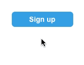
Calls to action should excite people into doing something. Yet many form buttons do little to encourage the mood. Making buttons change color on hover is easy — and overused. Buttons that swell as people interact with them have a little extra “wow” factor.
They’re also easy to simulate in UXPin. Here’s how you can build one yourself.
1. Create a button
Search for the button element. Add it to your canvas and take note of its dimensions. If you choose to have round corners, no worries — we’re only going to change its dimensions and position, not its stylish attributes.
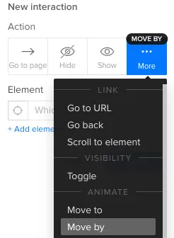
2. Move it slightly
Add a simple interaction that, on hover, moves the button -6 pixels horizontally and -6 pixels vertically. Be sure to use the “move by” action, not “move to.”
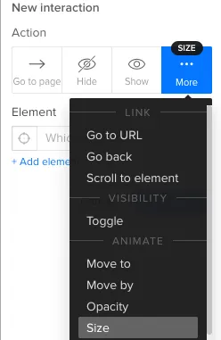
3. Make it grow
Add another interaction that, on hover, expands its width and height by 12 pixels each way.
Customizing the effect
Six pixels is arbitrary. If you want a different size on hover, then use different figures. The key is to make the resize action twice the move. For example, if you move the button up and left by -4 pixels, then you’ll need to increase its width and height by 8 pixels.
Why not use an advanced animation? Because they’re trickier to reposition. If you decide to move the button after the fact, the animation won’t move along with it. Using the “size” and “move by” actions, your button is sure to keep its expanding effect no matter where you put it.
Grab a free UXPin trial to simulate buttons that excite people.

