
Actions are the methods by which users interact with your prototype. That is, they do something when users click, swipe, or hover over them.
Basic interactions let you show, hide, move, and manipulate other elements on a page. They differ from advanced animations in that each action affects only one other element (or link) in one step. If you need a quick effect, basic interactions are the way to go.
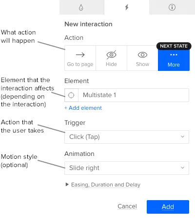
Every interaction has at least three parts.
- Action: the change that occurs
- Element: which item on the canvas is acted upon
- Trigger: what the user does to kick off the interaction
A few others, like “set step,” “toggle,” and “move to”, have additional options like step, animation type, and distance, respectively.
From buttons to boxes to images to groups, you can make any element in UXPin interactive. And any element can have more than one interaction. For example, a button can change color on hover, and take users to another page on click. A few simple interactions can make most any element change basic properties to give the user more information, as when a button darkens on hover to indicate that it’s clickable.
Actions
When users trigger an interaction, an action affects one or more elements on the canvas. For example, on hover (the trigger), a button may turn brighter (a color action).
The actions are:
- Show, Hide, and Toggle
- Go to page and Go to URL
- Scroll to element
- Move to and move by
- Opacity and Color
- Size and Rotate
- Advanced animation
- Bring to front
- Send to back
- Set state
- Previous and Next state
- Disable and enable form elements
- Check and uncheck form elements
- Focus on a form field
Element
The element is an item that changes when actions are triggered. Although any element or group can take an action, different kinds of elements can accept different actions. For example, an interaction can change a box’s color, but not a group’s. By the same token, the “next state” action only affects multistate elements. Learn more about special element interactions.
Triggers
When the user interacts with an element, they cause an action to begin. These are standard interactions, like clicking or hovering, that are common to human/computer interfaces. The triggers in UXPin are:
- Click (tap)
- Double click (double tap)
- Right click
- Hover
- Mouse in and out
- Swipe up, down, left, and right
- Touch and hold
- Hold release
- On focus
- On blur
Common Actions
Simple interactions can make a big difference in how users react to interfaces. And there are plenty you can do with them. For example:
- Make a button change on hover to indicate that it’s clickable.
- Make a search box appear on demand.
- Send users to a real landing page when they fill out a simulated form.
- Make a modal window group appear when users click a login button.
- Take users to the top of a scrolling view on click.
- Reveal text information when users hover over an image thumbnail.
- Make a drop-down menu appear when users’ cursors enter a tab.
- Take users to a new page or view when they double-click an app icon.
- Hide unnecessary form fields is users click a certain radio button.
Related resources
- Article: Interaction Design Trends: 11 Microinteractions Deconstructed
- Article: An Introduction to Interactions With Material Design
- Tutorial: How to Make Expanding Buttons in UXPin
- Tutorial: Hide the Right Functions With Custom Drop-down Lists
- Ebook: The Practical Handbook to Rapid Lo-Fi Prototyping
- Get a free trial

