List Design in UI: Types, Best Practices & Examples (2026)
Lists are foundational UI components that organize information into scannable, digestible formats. Whether it’s a settings menu, a product catalogue, an email inbox, or a social media feed, well-designed lists directly impact usability and user satisfaction.
This guide covers list types, design principles, interaction patterns, accessibility requirements, and a step-by-step approach to building list UIs — including how to prototype with real code components in UXPin.
Speed up your list design process with UXPin Merge. Drag production-ready components onto the canvas, configure props, and create interactive prototypes identical to the shipped product. Try UXPin for free.

What Is a List in UI Design?
A list is a method of organizing information vertically (or sometimes horizontally), allowing users to scan and process data quickly. Lists can display simple text items or complex layouts with images, descriptions, metadata, and interactive elements.
Lists improve usability by breaking information into manageable chunks. They appear in countless forms — single-line lists, multi-line lists, image galleries, card grids — each tailored to specific content types.
What Is the Difference Between a List and a Data Table?
Data tables display structured datasets with headers, rows, columns, sorting, and filters.
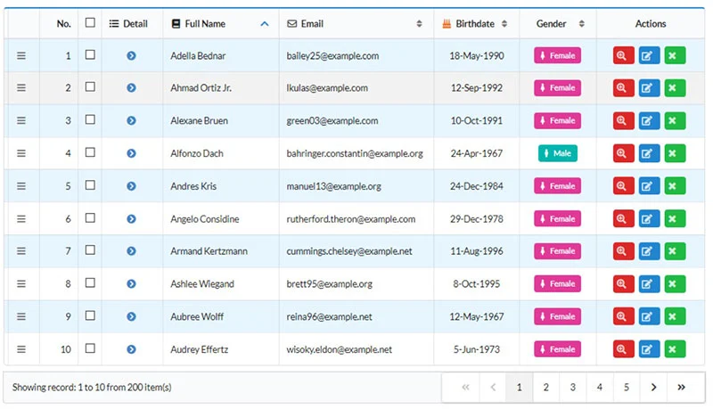
Lists don’t have a fixed structure. Each item is independent — from a single line of text in a dropdown to a complex card with images, titles, and CTAs.
Key difference: Tables enforce a row-and-column data structure; lists offer flexible, independent items in varied formats.
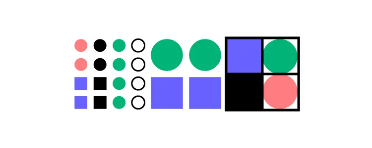
Types of List Designs
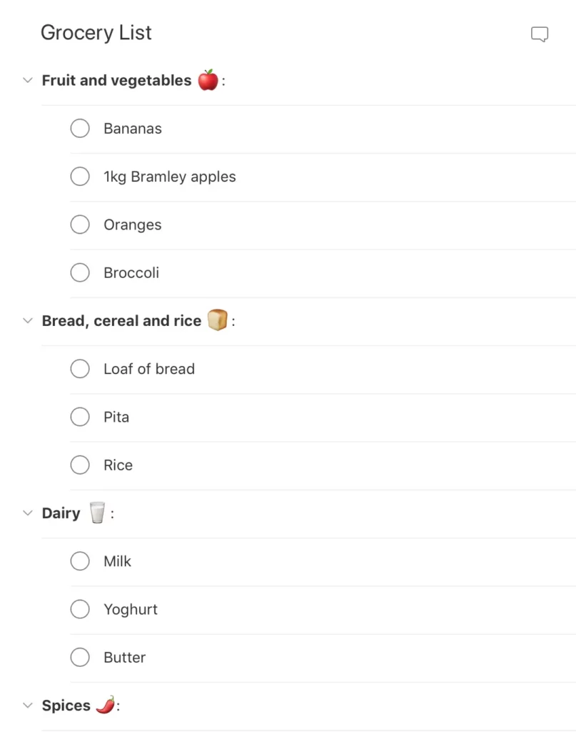
Text Lists
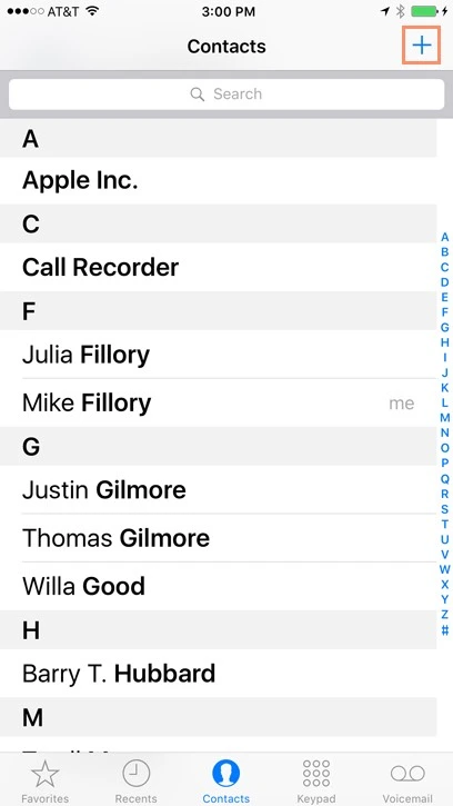
- Single-line lists: One line per item. Best for short, scannable information — settings, contacts, menu items.
- Two-line lists: Include a secondary line for supplementary context — subtitles, descriptions, timestamps.
- Three-line lists: Display richer information — titles, descriptions, and metadata. Useful for product listings.
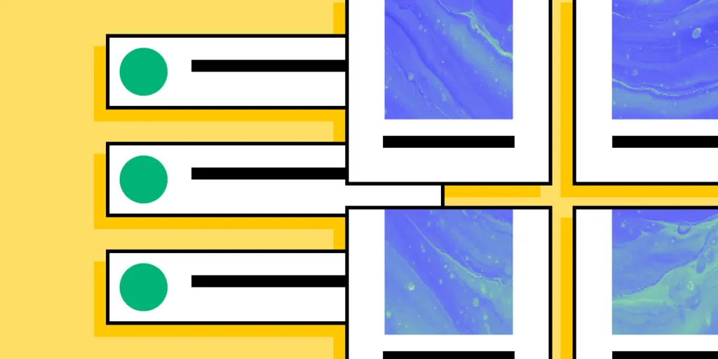
Image Lists
Image lists are used when visuals are the primary content — photo galleries, video galleries, portfolio showcases. Always include descriptive alt attributes for accessibility.
Card Lists
Card lists combine visual content, text, and often a CTA. eCommerce product grids are the quintessential example — each card includes an image, title, description, tags, price, and “Add to cart” button.
How to Design a List UI (Step-by-Step)
Step 1: Start with Content
Decide what content each list item needs, then choose the appropriate type. Structure options: vertical, horizontal, and grid layouts.
Real-world example — Instagram:
- Main feed: Vertical list
- Story feed: Horizontal list
- Search/Explore: Masonry grid list
Step 2: Apply Atomic Design Principles
Break your list into composable layers using atomic design:
- Atoms: Individual content elements — images, text strings, icons
- Molecules: Composed elements — a profile image with a name label
- Organisms: Complete list items
- Templates: The full list with search, filters, and pagination
Step 3: Design for Consistency
Maintain uniform layout, spacing, and alignment across all items. Consistent placement of text, icons, and actions reduces cognitive load.
Step 4: Optimise for Responsiveness
Consider how your list adapts across screen sizes. Vertical lists work best on mobile; grids are more effective on desktop.
Step 5: Test for Accessibility
Use proper semantic HTML. Ensure adequate colour contrast, include alt text for images, and avoid deeply nested lists that confuse screen readers.
Best Practices for List UI Design
1. Prioritise User Needs
Apply user-centred design and design thinking principles. The list design must match what users need to see and do.
2. Follow Material Design Principles
Google’s Material Design defines three list principles:
- Logical: Organise in meaningful ways (alphabetical, chronological, by priority).
- Actionable: Items must be easy to identify and act upon.
- Consistent: Uniform layouts for icons, text, and actions.
3. Make Lists Scannable
Users should find what they need quickly. Use clear scannability patterns — visual hierarchy, whitespace, and concise text.
4. Leverage Visual Hierarchy
Use typography size, weight, and colour to create clear levels of importance.
5. Ensure Accessibility
Use semantic HTML list elements, provide sufficient colour contrast, and include alt text for images.
List UI Design Patterns and Interactions

Checkboxes & Radio Buttons
Use checkboxes for multi-select and radio buttons for single-select.
Scrolling & Swiping
Swipe gestures are common in mobile list UIs. Implement lazy loading for long lists.
Select Lists (Dropdowns)
Dropdown menus let users choose from options. Add a search feature for long lists.
Collapsing & Expanding
Collapsible lists hide details until needed, reducing cognitive load.
Reordering & Sorting
Drag-and-drop reordering gives users control. Sorting by predefined categories lets users view data their preferred way.
Filtering
Filters narrow results to match specific criteria — essential for eCommerce and data-heavy applications.
Dividers
Dividers create visual separation. If your list feels cluttered, test whitespace as a cleaner alternative.
Prototyping List UIs with UXPin
With UXPin’s code-based design tool, you can build list prototypes that accurately replicate the final product. Use States and Interactions to create functioning dropdowns, collapsible menus, and swipe actions.
With UXPin Merge, prototype using production React components. Sync your MUI library, shadcn/ui, or your own custom design system. Everything designers build uses real code — no handoff gap.
Forge, UXPin’s AI assistant, can generate list layouts from text prompts using your team’s actual component library. Describe the list you need and Forge builds it with production components, outputting clean JSX.
Try UXPin for free and start building production-ready list prototypes today.
Frequently Asked Questions
What are the main types of lists in UI design?
The three primary types are text lists (single-line, two-line, three-line), image lists (where visuals are the primary content), and card lists (combining images, text, and CTAs).
What is the difference between a list and a table in UI design?
Tables display structured data in rows and columns with headers and sorting. Lists present independent items in flexible formats without a fixed data structure.
How do I make a list accessible?
Use semantic HTML elements (<ul>, <ol>, <li>), ensure sufficient colour contrast, provide alt text for images, and avoid deeply nested lists. Test with screen readers.
What are common list interaction patterns?
Checkboxes/radio buttons for selection, swipe gestures, collapsible/expandable items, drag-and-drop reordering, sorting, filtering, and dropdown select lists.
How do I design a scannable list?
Use visual hierarchy through typography size, weight, and colour. Place the most important information prominently. Use consistent spacing and whitespace.
Can I prototype lists with real components?
Yes. UXPin Merge lets you design with production React components — MUI, shadcn/ui, Ant Design, or your own library — creating fully interactive list prototypes.


