Want to speed up your design-to-development process? Claude Haiku 4.5, paired with shadcn/ui and UXPin Merge, lets you create functional, production-ready React prototypes directly from text prompts. Here’s the process in a nutshell:
- Claude Haiku 4.5 generates React component layouts from natural language prompts.
- shadcn/ui, a React component library, ensures accessibility and consistency.
- UXPin Merge integrates these components into a design tool, syncing directly with your codebase.
This workflow eliminates design-to-code handoff issues, reduces development time, and ensures your prototypes are ready for immediate use. Just describe what you need, let the AI build it, refine the design, and export clean JSX code.
Ready to learn how? Let’s break it down step-by-step.
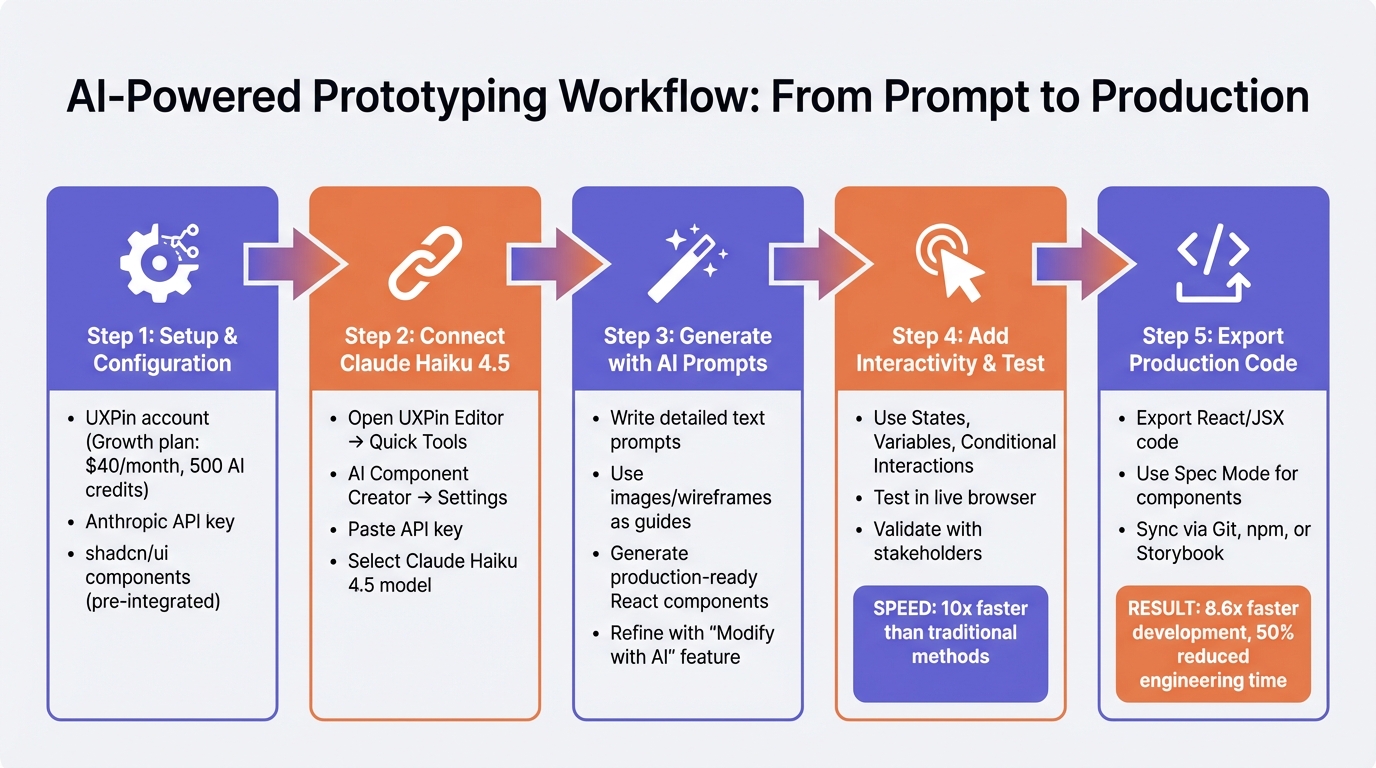
Claude Haiku 4.5 and UXPin Merge Prototyping Workflow: 5-Step Process
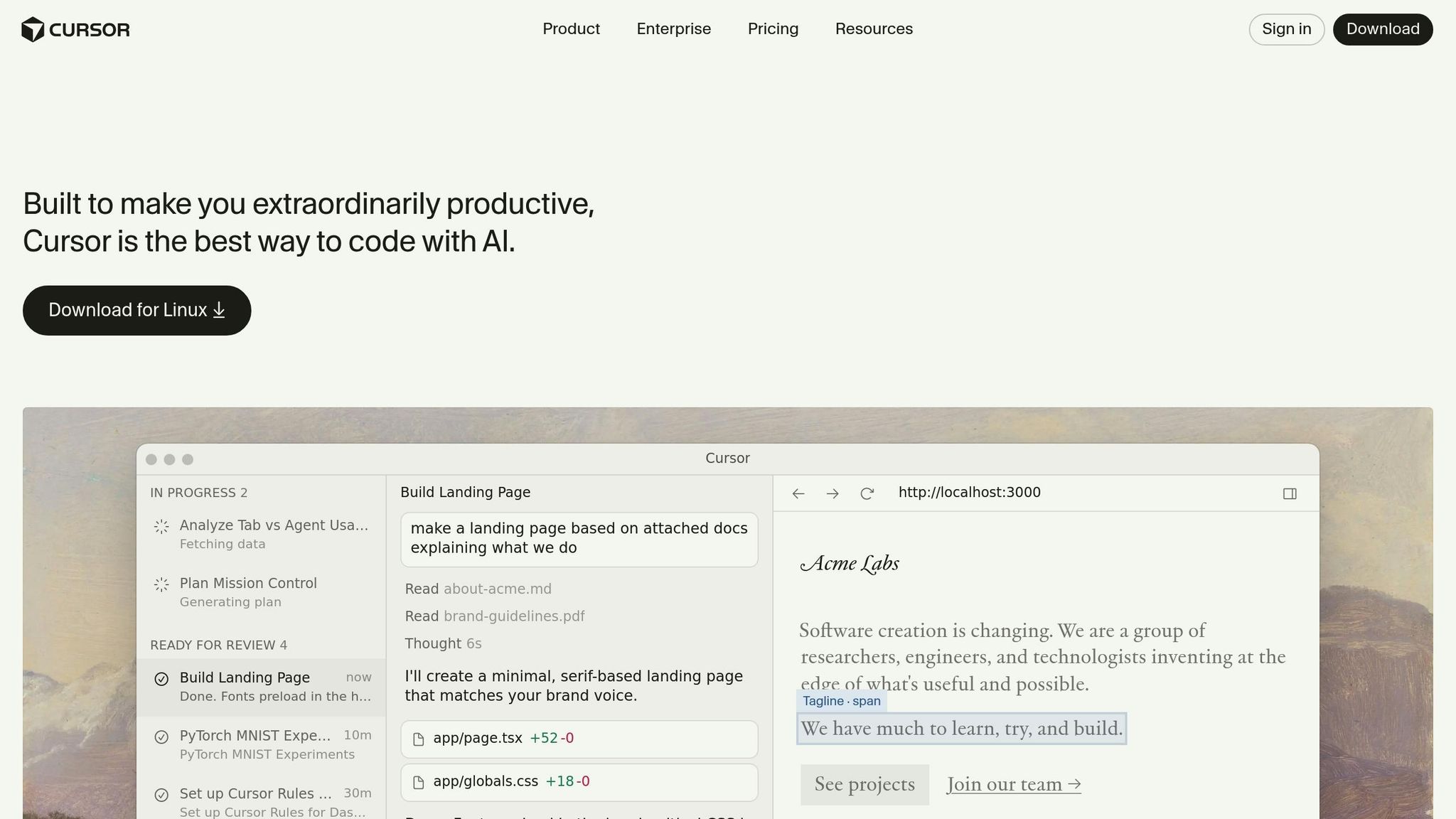
Designing in code with Cursor + React
sbb-itb-f6354c6
Setup and Prerequisites
Before diving into prototype building, make sure you have a UXPin account, an Anthropic API key, and access to the AI Component Creator tool. The good news? shadcn/ui components are already built into UXPin Merge, so there’s no need to import them manually – unless you’re working with a custom component library.
Required Tools and Accounts
First, you’ll need a UXPin account with Merge access. The Growth plan starts at $40/month and includes advanced AI tools along with 500 AI credits per month – perfect for teams that frequently prototype. For enterprise-level needs, the Enterprise plan offers flexible AI credit limits and dedicated support for custom component libraries.
Next, secure an Anthropic API key to connect with Claude Haiku 4.5. This key is essential for authenticating the AI Component Creator tool, which uses it to generate layouts with shadcn/ui components. Familiarity with shadcn/ui’s basic component patterns will also help you create effective prompts.
Once you’ve got your accounts and API key ready, it’s time to configure UXPin Merge for shadcn/ui.
Configuring UXPin Merge for shadcn/ui
This step ensures your design process stays tightly connected to production-ready code. Since shadcn/ui components are natively integrated into UXPin Merge, they’re immediately available for use in your workflows – no setup required. The AI Component Creator leverages these React components to transform your text prompts into functional layouts that align with your codebase.
Connecting Claude Haiku 4.5 to UXPin Merge
Once UXPin Merge is configured, the next step is linking Claude Haiku 4.5. This connection bridges AI-driven design prompts with functional React components. Here’s how:
- Open the UXPin Editor and go to the Quick Tools panel.
- Select AI Component Creator, then navigate to the Settings tab.
- Paste your Anthropic API key into the designated field.
- From the model dropdown menu, choose Claude Haiku 4.5.
With this setup, the AI is ready to generate shadcn/ui components based on your prompts. For fine-tuning, use the "Modify with AI" feature (purple icon) to adjust styles, spacing, or layouts without diving into manual edits.
Generating Prototypes with AI and shadcn/ui Components
With Claude Haiku 4.5 connected to shadcn/ui, transforming text prompts into functional layouts has never been easier. The AI Component Creator can generate production-ready React components using shadcn/ui’s extensive library. Since shadcn/ui is already integrated with UXPin Merge, every component suggested by the AI is ready to implement right away.
Creating Layouts with AI Prompts
The key to accurate layouts is in the details of your prompts. For instance, instead of saying, "create a form", try being more specific: "Create an ‘Email’ input field with a 16px bold label above it, a 2px solid bottom border, and a blue focus border." Clear and detailed instructions help the AI deliver exactly what you need.
For more complex interfaces, it’s best to break your request into smaller parts – like navigation bars, data tables, or form sections. Generate these components individually and then combine them on the canvas. This modular method gives you greater control and results in cleaner, more manageable designs.
You can also use images to guide the AI. Paste clipboard images of wireframes or mockups to generate layouts. Low-fidelity sketches are great for defining structure, while high-fidelity designs provide the AI with details like typography and spacing.
Once the AI generates your components, you can use them as a solid starting point for further customization.
Refining AI-Generated Prototypes
AI-generated outputs often need some fine-tuning. The "Modify with AI" feature (purple icon) makes adjustments like spacing, alignment, or styles simple – no manual effort required. For example, you can select a component and prompt: "Reposition elements side-by-side with 20px container padding."
Because these are real React components, not just static visuals, any adjustments will stay within your design system’s constraints. This ensures all refinements are technically viable for developers. And if you need a component that isn’t already in your library, you can quickly import open-source elements from shadcn/ui using npm, saving you time and effort.
Adding Functionality and Testing Prototypes
Once your AI-generated layouts are ready, the next step is to bring them to life with interactivity. Using shadcn/ui React components ensures your designs respond like real applications – complete with ripple effects, focus states, and functional elements like calendar pickers. This means input fields accept text, dropdowns expand, and buttons react instantly, creating a more realistic experience.
Adding Interactivity with UXPin Tools
UXPin’s features like States, Variables, and Conditional Interactions make it easy to build realistic user flows. For instance, you can design a login form where clicking "Submit" checks the email’s validity before navigating to the dashboard. These logic-driven interactions allow stakeholders to experience a design as if it were fully developed.
The AI Helper simplifies behavior updates. If you want to tweak a button’s hover effect or adjust spacing around an input field, just select the element and use a text prompt. Since the AI works within your design system’s rules, every change remains practical for developers. Once these interactions are set, you can simulate real user experiences to ensure everything works as intended.
Testing and Validating Prototypes
After adding interactivity, testing your prototype in a live browser is essential. This step ensures that behaviors function exactly as expected – stakeholders can see how forms submit, navigation flows, and data displays, all in a realistic environment.
Edward Nguyen, a UX Architect, shared his experience:
"UXPin prototypes gave our developers enough confidence to build our designs straight in code. If we had to code every prototype and they didn’t test well, I can only imagine the waste of time and money."
During testing, you can quickly make adjustments based on feedback. Because UXPin uses code-backed components, developers can confirm technical feasibility early on, reducing the risk of costly revisions. According to UXPin, this method can speed up prototyping by up to 10x compared to traditional approaches. By integrating these tools, your prototypes remain functional, testable, and aligned with production standards.
Exporting Production-Ready Code
Once your prototype is finalized, UXPin Merge allows you to export React code that’s ready for immediate use. Since the prototype is built using real shadcn/ui components synced directly from your codebase, the exported JSX ensures perfect alignment with your production setup. This means every prop, dependency, and interaction you’ve defined remains intact, just as you designed it.
After exporting, the transition to development becomes much smoother.
You can also leverage Spec Mode to copy JSX for individual components or full layouts. Alternatively, launch your prototype in StackBlitz for live testing before integrating it into your repository.
Handing Off to Development
A seamless handoff is possible when your design tool and development environment share the same foundation. By syncing your shadcn/ui library through Git, npm, or Storybook integration, developers can directly use components that match the codebase. This eliminates the need for developers to recreate designs from scratch.
Larry Sawyer, a Lead UX Designer, shared his experience:
"When I used UXPin Merge, our engineering time was reduced by around 50%"
Allison Barkley, Director of Operations at Baremetrics, also highlighted the benefits:
"Jumping straight from design to production-ready code is a huge time-saver for our team"
UXPin reports that this workflow can accelerate product development by 8.6 times compared to traditional image-based design methods.
To ensure even greater consistency, consider this extra step: When generating components with Claude Haiku 4.5, connect to the shadcn/ui MCP server (https://www.shadcn.io/api/mcp). This link provides the AI with precise TypeScript definitions, preventing errors like incorrect props and ensuring adherence to shadcn/ui standards. The result? Production-ready code that developers can rely on, with all dependencies accurately captured and maintained throughout the export process.
Conclusion
Pairing Claude Haiku 4.5, shadcn/ui, and UXPin Merge creates a prototyping workflow that seamlessly connects design and development. By using AI prompts to describe your requirements, you can instantly generate code-ready prototypes, transforming what used to be a time-consuming process into a smooth and collaborative experience.
The advantages go well beyond speed. Because these prototypes are built with production-ready shadcn/ui components, they ensure design system best practices from the start. This approach allows for quick iterations while maintaining a unified alignment between design and development, making the entire process more efficient and cohesive.
This workflow redefines collaboration between design and development teams. For enterprise teams managing intricate design systems, it provides structure and consistency without compromising flexibility. By combining AI-generated components with UXPin Merge’s seamless integration, every component adheres to your approved design system. This ensures that AI-driven suggestions are not only developer-ready but also aligned with your pre-established design rules. The result? Fast iterations without unexpected design inconsistencies or compliance headaches.
FAQs
What makes a good prompt for shadcn/ui layouts?
When guiding AI to create layouts with shadcn/ui, a well-constructed prompt is essential to ensure the output aligns with production standards. Here’s what a strong prompt should emphasize:
- Production-Ready Components: Request components that are not only functional but also polished for immediate deployment. This means the AI should focus on clean, reusable code that integrates seamlessly into real-world projects.
- Accessibility at the Core: Include instructions for implementing accessibility features such as keyboard navigation, ARIA attributes, and support for screen readers. Highlight the importance of leveraging Radix UI primitives, which are foundational for accessible and reliable components.
- CVA-Based Styling: Specify the use of the Class Variance Authority (CVA) for styling. This ensures consistent and maintainable class management, promoting a unified design system across components.
- TypeScript Interfaces: Encourage the generation of complete TypeScript interfaces for props and options. This adds type safety and makes the components easier to use and maintain in larger projects.
- Design System Mindset: Guide the AI to think holistically about the design system. Components should be modular, consistent, and adaptable, fitting seamlessly into the broader UI framework.
By focusing on these elements, your prompt will drive the AI to create components that are practical, accessible, and ready for deployment in modern web applications.
Can I use my own component library with UXPin Merge?
Absolutely! UXPin Merge lets you integrate your own component library directly into the platform. You can import and manage components from your design system through Git, Storybook, or npm. This means you’ll be designing with production-ready, code-backed components that perfectly match your library. The result? A smoother workflow and improved collaboration between design and development teams.
How do I prevent wrong props in AI-generated JSX?
To prevent issues with incorrect props in AI-generated JSX when using UXPin, it’s important to validate and parse props carefully. Implement logic to verify that props match the expected data types and values. If something doesn’t align, adjust the data or handle errors in a way that doesn’t disrupt functionality. This approach ensures that your props remain consistent, reducing the risk of unexpected behavior in your prototypes. By focusing on proper parsing, you help maintain reliable and functional components throughout your design process.

