Want to simplify UI design and development? By combining GPT-4.1, MUI, and UXPin Merge, you can create production-ready, interactive prototypes without the usual design-to-code friction. Here’s how it works:
- GPT-4.1: Generates MUI component configurations and layouts from natural language prompts or visual inputs like screenshots.
- MUI: Provides a library of React components (e.g., buttons, forms, navigation) that are functional, accessible, and aligned with Material Design principles.
- UXPin Merge: Lets you design with live, production-ready MUI components directly in the design canvas, ensuring perfect consistency between design and code.
Key Benefits:
- Designers and developers work with the same components, eliminating design handoff issues.
- Test real interactions (e.g., hovers, animations) in prototypes.
- Export clean JSX code directly from UXPin Merge for seamless integration into React apps.
Why it matters: This workflow reduces errors, saves time, and ensures your design matches the final product. Whether you’re a solo developer or part of a team, this approach makes turning ideas into deployable UIs faster and easier.
Setting Up UXPin Merge with MUI
Getting Started with UXPin Merge
UXPin Merge makes life easier by including MUI 5 pre-configured, so you can skip the hassle of dealing with packages and dependencies. If you’re using a trial or any paid plan, the MUI library is already available in the Design System Libraries tab within the editor. No setup headaches – just jump right in.
To get started, open a new project in UXPin and head to the Design System Libraries panel on the left side of your canvas. You’ll find "MUI 5" listed there. Click to enable it, and you’re ready to go. Instantly, you’ll have access to a full collection of components – buttons, forms, navigation bars, data grids, date pickers, and more – right on your canvas. These are live, production-ready components you can use immediately.
If you’re working with custom themes or specific forks, you might need to manually import MUI via npm. But for most users, the built-in library has everything you need to start building polished, production-ready interfaces.
Once MUI is enabled, you can dive in and start exploring its wide range of components directly from the design panel.
Using the Built-in MUI Component Library
After enabling the MUI library, you’ll see it in your component panel, neatly organized into categories like Inputs, Data Display, Navigation, and Feedback. These categories align with MUI’s official documentation, making it easy for designers and developers to stay on the same page when referencing components.
Each component follows Google’s Material Design principles and includes features like autocomplete fields, steppers, and pagination controls. For example, you can drag a Button component onto your canvas and fine-tune its properties – like variant, color, size, or disabled state – right in the Properties Panel. All updates happen in real-time, with no coding required. However, the underlying HTML, CSS, and JavaScript are fully functional and ready to export when needed.
"It used to take us two to three months just to do the design. Now, with UXPin Merge, teams can design, test, and deliver products in the same timeframe." – Erica Rider, UX Architect and Design Leader
This approach removes the usual back-and-forth between design and development. Designers work directly with the same components developers will use, ensuring perfect consistency from prototype to production.
sbb-itb-f6354c6
From Prompt to Interactive Prototype in under 90 Seconds
Using GPT-4.1 to Generate MUI Components
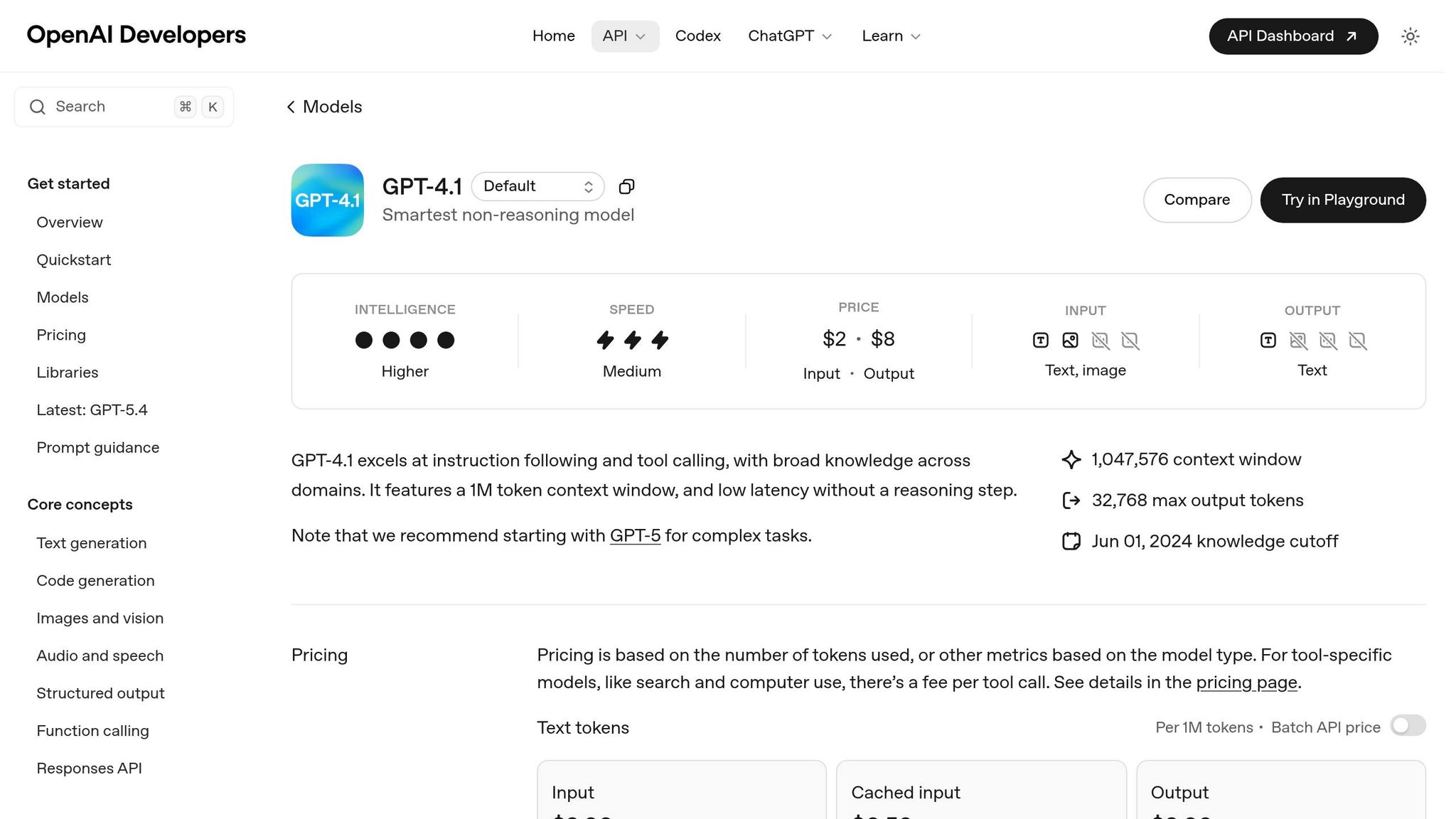
Released on April 14, 2025, GPT-4.1 brings a new level of coding capability, surpassing earlier versions on the SWE-bench Verified benchmark. With its massive 1 million token context window, you can input entire design system documentation, ensuring the generated MUI components align perfectly with your design standards.
Another standout feature is its support for multimodal inputs. You can upload UI screenshots or even simple hand-drawn wireframes, and GPT-4.1 will suggest tailored MUI components. During testing, it successfully passed 5 out of 7 general capability tests, including complex OCR and visual question answering. This makes it an excellent tool for transforming visual ideas into functional code in no time.
Because UXPin Merge ensures 100% parity between design and code, the MUI components generated by GPT-4.1 can be seamlessly integrated into UXPin Merge as fully functional elements. Next, let’s dive into how to craft effective prompts to make the most of this capability.
Writing Effective Prompts for GPT-4.1
To get the best results, your prompts need to be detailed and well-structured. Include your entire theme configuration – such as colors, spacing tokens, and typography – so the generated MUI code aligns with your brand guidelines.
For example, instead of a vague request like "create a form", try something more specific: "Generate a MUI form with TextField, Select, and Button components using primary colors, 16px spacing, and validation states." The more precise you are, the closer the output will be to production-ready code.
If you’re working from a visual reference, take advantage of GPT-4.1’s vision capabilities. Upload a screenshot and ask: "Identify the MUI components needed to recreate this layout in UXPin Merge." The model can detect buttons, cards, grids, and navigation patterns, then generate the corresponding component structure. However, while it excels in recognizing components, it may require manual adjustments for precise object positioning.
Another useful feature is the availability of three model variants – GPT-4.1, GPT-4.1 mini, and GPT-4.1 nano. For complex layouts with nested components, the full GPT-4.1 model is your best bet. For simpler tasks, like creating individual buttons or input fields, the mini or nano versions deliver faster responses while still being effective.
Testing AI-Generated Components
Once you’ve generated code, it’s essential to validate it before full integration. Start by performing a naming check using the MUI Component API. GPT-4.1 might sometimes suggest incorrect names, like button instead of Button, and small errors like these can disrupt imports.
Next, use the Merge Component Manager to map React props to the UXPin Properties Panel. This step allows designers to tweak components without needing to write code. Afterward, preview the component using the Component Preview feature to identify any syntax or styling issues before adding it to your design canvas.
Finally, test the components within the UXPin Merge interface. Drag them onto the UXPin Design Canvas to see how they interact with other MUI elements. Check for responsiveness to state changes, alignment with your grid system, and overall functionality. This ensures the components work as intended in a broader design context, not just in isolation.
If you’re a student or part of an early-stage team, you can take advantage of Merge AI plans at 50% off for six months with promo code UXPINTH50, or get a full year at 50% off using UXPINTH50Y. This makes it easier to explore AI-driven workflows without breaking the bank.
Building UI Prototypes with GPT-4.1 and MUI
Once you’ve tested your AI-generated MUI components, the next step is assembling them into high-fidelity prototypes. By combining MUI with UXPin Merge, you can create prototypes that not only look and feel like the final application but also deliver real performance insights, such as responsiveness and latency – something low-fidelity prototypes simply can’t provide.
Creating Interactive Prototypes
Start by dragging your validated MUI components onto the canvas, where you can instantly test interactions like button clicks, form submissions, and state changes. Because UXPin Merge uses production-ready components, these behaviors are ready to test immediately.
The Properties Panel allows you to fine-tune each component’s behavior. For instance, you can set a TextField’s variant to "outlined", change a Button’s color to "primary", or configure menu items for a Select component. These aren’t just visual tweaks – they’re actual React props in action. You can even add conditional logic, variables, and expressions directly on the canvas, enabling dynamic prototypes that react to user input. This level of interactivity makes your demos especially compelling, particularly for stakeholders who might not be familiar with low-fidelity design approaches.
Once the interactive behaviors are set, you can shift your attention to refining the layout and structure of your prototype using GPT-4.1.
Using GPT-4.1 for Layout Suggestions
GPT-4.1 isn’t just for generating code – it’s also a valuable tool for suggesting effective layout structures. By translating text-based requirements into high-fidelity app interfaces, it can help organize elements like dashboards, navigation tabs, and more into a clear hierarchy. For example, you could use a prompt like: “Design a travel planning dashboard with a hero section, search filters, and a card grid displaying destinations.” GPT-4.1 will generate a structured layout based on your input.
Need adjustments? You can refine the layout iteratively. Ask GPT-4.1 to add a CTA section, tweak the primary color theme, or make other broad changes, and it will modify the component structure accordingly. This method is much faster than manually rearranging components, especially for large-scale layout shifts. Plus, GPT-4.1 ensures consistency by adhering to your established MUI theme configuration, keeping colors and styles uniform across all screens.
For additional design elements – like icons, backgrounds, or hero illustrations – GPT-4.1 can provide tailored suggestions that integrate seamlessly into your MUI-based layout. It can even link screens together to create basic navigation flows automatically, saving you the time and effort of manually connecting buttons to their destinations.
Exporting Production-Ready Code
When your prototype is ready, moving it into development is a breeze. With UXPin Merge, which uses code-backed components, you can export production-ready code directly. This streamlined process bridges design and development, ensuring a smooth transition. Here’s how you can make it happen.
Moving from Prototype to Code
Switch to Spec Mode to inspect your prototype and grab clean JSX code. All you need to do is open Spec Mode, select the component setup you want, and copy the JSX. From there, paste it into your App.js file or any React component file within your project.
For an even more seamless experience, use the StackBlitz integration to open your prototype in a live coding environment. This feature lets you view, edit, and run the code immediately. UXPin’s data shows that this approach can speed up product development by 8.6 times, as it eliminates the need for developers to recreate designs from scratch.
"Being able to jump straight from design to having code ready to going to be a huge time-saver for our team."
- Allison Barkley, Director of Operations, Baremetrics
Don’t forget to include the necessary import statements (like import Button from '@mui/material/Button') to resolve dependencies. After that, run npm install followed by npm start to see your prototype live on your local environment.
Maintaining Design System Consistency
After exporting the code, it’s essential to keep your design consistent with your production environment. Syncing themes and tokens is key. Always sync your themes via npm so that updates made by developers are automatically reflected in UXPin Merge. This prevents any visual discrepancies between design and production.
Use the ThemeCustomizer component in UXPin to tweak global theme settings like colors, typography, and spacing. Once adjusted, copy the JSX from Spec Mode and paste it into your theme.js file for seamless integration.
When setting up components in the Merge Component Manager, consult the MUI Component API documentation to ensure React props are correctly named. This step ensures the exported JSX works right away without requiring manual adjustments.
"The ‘hand-off’ use case, and being able to use AI to capture DEPENDENCIES between components, assets, etc is huge."
- Harrison Johnson, Reviewer
For consistent design management, rely on token-based design systems to handle colors, typography, and spacing. Additionally, connect your component library to Git so your design team always works with the latest production components. This integration keeps AI-generated components and design updates aligned with your development repository, reducing errors and ensuring everyone stays on the same page.
Workflow Comparison: Standard vs. UXPin Merge
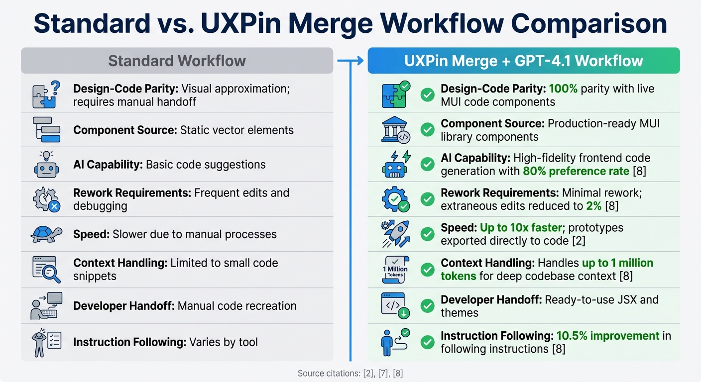
Standard Design Workflow vs UXPin Merge with GPT-4.1 Comparison
Let’s take a closer look at how the UXPin Merge workflow stacks up against traditional design methods, especially in the context of prototyping and AI-driven component generation.
Traditional design workflows rely heavily on static graphics and manual handoffs, which often lead to gaps between design and code. UXPin Merge addresses this issue by allowing designers to work directly with production-ready MUI components, boosted by GPT-4.1’s AI capabilities. This approach not only bridges the design-to-code gap but also generates cleaner code with fewer errors. For instance, GPT-4.1’s AI achieved an 80% preference rate for code generation and cut extraneous edits from 9% to just 2%. That’s a significant improvement, reducing debugging time and effort.
Windsurf reported that GPT-4.1 outperformed its predecessor, GPT-4o, by 60%, delivering 30% more efficient tool usage and cutting repeated edits in half. Similarly, Hex saw a nearly twofold improvement in tackling their toughest SQL evaluation tasks, resulting in less manual debugging.
"UXPin Merge is a design tool for developers and technical designers who want 100% parity between design and code."
- Rachel Johnson, Python Teacher and Visual Designer, Treehouse
Using production-ready MUI components not only reduces rework but also enhances efficiency. The table below highlights these improvements.
Comparison Table: Standard vs. Merge Workflow
| Feature | Standard Workflow | UXPin Merge + GPT-4.1 Workflow |
|---|---|---|
| Design-Code Parity | Visual approximation; requires manual handoff | 100% parity with live MUI code components |
| Component Source | Static vector elements | Production-ready MUI library components |
| AI Capability | Basic code suggestions | High-fidelity frontend code generation with 80% preference rate |
| Rework Requirements | Frequent edits and debugging | Minimal rework; extraneous edits reduced to 2% |
| Speed | Slower due to manual processes | Up to 10x faster; prototypes exported directly to code |
| Context Handling | Limited to small code snippets | Handles up to 1 million tokens for deep codebase context |
| Developer Handoff | Manual code recreation | Ready-to-use JSX and themes |
| Instruction Following | Varies by tool | 10.5% improvement in following instructions |
Conclusion
Bringing together GPT-4.1, MUI, and UXPin Merge changes how enterprise teams approach UI design and development. Instead of relying on static mockups, teams can design using shippable React components. This eliminates the usual back-and-forth delays that disrupt workflows and prevents inconsistencies between design and code.
This seamless integration doesn’t just speed up the development process – it also reduces errors along the way. With UXPin Merge, teams can build responsive UIs 10x faster compared to older methods. When UXPin introduced Merge AI on December 10, 2025, the vision was simple: move AI beyond creating "pretty pictures" and into delivering shippable interfaces. The platform lives up to this promise by allowing developers to copy JSX code directly from prototypes and paste it into React apps, cutting hours of manual coding.
"AI should create interfaces you can actually ship – not just pretty pictures." – UXPin
For enterprise teams, this workflow ensures design and code remain perfectly aligned across all products and platforms. The built-in MUI library and ThemeCustomizer make it easy to stick to brand guidelines while the AI generates layouts using only approved components. This means no guesswork, no wasted effort, and no risk of design drift.
With this system, prototypes are no longer just rough ideas – they’re the exact components developers will implement. The result? Faster timelines, smoother collaboration, fewer mistakes, and quicker product launches.
FAQs
What does “100% design-to-code parity” mean in UXPin Merge?
In UXPin Merge, "100% design-to-code parity" means that the design components you work with are directly powered by production-ready code. This ensures that what you design in UXPin matches the final implementation exactly, down to the last detail.
By bridging the gap between design and development, this approach eliminates inconsistencies, simplifies collaboration, and boosts workflow efficiency. It’s a game-changer for teams aiming for seamless integration and precision in their projects.
How do I use GPT-4.1 with screenshots to generate MUI layouts?
To create layouts using MUI components with GPT-4.1, start by either uploading a screenshot of your desired design or describing it in detail. For example, you could use a prompt like: "Create a dashboard layout with a sidebar and header using MUI components."
GPT-4.1 will then generate the corresponding code for you. Once you receive the code, you can review it and make any necessary adjustments in tools like UXPin to refine the design further.
If you need to tweak the layout or add more details, you can upload additional screenshots or provide updated prompts. This iterative process ensures your layout aligns with your vision while maintaining precision and usability.
What should I check before exporting JSX to my React app?
Before incorporating JSX into your React app, double-check that your prototype is fully functional and matches your design system. Ensure all components are properly set up, interactions behave as expected, and styling, props, and functionality align with your production requirements. This extra attention minimizes inconsistencies and ensures a seamless transition for developers.

