Footer Design Best Practices: 6 Expert Examples & Tips for 2026
A website footer is far more than a visual bookend. It’s a critical UI pattern that guides visitors to key information, supports SEO through internal linking, and creates one final opportunity to convert, engage, or inform on every page of your site.
This guide covers everything you need to design effective footers in 2026: what to include, best practices, common mistakes, and six real-world examples from companies that get it right.
Prototype responsive, interactive footer designs with UXPin — including hover states, working forms, and responsive breakpoints. Sign up for a free trial to build with code-level fidelity.

What Is a Website Footer?
A website footer is a UI pattern anchored to the bottom of every page on a website or application. It typically contains navigational links, contact details, legal policies, copyright information, and social media connections.
Because the footer appears on every page, it serves as a persistent, predictable element — a reliable place where users know they can find secondary information regardless of where they are on the site.
What Is the Purpose of a Footer?
A footer serves multiple roles depending on the type of website:
- Secondary navigation — Links to pages that don’t fit in the main header (about, docs, careers, press)
- Legal compliance — GDPR, CCPA, and other regulations require easily accessible links to privacy policies and terms of use
- Contact and support access — Phone, email, address, and help center links
- Brand reinforcement — Logo, tagline, social channels, and trust signals
- Conversion — CTAs, newsletter signups, and product links
How Footer Design Helps SEO
Footer links carry real SEO value because they appear on every page of your site:
- Internal link distribution: Footer links to key pages pass authority across your entire site
- Reduced bounce rate: Relevant footer links give users a reason to explore further
- Crawl efficiency: Search engine bots use footer links to discover and index important pages
Avoid keyword stuffing in footers — this is a known SEO anti-pattern that can trigger Google penalties. Keep footer text natural and user-focused.
What Should a Footer Include?
The exact content depends on your site type. Here’s a comprehensive checklist:
Navigation Links
- Utility links: Contact info, phone, email, physical address, customer service, privacy policy, terms of use
- Doormat navigation: A mirror of the main navigation for convenience (skip this if you use a sticky header)
- Secondary task links: Careers, investor info, documentation, press, affiliate programs, FAQs
- Sitemap links: Links to major topic or product categories
Brand Engagement & Messaging
- Social media icons with links to active profiles
- Brand logo and a short tagline or mission statement (1–2 sentences)
- Email newsletter signup form
Trust Signals
- Customer testimonials or review snippets
- Trust badges (security certifications, industry awards)
- Google Business or Trustpilot rating widgets
Copyright and Legal
- Copyright notice with current year
- Links to privacy policy, terms of service, cookie policy
- Accessibility statement
6 Expert Footer Design Examples
1. Apple

Apple’s footer is a masterclass in organized simplicity. Multi-column link groups cover products, services, and support, while a minimal bottom bar handles legal links and locale selection.
What to learn: Group links logically by user intent. Apple separates “Shop and Learn,” “Services,” and “Apple Values” — each column serves a different type of visitor.
2. Amazon

Amazon’s footer packs an enormous amount of information into a structured, scannable layout. The “Back to Top” link at the top of the footer is a practical touch for long product pages.
What to learn: For content-heavy footers, use a clear visual hierarchy with bold category headers and subdued link text. The density works because the organization is logical.
3. Mailchimp

Mailchimp’s footer reflects their brand personality — approachable, well-organized, and distinctive. The use of the brand’s illustration style extends their visual identity to the very bottom of the page.
What to learn: Your footer is a branding opportunity. Don’t treat it as an afterthought — extend your visual identity consistently through every section, including the footer.
4. HubSpot

HubSpot’s footer efficiently categorizes their extensive product suite and resource library. Each column header clearly communicates the section’s purpose, and the footer serves as a mini-sitemap for their sprawling website.
What to learn: For SaaS companies with many products, treat the footer as a product discovery tool. Organized link groups help visitors find the right product or resource quickly.
5. Chase Bank
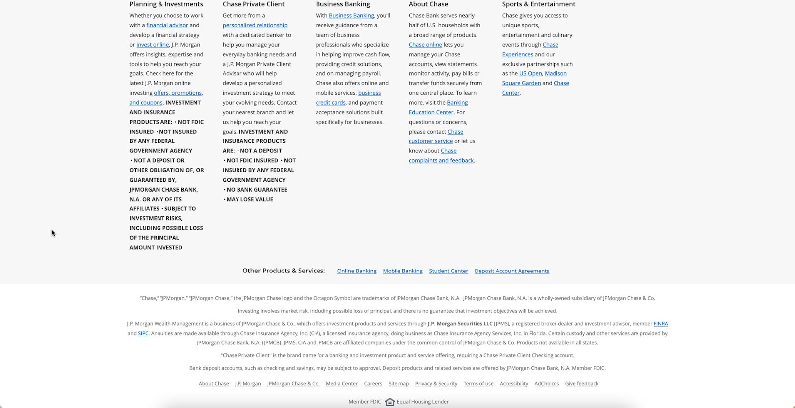
Chase Bank prioritizes compliance and trust in their footer. Legal disclosures, FDIC logos, and Equal Housing Lender notices are prominently displayed — critical for the financial services industry.
What to learn: Regulated industries must treat the footer as a compliance tool. Legal disclosures, certifications, and trust badges belong here and should be clearly visible.
6. UXPin
UXPin’s own footer balances product navigation, educational resources, and brand touchpoints. The link structure covers products (Merge, Forge), learning resources (blog, docs, examples), and company information — giving different visitor types clear paths forward.
What to learn: Include links to your most important product and educational pages. A well-structured footer doubles as both a navigation aid and an SEO tool.
Footer Design Best Practices for 2026
Do: Follow These Principles
- Keep it organized. Use columns with clear headers to group related links. Limit yourself to 4–6 columns maximum.
- Prioritize mobile responsiveness. Multi-column footers should stack into a single column on mobile, with accordion sections for link groups.
- Ensure accessibility. Meet WCAG 2.1 AA contrast ratios, use descriptive link text (not “click here”), and make sure all interactive elements are keyboard-navigable.
- Include a CTA. Whether it’s a newsletter signup, free trial link, or contact button, give visitors one clear action to take.
- Use consistent branding. The footer should feel like a natural extension of the rest of the site — same typography, color palette, and visual language.
- Link to your most valuable pages. Every page on your site links to the footer, so footer links carry significant internal link equity for SEO.
Don’t: Avoid These Mistakes
- Don’t overcrowd. If you need more than 40–50 links, consider collapsible sections or a dedicated sitemap page instead.
- Don’t use tiny text. Footer text should be at least 12px (ideally 14px). If it’s hard to read, it’s not serving anyone.
- Don’t hide essential information. Contact details, privacy policy, and terms of use should be immediately visible — not buried in expanding menus.
- Don’t keyword-stuff. Hidden text blocks or excessive keyword-laden copy in the footer can trigger search engine penalties.
- Don’t forget to update. Broken links, outdated copyright years, and dead social profiles undermine trust instantly.
Design Interactive Footers With UXPin
Creating responsive, interactive footer prototypes requires a tool that supports real component behavior — hover states on links, working accordion sections, responsive breakpoints, and form validation for newsletter signups.
UXPin’s code-based design approach makes all of this possible without writing code. With UXPin Merge, you can drag in your team’s actual production footer components — built in React, with MUI, shadcn/ui, or your custom design system — and prototype a footer that behaves exactly like the final implementation.
Need to quickly explore multiple footer layouts? Forge, UXPin’s AI assistant, can generate footer concepts from a text description or a screenshot of a footer you admire — always using your team’s real components as building blocks.
UXPin also includes built-in accessibility tools, including a contrast checker and color blindness simulator, so you can validate footer accessibility without leaving the canvas.
Sign up for a free trial and start building better footers today.
Frequently Asked Questions About Footer Design
What is a website footer and why does it matter?
A website footer is the content section at the bottom of every page. It matters because it provides secondary navigation, legal compliance links (privacy policy, terms of use), contact information, and brand touchpoints like social media links. Well-designed footers improve SEO through internal linking and give users a reliable place to find information.
What should a website footer include?
A website footer should include: navigation links (secondary pages, sitemap), contact information (email, phone, address), legal links (privacy policy, terms of service), social media icons, copyright notice, and optionally a newsletter signup or CTA. The specific content depends on your business type and goals.
How does footer design affect SEO?
Footers help SEO in three ways: they provide internal links to important pages (distributing page authority), they reduce bounce rate by offering users relevant next steps, and they appear on every page — giving consistent internal link signals to search engines. Avoid keyword stuffing in footers, which can trigger penalties.
What are common footer design mistakes?
Common mistakes include: overcrowding the footer with too many links, using tiny unreadable text, hiding essential information (contact, legal pages), neglecting mobile responsiveness, poor color contrast that fails accessibility standards, and including broken or outdated links.
How do I make a footer responsive for mobile?
For mobile footer design: stack multi-column layouts into a single column, use accordion or collapsible sections for link groups, ensure tap targets are at least 44×44 pixels, prioritize the most important links at the top, and test on real devices. Consider hiding less critical content behind expandable sections.
How can I prototype a website footer with interactive states?
UXPin lets you prototype footers with real interactive behavior — hover states on links, working accordion sections, responsive breakpoints, and form validation for newsletter signups. With UXPin Merge, you can use your team’s actual production components, so the prototype footer matches the final implementation exactly.


