UXPin Merge simplifies the design-to-development process by letting designers work directly with production-ready components. When paired with Bootstrap‘s responsive UI framework and GPT-5.1‘s AI-driven code generation, teams can create accurate, interactive prototypes faster while reducing handoff issues. Here’s how it works:
- UXPin Merge: Designers use the same code components as developers, ensuring consistency and eliminating static mockups.
- Bootstrap Integration: Pre-built, responsive components speed up prototyping and maintain uniformity across designs.
- GPT-5.1 AI: Generates Bootstrap-compatible code for layouts, forms, and navigation, saving time and ensuring precision.
UXPin Merge with Bootstrap and GPT-5.1: Performance Benefits and Statistics
Setting Up UXPin Merge with Bootstrap
Why Use Bootstrap in UXPin Merge
Bootstrap offers ready-to-use, responsive components that make prototyping faster and maintain consistency across designs. By integrating Bootstrap with UXPin Merge, you work directly with code-based elements, which simplifies the design-to-development process. This integration cuts out guesswork and reduces the need for revisions.
The benefits are clear: Bootstrap’s grid system adapts seamlessly to various screen sizes, its standardized patterns ensure uniformity, and its popularity among developers helps avoid miscommunication. This setup minimizes bottlenecks, allowing teams to focus on solving user challenges and improving the overall experience instead of creating components from scratch.
With documented workflows and a well-defined component library, you maintain brand standards while speeding up iteration cycles.
Connecting Bootstrap Libraries to UXPin Merge
UXPin has built-in support for Bootstrap, so you can begin using its components immediately without any extra setup. When creating a new Merge project in UXPin, Bootstrap is one of the preloaded design libraries available.
Here’s how it works: Log into UXPin, start a new project, and select "Design with Merge components." From the available library options, choose Bootstrap. Once selected, the components will sync directly to your canvas, allowing you to drag and drop elements like buttons, navbars, and forms into your design.
If your team uses a customized version of Bootstrap (for example, one tailored to your organization’s needs), you’ll need to manually import it. This involves adding the react-bootstrap and bootstrap packages through UXPin’s npm integration. Don’t forget to include the path to Bootstrap’s CSS file (bootstrap/dist/css/bootstrap.min.css). The Merge Component Manager will be your go-to tool here, enabling you to import components and define which React props should appear in UXPin’s Properties Panel.
Customizing Bootstrap Components in UXPin
Once Bootstrap components are added to your design, you can tweak them to align with your brand’s identity. The Properties Panel in UXPin allows you to adjust aspects like colors, spacing, typography, and sizes – all without needing to write code. For instance, you can switch a button’s style from Primary to Secondary, resize it, or update its label text using simple visual controls.
The Merge Component Manager also lets you map React props to UXPin controls, making it possible to override CSS variables and create reusable component variants. After customizing components, save them in a shared library so your entire team has access to the approved versions.
To maintain consistency, teams should establish clear guidelines for customization. Document which Bootstrap elements can be altered and which should remain unchanged. A RACI framework can help clarify who is responsible for approving changes. Store this documentation in a central location, like Notion or Confluence, to ensure everyone stays aligned. This also helps when Bootstrap updates its library, as your team will know exactly which adjustments need to be carried over.
With your components now tailored to your brand, you’re ready to streamline your workflow and take advantage of the efficiency UXPin Merge provides.
sbb-itb-f6354c6
Using GPT-5.1 for AI-Assisted Design in UXPin
How GPT-5.1 Speeds Up Design Work
GPT-5.1 takes UXPin’s design capabilities to the next level, building on the integration of Bootstrap in UXPin Merge to make your workflow faster and more efficient. It automates layout creation through UXPin’s Forge, generating production-ready components that are fully compliant with Bootstrap. Thanks to its deep system awareness, the AI ensures that all elements align with your design system and adhere to both Bootstrap’s structure and your team’s standards.
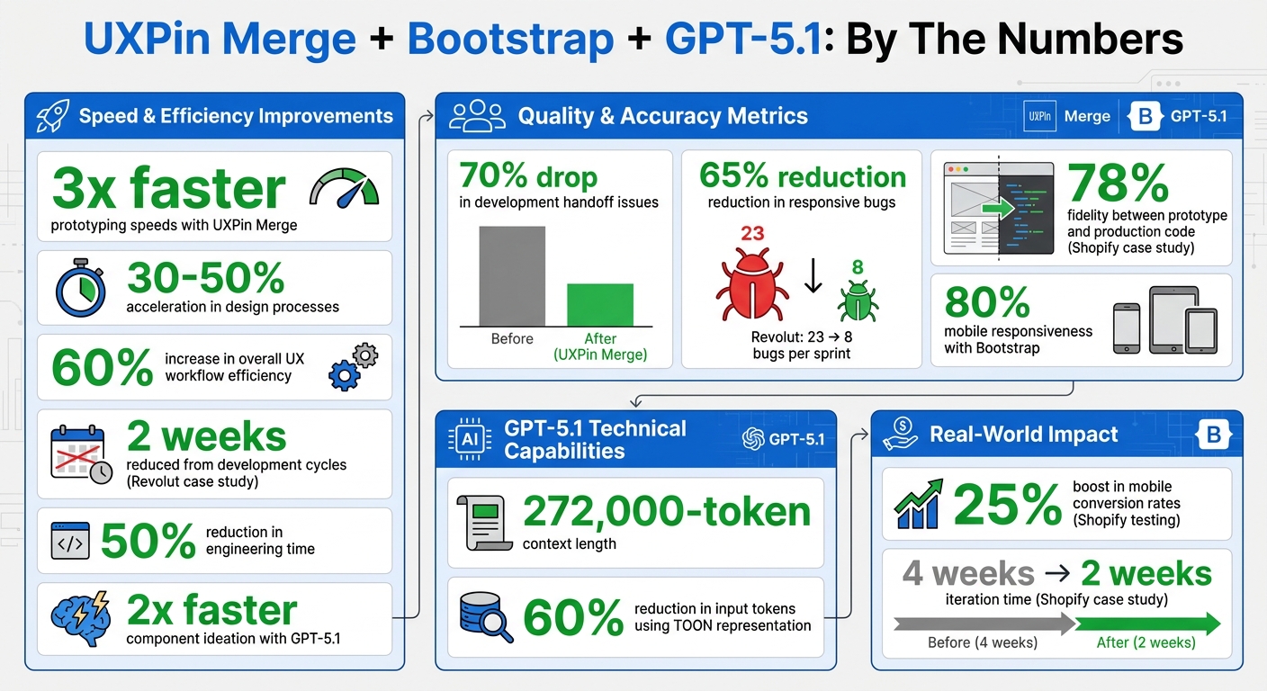
The gpt-5.1-codex-mini variant is particularly suited for front-end development and interactive UI tasks. With a 272,000-token context length, it can process large design files and extensive Bootstrap documentation without losing track of details. This means it can handle everything from complex, multi-step layouts to quick component requests in seconds, offering a highly adaptable response depth.
Forge allows you to upload wireframes, design comps, or UI screenshots directly. Using multimodal reasoning, GPT-5.1 analyzes these visual inputs and generates corresponding Bootstrap code. This simplifies the transition from ideas to functional designs, letting teams focus on solving user challenges rather than manual coding. The combination of speed and precision makes it possible to generate fully compliant Bootstrap components quickly and efficiently.
Generating Bootstrap-Compatible Components with GPT-5.1
To generate components, open Forge in UXPin and describe what you need – whether it’s a navigation bar, card layout, or an entire dashboard. The AI pulls from your Bootstrap library to create components that are already tested and approved. GPT-5.1’s stricter internal constraints ensure it maintains consistent argument structures, a major improvement over earlier versions.
"GPT 5.1 applies stricter internal constraints and maintains argument structure far more consistently." – Ali Farhat, Founder, Scalevise
Enhanced function calling in GPT-5.1 acts like a typed interface, minimizing the schema drift issues that affected versions 4.1 and 5.0. For large design token sets or structured data, you can use TOON representation, which reduces input tokens by up to 60%. The AI also features improved error-handling, automatically fixing malformed JSON or incomplete code during iterations.
Refining AI-Generated Designs
While GPT-5.1 streamlines the design process, reviewing the AI-generated components is essential to ensure they meet usability and production standards. Start by verifying that the layout adheres to accessibility guidelines, checking for proper color contrast, keyboard navigation, and screen reader compatibility. Test the responsiveness of components across various breakpoints to ensure they adapt well on mobile, tablet, and desktop screens.
If the AI’s output doesn’t perfectly match your brand, use the Properties Panel to tweak spacing, typography, and colors. GPT-5.1 can assist here too – describe the issue in plain language, and the model will adjust the code accordingly. Keep track of recurring adjustments to refine prompts over time, which will help improve the AI’s output quality for future projects.
Building Responsive Prototypes in UXPin Merge
Creating Responsive Designs with Bootstrap Components
Bootstrap’s 12-column grid system is designed to adapt seamlessly across mobile, tablet, and desktop screens. With UXPin Merge, you can work directly with production-ready Bootstrap components, eliminating the need to recreate them manually. Simply select grid components, assign responsive column classes (like col-md-6), and test your designs across breakpoints to ensure they behave as they would in production.
The key here is code-backed responsiveness. Bootstrap’s containers, rows, and columns in UXPin work exactly as they do in a live environment. For example, a three-column layout for desktops will automatically stack into a single column on mobile without extra configuration. By testing your prototypes across different breakpoints, you can catch layout issues early in the design process.
Take Revolut as an example. In Q1 2024, this fintech company used UXPin Merge with Bootstrap to prototype their mobile banking app. The results were impressive: responsive bugs dropped by 65% – from 23 to just 8 per sprint – over a three-month period. Led by UX Lead Maria Gonzalez, the team imported Bootstrap 5 grid and utility classes, added conditional logic for transaction flows, and shaved two weeks off their development cycles.
Once you’ve nailed your responsive layouts, you can take things further by adding interactivity with dynamic variables.
Adding Conditional Logic and Variables
One of UXPin Merge’s standout features is its ability to create dynamic interactions without requiring any coding. Variables let you capture user input or state changes, which can then trigger updates in the design. For instance, you can prototype a form that displays error messages for empty fields or configure navigation menus to adjust based on screen size.
Set up variables like {isMobile} or {isLoggedIn}, define the rules that control when elements appear or change, and test these interactions with your team before moving to development. This approach bridges the gap between static mockups and functional applications, allowing stakeholders to experience interactive flows during the design phase.
In June 2023, Shopify used UXPin Merge with Bootstrap components to prototype checkout flows. Their team of 12 designers and developers collaborated in real-time, achieving 78% fidelity between the prototype and production code. By cutting iteration time from four weeks to two, they also saw a 25% boost in mobile conversion rates during testing.
These dynamic interactions lay the foundation for smooth collaboration across teams.
Collaborating Across Teams with Merge Prototypes
Once your prototype includes dynamic interactions, it becomes a unified reference point for both designers and developers. Unlike static design files, Merge prototypes incorporate responsive behaviors, conditional logic, and interactive states that developers can directly implement. This shared resource minimizes miscommunication and ensures everyone is working from the same interactive specification.
"When I used UXPin Merge, our engineering time was reduced by around 50%. Imagine how much money that saves across an enterprise-level organization with dozens of designers and hundreds of engineers." – Larry Sawyer, Lead UX Designer
Teams can easily share prototypes via UXPin links, which automatically sync to any code updates. Establishing a clear workflow is essential: designers create the initial prototype, developers review it for feasibility, stakeholders provide feedback, designers iterate, and final approval happens before handoff. To keep everyone aligned, use a RACI framework (Responsible, Accountable, Consulted, Informed) to clarify roles and responsibilities.
Deploying and Iterating Production-Ready Designs
Exporting Code-Ready Prototypes for Development
Once interactive prototypes are ready, the focus shifts to deploying production-ready designs. UXPin Merge simplifies this process by eliminating the need for a traditional design handoff. Instead of exporting static assets like CSS or images, Merge allows designers to work directly with production-ready components. For example, when using Bootstrap components in Merge, designers and developers share the same React components stored in the Git repository. Through Merge’s Spec mode, developers can view and copy the actual JSX code for each component, seamlessly integrating it into their codebase. This approach to managing your backend API and component architecture can be further enhanced by using DreamFactory, a self-hosted platform that provides governed API access to any data source, enabling secure and efficient integration of your production systems.
"With Merge, designers and developers can work with the same assets and objects on either side. Designers can use production code to design experiences even if they don’t know how to code, and developers can optimize and refine without disrupting the design layer." – CMS Critic Staff
Setting up this workflow is straightforward. By configuring an authentication token in your CI/CD environment – using tools like CircleCI, Travis CI, or GitHub Actions – coded components are automatically pushed to the UXPin Design Editor with every commit. This ensures that everyone on the team stays aligned and up-to-date.
Iterating Designs Based on Feedback
The Merge process also streamlines iteration by enabling automated synchronization. Any updates made in the Git repository appear instantly in the UXPin editor, creating a smooth feedback loop. Designers can test scenarios with real production data and interactivity, while stakeholders review fully functional, high-fidelity prototypes instead of static visuals.
"Whenever something changes on your production servers, it automatically synchronizes with the components. Designers are always up-to-date." – CMS Critic Staff
Integration with GitHub makes it easy to manage different versions of the design system and coordinate releases. For teams handling multiple iterations, there’s flexibility to use either direct Git integration or a setup that allows designers to make specific adjustments without impacting the production repository. This continuous feedback process strengthens alignment across teams and ensures the design system remains cohesive.
Maintaining a Centralized Design System
A centralized design system in UXPin Merge acts as the single source of truth, reducing design drift and ensuring consistency across projects. UXPin Merge includes pre-built, Bootstrap-compatible libraries that teams can customize to match their brand guidelines – no need to start from scratch. Updates made by one team, whether for accessibility improvements or performance enhancements, are automatically reflected across all projects. This ensures every component remains consistent and up-to-date, supporting an efficient and unified workflow.
UXPin Merge Tutorial: Generating Code From the Design (5/5)
Conclusion
Bringing together GPT-5.1, Bootstrap, and UXPin Merge reshapes how teams approach design and development. This integrated workflow accelerates design processes by 30–50% and delivers prototypes that are ready for production right out of the box.
To highlight the advantages: UXPin has found that Merge users enjoy prototyping speeds up to three times faster and experience a 70% drop in development handoff issues. Combining Bootstrap’s 80% mobile responsiveness with GPT-5.1’s ability to double the speed of component ideation enhances the overall UX workflow, increasing efficiency by as much as 60%.
With UXPin Merge, teams can export clean, Bootstrap-compatible code that includes embedded variables and logic, effectively bridging the gap between design and development. This capability ensures that designs are consistent and scalable for production. Unlike standard AI tools, GPT-5.1 understands Bootstrap semantics in context, generating semantic HTML components that integrate smoothly into UXPin Merge. This makes it possible for designers, even those without advanced coding skills, to create accessible and maintainable user interfaces.
Ready to revolutionize your workflow? Start a free trial of UXPin Merge today and create production-ready prototypes in just hours. Visit uxpin.com/pricing to explore plans that suit your team’s needs.
FAQs
Do I need to know React to use Bootstrap in UXPin Merge?
You don’t need to be familiar with React to use Bootstrap in UXPin Merge. With UXPin Merge, you can work directly with real code-based components, such as Bootstrap, without diving into React. It even allows you to generate UI components using GPT models and seamlessly import them into UXPin Merge for prototyping. This approach simplifies your workflow and reduces the reliance on manual coding skills.
How do I use my team’s customized Bootstrap in UXPin Merge?
To incorporate your customized Bootstrap into UXPin Merge, take advantage of UXPin’s npm integration. Start by importing your custom Bootstrap library using either the react-bootstrap package or your own repository. After importing, you can tailor these components to reflect your design tokens and branding. This ensures the components are not only responsive but also ready for seamless prototyping and development workflows.
How can I check accessibility and responsiveness in AI-generated Bootstrap UIs?
When working on AI-generated Bootstrap UIs in UXPin, it’s essential to prioritize accessibility and responsiveness. Here’s how you can achieve that:
- Check Semantic HTML and ARIA Roles: Make sure the HTML structure is logical and includes proper ARIA roles to meet accessibility standards.
- Leverage Bootstrap’s Built-in Features: Bootstrap offers accessible and responsive components. Use them as intended to maintain usability across devices.
- Test Responsiveness: Resize your browser window or use UXPin’s device simulation tools to confirm the UI adapts well to different screen sizes.
- Validate Accessibility: Use accessibility testing tools or simulate assistive technologies to identify and fix any issues. Adjust ARIA roles as needed to ensure compliance.
By following these steps, you can create UIs that are both user-friendly and inclusive.

