Button States Explained: The Complete Design Guide for 2026
Button states are the visual feedback system that tells users what’s happening with every interactive element in your interface. They’re how a button communicates: “click me,” “I’m processing,” or “not available right now.”
Getting button states right is fundamental to usable, accessible UI design. This guide covers every standard button state, design principles for each, accessibility requirements, and cross-platform considerations for web, mobile, and beyond.
Key takeaways:
- Button states are visual cues that communicate a button’s interactive condition to users.
- Consistent state design across your UI builds familiarity and reduces cognitive load.
- Accessibility requirements (ARIA roles, keyboard navigation, contrast ratios) are non-negotiable.
- Different platforms (web, iOS, Android, TV) have distinct expectations for state behavior.
UXPin’s States feature lets you design and test every button state with real interactive behavior — hover, click, focus, disabled, and more — without writing code. Sign up for a free trial to start prototyping interactive button states today.

What Are Button States?
A button state indicates the element’s current interactive condition — whether it’s ready for interaction, being interacted with, or temporarily unavailable. Each state provides a distinct visual cue that helps users understand what actions are possible.
For example, a subtle color shift on hover signals that a button is clickable, while a grayed-out appearance communicates that an action is currently unavailable. Well-implemented button states reduce confusion, prevent user errors, and make interfaces feel responsive and polished.
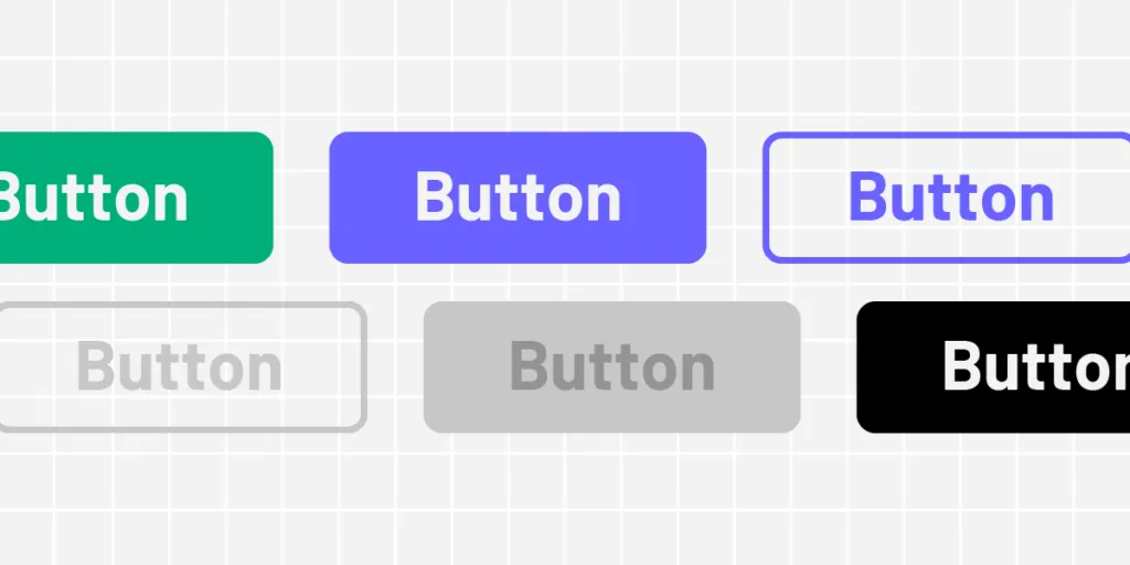
The 7 Standard Button States
Most buttons require four to seven states depending on the product and interaction complexity. Here are the seven standard states used in modern UI design:
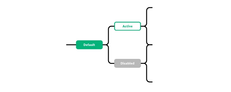
1. Default State
What it is: The button’s initial, idle appearance — what users see when a page loads.
Design best practices:
- Use high-contrast colors that meet WCAG AA contrast requirements (4.5:1 for text)
- Write a clear, action-oriented label (“Submit Order,” not “Submit”)
- Ensure the button size is tappable on mobile (minimum 44×44px)
2. Hover State
What it is: Triggered when a user moves their cursor over the button without clicking. Signals that the element is interactive.
Design best practices:
- Apply a subtle change — slight color shift, elevation shadow, or underline
- Keep changes noticeable but not jarring (no dramatic animations)
- Remember: hover doesn’t exist on touch devices — never put essential information only in hover states
3. Active State (Pressed)
What it is: Appears during the click or tap — the moment between mousedown and mouseup. Confirms the system registered the user’s action.
Design best practices:
- Use a visual effect like color darkening, inset shadow, or scale reduction
- Make the effect brief and immediate — the active state should feel “snappy”
- Ensure the effect reverses cleanly when the user releases
4. Focus State
What it is: Indicates the button has keyboard focus, typically shown as an outline ring around the element. Essential for keyboard and assistive technology users.
Design best practices:
- Never remove the focus indicator — it’s a WCAG requirement
- If the default browser outline doesn’t fit your design, replace it with a custom style (e.g., a 2px offset ring in your brand color)
- Ensure the focus ring has at least 3:1 contrast against the background
5. Disabled State
What it is: Communicates that the button is currently unavailable — the user can see it but can’t interact with it.
Design best practices:
- Reduce opacity or use a muted color palette to visually distinguish from the default state
- Use
aria-disabled="true"for screen readers - Where possible, include a tooltip or nearby text explaining why the button is disabled (“Complete all required fields to continue”)
6. Loading State
What it is: Shown when the button has been clicked and the system is processing the action. Prevents double-clicks and communicates progress.
Design best practices:
- Replace the label with a spinner or progress indicator, or add a spinner alongside the text
- Disable the button during loading to prevent duplicate submissions
- If possible, show progress percentage for long operations
7. Toggle State
What it is: Used when a button switches between two conditions — on/off, selected/unselected, bookmarked/not bookmarked.
Design best practices:
- Make both states clearly distinguishable (color change, icon swap, fill vs. outline)
- Use
aria-pressed="true/false"to communicate the toggle state to screen readers - Add a microinteraction — a brief animation during the transition reinforces the state change
Button States Across Button Types
These seven states apply to all button variants in your design system:
- Primary buttons: The main action button — bold, high-contrast. States should be most visually prominent here.
- Secondary buttons: Supporting actions. States follow the same patterns but with reduced visual emphasis.
- Tertiary buttons: Low-priority actions (often text-only or outline style). States are subtle — underline on hover, slight color shift on active.
- Icon buttons: States often use background fill or ring effects rather than color changes on the icon itself.
- Ghost buttons: Transparent by default — states may add a background fill or border.
Accessibility Requirements for Button States
Accessible button states aren’t optional — they’re a legal and ethical requirement. Here are the non-negotiables:
- Color is not sufficient alone. Always pair color changes with a secondary indicator (shape, text, icon, or size change). Users with color blindness rely on these secondary cues.
- Visible focus indicators. Every interactive element must have a visible focus state for keyboard navigation.
- ARIA attributes. Use
role="button",aria-disabled,aria-pressed, andaria-labelappropriately. - Keyboard operability. All button states must be reachable and triggerable via keyboard (Enter and Space keys).
- Contrast ratios. Text on buttons must meet 4.5:1 (AA) contrast in every state — not just the default.
Cross-Platform Button State Considerations
Web (Desktop)
Web buttons support the full range of states — hover, active, focus, disabled, loading, and toggle. Focus states are critical because web interfaces are frequently navigated by keyboard. Use CSS pseudo-classes (:hover, :active, :focus-visible) for implementation.
Mobile (iOS and Android)
Mobile buttons don’t have hover states — touch interactions skip directly from default to active. Focus states still matter for screen reader users (VoiceOver on iOS, TalkBack on Android). Follow Material Design 3 or Apple’s Human Interface Guidelines for platform-appropriate state behavior.
Smart TVs and Game Consoles
These platforms rely on remote or controller-based navigation, making the focus state the primary interaction signal. Focus indicators must be large, high-contrast, and impossible to miss on big screens viewed from a distance.
Button State Design in Design Systems
In mature design systems, button states are defined once and enforced across every product surface. This is where tools like UXPin Merge become especially valuable — designers work with the same coded button components that developers ship, so state definitions are identical between design and production.
When button states live in a centralized design system, you get:
- Consistency — Every product uses the same state definitions
- Efficiency — Designers don’t recreate state logic for every project
- Accuracy — What stakeholders review in the prototype is what users experience in production
Prototype Interactive Button States With UXPin
UXPin is a code-based design tool that lets you create fully interactive button state prototypes — not static artboards with annotations, but buttons that actually respond to hover, click, focus, and other triggers.
With UXPin States, you can:
- Define unique visual properties for each button state
- Set triggers for both web (hover, click) and mobile (tap, swipe) interactions
- Build complex UI patterns like dropdown menus, tab navigation, and navigational drawers
- Test the prototype with real users to validate state behavior before development
With UXPin Merge, your button states come pre-built from your production component library — built in React with MUI, shadcn/ui, or your custom system. No manual recreation needed. And with Forge, UXPin’s AI design assistant, you can generate complete interfaces that already include properly configured button states from your design system.
Sign up for a free trial to explore States, Merge, and Forge.
Frequently Asked Questions About Button States
What are button states in UI design?
Button states are the visual variations a button displays to communicate its current interactive condition to users. Common states include default (ready to click), hover (cursor is over the button), active (being clicked), focus (selected via keyboard), disabled (not available), loading (processing an action), and toggle (switched on or off). Each state provides visual feedback that guides user interaction.
How many button states should I design?
At minimum, design four states: default, hover, active, and disabled. For accessible interfaces, add a focus state (required for keyboard navigation). Loading and toggle states are important for buttons that trigger async actions or switch between two conditions. Most production design systems define 5–7 states per button variant.
What’s the difference between active and focus button states?
The active state appears when a button is being clicked or tapped (mousedown/touchstart). The focus state indicates that the button has keyboard focus — typically shown with an outline ring. Active is momentary (visible only during the click), while focus persists until the user moves focus to another element. Both are essential for different interaction modes.
How do I make button states accessible?
For accessible button states: never rely on color alone (use shape, size, or icon changes too), maintain WCAG 2.1 AA contrast ratios (4.5:1 for text), always include a visible focus state for keyboard users, use ARIA roles and labels for screen readers, ensure disabled buttons explain why they’re disabled, and test with keyboard-only navigation.
Should I remove the focus outline on buttons?
Never remove the focus outline without providing an alternative. The focus indicator is essential for keyboard users and is a WCAG requirement. If the default browser outline doesn’t match your design, replace it with a custom focus style — but always ensure it’s clearly visible with sufficient contrast.
How can I prototype button states without coding?
UXPin’s States feature lets you design and test all button states with real interactive behavior — no code required. Define properties for each state and set triggers (hover, click, tap) that match the target platform. With UXPin Merge, button states come pre-built from your production design system, so what you prototype is exactly what developers ship.


