Want to create consistent, efficient UX workflows? Combining Claude Opus 4.5, Ant Design, and UXPin Merge can help you streamline design-to-development processes. This trio ensures your designs are aligned with production code, reducing delays and errors. Here’s how:
- Claude Opus 4.5: Anthropic‘s AI tool transforms user stories into detailed wireframe specs, identifies edge cases, and recommends layouts using Ant Design components.
- Ant Design: A React-based UI library with pre-built components for enterprise applications like dashboards and admin panels.
- UXPin Merge: Syncs live React components (like Ant Design) into a design tool, letting designers and developers work with the same components.
Key Benefits:
- Build designs faster with AI-driven tools.
- Use real Ant Design components in prototypes.
- Reduce handoff friction between designers and developers.
- Maintain consistency with shared design tokens and live components.
This guide explains how to integrate these tools, write effective AI prompts, and refine layouts for production-ready UX. Let’s dive in.
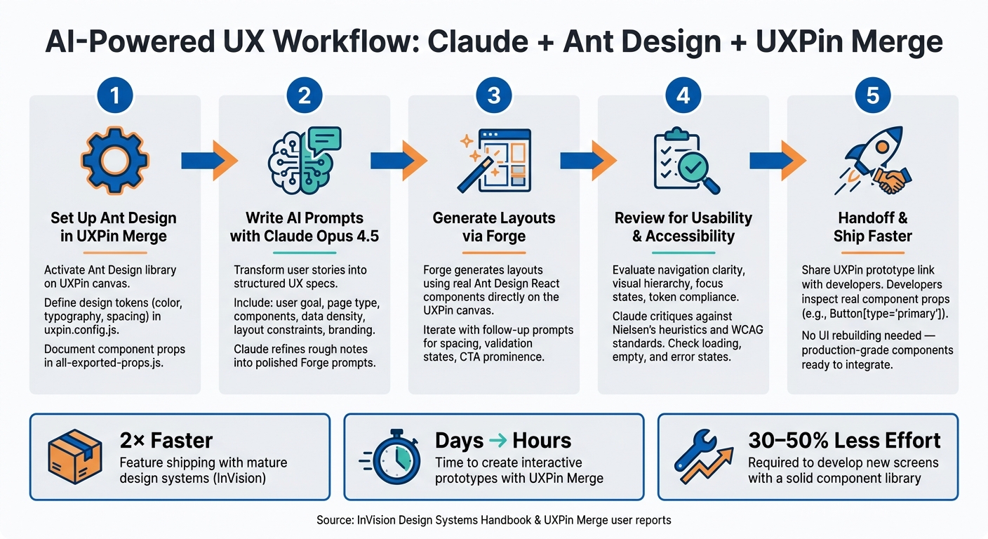
AI-Powered UX Workflow: Claude + Ant Design + UXPin Merge
UXPin Merge AI: Smarter UI Generation That Follows Your Design System
sbb-itb-f6354c6
Setting Up Ant Design and UXPin Merge
To kick off faster, AI-powered UX design, you’ll need to configure Ant Design within UXPin Merge. The good news? Ant Design is already built into UXPin Merge. There’s no need to install anything, create separate accounts, or subscribe to additional services – everything you need is available directly on the UXPin canvas.
How to Configure Ant Design in UXPin Merge
Inside UXPin, head to the component panel and activate Ant Design as your library. From there, you can drag and drop components like tables, forms, modals, and navigation menus straight onto your canvas. These aren’t just static visuals – they’re the same React components your developers use, complete with real props and customizable states.
If your team uses a Git-based workflow, you can go further by configuring the uxpin.config.js file. This file allows you to define custom styles, expose specific props, and adjust component behavior inside the editor. This approach is especially handy for aligning Ant Design components with your brand’s unique style before you dive into design.
Setting Up Design Tokens and Brand Foundations
Before designing your screens, it’s crucial to establish design tokens for elements like color, typography, and spacing. In UXPin Merge, these tokens are defined once and then applied across all components, ensuring consistency. Use the uxpin.config.js file as your go-to source for brand standards. Keep it updated as your design system evolves so that both designers and Forge work with the latest approved values.
Preparing Components for AI-Driven Workflows
This step is key to making your components AI-ready. For Forge to generate accurate layouts, your Ant Design components must be thoroughly documented at the prop level. Create an all-exported-props.js file in your integration repository to list each component’s attributes (like Avatar, Badge, Card, and Ribbon). This file acts as a guide for the AI, detailing exactly what each component can do.
Don’t overlook interaction states. Make sure hover, active, and disabled states are explicitly exported as props so Forge can create layouts that reflect real UI behavior. Additionally, locking down functional props like IconPosition or renderItem in the source code helps prevent issues with AI-generated layouts. Using consistent prop names will also improve the AI’s accuracy when configuring components.
With your components fully documented, you’re ready to dive into AI-driven UX design using tools like Claude Opus 4.5 and Forge.
Using Claude Opus 4.5 and Forge for AI-Driven UX Design
Claude Opus 4.5, with its ability to craft detailed prompts and structured UX specifications, pairs seamlessly with Forge to streamline UX design. Forge integrates directly into the UXPin canvas, allowing you to generate layouts right within the platform. It uses real Ant Design components from your library, eliminating the need for additional tools or copy-pasting.
How to Write Effective Prompts for Forge
The quality of Forge’s output depends heavily on the clarity and specificity of your prompts. A well-crafted prompt should address six key factors: the user goal, the type of page, the Ant Design components required, the desired data density, any layout constraints, and relevant branding or accessibility guidelines. Here’s an example:
"Create a responsive admin dashboard for customer support using Ant Design with a left navigation, KPI cards, a searchable table, filter drawer, and a detail panel. Use a compact enterprise style, 12-column layout, and prioritize desktop-first responsiveness."
This prompt provides Forge with enough detail to make informed decisions about the layout, component selection, and overall structure. When translating product requirements into prompts, focus on turning broad business objectives into actionable UI tasks. For instance, a goal like "reduce time spent on claim review" can be reframed as: "Generate a claims queue with status filters, bulk actions, validation states, and an inspector panel for details."
Don’t overlook token-level details such as spacing, colors, or border radii. Including these ensures the output aligns with your brand guidelines and minimizes the need for manual adjustments.
Claude Opus 4.5 plays a key role in refining prompts before they reach Forge. It helps transform rough notes into polished, clear instructions, identifies missing details, and even suggests edge cases worth considering – especially helpful when dealing with incomplete or ambiguous input from multiple stakeholders.
Once your prompts are ready, you can move on to refining the structure of your designs.
Generating Layouts and Refining Designs
The initial output from Forge serves as a foundation for your design’s information architecture. This includes defining sections, selecting components, and organizing them effectively. From there, you can refine the design through iterative prompts. For example, you might start with: "Create a 3-step customer onboarding flow using Ant Design Steps and Form components." Follow-up prompts could include: "widen spacing between form groups," "add inline validation error states," or "make the primary CTA more prominent on step 2." These incremental refinements bring the design closer to meeting the product’s needs.
Claude can also help explore alternative layouts. For instance, you could request: "Generate 3 layout options for this billing page and explain the trade-offs in scannability and error prevention for each." This approach provides your team with choices, fostering collaborative decision-making rather than settling for a single option.
Once the design feels complete, it’s time for a thorough review to ensure it meets production standards.
Reviewing AI-Generated Outputs
Before finalizing, evaluate the design for usability, accessibility, and adherence to Ant Design principles. Key areas to review include navigation clarity, visual hierarchy, focus states, and token compliance. Check elements like labels, empty states, loading states, form validation, and responsiveness. Ensure the layout aligns with Ant Design’s interaction patterns – for example, using a Drawer for editing instead of a full-page navigation shift. If the design introduces custom patterns that your development team can’t efficiently implement, it’s not ready for production.
Claude can assist in this review process by critiquing the design against usability principles and WCAG standards. Use it to identify areas for improvement before a human review begins, effectively adding an extra layer of quality assurance to your workflow.
Building UX Layouts with Ant Design Components
Once AI approval is secured, you can start assembling the layout in UXPin Merge using Ant Design components. This is where your design takes a step closer to being production-ready.
Designing Layout Structures
Ant Design’s Layout component serves as the foundation for creating enterprise-level screens. It consists of four main regions – Header, Sider, Content, and Footer – which can be combined to build standard app shells like dashboards, admin consoles, or back-office tools. Simply drag and drop these components onto the canvas and tweak their properties in the panel.
For example, a typical B2B dashboard might feature a fixed Header, a collapsible Sider between 240–280px wide for navigation, and a scrollable Content area. To further divide the Content, use the Row and Col components. Ant Design’s grid system is based on 24 columns, allowing you to set responsive spans for different breakpoints. For instance, you might configure Col span={16} for the main content and Col span={8} for a side panel on desktop, switching to Col span={24} for both on mobile. Adjust breakpoint props like xs, sm, md, lg, and xl directly in UXPin Merge to mimic responsive behavior, minimizing surprises when the layout transitions to production.
With these structural elements in place, you can move on to crafting data-rich interfaces and functional forms.
Building Data-Rich Interfaces and Forms
When designing dashboards or admin panels, Ant Design’s Table component is an excellent tool for managing complex interactions. It comes pre-equipped with features like sorting, filtering, pagination, row selection, and expandable rows. In UXPin Merge, you can map the columns and dataSource props to sample JSON data, enabling you to prototype realistic interactions like bulk actions, status filtering, or drill-down panels without writing custom code.
For data-heavy screens, consider organizing content in horizontal bands using stacked Row components. A common layout might include:
- A top
Rowwith fourCol span={6}KPI cards. - A middle
Rowfeaturing aCol span={16}table alongside aCol span={8}filter panel. - A bottom
Rowwith a full-widthCol span={24}for logs or timelines.
This banded structure keeps the hierarchy clear and ensures the layout remains easy to scan.
When it comes to forms, always wrap input fields with Ant Design’s Form component instead of placing them independently. The Form component handles validation, layout options (horizontal, vertical, or inline), and error messaging through Form.Item. This approach aligns perfectly with how developers implement forms in code. For multi-step workflows, combine Form with the Steps component and include a fixed action bar featuring buttons like Back, Save & Continue, and Cancel. Use UXPin to demonstrate various states – pristine, inline validation errors, and server-side errors – so stakeholders can see how the form behaves before development begins.
Once the structure and functionality are in place, it’s time to refine the design with tokens and interaction states.
Applying Tokens and Interaction States
Ant Design v5 introduced a token system that simplifies theming with seed tokens, map tokens, and semantic tokens. Core tokens like colorPrimary, borderRadius, fontSize, and controlHeight are interconnected, meaning that updating a single value can apply changes across your entire product. In a Merge-powered workflow, these tokens should come from the same source your developers use – either a shared design-tokens JSON file or an AntD theme file – ensuring seamless alignment between design and code.
To add interaction states, rely on Ant Design’s built-in props rather than creating custom overrides. For instance, you can toggle loading on a Button to display a spinner, set status="error" on a Form.Item to trigger validation styling, or use disabled on inputs to indicate locked states. In UXPin, you can bind these props to interaction triggers – for example, clicking a button might set loading={true} and then transition to a success Result component. This approach allows stakeholders to experience realistic feedback during reviews, providing clear and actionable specifications for developers.
Keeping Designs Consistent and Shipping Faster
AI-powered design tools and seamless prototyping are helping teams maintain consistency while speeding up delivery timelines.
Collaborating Across Product, Design, and Dev Teams
When everyone works from a shared interactive prototype built with real Ant Design components, misunderstandings drop significantly. Product managers can leave comments directly on these prototypes, while developers inspect component properties – like Button[type="primary"] or Form[layout="vertical"] – to ensure everything is feasible.
To keep everyone aligned, effective teams rely on structured collaboration. For example, a weekly AI + UX session brings together designers, product managers, and lead engineers to refine layouts generated by Forge. These sessions allow design ideas to be reviewed and aligned quickly. Additionally, pre-development kickoff reviews for each epic give the entire team a chance to walk through the prototype, confirm component usage, and address technical constraints early. This kind of collaboration streamlines the process and sets the stage for smooth handoffs between teams.
Cutting Handoff Friction
Real-time component integration takes the pain out of handoffs. Traditionally, developers had to rebuild the UI from static images, figuring out spacing, states, and interactions from scratch. With tools like UXPin Merge, which use production-grade components, developers no longer need to recreate designs, saving time and reducing errors.
The handoff process becomes straightforward: share the UXPin prototype link, agree on any non-standard API behavior, and integrate the production-ready components directly into the React code. This approach eliminates unnecessary steps and ensures smoother transitions.
Measuring Workflow Improvements and ROI
Integrated workflows like these can significantly boost efficiency. According to InVision’s Design Systems Handbook, organizations with mature design systems can ship new features up to 2× faster. Teams using UXPin Merge have also reported cutting the time to create interactive prototypes from days to just hours. Once a solid component library is in place, developing new screens often requires 30–50% less effort.
To measure success, track metrics such as the time it takes to go from project brief to a testable prototype, the cycle time from UX approval to the first working build, and the number of UI defect tickets per release. Monitoring these indicators over a few quarters can reveal where your workflow excels and where there’s room for improvement.
FAQs
What do I need to set up Ant Design in UXPin Merge?
To integrate Ant Design into UXPin Merge, you can use the built-in Ant Design library available directly in the component panel – there’s no need for manual imports. For custom libraries, the process involves connecting via Git and installing the antd package along with its CSS using UXPin’s npm integration. When working with custom components, make sure to use the Merge Component Manager, adhere to Ant Design’s naming conventions, and map properties based on the React props documentation.
How do I write prompts that help Forge create usable layouts?
To create effective prompts for Forge, focus on being specific and detailed. Clearly outline the UI structure, the hierarchy of components, and your styling preferences – things like colors, spacing, or alignment. For instance, you could request something like: "Build a responsive form using Ant Design’s Input, Select, and Button components, complete with validation rules."
When dealing with more complex layouts, it’s helpful to break them into smaller, manageable steps. Provide clear, step-by-step instructions to help the AI deliver accurate and production-ready components that meet your expectations.
How can I ensure tokens and states match production code?
To make sure your tokens and states align perfectly with production code when using UXPin Merge with Claude Opus 4.5 and Ant Design, follow these steps:
- Import Ant Design Components: Bring in production-ready Ant Design components directly into UXPin Merge to maintain consistency.
- Set Up Design Tokens: Configure key design tokens like colors, spacing, and typography in the
config.jsonfile for seamless design-to-code alignment. - Sync with Git: Regularly update your Git repository to ensure all changes are reflected and up to date.
- Leverage Prop Parsing: Use UXPin’s prop parsing feature to validate inputs and ensure components behave exactly as they do in production environments.
These steps help bridge the gap between design and development, ensuring your prototypes are as close to the final product as possible.

