

How to build a landing page using Claude Sonnet 4.5 + Custom Design Systems – Use UXPin Merge!
Start from your design system: use Claude Sonnet 4.5 for sectioned copy, assemble in UXPin Merge with code-backed components, then validate.
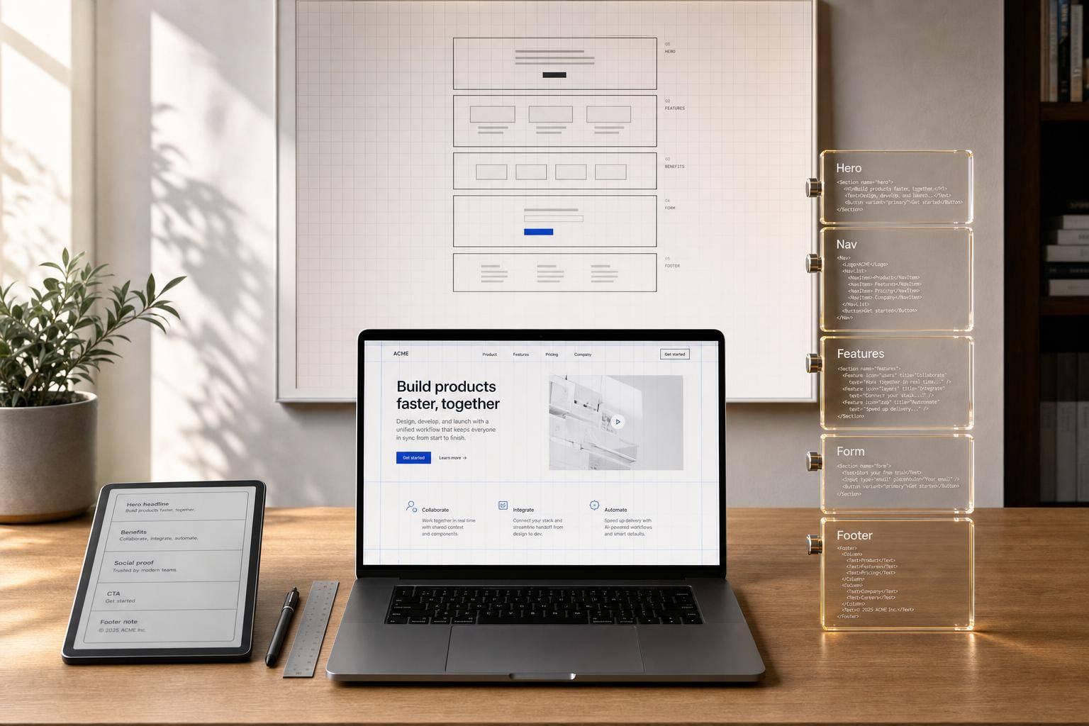
You can cut design-to-dev back-and-forth by writing the page with Claude Sonnet 4.5 and building it with code-backed components in UXPin Merge. Instead of starting with a static mockup, I’d start with a UI design system, generate section copy that fits component props, assemble the page from those parts, and then test the prototype before handoff.
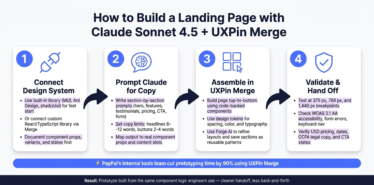
Here’s the whole flow in plain English:
- Connect your design system first
- Use a built-in library like MUI for a fast start
- Or connect your own React/TypeScript component library in Merge for a closer match to shipped UI
- Prompt Claude with structure
- Ask for a landing page outline with sections like hero, features, testimonials, pricing, CTA, and form
- Set copy limits like 6–12 words for headlines and 2–4 words for button labels
- Build with code-backed components
- Validate before handoff
- Test at 375 px, 768 px, and 1,440 px
- Check form errors, keyboard navigation, CTA states, pricing format, dates, and legal copy
- Use WCAG 2.1 AA as the baseline
A few numbers stand out. The article notes that PayPal’s internal tools team cut prototyping time by 90% with UXPin Merge. It also gives hard limits for copy so text fits UI without overflow.
If I had to boil it down, it’s this: Claude writes the structure and copy, UXPin Merge turns that into a prototype built from the same component logic engineers use, and the last step is QA.
| Step | What I’d do | Main outcome |
|---|---|---|
| 1 | Connect built-in or custom design system | Components and props are ready |
| 2 | Prompt Claude for section-based copy | Copy fits each UI slot |
| 3 | Assemble sections in Merge | Prototype matches component structure |
| 4 | Test layout, access, and content | Handoff is cleaner |
That’s the core idea of the article: start from the system, keep copy tied to components, and hand off a prototype that matches how the page will be built.
Claude Sonnet 4.5 + UXPin Merge: Landing Page Workflow
UXPin Merge AI: Smarter UI Generation That Follows Your Design System
sbb-itb-f6354c6
1. Set up UXPin Merge with your design system
Set up your design system in UXPin Merge before you prompt Claude Sonnet 4.5. This step shapes how close your prototype gets to the shipped product.
Choose a built-in library or connect a custom component system
UXPin gives you two setup paths.
The first is a built-in coded library like MUI, Ant Design, Bootstrap, or shadcn/ui. These are already inside UXPin, so you can move fast. This route works well for concept testing and early layout work.
The second is to connect your own React/TypeScript component library through Merge. Pick this when the landing page needs to match production UI exactly. When designers work with the same components engineers ship, the prototype stays in sync with the final UI.
Once your workspace is connected, you can map Claude’s output to actual component props.
Prepare components, tokens, and permissions before you start
If you’re using a custom system, you’ll need a Merge-enabled UXPin workspace, a hosted repository on GitHub, Bitbucket, or GitLab, and at least one developer or system owner with admin rights in both UXPin and the repo. Your component library should have a clean structure like /components, /tokens, and /themes, plus a stable build pipeline so Merge can pull updates without issues.
Before you begin, document each component’s props, variants, and states. That includes landing-page sections such as hero banners, feature grids, CTAs, testimonials, and forms. For example, a HeroSection might use props like title, subtitle, primaryCTA, backgroundImage, and themeVariant.
That prep work matters. It lets you map Claude Sonnet 4.5’s output straight to real component attributes. UXPin reads props from PropTypes, TypeScript interfaces, or Flow types, so clear prop definitions also make the editor easier for the design team to use.
Set governance before design work starts. In many U.S. enterprise teams, System Owners handle the Merge configuration, Component Maintainers manage updates through pull requests, and Design Leads can request new components but don’t change the codebase directly. Changes to high-impact components like hero, CTA, and pricing sections should go through pull request, approval, testing, and visual QA. Store the UXPin Auth token in CI variables, not in source-controlled files, and keep repo access read-only.
Built-in library vs. custom design system: a side-by-side comparison
| Aspect | Built-in library (e.g., MUI) | Custom system via Merge |
|---|---|---|
| Setup time | Minutes; enable and start immediately | Days to weeks for repo setup and integration |
| Branding control | Limited to library theme customization | Full alignment with your brand tokens |
| Production alignment | High (real, production-grade code) | Identical (your production code) |
| Maintenance | Managed by UXPin and library authors | Managed by your engineering team |
| Governance | Less restrictive; available to workspace editors | Git-based PRs, version control, role-based access |
| Best fit | Startups, MVPs, concept validation | Enterprise products, regulated industries |
If you need exact production parity, use Merge with your custom system, then prompt Claude against those components. After that, use Claude Sonnet 4.5 to generate the landing page structure and section copy.
2. Use Claude Sonnet 4.5 to generate landing page structure and copy
With your design system connected in UXPin Merge, you can turn a landing page brief into content that’s ready for each section. Claude Sonnet 4.5 works best when you give it tight, structured instructions that line up with your component slots. After you have the outline, trim each block so it fits the props in Merge.
Prompt for a section-by-section landing page outline
Start with a clear role and goal statement. Then add product context, required sections, and localization rules. A prompt that works well looks like this:
You are a senior UX copywriter specializing in SaaS landing pages for a U.S. audience. Based on the following product brief, create a section-by-section outline for a landing page, including: hero, feature grid, primary CTA, testimonials, pricing, and a demo request form. For each section, provide a short title, a 1–2 sentence description, and bullets where appropriate. Use en-US spelling and USD pricing (e.g., $29/month). Focus on clear, conversion-oriented messaging. State your main conversion goal right away, whether that’s Start your free 14-day trial, Book a live demo, or Subscribe from $29/month. You can also add social proof hooks like Trusted by 1,500+ U.S. product teams and risk reducers like Cancel anytime or No setup fees. Those patterns line up neatly with specific component slots in your design system.
Refine prompts so output fits reusable components
Component-specific prompts help you get copy you can paste straight into UXPin Merge.
For a 3-column feature grid, tell Claude exactly what each column should include: a featureTitle (max 6 words), a featureDescription (max 30 words), and one outcome-focused bullet (max 12 words, such as Cut handoff time by 40%). For testimonial cards, ask for three entries, each with a quote under 35 words, plus name, title, company, and an optional metric. For a demo request form, list the fields by name – fullName, workEmail, companySize, role, message – and ask for placeholder text and validation microcopy like Please use a valid work email.
Hero headlines should stay within 6–12 words. Subheadlines should land around 15–25 words. Button labels should fit in 2–4 words. These limits help you avoid text overflow in Merge components and cut down on cleanup later. It also helps to ask Claude for descriptions that still read well when stacked into a single mobile column. That can save you one more editing pass when you test breakpoints.
Generic prompts vs. component-aware prompts: a side-by-side comparison
The table below shows how more detail in the prompt changes the shape of each section.
| Section | Generic prompt output | Component-specific prompt output |
|---|---|---|
| Hero | Long paragraph mixing headline, body copy, and multiple CTAs | headline (9 words), subheadline (22 words), primaryCtaLabel (Start free trial), supportingText (1 line) |
| Feature grid | Narrative description of 5–6 features with no consistent format | 3 features, each with featureTitle (≤6 words), featureDescription (≤30 words), 1 outcome bullet |
| Testimonials | Narrative copy with no attribution structure | 3 cards: quote (≤35 words), name, title, company, optional metric |
| Primary CTA band | Multiple competing calls-to-action across two paragraphs | title (≤8 words), 1 supporting sentence, single primaryCtaLabel |
| Demo request form | Generic contact copy with no field-level detail | Field placeholders, form headline, button label, and validation messages per field |
Once the copy fits each component slot, you’re ready to assemble the page in Merge.
3. Assemble the landing page in UXPin Merge with code-backed components
Once Claude’s copy is mapped to sections, build the page in Merge using components that match production. With the page structure set, assemble each section right on the canvas.
Build hero, feature grid, testimonials, CTAs, and forms as reusable sections
Build the page from top to bottom on the canvas: hero, feature grid, testimonials, CTA strip, and form. Use your connected components for each part. Then map Claude’s output to component props and content slots. Put the headline into Typography, the main CTA text into Button, and feature descriptions into each Card content area.
Use design tokens for spacing, color, and type instead of hardcoded values. That keeps the prototype tied to your system and helps prevent drift.
Once a section is done, group it and save it as a reusable pattern. Later, you can bring back the same structure and swap only the content.
Use Forge inside UXPin to generate and refine layouts
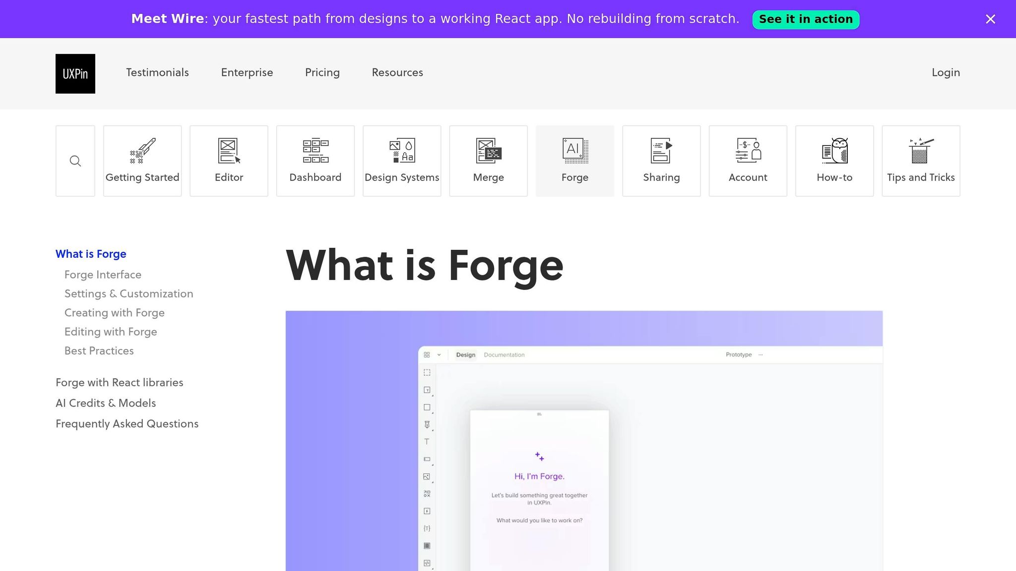
Forge is UXPin’s AI assistant inside the canvas. When you describe a layout, Forge builds it from approved components already available in the canvas.
Use Forge to fine-tune spacing, hierarchy, and component variants without breaking system rules. This is most useful in CTA strips and forms, where spacing and button placement can change conversion.
Component-driven prototyping vs. static mockup: a side-by-side comparison
The tradeoff is pretty clear:
| Dimension | Static mockup | Component-driven prototype in Merge |
|---|---|---|
| Reusability | Built as one-off screens | Sections can be saved and reused as patterns |
| Design-dev alignment | Engineers interpret static visuals | Components map to the underlying code structure |
| Speed to handoff | Needs a manual rebuild in code | Already aligned with production components |
| Risk of design drift | Higher as specs change | Lower because tokens and components stay in sync |
| Engineering handoff | Requires extra interpretation and translation | Shares the same component structure engineers will build |
The biggest difference is handoff quality. When design and code line up this early, the next step gets a lot easier.
Next, validate responsiveness, accessibility, and handoff details.
4. Validate the prototype and prepare it for handoff
Once the page is built in Merge, it’s time to pressure-test it before engineering picks it up. Start with the layout and interactions. Then move into content, accessibility, and handoff details.
Check responsiveness, interactions, accessibility, and content accuracy
Test the layout at 375 px, 768 px, and 1440 px to make sure the page reflows cleanly.
Then click through the primary and secondary CTAs, navigation links, and any other interactive controls. You want to confirm each state and behavior works the way it should. After that, tab through the page with a keyboard to check focus order and confirm focus indicators are visible.
For forms, try invalid or incomplete submissions. Error messages should be specific, easy to see, and tied to the right field. Use WCAG 2.1 AA as your baseline, and apply any ADA rules that fit your use case.
Content needs its own QA pass too, especially for U.S. details. A few things to check:
- Pricing should use the $ symbol before the amount, with a clear billing period like $49/month or $499/year
- Dates should follow MM/DD/YYYY or a spelled-out style like July 26, 2026
- Privacy and compliance copy, including CCPA language for California residents, should match your company’s approved U.S. templates
Use Claude Sonnet 4.5 to flag tone issues, spelling, CTA clarity, and U.S. locale mistakes in the final copy. Once the copy is clean, move from content QA into engineering handoff.
Share with engineering using component structure and system-aligned specs
Engineers can inspect variant names, props, and layout choices right inside UXPin. Review the prototype with them, call out custom configurations, and annotate any layout exceptions.
Also document spacing tokens, typography scales, and breakpoint rules in UXPin itself. That gives engineers a direct path to map those decisions to theme objects or CSS utilities in the codebase. It also helps keep the landing page tied to the design system, even if copy or layout shifts late in the process.
Final validation checklist and next steps
Use this checklist before review:
| Checkpoint | Owner | Pass criteria |
|---|---|---|
| Responsive layout at 375/768/1440 px | Designer | No clipped text, correct reflow per system docs |
| CTA, form, and interaction states | UX | Primary and secondary flows work; hover, focus, active, and disabled states confirmed |
| Accessibility: labels, errors, keyboard nav | UX / Engineering | WCAG 2.1 AA met; error messages specific and field-linked |
| USD pricing and billing period display | Product / Marketing | Follows $XX.XX format; matches current billing system |
| Legal and privacy copy | Legal / Product | Matches approved U.S. templates; CCPA language current |
| Date formatting | UX / Content | MM/DD/YYYY or spelled-out format used consistently |
| Component variants aligned with system | Designer / Engineering | No unauthorized variants; tokens used throughout |
| Claims, metrics, and testimonials verified | Marketing / Legal | Attributable, approved, and factually accurate |
The full workflow looks like this: use Claude Sonnet 4.5 to generate landing page content section by section, build in UXPin Merge with approved code-backed components, refine layouts and copy with Forge, and then run this checklist before handoff.
FAQs
Do I need a custom design system to use this workflow?
No. You can use this workflow without a custom design system by working with pre-integrated, production-ready libraries in UXPin Merge, such as MUI, Bootstrap, Ant Design, or shadcn/ui.
If your team has a proprietary design system, you can connect it through Git, Storybook, or npm so your prototypes stay aligned with production code.
How should I structure prompts so Claude’s copy fits my components?
Treat Claude like a UX writer working inside your design system. Give it a whitelist of approved components and tokens, and state plainly that it must not invent new UI patterns.
Map each piece of text to a named component prop. For each prop, set a character limit so the output fits the UI instead of spilling past it.
Ask for structured JSON that matches your component props exactly. Include a used_components array so you can check, at a glance, which approved components the draft uses.
A simple setup might look like this:
{ "used_components": ["hero_banner", "cta_button", "feature_card"], "hero_banner": { "eyebrow": "", "headline": "", "body": "" }, "cta_button": { "label": "" }, "feature_card": [ { "title": "", "description": "" } ] } Be explicit about limits at the prompt level, like:
hero_banner.eyebrow: 30 characters maxhero_banner.headline: 60 characters maxhero_banner.body: 140 characters maxcta_button.label: 24 characters maxfeature_card.title: 40 characters maxfeature_card.description: 100 characters max
Also tell Claude to use only the listed components, props, and tokens. No extra fields. No made-up patterns. No side comments outside the JSON.
What should I validate before handing the prototype to engineering?
Before you hand a prototype to engineering, check both the structure and the function so the handoff goes smoothly. Make sure components match the production library, use design tokens instead of hard-coded values, and review state changes like hover, active, disabled, loading, and error.
You’ll also want to check accessibility against WCAG 2.1 AA and U.S. requirements. That includes color contrast, keyboard navigation, and screen reader support.
Then review U.S. localization details:
- Currency: $1,234.56
- Dates: MM/DD/YYYY
- Numbers and spelling: use U.S. conventions
Finally, use Spec Mode to inspect the final JSX and CSS details.
Related Blog Posts
- How to build a landing page using Claude Opus 4.5 + Custom Design Systems – Use UXPin Merge!
- How to build a landing page using Claude Sonnet 4.5 + shadcn/ui – Use UXPin Merge!
- How to build a landing page using Claude Sonnet 4.5 + Ant Design – Use UXPin Merge!
- How to build a landing page using Claude Sonnet 4.5 + Bootstrap – Use UXPin Merge!