
How to build a landing page using Claude Sonnet 4.5 + Ant Design – Use UXPin Merge!
Plan and build a production-ready landing page with AI-driven outlines, Ant Design React components, and UXPin Merge prototypes.
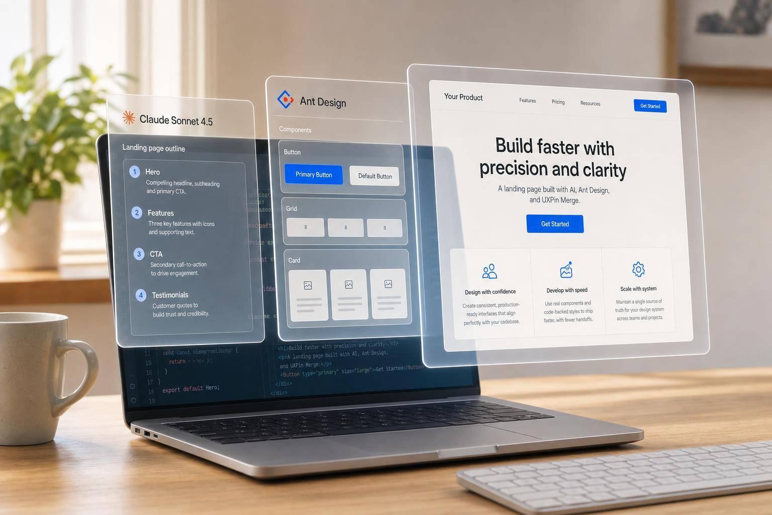
If I want to build a landing page with less back-and-forth, I can split the job into 3 parts: Claude Sonnet 4.5 plans the page, Ant Design provides the React components, and UXPin Merge lets me place those code-backed parts into a prototype.
In this workflow, I’m not starting from a blank mockup. I’m starting with a page outline, section copy, CTA labels, a component map, and a build checklist. The article walks through a landing page with 7 sections: hero, feature cards, social proof, pricing, signup form, navigation, and footer.
Here’s the short version:
- Claude Sonnet 4.5: I use it to outline sections, draft copy, format pricing like $29/month, and map each section to Ant Design components.
- Ant Design: I use it for React UI parts like Button, Card, Form, Input, Layout, and Menu.
- UXPin Merge: I use it to assemble those parts on canvas with actual props, spacing, and behavior.
- Build setup: The page uses a 12-column grid, 24 px gutters, and breakpoints at 375 px, 768 px, 1,024 px, and 1,440 px.
- Review step: I test anchors, CTA actions, form states, spacing, and breakpoint behavior before handoff.
What stands out is the smooth design handoff angle. The article argues that when the prototype uses the same component set engineers use, teams spend less time redoing layouts, states, and props.
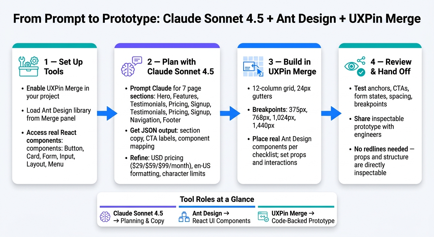
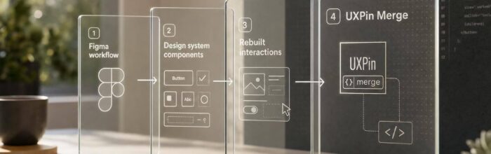
From Prompt to Prototype: Claude + Ant Design + UXPin Merge Workflow
Design Using Your Favorite React UI Libraries
sbb-itb-f6354c6
Quick comparison
| Tool | What I use it for | Output |
|---|---|---|
| Claude Sonnet 4.5 | Page outline, copy, CTA labels, component mapping | JSON plan and component checklist |
| Ant Design | UI building blocks | React components like Button, Card, Form, Menu |
| UXPin Merge | Page assembly and interaction setup | Code-backed prototype |
In short: this article shows me how to go from prompt to prototype in a step-by-step way, using AI for planning, Ant Design for UI parts, and UXPin Merge for the actual page build using code components.
Step 1: Set up UXPin Merge and Ant Design
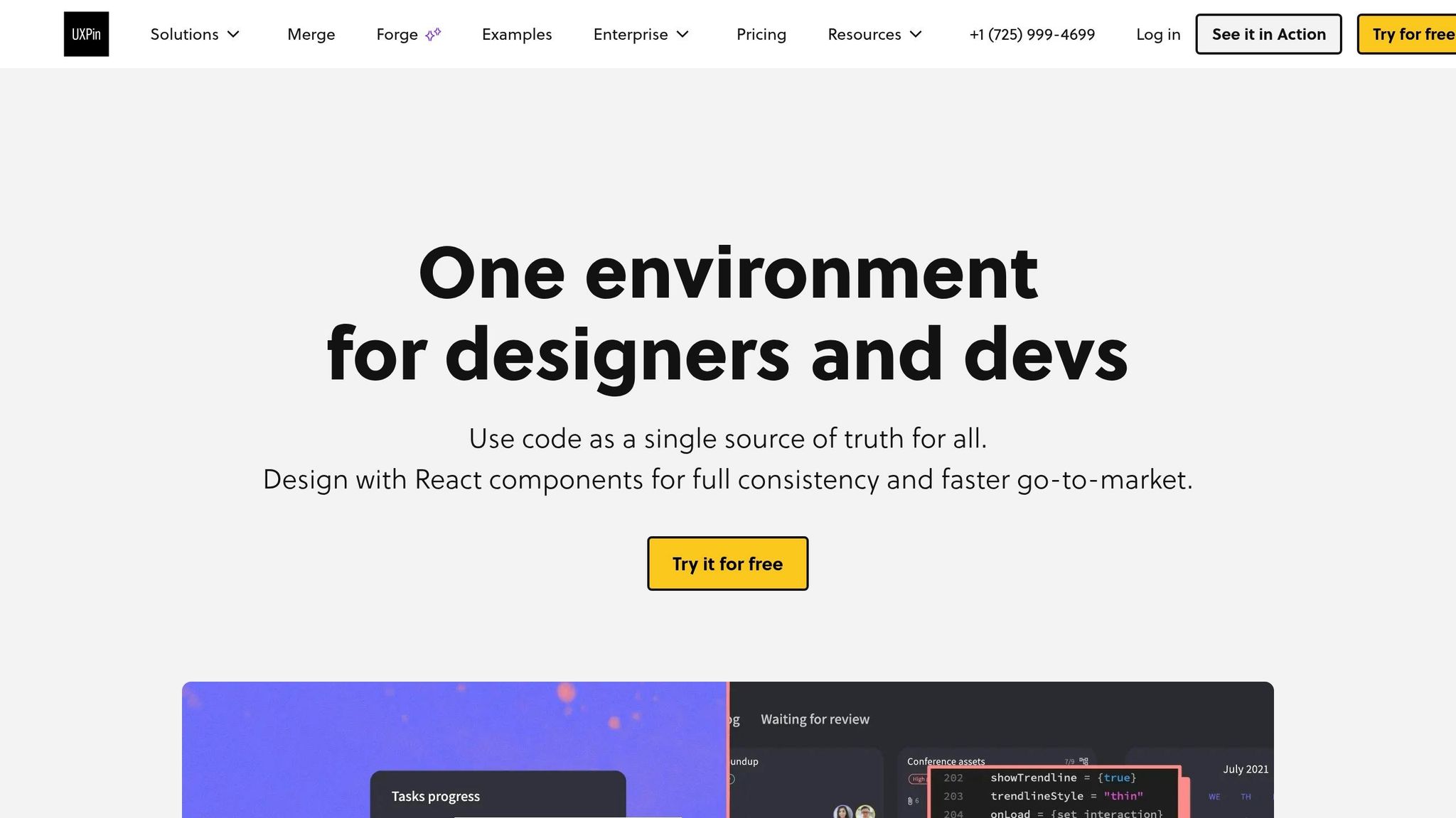
Start by setting up UXPin Merge and Ant Design. Open a UXPin project with Merge enabled, then load the built-in Ant Design library from the Merge panel.
Use Ant Design directly inside UXPin
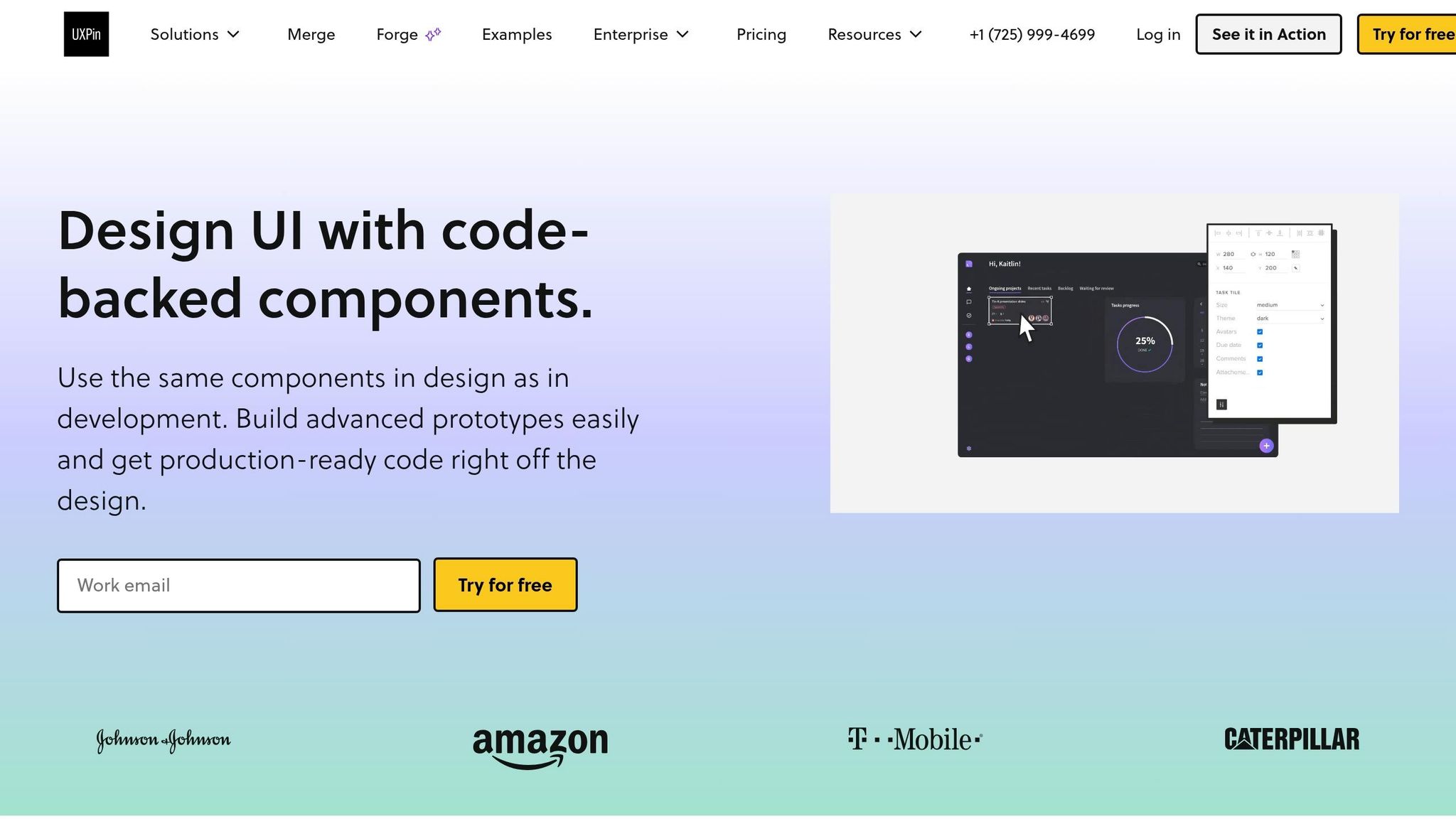
UXPin comes with Ant Design built in. Open a new or existing project, choose Ant Design from the libraries in the Merge panel, and drag components onto the canvas.
You’ll get components like Button, Input, Form, Card, Layout, Menu, and Typography. These are real React components, not static mockups. You can edit props and states, then adjust things like size, variant, or color in the Properties Panel. Those changes connect back to the code behind the component. Merge helps keep imported components in line with production behavior, interactions, and data handling.
Once Ant Design is loaded, you can turn Claude’s page plan into actual components in the next step.
When to connect a custom Ant Design-based library
For most landing page work, the built-in library is enough. But if your team uses a themed Ant Design system with custom tokens or its own component logic, connect that React library through Merge instead.
That way, your prototype components stay in sync with the code your team already uses. After you connect it, UXPin can document the library in the Design System area, so designers can browse components, review props, and check usage notes without leaving the tool.
For this guide, stick with the built-in library, then move to Step 2 to map Claude’s output to components. After that, use Claude Sonnet 4.5 to define the landing page structure and component map.
Step 2: Use Claude Sonnet 4.5 to plan the landing page
With Ant Design in place, use Claude Sonnet 4.5 to shape your goals into a landing page outline, copy, and a component map for UXPin Merge. At this stage, you’re turning the setup into a page plan you can actually build from.
Prompt Claude for sections, copy, and component mapping
Give Claude a prompt that spells out the page goal, the sections you need, and the Ant Design components it should use. The output becomes your build spec for UXPin Merge.
"Act as a UX designer working with Ant Design and UXPin Merge for a SaaS analytics product. Context: We’re building a single-page marketing landing page for U.S. business customers. The goal is to drive free trial sign-ups. Task:
- Propose a landing page structure with these sections: hero, feature grid, testimonials, pricing, contact form, footer.
- For each section, provide: an
idname, 1 headline or section title, 1–2 short body copy paragraphs (max ~160 characters each), and 1–2 CTA button labels (max 24 characters).- Map every part of each section to Ant Design components from this set:
Layout,Row,Col,Typography,Button,Card,Form,Input,Menu. Format: Return JSON with one object per section containingsectionId,sectionTitle,copy,primaryCTA,secondaryCTA(optional),antdComponents(array), and layout notes."
That prompt does two jobs at once. It gives you page copy, and it tells you which UI parts to use. So instead of staring at a blank canvas in UXPin Merge, you start with a draft that already has structure.
Example hero output:
- Headline: "Turn your sales data into clear insights"
- Subcopy: "Connect your CRM and see real-time pipeline metrics in one dashboard."
- Primary CTA: "Start free trial" | Secondary CTA: "Book a demo"
- Components:
Layout,Row,Col,Typography.Title,Typography.Paragraph,Button
Refine the output for en-US formatting and production use
Then run a second prompt to tighten the copy so it fits the layout and follows U.S. formatting rules.
"Refine all text to fit the specified character limits, use en-US formatting throughout, price plans in USD (e.g., $29/month, $59/month, $99/month), format any dates as MM/DD/YYYY, and remove generic marketing phrases. Return only the updated copy and component mapping."
This pass helps clean things up before you build. It keeps pricing in USD, trims lines that might wrap awkwardly, and makes labels easier to use in a live UI.
Use USD pricing such as $29/month, $59/month, and $99/month, and keep form labels short:
- Name
- Work Email
- Company
- Preferred demo date (MM/DD/YYYY)
Turn Claude output into a component checklist
Next, turn Claude’s response into a componentsChecklist array so building in UXPin Merge goes faster. Ask Claude to return each item with the sectionId, componentName, its role on the page, recommendedProps, and a short interaction note.
Example checklist item:
Button→ role: "Hero primary CTA" → props:type: "primary", size: "large"→ interaction: "onClick scroll to #pricing"
This is the part that saves time. You’re no longer just working from copy or a rough wireframe. You now have a section-by-section parts list tied to purpose and behavior.
Before moving into Step 3, check Claude’s component names against your Ant Design library so the spec matches what you can build in UXPin Merge.
Step 3: Build the landing page in UXPin Merge with Ant Design components
Open your UXPin project and start placing real Ant Design components on the canvas. The goal here is simple: take Claude’s outline and turn it into a working page, one section at a time. Follow the checklist so you can place each component in UXPin without changing the structure halfway through.
Build each section with Ant Design components
Start with layout first. Don’t worry about polish yet. Drop a Layout component onto the canvas for each section, then place Row and Col inside it to set up the grid. Use a 12-column grid with 24 px gutters on a 1,440 px desktop canvas, then adjust it for 375 px, 768 px, 1,024 px, and 1,440 px breakpoints.
Each component below comes straight from Claude’s plan and should be added as a real Ant Design element in UXPin:
- Hero: Use
Typography.Titlefor the headline,Typography.TextorParagraphfor short subcopy, and two buttons: a primary CTA likeStart Free Trialand a secondarySchedule Demo. - Features: Use
Cardcomponents inside a three-columnRowon desktop. Each card can useCard.Metafor the title and short description. If Claude’s outline calls for a feature list instead, useListwithList.Item.Meta. - Testimonials: Combine
CardwithAvatarfor the customer image or initials,Typography.Textfor the name and role, andParagraphfor the testimonial text. - Pricing: Use three
Colelements, each with aCard. AddTypography.Titlefor the price,Tagfor labels likeMost PopularorBest Value, and set the recommended plan’s button totype="primary"while the others staytype="default". - Signup: Add a
Formwithlayout="vertical", then wrap each field inForm.Item. UseInputfor Name, Work Email, and Company, plus aSelectfor Team Size with options like1–10,11–50,51–200, and200+. Add aCheckboxfor terms consent and a primaryButtonto submit. - Navigation and footer: Place
MenuinLayout.Headerand link eachMenu.Itemto its section. Build the footer insideLayout.Footerwith footer links.
Set props, styles, and interactions in UXPin
Set Ant Design props in UXPin the same way you would in code. That means using the exact props your build would use later. For example, set Button props like type="primary" and size="large". Set Typography.Title level to 1 for the hero headline and 2–3 for section headings. Use Row gutter to control spacing between columns, and set justify and align to match Ant Design’s responsive layout behavior.
Here’s a useful rule of thumb: avoid custom styles that override Ant Design defaults unless your design system says otherwise. If you stay close to Ant Design’s default behavior, the prototype will map to production code with less CSS cleanup later. That saves time and cuts back on back-and-forth with engineering.
For interactions, use UXPin’s built-in events right on the components. Connect the hero Button‘s onClick to scroll or jump to the #signup section. Link each Menu.Item to its anchor. On submit, show a loading state, then display a Result or Alert with confirmation copy. You can also toggle Form.Item error states to mimic validation when required fields are left blank.
Static mockups vs. Merge-based landing pages: a comparison
The gap between a static mockup and a Merge-based prototype shows up fast the moment someone clicks around. One looks finished. The other acts finished. That difference matters a lot for product and engineering teams.
| Aspect | Static Design-Only Mockups | UXPin Merge + Ant Design |
|---|---|---|
| Visual Fidelity | High, but not guaranteed to match production components exactly | High, using real Ant Design components identical to production |
| Interaction Realism | Limited; interactions are annotated, not experienced | Full; clicks, navigation, and form states behave like production UI |
| Design-System Compliance | Depends on designer discipline; easy to drift from system tokens | Strong; code-backed library enforces design-system rules automatically |
| Developer Rework | High; devs must translate visuals into components and resolve mismatches | Low; devs reuse component choices, props, and layout patterns directly |
| Handoff Effort | Heavy reliance on redlines, documentation, and clarification meetings | Reduced; prototype doubles as a living spec with inspectable props |
Once the page matches the checklist, it’s ready for review and handoff.
Step 4: Review, hand off, and keep design and development aligned
Once the page is assembled, the next move is to make sure it works the way it should before handoff.
Validate the prototype and share it with stakeholders
Review the full page in preview mode before you share it. Test the navigation links. Make sure the primary CTA stands out. Check that form fields respond the right way, card layouts and spacing stay in place, and the page works well across breakpoints. Since the page uses real Ant Design components, reviewers are looking at the same system engineers will ship.
Use the section IDs, component names, and props from Steps 2 and 3 as a review checklist. It helps to check content hierarchy, CTA priority, and form behavior as separate passes. Tag teammates directly on components with comments. That keeps feedback tied to the actual component instead of a screenshot, which makes revisions faster and cuts down on inconsistencies.
Once the page passes review, package the component list and prop notes for engineering.
Traditional handoff vs. Merge-based handoff: a comparison
After the preview pass, capture only the implementation details engineers need. Merge-based handoff gives engineers inspectable components, props, and structure. They can inspect the component structure and reference the exact Ant Design elements used, with no redlines to decode.
Key takeaways for faster, cleaner landing page delivery
Claude defines the plan, Ant Design supplies the components, and UXPin Merge turns both into an implementation-ready prototype. That cuts rework and keeps design aligned with code.
FAQs
How much of the page can Claude plan for me?
Claude can map out your entire landing page, from the page structure to the copy and component choices. If you share your design system inventory, it can put together a section-by-section brief that lines up with your Ant Design components.
It can also write headlines, subheadlines, benefit-driven copy, and CTA labels that fit your layout limits. That helps keep the page implementation-ready before you build it in UXPin Merge.
When should I use a custom Ant Design library in Merge?
Use a custom Ant Design library in Merge only if you’re working with a modified or proprietary version that’s different from the standard Ant Design package.
For standard use, you don’t need to import anything manually because UXPin already includes a built-in Ant Design library.
You can also use a custom npm import if you need to match a specific version or add custom settings that aren’t included in the default library.
What should I test before handing off the landing page?
Before handoff, review the page in Preview Mode to make sure it works the way it should on both desktop and mobile.
Test the main interaction points, including:
- Navigation links
- Calls to action
- Form validation
- Keyboard tab order
- Hover, active, error, and success states
Then check the layout at 375 px, 768 px, 1,024 px, and 1,440 px.
At each breakpoint, confirm that:
- Headlines stay above the fold
- Cards stack cleanly without horizontal scrolling
- Text contrast meets accessibility rules
- Tap targets are at least 44×44 px
This step helps catch small issues before they turn into big ones after launch.
Related Blog Posts
- How to prototype using Claude Sonnet 4.5 + Ant Design – Use UXPin Merge!
- How to build UI using Claude Sonnet 4.5 + shadcn/ui – Use UXPin Merge!
- How to build UI using Claude Sonnet 4.5 + Ant Design – Use UXPin Merge!
- How to build a landing page using Claude Opus 4.5 + Custom Design Systems – Use UXPin Merge!