Want to create UX designs that developers can use right away? Combining Claude Sonnet 4.5 with UXPin Merge lets you turn ideas into production-ready prototypes faster and with fewer errors.
- Claude Sonnet 4.5: An AI tool that processes design system rules, generates layouts, and drafts microcopy based on your input.
- UXPin Merge: A design tool that uses real React components, ensuring designs match the code developers use.
Together, they eliminate rework, improve consistency, and simplify collaboration between designers and developers.
Key Steps:
- Use Claude Sonnet 4.5 to generate layouts and UX ideas based on your design system.
- Build these layouts in UXPin Merge using real components from your codebase.
- Test, refine, and hand off prototypes that developers can directly implement.
This workflow reduces design-to-development time, ensures alignment with your design system, and keeps your team focused on delivering polished, functional user experiences.
UXPin Merge AI: Smarter UI Generation That Follows Your Design System
sbb-itb-f6354c6
How Claude Sonnet 4.5 Supports UX Design
Claude Sonnet 4.5 doesn’t create wireframes, but it tackles design challenges with clear, structured reasoning. This makes it a helpful partner in workflows that rely on components. It’s especially useful for turning vague product requirements into detailed, component-driven layout plans.
What Claude Sonnet 4.5 Can Do for UX Teams
Claude’s standout ability is processing large amounts of contextual information at once. You can provide it with a product requirements document, a component catalog, and brand guidelines in a single session. With all these inputs, it can analyze and connect the dots effectively. For instance, it can take a user story like, "As a sales rep, I want to filter my pipeline by deal stage", and generate a screen layout using your actual components – such as FilterBar, DataTable, and StatusBadge – complete with their properties.
It’s also great at generating multiple layout options in record time. Instead of spending hours sketching out different dashboard ideas, you can ask Claude to propose several component-based layouts and explain the tradeoffs of each approach – all in less than a minute. In fact, a 2023 Nielsen Norman Group study found that designers using large language model (LLM) tools saved 23–46% of their time on tasks like UX writing, brainstorming, and documentation.
Beyond layouts, Claude is adept at handling text-heavy elements like error messages, tooltips, onboarding instructions, and form validations – tasks that often slow teams down. By specifying parameters like character limits, tone, and the relevant component, you can quickly produce copy that aligns perfectly with your design system.
This structured approach not only streamlines layout creation but also ensures that your design system is consistently followed, making it easier to maintain uniformity across projects.
Keeping Claude’s Output Within Your Design System
One challenge with using AI in design workflows is the risk of "drift", where the AI might create patterns that don’t exist in your system. This can lead to designs that developers can’t implement. Claude minimizes this risk by sticking closely to defined constraints.
To ensure consistency, start by providing a clear list of components and examples. Use the exact names from your codebase or UXPin Merge library, and include instructions like: "Only use components from this list. If something isn’t possible with the current components, describe the limitation instead of inventing a new pattern." Including an example component tree can further guide Claude to apply the correct patterns every time.
If Claude does stray – such as suggesting a non-existent "floating panel" – you can correct it by specifying: "Replace ‘floating panel’ with our Modal component." This feedback helps refine its outputs over time. Your team can even develop a reusable prompt template that encodes these rules, ensuring every designer starts with the same system-aware guidelines. This level of precision is especially important when working with tools like UXPin Merge to create production-ready prototypes.
How to Set Up UXPin Merge with Your Design System
Getting UXPin Merge configured properly is critical to ensure designers and developers stay on the same page. The ultimate goal? Make sure designers work with the exact components developers will ship.
Connecting Your Component Library to UXPin Merge
You can integrate your React library into UXPin Merge using Git-based control, Storybook, or NPM (available on certain plans). Popular libraries like MUI, Ant Design, Bootstrap, and ShadCN are already pre-integrated. However, custom libraries will need manual setup.
Once integrated, all your component’s props, variants, and states become accessible through UXPin’s properties panel. For example, a designer can easily switch a button’s state from variant="primary" to variant="ghost" – just as a developer would – without writing a single line of code.
Setting Up Design Tokens and UI Patterns
Design tokens are the foundation of consistency. Instead of using hard-coded values, reference core tokens like color-brand-primary. Organize tokens hierarchically, starting with foundational tokens and moving to semantic ones, to maintain consistency across your system. Connect your token source – whether it’s a tokens.json file, CSS variables, or output from a Style Dictionary – directly to your component theme. This ensures that any updates to tokens automatically flow into your prototypes.
In addition to tokens, create a library of UI patterns in UXPin. These are pre-assembled layouts like login forms, filter bars, dashboards, or empty states, built using your Merge components. These patterns give designers a head start and ensure every screen aligns with your design system.
With tokens and patterns in place, your team can prototype efficiently while maintaining consistency.
UXPin Merge Setup Checklist
Before diving into design work or using tools like Claude Sonnet 4.5 for layout ideas, ensure Merge is fully configured. Assign a design system owner to oversee synchronization between design and development. Running a pilot test on three key screens – a form, a dashboard, and a modal – can help identify and resolve any gaps before scaling up.
| Setup Step | What to Verify |
|---|---|
| Component library connected | All core components display correctly on the UXPin canvas |
| Props and variants visible | Designers can adjust states without needing to code |
| Design tokens mapped | Colors, typography, and spacing tokens are linked to component styles |
| Accessibility states defined | Focus, disabled, and error states are available for each component |
| UI patterns documented | Reusable templates (e.g., forms, dashboards, modals) are saved in UXPin |
| Naming conventions aligned | Component and prop names match the codebase exactly |
| Version policy established | Both design and dev teams are using the same library version |
| Access permissions set | Roles and permissions are configured for design and engineering teams |
How to Use Claude Sonnet 4.5 with UXPin Merge
Once Merge is set up and your component library is linked, Claude becomes your brainstorming partner, generating the blueprint while Merge creates the production-ready prototype. Here’s how to write precise prompts and turn Claude’s layouts into functional prototypes.
Writing Prompts That Align with Your Design System
Avoid vague prompts like "Design a dashboard for our SaaS app." These often lead to generic layouts and mismatched components. Instead, focus on prompts that adhere strictly to your design tokens and component names.
The key? Be specific and structured. A strong prompt includes four essential parts:
- Context: Define the product, platform, and user goal.
- Components: Specify exact component names from your Merge library.
- Token Rules: Clarify rules for actions, spacing, and typography.
- Output Format: Request a detailed component hierarchy.
Here’s an example of a tailored prompt for a B2B analytics dashboard:
"You are a senior UX designer working with our enterprise design system in React, available in UXPin Merge. Use only these components:
AppShell,TopNav,SideNav,Tabs,FilterBar,Card,Table,Pagination, andModal. Primary actions useButton[variant=primary]; destructive actions useButton[variant=danger]. Propose 2 alternative layouts described as component hierarchies I can build in UXPin Merge. No new component types. Keep filters above the data table."
It’s equally important to include negative instructions. For example, telling Claude "do not introduce carousels, steppers, or accordions – they are not in our system" ensures the suggestions stay within your design system. Over time, you can save these prompts as templates for recurring tasks like onboarding flows, search pages, or settings screens.
Converting AI Layouts into Merge Prototypes
Once you’ve crafted a strong prompt, follow these steps to bring Claude’s layouts to life in UXPin Merge:
- Review and normalize: Double-check that each component Claude used exists in your library. This avoids unnecessary rework later.
- Build the hierarchy in UXPin: Start a new prototype and drag-and-drop components from the library to match Claude’s structure. Use the properties panel to apply props as specified (e.g.,
Button[variant="primary", size="md"]). - Wire the interactions: Use UXPin’s interaction panel to set up flows based on Claude’s recommendations. For instance, if Claude suggests "on
PrimaryButtonclick, navigate to the confirmation modal," configure this directly in UXPin – no coding required. - Iterate with Claude: If something doesn’t feel right during testing, describe the issue to Claude and ask for "improvements using only the existing components and tokens." Apply the updated suggestions and preview the prototype again.
This process – prompt → hierarchy → Merge prototype → review → refine – keeps every iteration tied to your component library, ensuring developers don’t need to rebuild elements from scratch. By sticking to this workflow, you maintain consistency and save time.
Reviewing, Refining, and Handing Off to Development
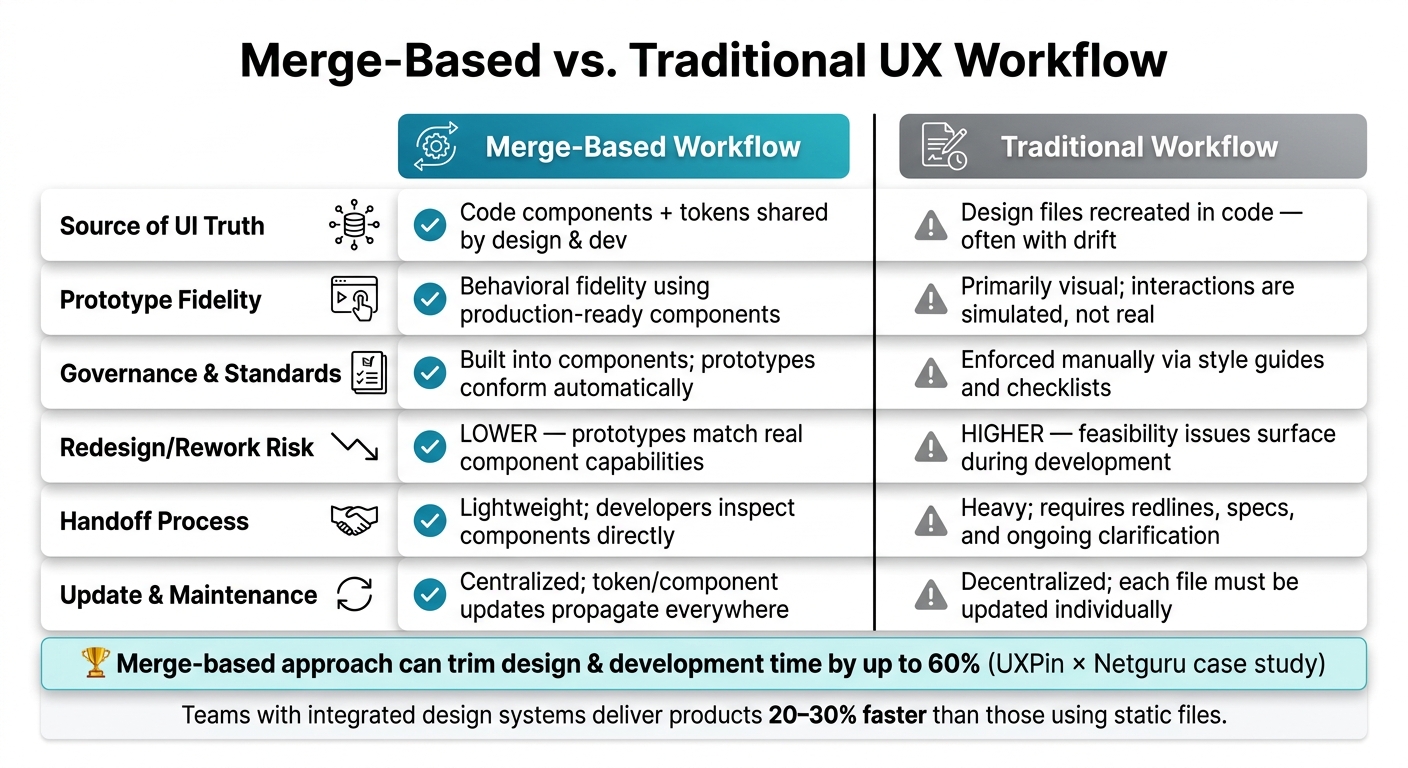
Merge-Based vs. Traditional UX Workflow: Key Differences
Once your Merge prototype is complete, the next step is to ensure it’s ready for action – not just in appearance but also in structure and functionality. This stage can either save your team valuable time or lead to unnecessary delays.
Checking Prototypes Against Your Design Standards
To ensure your prototype meets expectations, focus on four key areas: component usage, token compliance, accessibility, and governance compliance.
Start with a component audit. Make sure only approved Merge components are in use. Then, check that design tokens are applied properly. For instance, colors should reference tokens like color-primary-600 instead of hardcoded hex values, and spacing should use tokens such as space-16 rather than manual pixel adjustments. Catching any deviations from the token system at this stage prevents issues during development.
For accessibility, confirm that color contrast ratios meet WCAG standards (4.5:1 for body text), focus states are visible, and interactive elements have sufficient hit areas. Finally, perform a governance check. This is particularly important for US-specific formatting – dates should follow the MM/DD/YYYY format, currency should appear as $1,234.56, and numbers should use commas for thousands and periods for decimals. If your prototype includes sample data like tables, forms, or charts, ensure these conventions are applied correctly before passing it along to developers.
To streamline this process, assign clear roles. Design operations can manage the checklist, designers can perform self-reviews, and the design system lead can provide final approval. This shared responsibility ensures efficiency and avoids unnecessary bottlenecks.
Once your prototype is up to standard, it’s worth considering how this workflow compares to high-fidelity vs. low-fidelity prototyping methods.
Merge Workflows vs. Traditional Methods: A Comparison
Here’s how a Merge-based workflow stacks up against traditional processes:
| Factor | Merge-Based Workflow | Traditional Workflow |
|---|---|---|
| Source of UI truth | Code components + tokens shared by design and dev | Design files that devs recreate in code, often with drift |
| Prototype fidelity | Behavioral fidelity using production-ready components | Primarily visual; interactions are simulated, not real |
| Governance & standards | Built into components; prototypes conform automatically | Enforced manually via style guides and checklists |
| Redesign/rework risk | Lower; prototypes match real component capabilities | Higher; feasibility issues surface during development |
| Handoff process | Lightweight; developers inspect components directly | Heavy; requires redlines, specs, and ongoing clarification |
| Update & maintenance | Centralized; token or component updates propagate everywhere | Decentralized; each file must be updated individually |
A UXPin case study with Netguru found that using a code-component approach trimmed product design and development time by up to 60%. This was largely due to reduced rework and a smoother handoff process. Research also shows that teams with advanced design systems – where components are shared between design and code – can deliver products 20–30% faster than those relying on static design files.
This unified approach not only speeds up the design-to-development process but also ensures that prototypes reflect real-world functionality.
Handing Off to Developers with Real Code Components
With Merge, the handoff process becomes far more straightforward. The prototype itself serves as the specification, allowing developers to inspect interactive components, props, and states directly – no need for redlines or detailed annotations.
If your library is integrated with tools like Git or Storybook, developers can easily access component documentation without disrupting their workflow. Instead of converting static designs into code, they simply confirm that the implementation matches what’s already assembled in Merge.
To make the handoff seamless, include behavior notes directly in the prototype for any complex interactions, such as table sorting rules, form validation timing, or error and empty states. Annotate screens that rely on specific APIs or feature flags. These notes eliminate the back-and-forth that can follow a handoff and prevent developers from making assumptions that lead to rework. The goal is a single, comprehensive handoff: a prototype link and any relevant API notes – no endless clarification cycles needed.
Conclusion: Faster UX Delivery with Claude Sonnet 4.5 and UXPin Merge
The advantages of combining Claude Sonnet 4.5 with UXPin Merge are straightforward: AI-driven creativity paired with production-ready components transforms the speed and quality of UX workflows. Claude Sonnet 4.5 accelerates ideation – handling tasks like user flows, layout variations, edge cases, and component suggestions – while UXPin Merge ensures that everything aligns seamlessly with your existing codebase. Together, they shrink the design-to-prototype process from weeks to mere days.
This pairing also ensures consistency. By working directly with your design system and using only approved components and tokens, the results are clean and production-ready. No more mismatched screens, random color values, or unapproved patterns that developers need to rework. In fact, McKinsey research highlights that teams with integrated design and engineering workflows can achieve up to 50% faster time-to-market, while also cutting down on design debt.
A key benefit of this approach is the reduction in handoff delays. When prototypes are built with real code components, developers can focus on confirming and implementing the designs instead of deciphering them. This eliminates much of the back-and-forth that often slows down projects.
To make the most of this workflow, start by connecting your component library, crafting precise design prompts, and tracking key metrics like time-to-prototype, the number of design-development revisions, and UI-related defects. These metrics will show exactly where the process is working and where it might need adjustments.
FAQs
What inputs should I give Claude so it only uses our real components and tokens?
To make sure Claude incorporates your design components and tokens effectively, you should upload your design token JSON files, CSS variables, and component documentation directly within the prompt. Use structured XML tags like <tokens> and <requirements> to organize your input clearly.
For example:
- Name components explicitly: Provide clear names for each component (e.g.,
PrimaryButton,CardComponent) and detail how their UI properties map to tokens (e.g.,PrimaryButtonusesaction-color-backgroundfor its background color andheading-fontfor its typography). - Include constraints: Specify any limitations, like adhering to a specific typography scale or color palette. For instance, you might state that all text must use the
Robotofont family and colors must be chosen from a predefined palette. - Reference codebase files: To ensure consistency, instruct Claude to refer to existing files in your codebase, such as
theme.cssortokens.json. This will help maintain alignment with your current design system.
By organizing your input this way, you can provide Claude with everything needed to generate outputs that are aligned with your design system. Here’s an example structure:
<tokens> { "colors": { "primary": "#0052cc", "secondary": "#172b4d", "background": "#f4f5f7" }, "typography": { "font-family": "Roboto, sans-serif", "font-sizes": { "small": "12px", "medium": "16px", "large": "20px" } } } </tokens> <requirements> <components> <PrimaryButton> <description>Main action button used across the application</description> <properties> <background-color>action-color-background</background-color> <text-color>text-color-primary</text-color> <font>heading-font</font> </properties> </PrimaryButton> <CardComponent> <description>Container for displaying grouped content</description> <properties> <background-color>surface-color</background-color> <border-color>border-color-light</border-color> <font>body-font</font> </properties> </CardComponent> </components> <constraints> <typography>All text must use the Roboto font family</typography> <color-palette>Colors must be selected from tokens defined in tokens.json</color-palette> </constraints> </requirements> This detailed structure ensures Claude can generate outputs that are not only visually consistent but also adhere to your predefined design system.
What’s the fastest way to connect our React design system to UXPin Merge?
To integrate your React design system with UXPin Merge, start by installing the Merge CLI using:
npm install @uxpin/merge-cli --save-dev Next, create a uxpin.config.js file in your project’s root directory. This file will specify the paths to your components and can also enable AI features with the useAI setting.
Once configured, authenticate and upload your library by running:
npx uxpin-merge push --token="YOUR_TOKEN" For a smoother workflow, consider automating the process by integrating Merge with CI/CD tools like GitHub Actions.
How do we validate accessibility and token compliance before developer handoff?
To make sure your work meets accessibility standards and token compliance, it’s essential to integrate validation into your process. Start by using Claude’s extended thinking API to review token hierarchies before generating code. This step helps identify potential issues early.
When crafting prompts, be specific about accessibility standards like WCAG 2.1 AA and Section 508. These guidelines cover critical elements such as:
- Maintaining a 4.5:1 contrast ratio for text and background.
- Ensuring visible and functional focus states for interactive elements.
- Using appropriate ARIA attributes to enhance screen reader compatibility.
Additionally, tools like Playwright can automate UI interaction testing, helping you spot inconsistencies and refine user interfaces. This proactive approach ensures a polished and accessible final product.
Related Blog Posts
- How to prototype using Claude Sonnet 4.5 + Custom Design Systems – Use UXPin Merge!
- How to build UI using Claude Opus 4.5 + shadcn/ui – Use UXPin Merge!
- How to build UI using Claude Sonnet 4.5 + shadcn/ui – Use UXPin Merge!
- How to build UI using Claude Sonnet 4.5 + Custom Design Systems – Use UXPin Merge!