Looking to streamline your UX design process? Here’s how you can combine Claude Haiku 4.5, MUI (Material-UI), and UXPin Merge to create consistent, production-ready prototypes faster.
- Claude Haiku 4.5: Generates UX flows, layouts, and component lists in structured formats like JSON, perfect for integrating into prototypes.
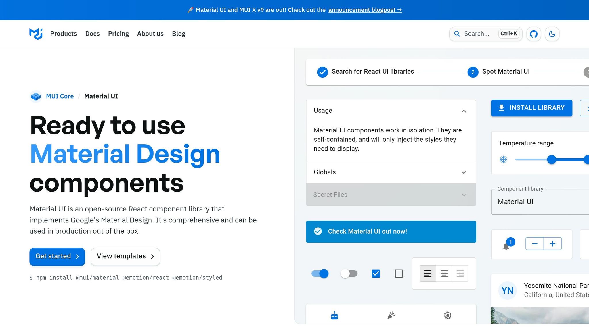
- MUI: A React component library based on Material Design principles, ensuring design consistency with reusable components.
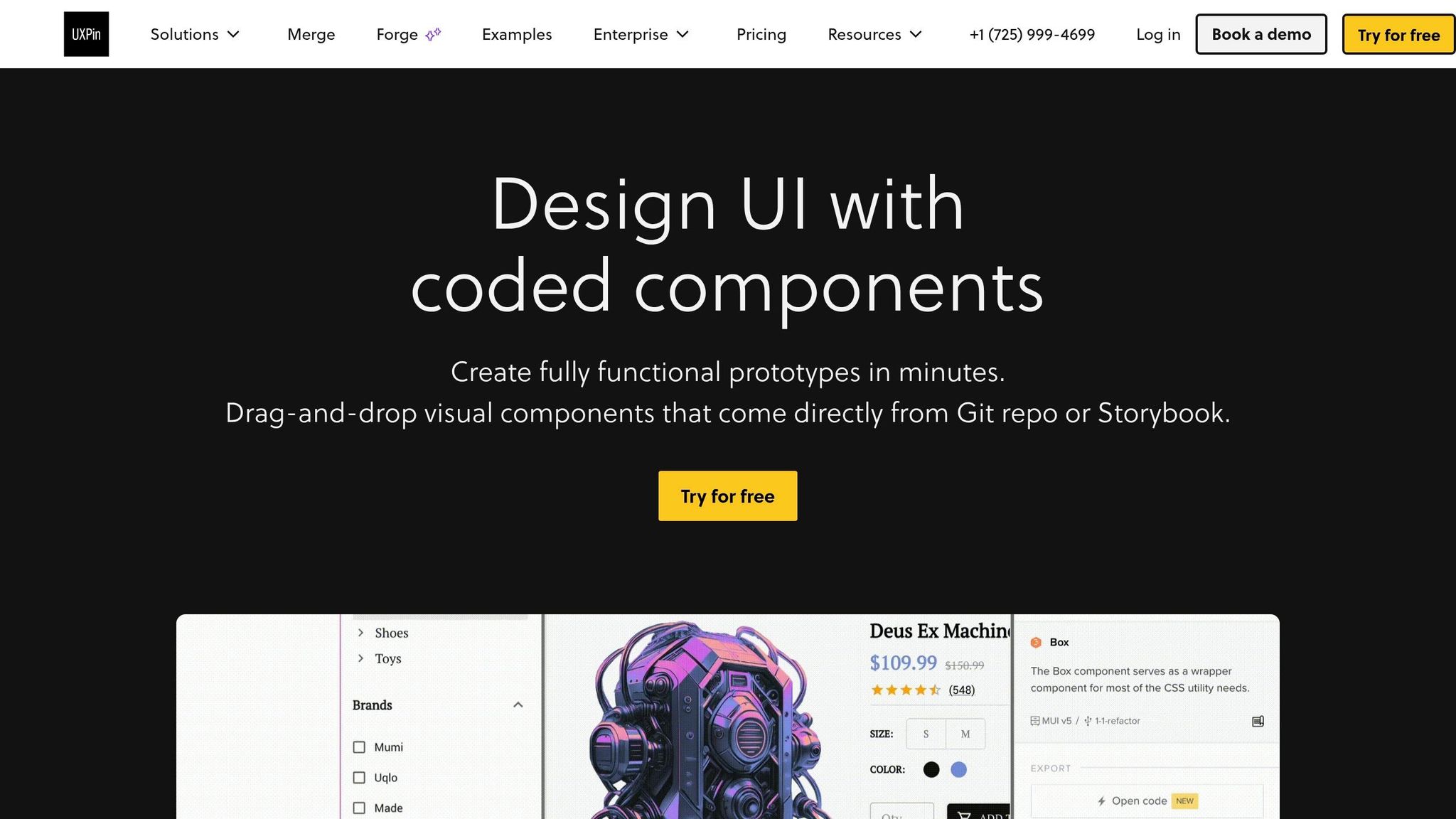
- UXPin Merge: Lets you prototype directly with code-based components, eliminating handoff errors and saving time.
This workflow connects AI-driven ideation with real production components, cutting design cycles by up to 70% (McKinsey). Designers, developers, and product managers stay aligned, reducing rework and improving collaboration.
Key Steps:
- Set up your MUI component library in UXPin Merge.
- Use Claude Haiku 4.5 to generate structured UX flows.
- Build and refine screens using MUI components in UXPin.
- Validate prototypes for accessibility, US localization, and enterprise standards.
This approach ensures your designs match the final product, speeding up delivery while maintaining quality. Whether you’re creating dashboards, forms, or data-heavy views, this workflow keeps everything in sync.
Ready to get started? Connect your MUI library to UXPin Merge, use Claude Haiku for ideation, and build faster, more accurate prototypes.
Setting Up Your MUI Component Library in UXPin Merge
Prerequisites for Using UXPin Merge with MUI
If you’re working with MUI, UXPin makes things easy by offering native support right on its canvas. This means designers can dive in and start using production-ready MUI components immediately. To get started, you’ll need a UXPin account with Merge enabled. Merge is included in all paid plans: Core ($29/month), Growth ($40/month), and Enterprise (custom pricing).
For teams utilizing a custom MUI design system, you’ll also need a Git repository (supported platforms include GitHub, GitLab, Bitbucket, or Azure DevOps) and a Node.js toolchain (Node 18 LTS is recommended). These tools are essential for connecting your custom library to UXPin. Enterprise teams managing private repositories should also prepare access tokens or SSH keys for secure, read-only connections. Additionally, make sure to secure any internal approvals required for linking external tools to your codebase. Once your setup is ready, you can move on to configuring MUI tokens and components to ensure precise, production-level design representation.
Configuring MUI Tokens and Components
Whether you’re using UXPin’s preloaded MUI library or a custom version, aligning design tokens with your production environment is key to maintaining accurate prototypes. Treat your MUI theme as the single source of truth for all design attributes – colors, typography, and spacing.
For custom libraries, keep your theme files organized: store palette, typography, and spacing in separate files under src/theme/. Then, use MUI’s createTheme() to export a unified theme. To ensure consistency, map your brand colors through a token dictionary, which will help maintain uniform naming conventions and simplify updates across both design and development teams. These steps ensure that your prototypes mirror the final product, reinforcing a seamless, code-aligned workflow. After setting up tokens, focus on structuring your components to support scalable workflows.
Structuring Components for Scalable Workflows
A well-structured component library is the backbone of a scalable design system. For custom MUI libraries, use a single export file (e.g., src/index.ts) to make all components accessible while avoiding the risk of designers accidentally using incomplete components.
Design components should rely on props instead of hardcoded values. For example, a Button component should use props like variant, color, and size. This approach allows UXPin’s inspector to expose these options directly to designers, making customization straightforward.
For enterprise teams, consider maintaining a beta branch linked to a separate Merge library. This setup lets you test experimental components without affecting production prototypes. It keeps your main library stable while still allowing room for innovation and iteration.
"With the MUI library in UXPin, design and development needs no translation, as you all build your React application or website using the very same component library’s elements." – UXPin
UXPin Merge Tutorial: Prototyping an App with MUI – (4/5)
Using Claude Haiku 4.5 for UX Ideation and Layouts
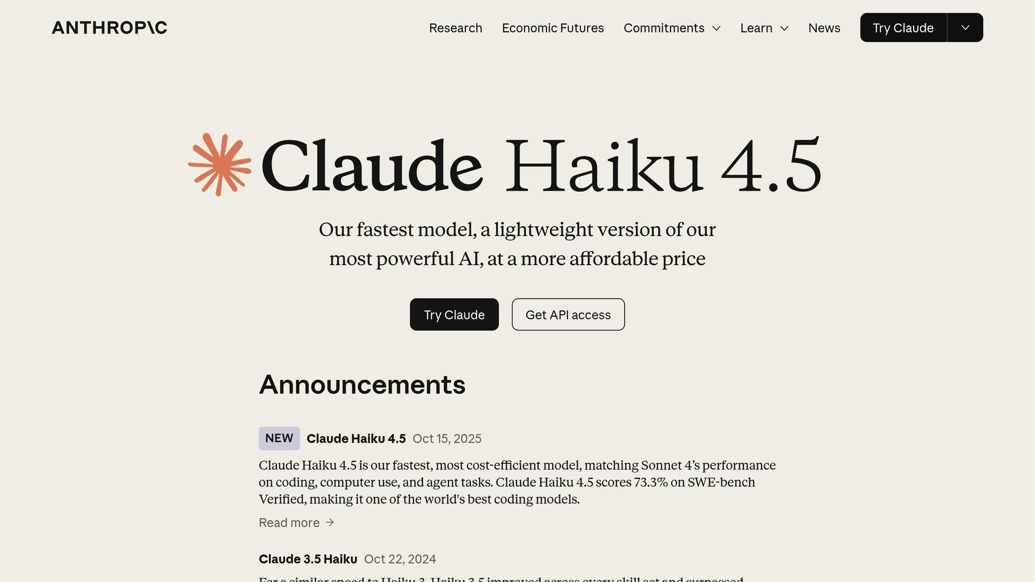
With your MUI library set up in UXPin Merge, you’re ready to move from ideas to structured layouts in record time. Enter Claude Haiku 4.5, Anthropic‘s model designed for iterative ideation and drafting. It works alongside your design expertise, helping you cut down the time from concept to prototype significantly. The key to getting the most out of Haiku lies in crafting prompts that guide it effectively.
According to McKinsey, using generative AI tools for tasks like ideation and drafting in software development can boost productivity by 20–45%. For enterprise UX teams juggling complex workflows, that’s a game-changer.
Writing Prompts for UX Flows and Components
The quality of Haiku’s outputs hinges on how well you frame your prompts. Vague prompts lead to generic results, while clear, detailed ones yield actionable designs.
For MUI-based enterprise products, a strong prompt includes four key elements: user persona, key task, specific MUI components, and desired output format. Here’s a useful template:
"You are designing for a U.S.-based SaaS admin managing a team of 200 sales reps on a web app built with MUI v5. Generate a detailed UX flow for creating, editing, and deactivating user accounts – including error and edge cases. For each step, recommend specific MUI components (AppBar, Drawer, DataGrid, Dialog, TextField, Snackbar, Stepper). Respond as a table with columns: Step Name, User Intent, UI State, Recommended MUI Components, Notes for UXPin Merge."
This approach ensures that every step is tied to real components, making it easy to bring Haiku’s output directly into UXPin Merge. You can adapt this template for various use cases like onboarding, billing setup, or subscription management. With a well-crafted prompt, you can quickly transform Haiku’s output into interactive prototypes.
Mapping Haiku Outputs to UXPin Merge Prototypes
Once Haiku generates a structured flow, turning it into a prototype is straightforward. Start by listing all the MUI components mentioned in the flow – like AppBar, Drawer, DataGrid, Dialog, TextField, Button, Snackbar, and Stepper – to create your component inventory.
From there, begin building your prototype step by step. Start with the page framework, such as an AppBar paired with a Drawer or another navigation system. Then, build the content area using components like Container, Grid, or Stack, following Haiku’s layout suggestions. For each step in the flow, create a separate page or state in UXPin, adding the relevant components.
When Haiku outlines logic – such as "on Save, validate fields; on error, show inline error + Snackbar" – implement it using UXPin’s interactions panel. Use variables to track field values, conditions to trigger error states, and state changes to simulate the entire flow. If the layout feels off after assembly, you can refine it by pasting the component list back into Haiku and asking for adjustments (e.g., "Optimize this layout for dense data and faster scanning"). This iterative process is fast because you’re working with structured text, not redrawing screens from scratch.
US Localization Best Practices for Content and Design
Localized content plays a major role in making your prototype feel polished and professional. By default, AI-generated UX copy may not account for specific regional formats, so including a localization directive in your prompts is essential for U.S. enterprise products. A simple directive like this covers common requirements:
"Use en-US conventions throughout: dates in MM/DD/YYYY or ‘Month D, YYYY’ format (e.g., Apr 15, 2026), currency as $ with comma groupings and two decimal places (e.g., $1,234.56), numbers with comma thousands separators (e.g., 12,500 users), imperial units for user-facing content (miles, lbs, ft), and temperatures in °F."
Details like these matter. Studies show that U.S. audiences are 7–12% more likely to convert when dates, currency, and numbers are formatted correctly. For prototypes used in stakeholder reviews or usability tests, placeholder values like $1,234.56 or Apr 15, 2026 add a layer of professionalism and keep the focus on the user experience. Reinforce this in UXPin by setting placeholders such as $0.00 for currency inputs and MM/DD/YYYY for date fields, ensuring your prototype feels like a finished U.S.-based product from the first interaction.
sbb-itb-f6354c6
Building and Refining MUI Screens in UXPin Merge
With your component inventory from Claude Haiku 4.5 ready, it’s time to shift from structured text to actual screens. This step ensures that every element you use reflects production code. That’s where UXPin Merge shines – every component you drag onto the canvas is the same React code your developers will deploy.
Creating Pages with MUI Components
Start each page by focusing on layout basics rather than jumping straight into UI elements. Begin with a Container to define your maximum width and padding. Next, use tools like Grid or Stack to establish your column structure. Add elements like the AppBar, Drawer, and content zones to replicate how your engineering team builds screens in React. This approach minimizes the back-and-forth during handoff.
Use UXPin’s Properties panel to configure component props instead of manually overriding styles. For form fields, apply fullWidth and use placeholders tailored to U.S. formats: $0.00 for currency, MM/DD/YYYY for dates, or (555) 867-5309 for phone numbers. Stick to MUI’s typography scale (h1, h2, body1, caption) rather than custom font sizes. This ensures your prototype stays synchronized with your production theme. Once the basic structure is in place, you can move on to creating common UX patterns that reflect enterprise needs.
Building Common UX Patterns with MUI
In U.S. enterprise design, three screen types dominate: dashboards, forms, and data tables. UXPin Merge offers repeatable patterns for each.
- Dashboards: Pair an AppBar with a permanent Drawer for navigation. Use a responsive
Gridin the content area. For desktop layouts, setmd={4}to display three KPI Cards side by side, and switch toxs={12}for stacking on smaller screens. Populate the cards with realistic metrics like "Total Revenue (MTD): $1,250,000.00", "Open Tickets: 3,847", or "Avg. Resolution Time: 2.3 days." This approach helps stakeholders evaluate layouts with actual data density. - Forms: Use MUI components like
TextField,Select,RadioGroup,Checkbox, andFormHelperTextto reflect typical enterprise fields such as "Annual Revenue (USD)", "State", "ZIP Code", and dates formatted as MM/DD/YYYY. Set fields asrequiredwhere necessary, and configuretype="email"ortype="number"for accuracy. This ensures your prototype mirrors the real-world requirements of a form. - Data-heavy views: Start with MUI’s
DataGridfor managing large datasets. Add a toolbar above it featuring aTextFieldfor search, aSelectfor status filters, and a pair ofDatePickercomponents for date ranges. Populate columns with meaningful labels like "Invoice #", "Customer", "Amount ($)", "Due Date", "Status", and "Last Updated." Format dollar amounts with right-alignment, comma separators, and two decimal places (e.g.,$48,750.00). This level of precision makes usability testing far more effective than using placeholder text or random numbers.
Once your screens are built, take them to the next level by simulating authentic app behavior using UXPin’s logic and variables.
Using UXPin’s Logic and Variables for Realistic Prototypes
Dynamic prototypes elevate usability tests and stakeholder reviews. Define variables like userRole, formIsValid, isLoading, and hasError, then bind them to component props to create responsive interactions. For example, if a user submits a form with an empty ZIP Code field, set hasError to true. This triggers the TextField to show an error state with helper text: "Enter a valid 5-digit ZIP Code."
For conditional navigation, use variables like userRole to guide flows. If userRole === "admin", clicking "Dashboard" routes to the Admin Dashboard; otherwise, it leads to the User Dashboard. This mirrors the flow suggestions from Haiku and is easy to implement via UXPin’s logic panel. Simulate different states – like loading or empty results – by toggling variables such as isLoading or hasResults. This allows you to switch between a skeleton loader, an empty-state illustration, and a populated DataGrid all on the same screen, without duplicating pages.
Validating and Iterating UX for Enterprise Standards
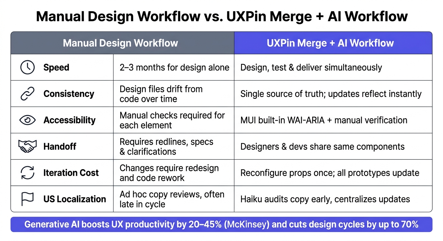
Manual Design Workflow vs. UXPin Merge + AI Workflow
Once your screens are built, the next step is rigorous validation to ensure they align with enterprise standards. This includes verifying that your prototypes meet accessibility requirements, US localization norms, and brand guidelines. Skipping these steps can lead to costly fixes later. According to Deque, addressing accessibility issues during the design phase can be 10–30 times cheaper than fixing them after release.
Checking for Accessibility and US Standards
A solid approach to accessibility starts with a checklist based on WCAG 2.1 AA standards. These are widely recognized as the baseline for enterprise products and are referenced in the US federal Section 508 guidelines. For prototypes built with MUI, focus on three critical areas: contrast, keyboard navigation, and copy accuracy.
- Contrast: Ensure that body text has a contrast ratio of at least 4.5:1, while large text, icons, and controls meet a 3:1 ratio. The 2024 WebAIM Million report revealed that low-contrast text was the most common WCAG failure, appearing on 81% of tested pages. Use tools like axe or WAVE within UXPin Preview to catch these issues before any production code is written.
- Keyboard Navigation: Test primary user flows – like signing in, onboarding, submitting forms, or interacting with data tables – using only keyboard inputs (Tab, Shift+Tab, Enter, and Space). Ensure focus indicators are visible, focus doesn’t get trapped in hidden elements, and components like Dialogs and Drawers return focus to the correct element when closed. While MUI supports WAI-ARIA out of the box, manual testing ensures everything works as intended in real-world scenarios.
- US Localization: Audit your copy for any non-US formats or inconsistencies, such as UK spellings, incorrect date or currency formats, or language that doesn’t align with a clear and professional US English tone. Update and centralize corrected copy within reusable MUI components in UXPin Merge to ensure changes automatically apply across all screens.
Iterating with Haiku and Merge
Validation isn’t a one-time process – it should drive ongoing design improvements. When usability testing or stakeholder feedback highlights an issue, bring it into Haiku to refine the experience. Using your MUI components and AI-driven layouts, you can adjust interactions and copy seamlessly. For instance, describe the problem to Haiku, and it can suggest revised step sequences or updated microcopy tailored to your existing components, such as Stepper, Dialog, or Snackbar.
Once Haiku provides actionable suggestions – like a reworded error message, reordered form steps, or improved empty-state labels – apply them directly in UXPin Merge. Adjusting component props in Merge ensures these updates propagate across all prototypes automatically, thanks to its use of production React components as the single source of truth. As Erica Rider, a UX Architect and Design Leader, explains:
"It used to take us two to three months just to do the design. Now, with UXPin Merge, teams can design, test, and deliver products in the same timeframe."
Manual vs. Merge + AI Workflow: A Side-by-Side Comparison
The efficiency of a Merge + AI workflow becomes especially clear at an enterprise level, where maintaining consistency and reducing handoff errors are critical to meeting deadlines.
| Dimension | Manual Design Workflow | UXPin Merge + AI Workflow |
|---|---|---|
| Speed | 2–3 months for design alone | Design, test, and deliver simultaneously |
| Consistency | Design files can drift from code over time | Single source of truth; updates instantly reflect in prototypes |
| Accessibility | Manual checks required for each element | MUI components include built-in WAI-ARIA and keyboard behavior; manual verification complements this |
| Handoff | Requires redlines, specs, and clarifications | Designers and developers work with the same components, reducing ambiguity |
| Iteration Cost | Changes require redesign and code rework | Reconfigure props in Merge; one change updates all prototypes |
| US Localization | Ad hoc copy reviews, often late in the cycle | Haiku audits copy early, centralizing updates across screens |
The real advantage isn’t just speed – it’s the cost-effectiveness of the Merge + AI workflow. Teams can test thoroughly, address issues early, and confidently deliver polished products.
Conclusion: How to Build Scalable UX with Claude Haiku 4.5, MUI, and UXPin Merge
This guide walks you through using Claude Haiku 4.5 to generate UX flows and US-localized content, then turning those ideas into functional prototypes with MUI components in UXPin Merge. From the start, this approach ensures that design and development stay aligned, streamlining the entire process.
For enterprise teams, the benefits are obvious. By sharing the same MUI components, designers and developers eliminate unnecessary rework, while updates flow seamlessly across the board. Stakeholder reviews also become more reliable since prototypes reflect production-ready components. Plus, integrating US-specific requirements early prevents last-minute fixes that can derail timelines.
It’s important to address AI’s role here: Claude Haiku 4.5 is a tool for generating ideas, not a substitute for your design system. Every suggestion it provides is filtered through your team’s vetted MUI components in UXPin Merge. This ensures quality and governance remain intact. Developers can rely on prototypes because they’re built with the same React components used in production.
To get started, audit your current MUI implementation, connect it to UXPin Merge, and create a pilot project – like an onboarding screen, checkout flow, or admin dashboard. Once validated, these patterns can become reusable templates, giving every new project a head start. That’s how scalable UX takes shape.
For large teams, UXPin Merge is available on Growth and Enterprise plans. If you need custom library integration or dedicated onboarding, check out uxpin.com/pricing or contact sales@uxpin.com for Enterprise options.
FAQs
How do I connect my MUI library to UXPin Merge?
Getting your MUI library connected to UXPin Merge is straightforward. For most use cases, you can use the preloaded MUI library available directly in the UXPin editor – this requires no additional setup.
If you’re working with a custom MUI library, you’ll need to link your Git repository. Here’s how you can do it:
- Install the UXPin CLI.
- Create a
uxpin.config.jsfile in your project. - Use your
UXPIN_AUTH_TOKENfor authentication.
Once everything is set up, push your components using the following command:
./node_modules/.bin/uxpin-merge push --webpack-config [path] --wrapper [path] --token "YOUR_TOKEN" This process ensures your custom components are integrated seamlessly into UXPin Merge.
What’s the best prompt format to get usable MUI-based UX flows from Claude Haiku 4.5?
To create an effective React and MUI coding assistant, it’s important to outline clear instructions, specifications, and examples. Here’s a structured approach to defining the persona and providing actionable outputs.
Instructions for the Assistant
- Purpose: Assist with creating React components using Material-UI (MUI) for modern, responsive, and accessible UIs.
- Input Format: Accept prompts with specifications for MUI components, layout requirements, and desired output formats (e.g., JSX or JSON Schema).
- Output Format: Provide clean, well-structured JSX code or JSON Schema tailored to the input prompt.
- Complex Layouts: For intricate designs, leverage adaptive reasoning to optimize logic and structure.
Example MUI Components
Below are 3–5 examples of commonly used MUI components with sample JSX outputs:
1. Drawer
A responsive navigation drawer that slides in from the side.
import React from 'react'; import Drawer from '@mui/material/Drawer'; import List from '@mui/material/List'; import ListItem from '@mui/material/ListItem'; import ListItemText from '@mui/material/ListItemText'; function AppDrawer({ open, onClose }) { return ( <Drawer anchor="left" open={open} onClose={onClose}> <List> {['Home', 'About', 'Contact'].map((text, index) => ( <ListItem button key={index}> <ListItemText primary={text} /> </ListItem> ))} </List> </Drawer> ); } export default AppDrawer; 2. Card
A simple card component with a title, content, and action buttons.
import React from 'react'; import Card from '@mui/material/Card'; import CardContent from '@mui/material/CardContent'; import CardActions from '@mui/material/CardActions'; import Typography from '@mui/material/Typography'; import Button from '@mui/material/Button'; function InfoCard() { return ( <Card> <CardContent> <Typography variant="h5" component="div"> Card Title </Typography> <Typography variant="body2" color="text.secondary"> This is a sample card content. You can use it to display information. </Typography> </CardContent> <CardActions> <Button size="small">Learn More</Button> </CardActions> </Card> ); } export default InfoCard; 3. Button
A customizable button with primary and secondary variants.
import React from 'react'; import Button from '@mui/material/Button'; function ActionButtons() { return ( <div> <Button variant="contained" color="primary"> Primary Action </Button> <Button variant="outlined" color="secondary"> Secondary Action </Button> </div> ); } export default ActionButtons; 4. AppBar
An application bar with a title and menu icon.
import React from 'react'; import AppBar from '@mui/material/AppBar'; import Toolbar from '@mui/material/Toolbar'; import Typography from '@mui/material/Typography'; import IconButton from '@mui/material/IconButton'; import MenuIcon from '@mui/icons-material/Menu'; function Header() { return ( <AppBar position="static"> <Toolbar> <IconButton edge="start" color="inherit" aria-label="menu"> <MenuIcon /> </IconButton> <Typography variant="h6" component="div"> App Title </Typography> </Toolbar> </AppBar> ); } export default Header; 5. Grid Layout
A responsive grid layout for displaying items.
import React from 'react'; import Grid from '@mui/material/Grid'; import Paper from '@mui/material/Paper'; import Typography from '@mui/material/Typography'; function GridExample() { return ( <Grid container spacing={2}> {Array.from({ length: 6 }).map((_, index) => ( <Grid item xs={12} sm={6} md={4} key={index}> <Paper style={{ padding: 16 }}> <Typography>Item {index + 1}</Typography> </Paper> </Grid> ))} </Grid> ); } export default GridExample; Request Outputs
When requesting outputs, specify the desired format and level of detail. For example:
- JSX Output: "Generate a responsive Drawer component with a list of links."
- JSON Schema: "Provide a JSON representation of a Card component with title, content, and actions."
Adaptive Reasoning for Complex Layouts
For more intricate designs, enable adaptive reasoning by increasing the budget_tokens parameter. This allows the assistant to handle additional complexity, such as nested components or dynamic layouts.
By following these guidelines, the assistant can effectively generate high-quality React and MUI components tailored to your needs.
How can I validate accessibility and en-US formatting in my UXPin Merge prototypes?
When working with MUI components, you can ensure accessibility by leveraging their built-in features. These components are designed to support keyboard navigation and adhere to contrast standards, making them more user-friendly for everyone.
Here are a few best practices to follow:
- Structure and Dialog Triggers: Ensure your components are properly structured and that dialog triggers are clear and intuitive.
- Focus Management: Pay attention to focus handling, especially for modal dialogs or interactive elements, to guide users effectively through the interface.
For en-US formatting, consistency is key across labels, placeholders, and messages. Stick to these standards:
- Currency: Use formats like
$1,234.56for monetary values. - Dates: Follow the
MM/DD/YYYYformat. - Time: Use the 12-hour clock with
AM/PM.
By combining these accessibility practices with localized formatting, you create a more inclusive and user-friendly experience.

