

How to build a landing page using Claude Sonnet 4.5 + shadcn/ui – Use UXPin Merge!
Build code-backed React landing pages using AI copy, shadcn/ui components, and UXPin Merge to align design, states, and handoff.
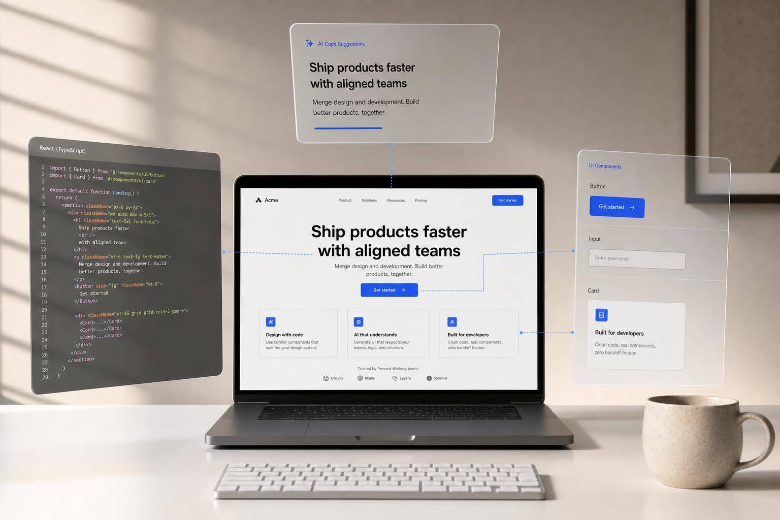
You can go from idea to a code-backed landing page faster if you split the work across three tools. I’d use Claude Sonnet 4.5 for copy and JSX drafts, shadcn/ui for the React component base, and UXPin Merge to assemble the page with the same components engineers will ship.
Here’s the core idea in plain English: instead of writing copy in one place, mocking screens in another, and rebuilding everything later, I’d set the page structure first, generate section-level content that fits that structure, and then build the prototype from actual components. That cuts handoff issues and keeps pricing, form states, and layout rules lined up from the start.
What this workflow covers:
- A landing page with a hero, feature grid, testimonials, pricing/CTA, and lead form
- A Vite + React TypeScript setup with shadcn/ui components like
Button,Card,Input, andAvatar - Claude prompts for copy, layout, and starter JSX
- UXPin Merge setup so designers work with code-backed components
- State checks for forms and CTAs, including loading, error, and success
A few details matter more than people think:
- Keep content in props instead of hard-coding it
- Use U.S. formatting like $29/month, 07/23/2026, and 10,000 subscribers
- Review AI output before using it
- Sync the component library so design stays tied to production code
One stat stands out: the article notes Claude Sonnet 4.5 reached a 0% error rate on Anthropic’s internal code editing benchmark, down from 9% on the prior Sonnet version. That doesn’t mean you should skip review. But it does mean I’d trust it more for structured copy and component drafts than for free-form page generation.
If I had to sum up the workflow in one line, it would be this: plan the sections, generate copy that fits them, then assemble the page with the same UI parts your team already uses.
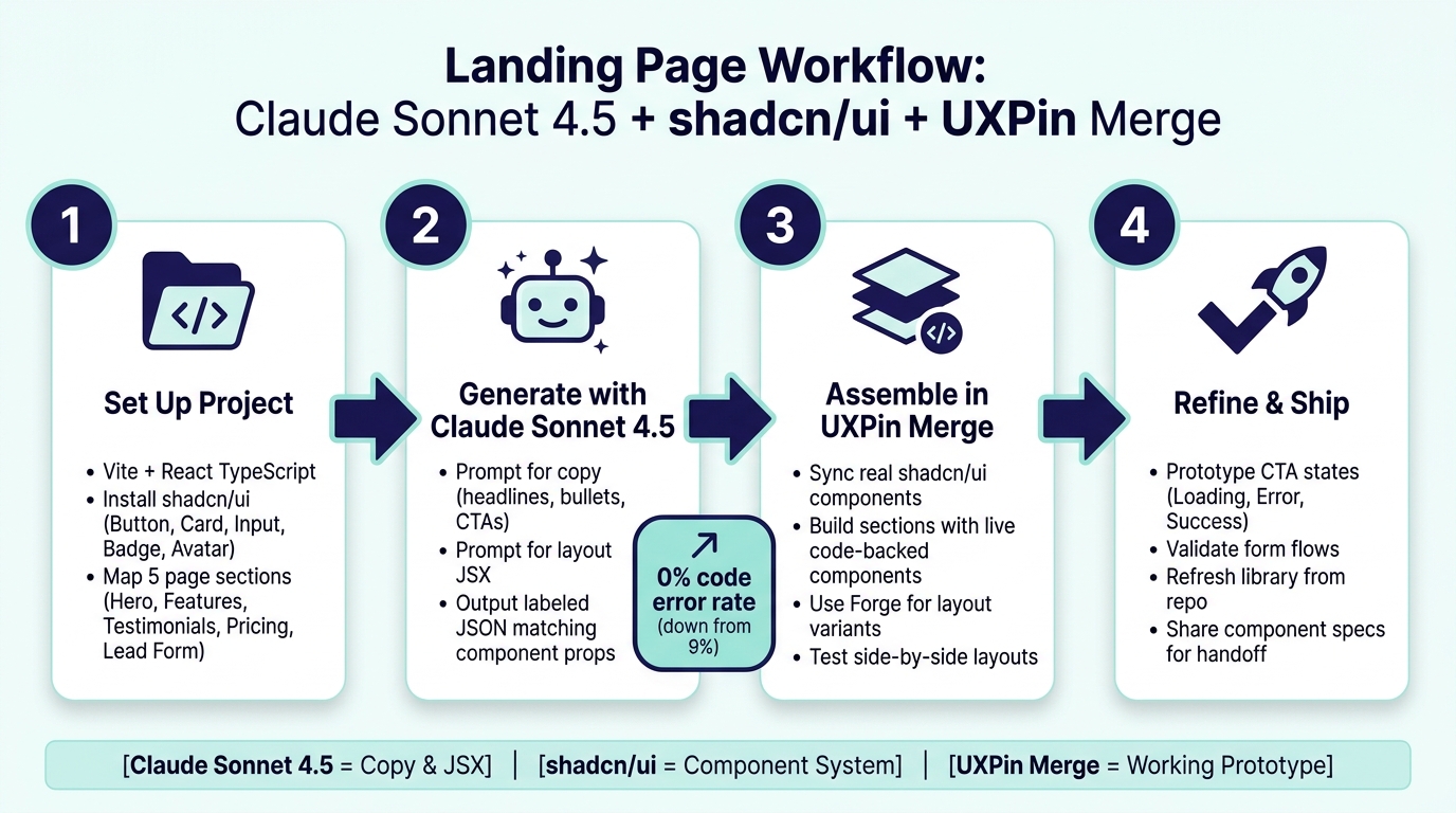
Landing Page Workflow: Claude + shadcn/ui + UXPin Merge
Build a Modern Landing Page Using React, Typescript, Shadcn UI, and Next Js [Full Project]
1. Set up the project and define the landing page structure
Before you prompt Claude, get the base project ready first. Start with a Vite + React TypeScript app, install shadcn/ui, and connect a Merge-enabled UXPin workspace.
Install shadcn/ui and organize components for reuse
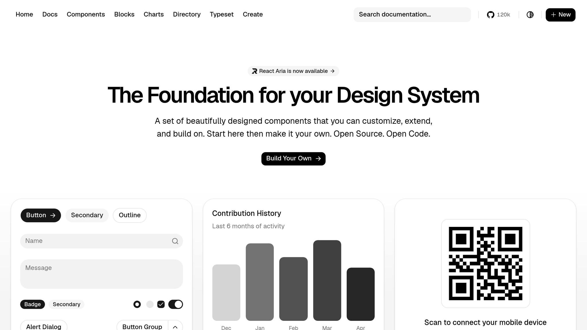
Scaffold the app with npm create vite@latest my-landing-page -- --template react-ts, then set up Tailwind CSS before you add shadcn/ui. After Tailwind is rendering in the browser, run the shadcn/ui CLI to initialize the project. Then add the primitives this landing page needs:
npx shadcn@latest add button card input badge avatar Store primitives in src/components/ui/ and place marketing sections in src/components/sections/. Create one file for each primitive, like button.tsx, card.tsx, and input.tsx. Then create one file for each section block:
HeroSection.tsxFeaturesGrid.tsxTestimonialsSection.tsxPricingTableSection.tsxLeadCaptureForm.tsx
This split keeps low-level UI parts separate from assembled page sections, which makes the codebase much easier to work with.
Each section component should accept content props instead of hard-coded copy. For example, HeroSection should take headline, subheadline, primaryCtaLabel, and supportingLogos. That setup lets teams reuse the same layout across campaigns without rewriting the component. When Merge syncs your repo, designers can see those prop controls in the UXPin property panel and update copy without touching code.
Map the landing page sections before writing prompts
Map the page skeleton before you ask Claude for anything. That way, every AI suggestion lands in a known spot, and you don’t end up with extra sections that don’t fit the component structure.
Here’s the skeleton this guide builds, with each section tied to its shadcn/ui components:
| Section | shadcn/ui Components | Key Props |
|---|---|---|
| Hero | Button, Badge, Input |
headline, subheadline, primaryCtaLabel |
| Feature Grid | Card (×3–6) |
title, description, icon |
| Testimonials | Card, Avatar |
quote, name, role, company |
| Pricing/CTA | Card, Button, Badge |
planName, priceInUsd, features |
| Lead Form | Input, Label, Button |
emailPlaceholder, ctaLabel |
Write down a short U.S. formatting spec too: $29/month, 07/23/2026, 10,000 subscribers, and U.S. spelling. Put currency formatting straight into PricingTableSection with Intl.NumberFormat('en-US', { style: 'currency', currency: 'USD' }) so the priceInUsd prop is formatted automatically.
Before moving on, do a quick render check. Render HeroSection, FeaturesGrid, and LeadCaptureForm with placeholder props. Confirm that U.S. formatting shows up the way you expect. Then check that the same components appear in UXPin Merge with editable prop controls.
With the structure in place, the next step is to use Claude for copy, layout ideas, and component-level suggestions.
2. Use Claude Sonnet 4.5 to generate copy, layout ideas, and component-level code suggestions
Once you’ve mapped the page structure, use Claude Sonnet 4.5 to draft copy and JSX constraints that match your shadcn/ui sections. The key is simple: specific prompts lead to output you can use. Anthropic says Claude Sonnet 4.5 hit a 0% error rate on its internal code editing benchmark, down from 9% on the previous Sonnet version. That makes it a strong fit for detailed component guidance and prop rules when your instructions are clear.
Prompt for landing page copy that fits the audience and offer
Treat Claude like a UX writer. Start with a tight brief:
You are a UX copywriter for a U.S. B2B SaaS landing page. Use plain language, conversion-focused messaging, and no buzzwords or exclamation marks. Follow the project’s U.S. formatting rules.
Then prompt one section at a time. For the hero, use:
Generate 5 hero headlines for a U.S. B2B SaaS that helps product teams prototype production-ready UI. Each should be under 60 characters, focus on outcomes like faster shipping or fewer handoff issues, and avoid vague claims. Include one option referencing starting at $99.00/month.
For feature bullets, try:
Write 6 benefit-focused bullets. Each starts with a strong verb – Align, Prototype, Ship – stays under 18 words, and uses U.S. number formatting for any metrics.
It also helps to ask Claude for labeled JSON that mirrors your component structure. That way, each field can map straight into JSX props and Merge controls. Include keys like:
hero_headlinehero_subheadprimary_cta_labelsecondary_cta_labelfeature_bulletstestimonial_quotetestimonial_attributionform_headlineform_help_text
Ask it to return labeled JSON, and add one more instruction: include a one-sentence rationale under each key element so reviews move faster and stakeholders can see the thinking behind the wording.
Once the copy prompt is dialed in, use that same level of control for layout prompts.
Prompt for layout recommendations tied to shadcn/ui components
For layout, combine section names, layout patterns, and shadcn/ui components in one prompt. Give Claude a component whitelist and the composition rules that matter. shadcn/ui is picky in a good way: Card needs CardHeader, CardTitle, CardDescription, CardContent, and CardFooter, while Avatar always needs AvatarFallback. Those rules help keep the JSX valid.
A strong layout prompt looks like this:
Write React + TypeScript JSX for four landing page sections – hero, three-column feature grid, testimonials row, and signup form – using only these shadcn/ui components: Button, Card, Input, Avatar, Badge. Follow shadcn/ui composition rules. Use Tailwind responsive classes like
grid-cols-1 md:grid-cols-3. Keep each section in its own functional component: HeroSection, FeaturesGrid, TestimonialsSection, LeadCaptureForm. Add short comments where teams should swap in real data.
After Claude gives you a first draft, do a tight review pass. A content designer should cut fuzzy phrases like end-to-end or transform your workflow and swap them for plain outcome-driven wording. An engineer should check that the component props line up with your actual shadcn/ui setup. Both teams should also review capitalization before sending one clean revision prompt back to Claude.
Use this component map as the blueprint for building the page in UXPin Merge.
sbb-itb-f6354c6
3. Bring shadcn/ui into UXPin Merge and assemble the landing page
Configure UXPin Merge for code-backed shadcn/ui components
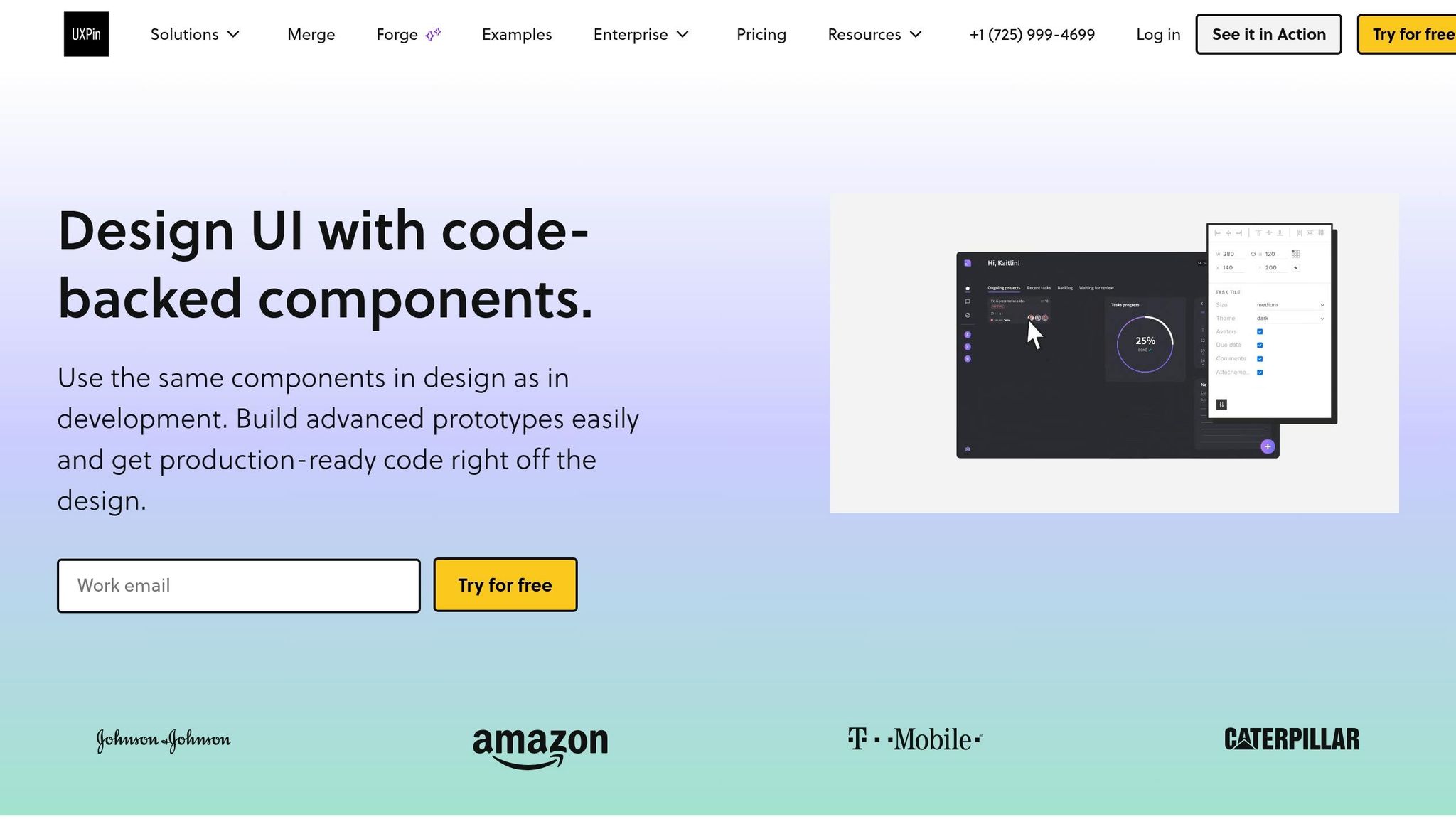
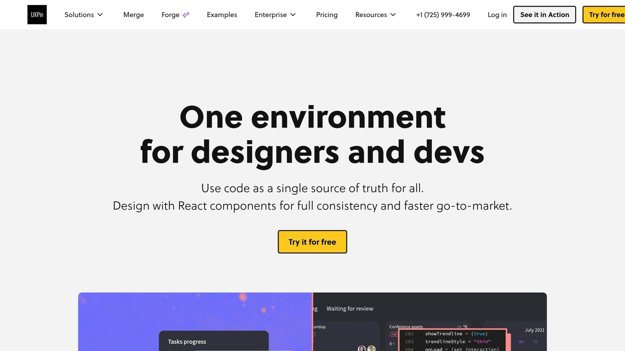
Connect your custom shadcn/ui library through UXPin Merge. If your project uses brand tokens, edited variants, or in-house accessibility rules, use the CLI (npx uxpin-merge) to bring your local React code into the UXPin library.
Before you sync anything, make sure each component is exported cleanly, its props are typed, and the Tailwind CSS and Radix UI dependencies are installed. Then group components into clear sections inside uxpin.config.js – Layout, Forms, Navigation, and Marketing. That way, designers can find what they need fast while building the page.
Build the page sections in UXPin with real components
Use Claude’s section order and prop names as your checklist in UXPin.
Start with the hero. Add an H1 text element, then body text for the subheading. After that, place a primary Button with variant='default' and size='lg'. Put a ghost or outline button next to it to give visitors a lower-commitment option.
For the feature grid, use Card components in a three-column layout. Each one should include an icon, a short title, and a benefit-led description. For testimonials, combine Avatar and Card components, then enter the name, role, and quote in the UXPin properties panel. Pricing or CTA blocks can use a Card plus plain text for the price label, such as Starting at $29/month, along with a Button for the action. Wrap up with the form section: use Input for text and email fields, Select for dropdowns, Checkbox for opt-ins, and a submit Button.
Engineers can pull the exact component names and props straight from the prototype during implementation.
| Landing Page Section | Primary components |
|---|---|
| Hero | Button, Badge |
| Feature Grid | Card, Badge, Lucide Icons |
| Testimonials | Avatar, Card |
| Pricing / CTA | Card, Button, Separator |
| Lead Form | Input, Label, Select, Checkbox, Button |
Use Forge to speed up layout iteration inside the design system
Once the sections are in place, UXPin Forge helps you test layout variants faster. It works with the Merge-connected components already tied to your design system, so every version it generates stays buildable.
Use Forge one section at a time. Ask it to try a two-column hero with an image on the right, or generate a three-card feature row with icons. From there, it rebuilds approved components into new layout options. You can compare versions side by side, switch props, and edit content without leaving the canvas.
That makes decisions a lot easier. You can see whether testimonials work better above or below the pricing block, or whether features read better in a grid or a stacked list.
Once the layout is locked, refine states, sync the library, and get the page ready for handoff.
4. Refine interactions, keep design and code in sync, and prepare for handoff
Prototype CTA and form flows with realistic states
Once the layout is locked, use those same Merge-backed components to test how things work, not just how they look. Since Merge uses real shadcn/ui components, states like disabled, loading, and aria-invalid act the same way they do in production. That means you can test hover, active, loading, error, and success states right on the live components.
Set up the primary CTA to move into loading, then into success, after a short simulated API call. Stakeholders can click through the full flow before engineering starts building it.
Use that same state logic for the form so the CTA and lead capture flow stay in step. Capture the email on change, validate it on submit, show an inline error when the input is invalid, and switch to a success Alert when it passes. Wrap the form in a Multi-state Component with Default, Loading, and Success states.
That gives engineers a spec that matches the validation logic, state changes, and component props they’ll build.
Refresh the library and keep designs aligned with production
Once the prototype is working, refresh the library so design stays tied to the codebase. When engineering updates a shadcn/ui component, Merge pulls those changes from the connected repo and updates every landing page section that uses it, including the hero, feature grid, testimonials, pricing, and lead form.
From there, teams can reuse the same component structure for new campaigns, swap in new content and routes, and ship without rebuilding the page.
Conclusion: A faster landing page workflow with less rework
Once the page is built and polished, the upside is pretty clear: align content, design, and code as early as you can so you’re not fixing mismatches at the very end. Claude Sonnet 4.5 can turn briefs into copy and layout ideas that map cleanly to shadcn/ui components.
shadcn/ui acts as the shared component layer, so every Button, Card, and Form in UXPin Merge matches the code engineers ship. That’s what makes Merge so useful. Designers work with live, code-backed components instead of static mocks, which means the prototype stakeholders click through is already close to what engineers will build. Handoff becomes a matter of sharing component specs and props, not translating a flat image into working code.
That alignment cuts rework, speeds handoff, and keeps production-ready details like pricing, copy, and form states consistent from the start.
Use Claude for content, shadcn/ui for the component system, and UXPin Merge for the working prototype. The result is less rework, faster handoff, and a landing page that stays aligned with production from the first draft.
FAQs
Do I need coding skills to use this workflow?
No. You don’t need coding skills or React knowledge to use this workflow.
With UXPin Merge, you work with production-ready React components through the properties panel instead of writing code. That means you can build your landing page right on the canvas, then tweak props, variants, and states with simple controls like dropdowns, checkboxes, and text fields.
How does UXPin Merge keep prototypes aligned with production code?
UXPin Merge keeps prototypes in sync with production code by using real, code-backed React components instead of static images. That means the parts you place on the canvas come straight from your codebase, so they behave much more like the finished app.
Designers can change props like variants, states, and labels in the Properties Panel using the same React component API that developers use. In plain English, there’s no awkward handoff where someone has to guess how a design should map to code. Developers can inspect the prototype and see the exact component names and prop settings used.
What should I review before using Claude-generated copy or JSX?
Before you use Claude-generated copy or JSX, give both the writing and the code a careful review.
Start with the copy. Make sure it matches your brand voice and tone, and check that it’s localized for the U.S. That means using $ for currency, commas for thousands, periods for decimals, dates in MM/DD/YYYY format, and standard U.S. English spelling.
Then move to the code. Confirm it uses your design system’s components, includes TypeScript props, and uses shadcn/ui cn() for class merging. You’ll also want to check accessibility before you preview anything locally in UXPin Merge, including:
- Color contrast
- Focus states
- Keyboard navigation
Related Blog Posts
- How to build UI using Claude Sonnet 4.5 + shadcn/ui – Use UXPin Merge!
- How to build a landing page using Claude Opus 4.5 + Bootstrap – Use UXPin Merge!
- How to build a landing page using Claude Opus 4.5 + Custom Design Systems – Use UXPin Merge!
- How to build a landing page using Claude Sonnet 4.5 + MUI – Use UXPin Merge!