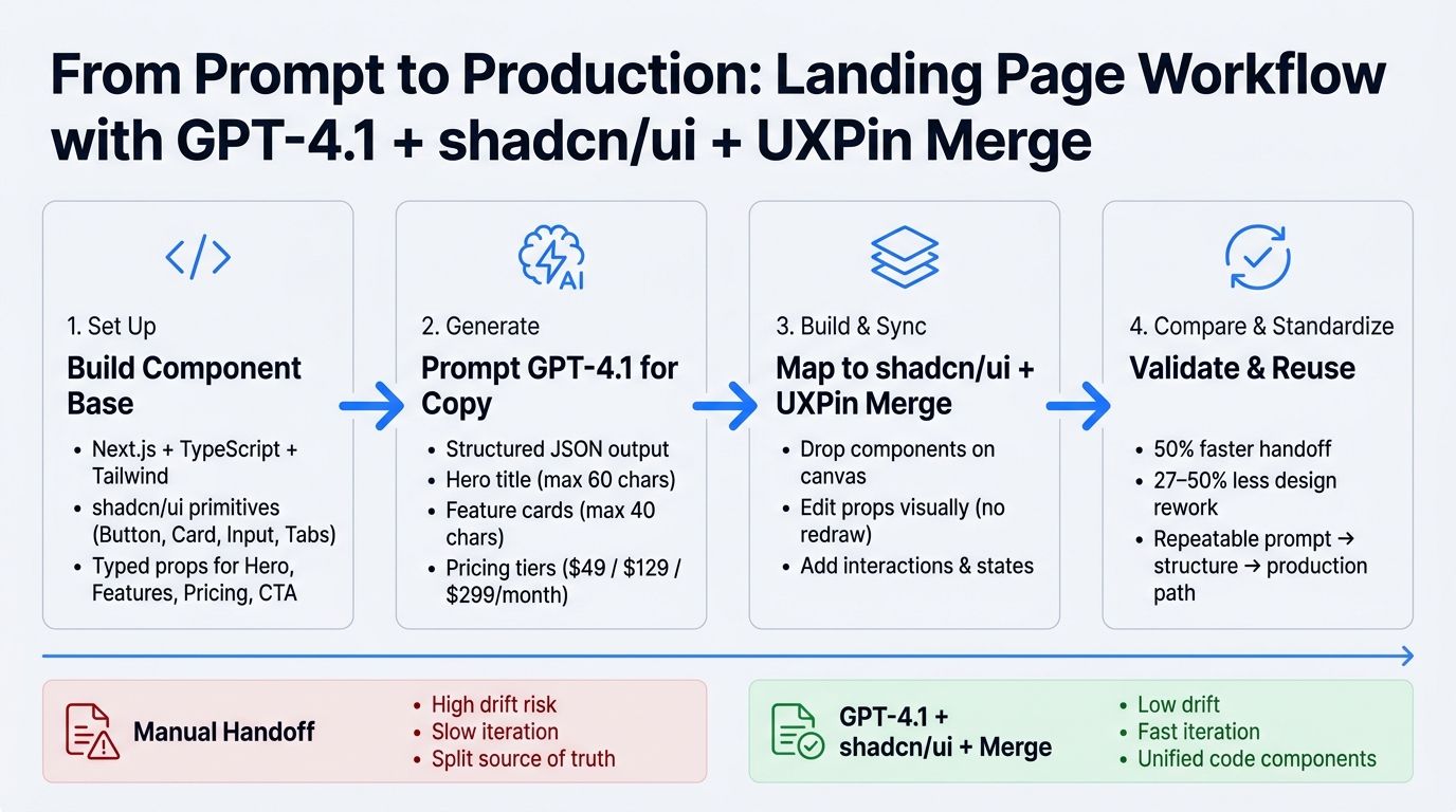
You can go from prompt to clickable landing page with one stack: GPT-4.1 writes the copy and page structure, shadcn/ui turns that into typed React sections, and UXPin Merge lets me place those same code components on a canvas. The point is simple: less drift, less rework, and a page that looks like what ships.
Here’s the workflow in plain English:
- I set up a Next.js + TypeScript + Tailwind + shadcn/ui project
- I build reusable sections like Hero, Features, Pricing, and CTA
- I ask GPT-4.1 for structured JSON, not loose text
- I map that JSON to typed props such as headlines, feature lists, and plans like $49/month or $129/month
- I sync those components into UXPin Merge for editing, layout changes, and state testing
- I compare this setup with a manual handoff flow, where teams often lose time and consistency
Why does this matter? Teams that use design systems can cut handoff time by about 50% and trim design work by roughly 27% to 50%. That doesn’t mean every page builds itself. It means I can start with code-backed blocks instead of redrawing the same layout over and over.
The main takeaway: use AI for structure and copy, use shadcn/ui for the component layer, and use UXPin Merge to keep design tied to code from the start.
Quick comparison
| Workflow | Main tool role | What I get | Common issue |
|---|---|---|---|
| Manual handoff | Design file + dev rebuild | Static mockup, then coded page | Drift between design and shipped UI |
| GPT-4.1 + shadcn/ui + UXPin Merge | Copy, typed components, code-based prototyping | Clickable prototype built from React components | Needs clean prop design and good prompts |
If I want a landing page process that is easier to repeat, this is the setup the article walks through.
GPT-4.1 + shadcn/ui + UXPin Merge: Landing Page Workflow
Build a Modern Landing Page Using React, Typescript, Shadcn UI, and Next Js [Full Project]
sbb-itb-f6354c6
Step 1: Set up shadcn/ui for a reusable landing page system
With the workflow set, start by building the component base that GPT-4.1 can fill and UXPin Merge can reuse. The goal is simple: create a typed component system that accepts GPT-4.1 output cleanly and stays easy to sync in UXPin Merge.
Create the base React or Next.js project
Start with Node.js 18+ and scaffold a new project with npx create-next-app@latest. During setup, turn on TypeScript, Tailwind CSS, the App Router, and the @/* import alias.
TypeScript gives your components clear prop definitions, which Merge can use to expose editable controls. And the @/* alias keeps imports tidy across @/components and @/lib. It’s a small choice, but it saves a lot of friction once the project grows.
Once the project is scaffolded, run npx shadcn@latest init. Then add the primitives you need for landing page sections:
npx shadcn@latest add button card input tabs accordion These commands add fully editable, typed React components to your project. Keep those components local so Merge reads the same props and variants your app uses. That way, what you build in code is the same thing your team works with in UXPin.
Define brand tokens in theme.extend so colors, fonts, and radii stay consistent across sections. For example, sections that use bg-primary and text-primary-foreground will keep the same visual style no matter what copy GPT-4.1 outputs.
Organize components for UXPin Merge and future reuse
Separate UI primitives from page sections. A simple folder split keeps things clean and makes reuse much easier later.
| Folder | Contents | Purpose |
|---|---|---|
src/components/ui |
Button, Card, Input, Badge, Tabs, Accordion | shadcn/ui atoms |
src/components/sections |
HeroSection, FeatureGrid, TestimonialsSection, PricingSection, CTASection, Footer | Composed blocks that accept AI-generated content as props |
src/lib |
cn(), formatCurrencyUsd(), formatDateUs() |
Shared utilities |
Each section should live in its own folder and expose typed props that match GPT-4.1 output. That includes fields like headline, body copy, card arrays, and CTA text, so pricing and similar fields render in a steady way.
For example, a PricingSection can accept:
plans: { name: string; priceUsd: number; billingCycle: "monthly" | "yearly"; features: string[]; cta: CtaProps }[]
Then format values inside the component with:
Intl.NumberFormat("en-US", { style: "currency", currency: "USD" })
This setup lets AI-generated content drop into reusable landing page blocks without extra cleanup or remapping.
It also helps to model layout and column options as union types. Merge can expose those as property controls, then map them to conditional Tailwind classes. In plain English: your design options stay controlled instead of turning into a mess of random string values.
Keep a central components/sections/index.ts file that re-exports every section by name. A clean export list makes the component library easier to expose in the property panel.
Once the section system is in place, use GPT-4.1 to fill those props with landing page copy and structure.
Step 2: Use GPT-4.1 to generate landing page copy and section structure
Use GPT-4.1 to produce copy that fits your component props from the start. Set your layout rules first: pick the shadcn/ui components you’ll use, define the grid, and set clear content limits. Keep the hero headline under 60 characters, card titles under 40 characters, and body copy to about 120 to 150 words per section.
Prompt GPT-4.1 for hero, features, pricing, and CTA blocks
Use a prompt like this:
"Act as a UX writer for a US-based B2B SaaS tool that helps product teams design landing pages faster using GPT-4.1, shadcn/ui, and UXPin Merge. Generate copy for these sections in US English, with US spelling and formatting:
- Hero section:
- hero_title (max 60 characters)
- hero_subtitle (1–2 short sentences)
- primary_cta_label (button text)
- secondary_cta_label (button text)
- Feature grid (4 features, each):
- feature_title (max 40 characters)
- feature_description (1 sentence)
- icon_hint (short word, e.g., ‘bolt’, ‘layers’)
- Pricing section (3 tiers):
- tier_name
- monthly_price_usd (e.g., 49, 129, 299)
- price_display (e.g., "$49/month")
- key_benefits (3 bullet points)
- ideal_customer_description (1 sentence) Use USD currency with ‘$’ symbol, commas for thousands (e.g., $1,299), and periods for decimals (e.g., $49.99).
- Social proof:
- testimonial_quote (max 30 words)
- testimonial_author
- testimonial_role
- company_name
- Bottom CTA banner:
- cta_title
- cta_body (max 2 sentences)
- primary_cta_label.
Return everything as a JSON structure with keys exactly as specified."
Here’s a shortened example of the kind of output GPT-4.1 returns:
{ "hero": { "title": "Design landing pages in hours, not weeks", "subtitle": "Combine GPT-4.1, shadcn/ui, and UXPin Merge to ship conversion-focused pages that match production code.", "primaryCtaLabel": "Get a live demo", "secondaryCtaLabel": "Try it free" }, "features": [ { "title": "AI-assisted layout", "description": "Generate hero, feature, and pricing sections in minutes with structured prompts.", "iconHint": "bolt" }, { "title": "Code-backed components", "description": "Use shadcn/ui so your designs match real React and Next.js code.", "iconHint": "layers" } ], "pricing": [ { "tierName": "Starter", "monthlyPriceUsd": 49, "priceDisplay": "$49/month", "keyBenefits": [ "Up to 3 projects", "Core shadcn/ui components", "Basic GPT-4.1 prompts library" ], "idealCustomerDescription": "Best for small teams validating their first landing pages." } ] } Each block should line up with a section component, so you can drop the content straight into HeroSection, FeatureGrid, PricingSection, and CTASection. Consistent key names and data types help a lot here. Prices should stay as numbers, labels as strings, and bullet points as arrays. That cuts down prop-mapping mistakes and keeps design and development on the same page.
Refine output to fit real component constraints
If the first pass runs long or the format drifts, do one cleanup pass before moving on. Check for British spelling, prices shown as 49 USD instead of $49/month, and feature descriptions that feel too long for a card.
A simple follow-up prompt usually fixes it:
"Shorten all feature descriptions to under 18 words while keeping the main benefit."
You can also ask GPT-4.1 to review its own formatting before you paste anything into your components:
"Review the previous output and correct spelling to US English and price formatting to US dollars with commas for thousands and periods for decimals."
For responsive layouts, ask for copy that still reads well when it gets cut off on smaller screens. Long sentences tend to fall apart there, so keep them tight.
Tone needs a quick check too. If the hero sounds sharp but the pricing section feels dry and mechanical, ask GPT-4.1 to smooth it out across every section. A confident, practical, friendly tone usually works well, especially without bloated jargon. For a US audience, "Get a demo" sounds more natural than "Arrange a demonstration", and "See it in action" usually lands better than "View a presentation."
Next, map this output to shadcn/ui sections and bring the components into UXPin Merge.
Step 3: Build the page with shadcn/ui and bring it into UXPin Merge
Map GPT-4.1 output to shadcn/ui components
Use the JSON from Step 2 as a content brief, not a finished interface. The goal here is simple: map each JSON field to the right shadcn/ui component. That way, the same content model stays visible in both the codebase and the canvas.
Start with the hero. Build it as a <header> with an h1, a subtitle <p>, and two Button components. The primary button should use size="lg". The secondary button should use variant="outline" size="lg". For mobile behavior, Tailwind classes like flex-col sm:flex-row handle stacking on their own, so you don’t need extra logic.
For the feature grid, wrap the area in <section aria-labelledby="features-title"> and render each feature inside a Card using CardHeader, CardTitle, and CardDescription. A grid-cols-1 md:grid-cols-2 lg:grid-cols-3 class keeps the layout responsive with very little effort.
The pricing block can follow that same Card setup. Use CardHeader for the plan name and price, formatted in U.S. currency like $49/month. Put the benefits list in CardContent, then place the "Select Plan" Button in CardFooter.
For the final CTA, keep it simple: a container with a Button and an Input for email capture.
Expose align, columns, highlighted, and planType as typed props. That gives you room to adjust each variant later without changing the component logic.
Compose and refine the landing page in UXPin Merge
Once those props are typed, shift from code structure to visual assembly. Initialize Merge in your repo with npx uxpin-merge init, list your components in uxpin.config.js under groups like "Marketing" or "Forms", and run the sync.
UXPin Merge parses your interfaces automatically and generates visual controls in the properties panel. So you get dropdowns for enums like variant, toggles for booleans like highlighted, and text fields for string props like title.
On the canvas, the workflow is pretty direct:
- Drop a
PageShell - Drag a
Heroto the top - Add
FeatureGridbelow it - Then place
PricingTableandBottomCTA
From there, you can edit in place. Select the Hero and update title, subtitle, and align right in the panel. No redrawing. No rebuilding assets. For FeatureGrid, switch columns from 3 to 2 if you want a tighter layout, then paste in the GPT-4.1 feature copy.
Add interactions to make the prototype production-aligned
Because these components are real code, interaction states carry into the prototype without redraws. Hover styles and focus rings show up automatically, which saves time right away.
For more deliberate behavior, expose selected and highlighted props on each PricingCard, then wire an interaction like "On click → set prop selectedPlan='Pro'" at the page level.
For modal CTAs, use the shadcn/ui Dialog component with open and onOpenChange props exposed. Map a button click to Dialog.open=true so reviewers can open and close the sign-up modal right inside the prototype.
Conditional content works in much the same way. Add a showGuarantee or showBadge boolean prop to the component, then use UXPin variables and conditional logic during review to switch content variants on and off. Use the "Scroll to" interaction on nav links to connect the header to each section. You can also simulate simple form validation with an "On Change" trigger on the email Input that checks for @ before showing a success state.
Use these states as the baseline for the workflow comparison in the next step.
Step 4: Compare the workflow and standardize what works
Manual implementation vs. shadcn/ui with UXPin Merge
Once the prototype is built, the next move is simple: compare it with a manual workflow and see what’s worth standardizing.
Inside UXPin Merge, the gap is easy to spot. Manual workflows split copy, layout, and code across different tools. Merge keeps the page connected to the same components used in production. That means less rework and fewer surprises, because design choices stay inside the limits of the actual code.
| Aspect | Manual handoff workflow | shadcn/ui with UXPin Merge |
|---|---|---|
| Source of truth | Split between design files and code repo | Unified: production-ready React components |
| Iteration speed | Slow; every change requires manual code updates | Fast; drag-and-drop components with instant visual feedback |
| Collaboration | High friction; relies on handoff docs and redlines | Smooth; designers and developers use the same blocks |
| Risk of design drift | High; code frequently deviates from design intent | Low; design is physically constrained by the code components |
That side-by-side view makes one thing clear: some parts of the landing page should live in a reusable system.
Manual workflows can still do the job for one-off experiments. But if you’re building pages again and again, a system saves time and cuts waste. Merge helps limit rebuilds and keeps the team working from the same set of components. Organizations using design systems can reduce design-to-development handoff time by about 50% and cut design work by roughly 27% to 50%.
Conclusion: A repeatable path from prompt to reusable landing page
Use that comparison to keep future landing pages on the same component system.
The pieces that already worked in the prototype – the hero, feature grid, pricing, and CTA blocks – are the best place to start. After those blocks are checked inside UXPin Merge, future campaigns start to feel less like a full build and more like assembly. GPT-4.1 drafts alternate copy and section structures. shadcn/ui keeps the visual and interaction patterns steady. UXPin Merge ties it all back to the components your developers already trust.
The workflow moves in one direction: prompt → structure → validation → production. Each step builds on the last. And each artifact – prompt templates, component blocks, and Merge canvas layouts – can be reused for the next campaign. That gives the team a repeatable operating model.
FAQs
How do I turn GPT-4.1 output into props?
Prompt GPT-4.1 to return content in a structured JSON format with clear fields like heroHeadline, heroSubheadline, and primaryCtaLabel. That way, the output lines up with your component props right away.
Then map those values to the UXPin Properties Panel. Or let the AI generate content that already fits the prop names exposed by your shadcn/ui components. In UXPin Merge, those props become live, interactive controls.
Which landing page sections should I build first?
Start with a clear structure. That way, the page feels easy to scan and each section has one job.
- Navbar: Logo, main links, CTA button
- Hero: Headline, subheadline, primary CTA
- Social Proof: Client logos, ratings, short testimonials
- Key Features: Core product points and why they matter
- How It Works: Simple step-by-step flow
- Pricing: Plan options, what’s included, CTA
- FAQs: Common objections and quick answers
- Contact/Book Demo: Form, calendar link, support details
- Footer: Legal links, contact info, social links
Hero
Build this section first because it does the heavy lifting. It tells people what you offer, who it’s for, and what they should do next.
Headline
Say what the product does in plain English.
Subheadline
Add a short line that explains the main outcome or pain point it solves.
Primary CTA
Use one direct action, such as Book a Demo, Start Free, or Get Started.
A simple Hero structure looks like this:
- Headline: Clear promise or main result
- Subheadline: One to two sentences of support
- Primary CTA: Main action button
- Secondary CTA: Optional link like Watch Demo or See Pricing
- Visual: Product screenshot, dashboard image, or short mockup
Navbar
Keep the Navbar short and easy to use. Most visitors just want to know where to click next.
Include:
- Logo
- Links to key sections like Features, Pricing, FAQs, and Contact
- A CTA button that matches the Hero CTA
If the page is short, anchor links work well. If not, keep navigation to the top priorities only.
Social Proof
This section answers the silent question every visitor has: Can I trust this?
Good options here include client logos, review scores, user counts, short testimonials, or partner badges. Keep it tight. A row of logos plus one strong quote often does the job better than a wall of text.
“This is where you show that other people already believe in what you’re offering.”
Key Features
Now that trust is in place, show what the product actually does.
Focus on the top three to six features. Don’t just list functions. Tie each one to a clear outcome. For example, instead of saying “advanced dashboard,” explain that users can track performance in one place and spot issues fast.
A clean format is:
- Feature name
- One-line explanation
- Small proof point, screenshot, or use case
How It Works
This part should make the product feel easy to start.
Use a short sequence, usually three steps. Think of it like guiding someone across a room instead of handing them a map.
A common flow:
- Sign up or book a demo
- Set up your account or connect your tools
- Start using the product and see results
Keep each step brief. If setup is simple, say so.
Pricing
Once people understand the value, show pricing. This section should feel direct, not slippery.
Include plan names, monthly or annual pricing, what each plan includes, and a CTA under each option. If pricing depends on usage or team size, say that plainly. If you offer custom plans, label them Custom or Contact Sales.
If one plan is best for most users, make it stand out with a small badge like Most Popular.
FAQs
FAQs help remove friction before someone leaves.
Answer the most common concerns:
- Who is this for?
- How long does setup take?
- Is there a free trial?
- Can I cancel anytime?
- Do you offer support?
- What happens after I book a demo?
Keep answers short and straight. No fluff.
Contact/Book Demo
This section is the handoff point. By now, the visitor should know what the product is, why it matters, and what to do next.
Include a short form or booking widget with only the fields you need. You can also add an email address, phone number, or support note for people who want a human touch.
Good CTA options here include Book a Demo, Talk to Sales, or Contact Us.
Footer
The Footer wraps up the page and gives people the last bits they may need before taking action.
Add:
- Company name
- Copyright line
- Privacy Policy
- Terms
- Contact info
- Social links
That’s the full flow: Hero first, then trust, product details, process, pricing, objections, contact, and footer. It keeps the page easy to follow and moves visitors toward one clear action.
How does UXPin Merge reduce design drift?
UXPin Merge cuts down on design drift by giving design and development one shared source of truth. It pulls your production-ready React component library straight into the design editor, so designers and developers use the same building blocks.
Because prototypes run on the exact production code, including styling, props, and interactions, handoff gets a lot simpler. There’s less back-and-forth, fewer guesses around static mockups, and a much tighter match between design and the final product. What gets designed is what gets shipped.

