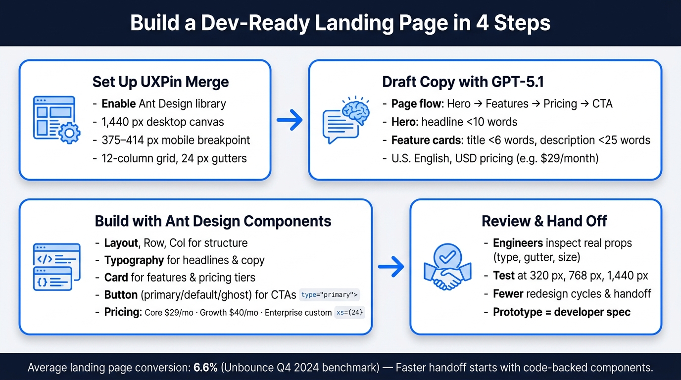
You can go from rough idea to dev-ready landing page by splitting the job into three parts: use GPT-5.1 for structure and copy, use Ant Design for UI components, and use UXPin Merge to assemble the page with the same parts engineers use. That matters when landing pages need testing fast, especially with average conversion at 6.6% from Unbounce’s Q4 2024 benchmark.
Here’s the short version:
- I start with GPT-5.1 to draft a simple page flow: hero, features, pricing, CTA
- I keep copy tight, in U.S. English, with USD pricing like $29/month
- I build the page in UXPin Merge with Ant Design parts like
Layout,Row,Col,Card,Typography, andButton - I use the grid for responsive layouts, such as 1,440 px desktop and 375–414 px mobile
- I set up clicks, hover states, and pricing actions so the prototype feels close to the shipped page
- I review copy and layout in the prototype instead of redoing static mockups
This workflow is simple: write with AI, build with code-backed components, then hand off with less guesswork. It gives me one clear path from draft copy to a prototype engineers can inspect and use.
If I need a landing page that is fast to review and easier to hand off, this is the setup I’d use.
How to Build a Landing Page with GPT-5.1, Ant Design & UXPin Merge
UXPin Merge AI: Smarter UI Generation That Follows Your Design System
sbb-itb-f6354c6
1. Set up UXPin Merge and the Ant Design library
Before you build the page, make sure your canvas uses the same Ant Design components your engineers will use. That keeps design and development in sync from the start. You’ll need an active UXPin account with Merge enabled, plus at least Editor permissions for the project. For stable previews, use the latest version of Chrome, Edge, or Safari.
Confirm Merge access and choose your component library
Open the Libraries panel and select Ant Design. In the left panel, components are grouped into categories such as Layout, Data Entry, and General, so you can drag them onto the canvas right away.
Set U.S. defaults for layout and content
Set the canvas for a U.S. audience before you generate any copy. Use a 1,440 px desktop canvas, a 375–414 px mobile breakpoint, and a 12-column grid with 24 px gutters. This lines up with Ant Design’s 24-grid system in <Row> and <Col>.
Also set content defaults now: U.S. spelling, dollar pricing, comma-separated thousands, and dates in Month Day, Year format. That way, every text component starts with the right U.S. localization.
Check which Ant Design components are available
Use these Ant Design components:
| Component | Used for |
|---|---|
Layout |
Page structure and section wrappers |
Row / Col |
Responsive grid for hero, features, and pricing |
Typography |
Headlines, subheadlines, and body copy |
Button |
Primary and secondary CTAs |
Card |
Feature blocks and pricing tier tiles |
Form |
Lead capture in the CTA section |
Input |
Email and name fields inside the form |
Use the right-side props panel to set type, size, layout, and placeholder text without writing code. If a component is missing from a custom library, fix that with your developers before you build that section.
With the library confirmed, use GPT-5.1 to draft the landing page structure and copy.
2. Use GPT-5.1 to generate landing page structure and copy
With your canvas and component library set, the next move is to create the words that go inside it. Use GPT-5.1 with tight instructions so you can get landing page copy fast and make it usable right away. Start with the outline. Then write each section one by one.
Draft the page structure section by section
Start by asking GPT-5.1 for a section-by-section outline before writing any copy. A practical SaaS landing page usually follows this order: hero → features → pricing → CTA. That sequence lines up neatly with the components you’ll drop into UXPin Merge.
A prompt like this works well: "Give me a SaaS landing page outline with four sections: hero, features, pricing, and CTA. For each section, list its purpose, the content types it needs, and how many items it should contain." The result gives you a clear plan for each section, and each part maps straight to the Ant Design components you built in Step 1. Once the outline is locked in, ask GPT-5.1 for the exact copy for each section.
Write concise copy in U.S. English
Generate copy one section at a time. That keeps the prompt tight and makes the output easier to place into components. For the hero, ask for one headline under 10 words, one subheadline under 20 words, and one primary CTA label. For features, ask for exactly three benefit-driven card headlines under six words each, with descriptions under 25 words. For pricing, ask for plan names, monthly prices, annual billing references, and short feature bullets for each tier.
Use U.S. pricing format every time. Your prompts should spell out wording like "$29/month, billed annually." CTAs should be direct and familiar, such as "Start free trial", "Get started," or "Book a demo," based on where the section appears in the funnel. If the copy comes back too long, tighten the prompt before you place it on the canvas.
Refine prompts so the output fits your design system
Make prompts match the component so the copy fits each Ant Design block. Long copy can spill out of a Card, so set limits from the start.
If a feature section uses three Card components, tell GPT-5.1 exactly that: "Write copy for exactly three feature cards. Each card needs a title under six words and a description under 20 words. Use plain U.S. business English. Avoid jargon." If the first draft still feels loose, follow up with: "Shorten each description to one sentence. Give me two alternative headlines for each card." That keeps edits small and saves time.
3. Build the landing page in UXPin Merge with Ant Design components
Now that your GPT-5.1 copy is done, drop it into UXPin Merge’s code-backed components so the prototype lines up with what engineering will ship. Use the exact headlines, card copy, pricing, and CTA labels from Step 2 in the matching components.
Build the hero and features sections
Start with the layout first, then fill in the copy. Add an Ant Design Layout component as the page wrapper. Inside it, place a Row with justify="space-between" and align="middle". Then split that row into two Col components, each set to xs={24} and md={12}. That gives you a simple setup: the text and image stack on mobile, then sit side by side on desktop. In the second column, add a product screenshot, dashboard preview, or illustration.
Use the exact headline and CTA text from Step 2. In the text column, place a Typography.Title at level={1} for your GPT-5.1 headline, such as Build production-ready prototypes in hours, not weeks. Add a Typography.Paragraph below it for the subheadline.
Then add two Button components:
- One with
type="primary"andsize="large"for the main CTA - One with
type="default"for a secondary action such as Request a demo
Ant Design recommends using no more than one primary button per section, so keep the visual order clear.
For the features area, add a Typography.Title at level={2} for the section heading. Under that, use a Row with three Col components set to xs={24} and md={8}. Put an Ant Design Card inside each column. Assign your GPT-5.1 feature titles to each Card’s title prop, then paste the short descriptions into Typography.Paragraph within the card body. Ant Design Cards are meant to show content tied to a single subject, which makes them a good match for feature tiles. Stick with built-in spacing and skip manual pixel adjustments.
Add pricing cards and a CTA section
Build the pricing section in the same pattern: a Row with three Col components using xs={24} and md={8}, with a Card inside each one. Use the current plan names and prices from the official pricing page: Core from $29/month, Growth from $40/month (Most Popular), and Enterprise custom pricing. Mark Growth with an Ant Design Badge or Tag.
Show the billing cadence right under each price with Typography.Text, such as billed monthly. Set the most popular plan’s Button to type="primary" and keep the others at type="default". For Enterprise, include custom component library integration, onboarding, and advanced AI controls, then point the CTA to uxpin.com/pricing.
After the pricing cards, add one bottom CTA block built for conversion. Use a full-width Layout container with a centered Row and one Col. A Typography.Title at level={2} works well for a line like Ready to build your next landing page in hours? Follow it with a short Typography.Paragraph, such as Start a 14-day free trial – no credit card required, and add a large primary Button labeled Get started.
If some buyers need to talk to sales first, add a secondary ghost Button for Contact sales. Use a Space component to handle the spacing between buttons.
Configure interactions and responsive behavior
Once the sections are built, set up interactions in UXPin Merge without changing code. For primary CTA buttons, add a Click interaction that either sends users to a sign-up page or scrolls them to the pricing section. For Request a demo, set a Click interaction to open an Ant Design Modal or move users to a separate demo-request section. If you have top navigation links, connect them to section anchors so the page feels like a real scrolling experience during review.
The responsive behavior should come from the grid props already set on each Col. Preview the page at 320 px, 768 px, and 1,440 px to check stacking, reflow, and overflow. Engineers can read those same grid props directly in JSX. Run those checks before moving into review and iteration in the next step.
4. Review, iterate, and keep design aligned with development
Once the page is built, use the prototype to test, refine, and hand off without changing the component structure.
With Merge, the prototype becomes the shared spec for the hero, features, pricing, and CTA. PMs can demo it live, and engineers can inspect real design system components and props.
Start with copy changes first. They’re the fastest way to improve the landing page.
Use Forge or GPT-5.1 to test copy and layout changes
When a stakeholder asks for a more action-oriented hero headline, you don’t need to rebuild the section. Turn the current page structure into a prompt and ask GPT-5.1 for 3 to 5 alternative headlines or subheadings in U.S. English. Keep GPT-5.1 prompts focused on the current sections, copy length, and U.S. English. Then paste the chosen variant into the existing Typography.Title or Typography.Text component in UXPin Merge.
Use Forge for design-system-safe suggestions. Use GPT-5.1 for copy variants.
Give engineers a clear picture of what will be built
Engineers can inspect Layout → Row → Col → Card and props like type="primary" and gutter={24} directly in the inspector. That means they can see how the page is put together instead of guessing from a flat mockup.
Set USD prices and U.S. date formats in the prototype so reviewers see final values. The payoff is fewer back-and-forth tickets and a shorter path from approved prototype to a staging build that matches what was designed.
Compare static mockup and UXPin Merge workflows side by side
That same component parity makes the handoff difference easy to see.
| Aspect | Static Mockup Workflow | UXPin Merge Workflow with Ant Design |
|---|---|---|
| Time to first prototype | Longer – everything is redrawn manually | Shorter – layout, spacing, and states come from code-backed components |
| Handoff iterations | Higher – engineers need more clarification | Lower – component names and props answer most questions upfront |
| Risk of design drift | Higher – one-off styles drift from the codebase | Lower – Merge keeps the design aligned with real Ant Design components and tokens |
| Reuse of production UI | Limited – engineers translate them by hand | High – prototype components map directly to reusable Ant Design patterns |
Conclusion: A repeatable workflow for faster landing page prototyping
Once you’ve reviewed the page and made a few rounds of changes, you’re ready to use the same workflow again on the next landing page.
The process is pretty straightforward: set up UXPin Merge with the Ant Design library, use GPT-5.1 to draft the page structure and copy, build each section with real components, then review and refine it with your team. After that, you can use the same setup for future landing pages.
The repeatable part is the component structure. GPT-5.1 changes the copy, but the structure stays the same. That fixed structure is what helps teams keep the design consistent without rebuilding everything from scratch every time.
Merge keeps prototypes tied to React components, so review stays close to what will actually be built.
For enterprise teams, that means fewer redesign cycles, less handoff friction, and stronger design system governance. That’s the payoff.
A good place to start is with a simple landing page:
- Hero
- Features
- Pricing
- CTA
Run the workflow from start to finish. GPT-5.1 handles the content, Ant Design provides the component system, and UXPin Merge keeps the prototype implementation-ready. That gives your team a practical path from idea to developer handoff. Start with one page, then use the same structure again for the next one.
FAQs
Do I need coding skills to use UXPin Merge with Ant Design?
No. UXPin Merge comes with native Ant Design integration, which means you can drag and drop production-ready React components straight from the library panel.
From there, you can tweak things like size, color, and text in the visual Properties Panel – no code needed. That makes it easy to build functional, high-fidelity prototypes with interactions and conditional logic.
How do I keep GPT-5.1 copy short enough for Ant Design components?
Set strict character or word limits in your prompt so GPT-5.1 fits Ant Design component space. For example, ask for a hero headline with a maximum of 60 characters or shorter CTA labels.
You can also ask for JSON output, which lets you map copy straight to component props. Clear design and scope constraints help prevent overflow or truncation.
What makes a UXPin Merge landing page easier for developers to use?
UXPin Merge makes landing pages easier for developers because it uses the same production-ready React components already in the codebase.
Since these are live, code-backed components, the design comes with built-in behavior like hover states, responsive layouts, and form validation. That means less guesswork, no need to rebuild layouts from scratch, and less back-and-forth between design and development.

