If I move from Figma to UXPin, I’m not just switching tools – I’m switching how I build, test, and hand off product work.
Here’s the short version: Figma is mostly frame-based and static. UXPin is component-based and tied more closely to code. That changes how I design screens, how engineers read specs, and how teams compare and sync design systems.
In plain English, this move usually means:
- I stop drawing many UI parts from scratch and start placing components with props and states.
- I get higher-fidelity prototypes with variables, conditions, validation, and branching flows.
- Engineers spend less time guessing because handoff includes component names, props, and behavior.
- Migration is not automatic: layouts may transfer, but logic, forms, states, and advanced interactions often need to be rebuilt.
- The switch works best for teams with a React component library or teams ready to work inside a stricter system.
A few facts stand out:
- UXPin can connect to libraries like MUI and Ant Design through Merge.
- One case study in the article says 3 designers supported 60 internal products and 1,000+ developers with a governed system.
- The biggest gains usually show up in handoff, system control, and prototype behavior – not in freeform visual work.
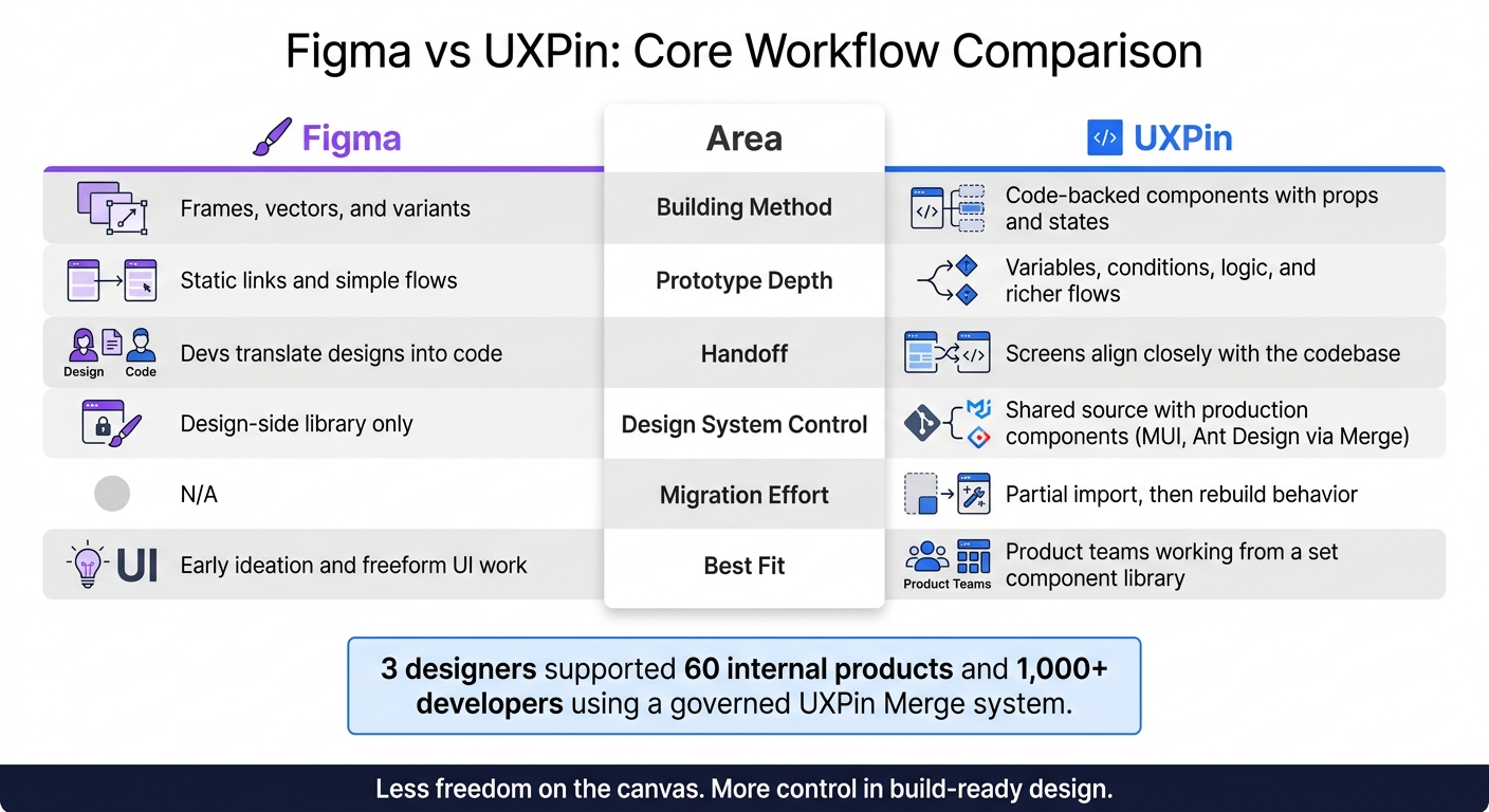
Figma vs UXPin: Core Workflow Comparison
Figma plugin – Copy, Paste, Prototype in UXPin
sbb-itb-f6354c6
Quick comparison
| Area | Figma | UXPin |
|---|---|---|
| Main building method | Frames, vectors, variants | Code-backed components, props, states |
| Prototype depth | Static links and simple flows | Variables, conditions, logic, richer flows |
| Handoff | Devs translate designs into code | Screens line up more closely with code |
| Design system control | Design-side library | Shared source with production components |
| Migration effort | N/A | Partial import, then rebuild behavior |
| Best fit | Early ideation and freeform UI work | Product teams working from a set component library |
My takeaway: if my team keeps losing time in design-dev back-and-forth, UXPin can fix a lot of that. But if my system is messy or still changing every week, the move may feel slow at first.
Below, I’d frame the article as a simple tradeoff: less freedom on the canvas, more control in build-ready design.
Figma vs UXPin: How the Core Workflow Changes
For teams thinking about a move, the main question is simple: how do these differences change speed, fidelity, and handoff? They shape how teams plan screens, review behavior, and pass work to engineering.
| Area | Figma | UXPin (with Merge) |
|---|---|---|
| Canvas | Shared canvas | Pages mapped to individual app views |
| Primary assets | Vector layers and shapes | Code-backed components (HTML/CSS/JS) |
| Component logic | Variants and static prototype links | Props, states, variables, and conditional logic |
| Component source | Visual UI kit (design-side only) | Production component library or built-in libraries like MUI or Ant Design |
| Collaboration focus | Real-time feedback on static mockups | Review of interactive prototypes that reflect real behavior |
| Design-to-dev handoff | Happens at handoff – developers interpret and recreate | Happens at design time – components already match the codebase |
The workflow shift gets easier to see when you look at the day-to-day work.
Canvas Structure, Assets, and Component Logic
In Figma, one file often contains a full user flow spread across dozens of frames, though you can turn Figma designs into interactive prototypes by moving them into a more robust environment. Pages tend to be used more loosely for broad grouping, like "flows" or "archive." In UXPin, each page maps to an app view, so the file structure follows the product’s navigation. That changes how designers organize and name work from the start.
The bigger shift is component behavior. In Figma, a button is usually a vector-based object with variants for hover, pressed, and disabled states. In UXPin, that same button is set up through props instead of being redrawn as layers. Change a text input to an error state, and you’re adjusting a prop, not rebuilding a frame.
What Changes for Designers, Engineers, and DesignOps
These differences hit each team in different ways.
For designers, the shift is from drawing UI to building screens with approved components. Component limits reduce the chance of making screens that look fine in review but fall apart in build. Early visual work can still happen, but screens meant for production are assembled by configuring real components.
For engineers, the biggest win shows up at handoff. Instead of translating mockups into build details, they get screens made from the same components already used in the codebase. Spec Mode shows component names, props, and interactions directly, so implementation becomes more like assembly than guesswork. That matters a lot for things like form validation or paginated data views, where state handling is tough to read from a static file.
For DesignOps, this brings more technical control. Because designers work from a curated component set, DesignOps can decide which components are available, remove old patterns, and keep tokens aligned with the codebase. Auditing gets much more concrete too: prototypes show exactly which components and props are in use.
Migrating Files and Design Systems Into UXPin
Migration isn’t a one-click job. Some parts of a Figma file move over without much trouble. Other parts need cleanup, and some have to be rebuilt from scratch. Knowing the difference up front saves time and cuts down on frustration.
| What You’re Moving | Transfer Status | What to Do |
|---|---|---|
| Layouts, frames, text, and images | Usually transfer via the plugin | Review layer naming and structure |
| Visual styles: colors, type, spacing | Usually transfer via the plugin | Map them to UXPin design system tokens |
| Page structure | Needs cleanup and reorganization | Reorganize around UXPin’s page-based model |
| Component variants and states | Usually need rebuilding | Recreate them as interactive states on a single component |
| Basic prototype links | Partial transfer | Enhance with triggers, actions, and animations |
| Form elements | Transfer as static images | Replace them with UXPin’s functional inputs and variables |
| Conditional logic, validation, and advanced behavior | Must be rebuilt | Use expressions and conditional interactions |
Moving Existing Screens and Rebuilding Missing Behavior
UXPin’s official Figma plugin, or a copy-and-paste-style workflow, can bring over screens as a starting point. That’s useful when you want to seed UXPin with existing layouts fast. But imported files still need a review pass for layer names, structure, and component fidelity.
A simple way to think about it: move the visual shell first, then clean it up so it fits UXPin’s page and component model.
The heavier lift is interaction logic. Anything tied to conditional flows, form validation, dynamic state changes, overlays, responsive behavior, or multi-step behavior in your Figma prototype has to be rebuilt inside UXPin with triggers, variables, and expressions. Figma carries over the design intent. UXPin is where teams rebuild how the interface actually works. A multi-step onboarding flow with branching logic, for example, may look fine after import, but its behavior still needs to be rebuilt.
Mapping Libraries, Tokens, and Patterns to a UXPin Design System
The best migration approach is foundations first, components second. Before moving screen by screen, normalize your colors, typography, and spacing into a token structure inside UXPin’s Design System Library. If you migrate components before doing this, you usually end up with duplicate patterns and inconsistency that’s a pain to sort out later.
Once the foundations are set, audit your existing Figma libraries for drift. Look for components that seem almost the same but changed over time, team-specific variants, and copy-pasted one-offs. Then choose which version becomes the main component in UXPin.
If your development team already uses a React library like MUI or Ant Design, connect it through Merge so designers and engineers work from the same source of truth. If you don’t have a custom library yet, you can start with the built-in integrations and move toward a proprietary system once your patterns settle down.
One internal case study showed that a governed, code-backed design system built with UXPin Merge allowed 3 designers to support 60 internal products and over 1,000 developers. That kind of scale comes from clean token and component ownership, not from importing screens alone.
Using Merge and Forge for Faster Design-to-Development Alignment
Once tokens and components are mapped, Merge and Forge help turn the design system into screens that people can actually use. At that point, design reviews stop being mostly about polish and start focusing on behavior, logic, and whether each component fits the job.
| Aspect | UXPin with Merge and Forge |
|---|---|
| Component behavior | Code-backed components with real props, states, and production logic |
| Prototyping depth | Conditions, variables, and realistic data flows using actual component behavior |
| Handoff quality | Spec Mode surfaces real component APIs and props, reducing ambiguity at handoff |
You feel the shift once designers start building full screens with those connected components. Instead of drawing lookalikes in Figma, they work with the same building blocks development already uses.
Designing With Merge and Built-In Libraries Like MUI or Ant Design
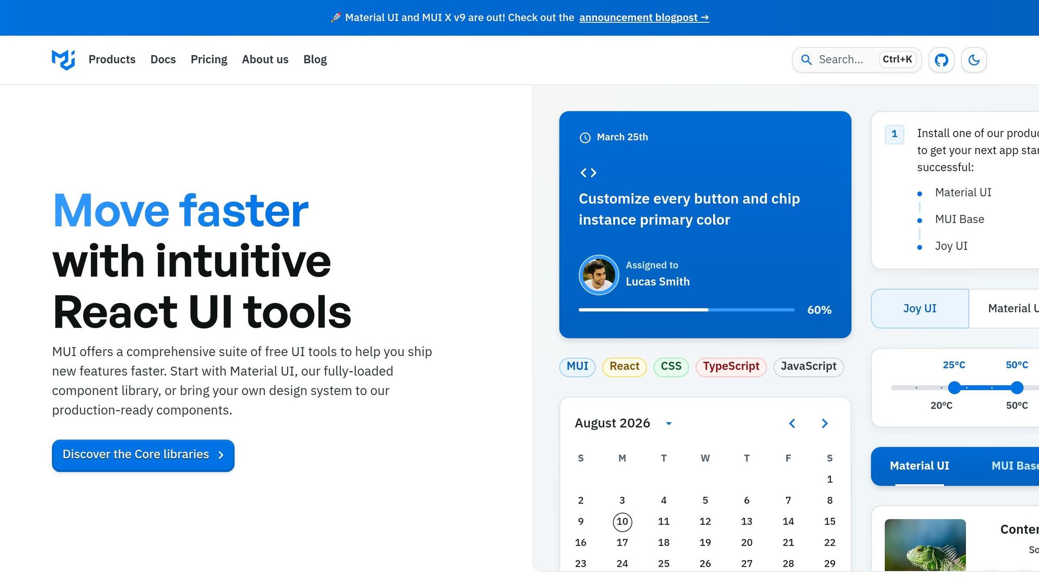
Connected libraries like MUI and Ant Design show up right on the canvas with their real props and states. A MUI Button, for example, includes options like variant, size, color, disableElevation, and startIcon. So designers can change how it works by editing properties, not by rebuilding the same element over and over.
For custom internal libraries, teams can connect through Git, Storybook, or npm. That keeps design and development tied to the same source. When component use, accessibility, and consistency need tight control, that shared source matters a lot.
How Prototyping, Spec Mode, and Handoff Work in UXPin
Because Merge components come with built-in states like hover, focused, disabled, and error, designers don’t have to make those from scratch. A login form can show the right error message based on the failed validation, toggle password visibility, and branch into success or failure paths with variables, all without duplicating screens.
Spec Mode shows the real component name and props. That changes handoff in a simple but important way: it becomes less about translating a mockup and more about checking structure, behavior, and logic.
Where Forge Fits During Migration and Iteration
Forge drafts screens in the canvas using approved components. If you prompt it to create a three-step checkout flow or a settings page, it puts together a starting point from the same component library your team already uses.
That comes in handy during migration, especially for repeatable patterns like:
- onboarding funnels
- dashboard variants
- form-heavy flows
Because Forge stays inside system boundaries, teams can move faster without slipping into off-system patterns.
That speed leads straight to the next issue: whether the migration effort pays off.
How to Decide if the Switch Is Worth It
Best-Fit Teams, Tradeoffs, and Rollout Considerations
After the workflow and migration details, the main question is simple: does this model fit your team?
UXPin makes sense when handoff friction keeps showing up. It also makes more sense when the move from static files to a code-backed workflow changes who can do solid work inside the system.
The tradeoff is pretty direct. UXPin gives up some freeform exploration in exchange for system discipline. It’s a better match for teams that design from reusable components, not one-off screens.
The best fit is usually enterprise and SaaS teams with mature component libraries and frequent designer-developer collaboration.
A good way to judge the switch is to check four things:
- System maturity
- Collaboration pain
- Implementation capacity
- high-fidelity prototyping vs. low-fidelity needs
If your component library is incomplete or changing fast, UXPin will only be as good as the system behind it.
For rollout, start small. Pick one pilot team or one product area, map the highest-priority components first, and define success before you expand. That gives the team time to refine governance, train users, and see whether the new workflow leads to real gains before the rest of the organization moves over.
FAQs
How long does a typical move to UXPin take?
It depends on the size of your design system and what your project calls for.
If your team already uses a code-backed system, some tasks that used to take more than an hour can drop to as little as 8 minutes. But the full move doesn’t happen overnight. The timeline changes from team to team.
For teams working with libraries like MUI or React, the setup starts with syncing your repository with Merge. That first step takes some work. But once it’s in place, it can cut engineering rework by up to 50% and help teams move faster.
Do I need a React component library before switching?
No. You can get started without a custom React component library by using UXPin’s built-in, production-ready libraries like MUI, Ant Design, Bootstrap, or ShadCN.
Later, if you need more control, you can sync your own Git-based React component library. That way, your organization’s design system becomes the single source of truth for prototyping and handoff.
What should I migrate first into UXPin?
Start with your existing design system.
If you already have a coded component library, connect it to UXPin through Merge with Git, Storybook, or npm packages. That gives your team one source of truth instead of bouncing between design files and code.
No custom library yet? You can use built-in libraries like MUI or Ant Design to get moving.
And if a full move feels like too much right now, take the simpler path: use the UXPin Figma plugin to bring your current screens into UXPin.