If your team already has React components, I’d prototype with those instead of redrawing the same UI. That’s the main point here. Using UXPin Merge ties design to the same component library engineers ship, which can cut handoff churn when 30%–40% of dev rework comes from weak or missing specs and designers spend 5–8 hours per week on handoff work.
Here’s the short version:
- I connect either a Git-based React library or an npm package
- I make sure the repo has clear props, variants, and tokens
- I add
uxpin.config.jsanduxpin.webpack.config.js - I expose only approved, stable components
- I sync the library again when props, themes, or components change
- I prototype with real props, states, and interactions, not fake layers
- I choose built-in libraries for less setup or an internal design system for a closer match to production
This workflow helps in plain ways:
- Designers work with components they can trust
- Engineers get handoff that maps to code
- DesignOps gets tighter control over what enters the library
A simple example: if a Button already supports variant="primary" and disabled={true} in code, I use those same options in the prototype. That means fewer made-up states, less manual spec work, and fewer surprises during build and QA.
Build Robust Prototypes with npm Libraries – UXPin Live Product Demo
sbb-itb-f6354c6
Quick Comparison
| Option | Best when I need | Setup | Match to shipped UI |
|---|---|---|---|
| Built-in UXPin library | Fast start | Low | High if the app uses that same framework |
| Internal React library via Merge | Brand control and exact component API match | More setup | Closest match |
So if I want less setup, I start with a built-in coded library. If I need my team’s design tokens, props, and component rules, I connect the internal React codebase through Merge.
What You Need Before Connecting Your Codebase to UXPin Merge
Before you connect your codebase, make sure the repo, access, and build setup are ready.
React Library and Repository Requirements
Start with a stable React component library or design system in GitHub, GitLab, Bitbucket, or npm. The setup should use predictable props, clear variants, consistent tokens, and a structure that’s easy to import.
Why does that matter? Because UXPin needs to read the same props, variants, and tokens your engineers use in production. If your code is messy or inconsistent, that handoff gets shaky fast.
Internal design systems are often a strong fit here. The same goes for customized MUI or Ant Design libraries, especially when your team controls the repo. If your library checks those boxes, you’re set up to connect it through Merge in the next step.
UXPin Merge Access and Setup Basics
You need Merge access and permission to decide which components editors can use.
If your team already works with MUI, Ant Design, Bootstrap, or ShadCN and has made only light changes, it usually makes more sense to use the built-in libraries instead of connecting a custom repo. That saves time and cuts setup work.
A custom Git or npm connection matters more when your team has internal components, tokens, or interaction patterns that don’t match those framework defaults. In that case, using your own library helps designers work with the same UI building blocks your team ships.
Configuration Files, Dependencies, and Permissions
Install Node.js, npm or yarn, and @uxpin/merge-cli v3.4.3+ as a dev dependency.
Then add two config files at the root of the repo:
uxpin.config.jscontrols which components, categories, and props show up in UXPin.uxpin.webpack.config.jshandles the Merge build and bundling step.
These files shape what designers can use and how Merge builds the library.
Merge reads prop-types, TypeScript interfaces, or Flow to show editable props in the Properties Panel, so those definitions need to be in place. No prop definitions, no editable controls. It’s that simple.
This is also where you control exposure. Only publish approved components, stable variants, and sanctioned tokens. That keeps the prototype library clean and helps stop designers from pulling in deprecated or unfinished UI.
If you want designers to edit spacing in the editor, add settings: { useUXPinProps: true } to uxpin.config.js only if your library supports it.
Once the repo, permissions, dependencies, and config files are in place, you can import the library and keep it synced as components change.
How to Connect a React Codebase to UXPin Merge
Connect a Custom React Library from Git
Once your repo is ready, connect it in Merge through Git or npm. In practice, that means linking the repo, mapping the exported components, and publishing the approved props. After that, run the Merge Dev Environment on your machine to make sure the components load as expected before you publish the library in UXPin.
Use the Git flow for internal libraries. Use npm for versioned packages.
You’ll also need to authenticate with your UXPin auth token. Store that token as UXPIN_AUTH_TOKEN in CI/CD, and keep it out of Git.
A simple example helps here. You might expose Button, Input, and Modal, along with the props that control user flows. That way, when designers open the Properties Panel, they see real controls they can edit – not filler fields or fake inputs.
Import a Packaged Library with npm Integration
If your library is already published, you can skip the repo connection and import the package version instead. In UXPin, enter the package name – for example, @mui/material – and choose the version your designers should use.
From there, use the Merge Component Manager to set component metadata, including clear display names, mapped props, and variants. This part matters more than it may seem. Without that setup, components can show up as generic placeholders. With it, designers can pick values like primary or secondary for a button, turn disabled on or off, or switch table density settings that match the real component API.
It also helps to pin the library to a stable release version. That keeps designers and engineers working from the same shipped component version instead of drifting out of sync.
Keep the Library in Sync as Components Change
Re-sync the library after component changes. If engineers update components, rename props, or adjust themes, run the Merge sync again so prototypes stay aligned with the codebase and remain accurate for design review, stakeholder sign-off, and QA.
How to Prototype in UXPin with Props, States, and Real Interactions
Build Screens from Your Component Library
Once your library is connected and synced, building a prototype feels a lot like drag-and-drop. Open the Merge Library panel, and your React components show up grouped by category – navigation, forms, tables, modals, and more. Drag a DataTable onto the canvas, place a DateRangePicker above it, and add a MultiSelect to filter by business unit.
From there, the Properties Panel gives you access to each component’s actual props. So instead of faking the interface, you can set a 30-day date range, format currency as $12,345.67, or turn table pagination on and off without rebuilding anything.
Use Real Props, Variants, and State-Driven Behavior
This is where UXPin starts to pay off. Every prop in the Properties Panel maps directly to the same component API engineers use. That means designers can choose only supported values, which helps keep prototypes buildable.
Say you have a TextField for a billing amount. You can set it to error={true} with helperText="Enter an amount greater than $0.00" to show what happens when a user enters bad input. Or take a DataTable: you can switch between compact, standard, and comfortable density settings with one dropdown.
The key here is simple: use the documented props from your library or Storybook, and skip ad hoc style overrides. If the component can do it in code, it should do it the same way in the prototype.
Add Interactions and AI-Assisted Layout Generation
UXPin can wire up component interactions without custom prototype code. A "New Report" button can set isReportModalOpen to true, open a Modal, and close it when the user clicks Cancel. Navigation can switch pages. Hover states can reveal inline edit icons on table rows.
For conditional flows, UXPin variables handle the logic. If you need to show different views based on user role, define a userRole variable and show or hide sections depending on whether the value is Admin, Manager, or Viewer. It’s a clean way to test product logic before a single line of implementation code is written.
Forge, UXPin’s AI assistant, can help you build a design system with AI to speed up early layout work. Describe the screen you want – "an admin page listing U.S. customer accounts with pagination and filters" – and Forge drafts it using approved components from your connected library or built-in sets. Teams can then tune the result by adjusting density, checking date formats, and reordering KPIs based on business priority. That leads straight into the next decision: when built-in libraries are enough, and when your own design system should take over.
Built-In Libraries, Internal Systems, and Workflow Benefits
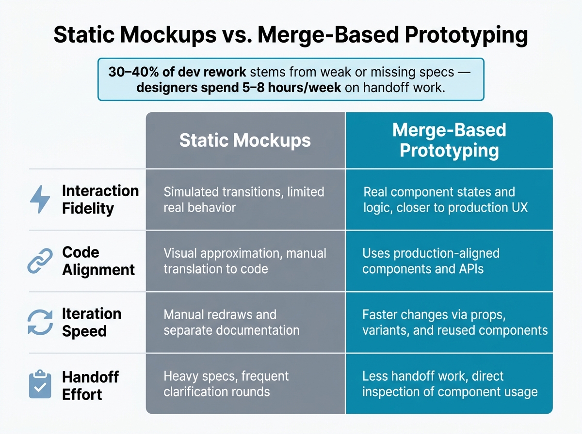
Static Mockups vs. Merge-Based Prototyping: Key Differences
When to Use UXPin’s Built-In Libraries vs. Your Internal Design System
Once your library is connected, the next step is simple: decide whether to prototype with a built-in system or with your own codebase. This isn’t about whether to use code in prototyping. It’s about picking the component source that gives your team the right mix of speed and control.
If speed is the main goal, go with a built-in coded library. If brand control and a close match to production matter more, use Merge-connected internal components.
A custom Merge setup works best for a mature internal system that needs exact tokens, governed props, and components that match production. It takes more setup, but it gets you much closer to what ships.
| Criteria | Built-In Libraries | Internal Design System via Merge |
|---|---|---|
| Setup effort | Minimal – enable the library and start prototyping | Moderate – requires Git or npm configuration and build setup |
| Production alignment | High, if production already uses the same framework | Complete – same component APIs as the production app |
| Best fit | Early validation, fast-moving teams | Branded systems with governed props and exact token requirements |
Use the lightest option that still fits your production needs.
How This Workflow Cuts Rework Across Design and Engineering
The big win here is less rework. Why? Because the prototype stays tied to real components.
Static mockups vs. high-fidelity prototypes can make room for layouts that look fine on a canvas but fall apart once engineering starts building them. Merge-based prototypes cut that off early by using real components from day one.
That usually means fewer adjustment rounds once implementation starts and less churn during QA.
| Aspect | Static Mockup Prototyping | Merge-Based Prototyping |
|---|---|---|
| Interaction fidelity | Simulated transitions, limited real behavior | Real component states and logic, closer to production UX |
| Code alignment | Visual approximation, manual translation to code | Uses production-aligned components and APIs |
| Iteration speed | Manual redraws and separate documentation | Faster changes via props, variants, and reused components |
| Handoff effort | Heavy specs, frequent clarification rounds | Less handoff work, direct inspection of component usage |
Conclusion: What Teams Should Do Next
Choose the lightest library that still matches production. Expose only stable components. Keep the library in sync as the codebase changes.
If you need to move fast, start with a built-in coded library. If your team needs full brand and governance control, connect your internal React system through Merge. In both cases, only expose stable, approved components – not experimental or app-specific ones that can create inconsistency.
From there, prototype with real props, documented states, and actual interactions. As the codebase changes, keep the library synced so your prototypes stay aligned with what engineering is building.
FAQs
How much React setup do I need before using Merge?
Not much, but you do need a working React setup that Merge can bundle and import.
For Git-based integration, that means:
- A React app running React 16.0.0+
- Webpack 4.6.0+
- Components stored in their own folders with default exports
- The Merge CLI
- Minimal
uxpin.webpack.config.jsanduxpin.config.jsfiles
The first setup usually takes about 30 minutes. That said, full integration time depends on how complex your library is.
Should I connect our internal library or use a built-in one?
Connecting your internal library is the best way to get a true single source of truth. When you import your own codebase through Git, Storybook, or npm, designers and developers work from the exact same components. That keeps design work much closer to what ships in production.
Built-in libraries like MUI or Ant Design work well for quick exploration, early trials, or teams that don’t have their own system yet. They help you move fast at the start. Then, when you’re ready, you can connect your internal library to build a custom design system that matches production.
How do I keep prototypes updated when components change?
Prototypes stay in sync through your Git repository integration. When developers update your component library, changes to props, styling, and interactions show up in the design environment.
For custom components, link your Git branch to keep things in sync in real time. If you’re using npm integrations, click Publish Library Changes and refresh your browser. You can also manage versions by hand with branches and tags.