If I want prototypes that match what gets built, I need to design with code components, not static shapes. That means I connect UXPin to a UI library or my team’s design system, use shipped props and states, add logic for errors and empty screens, and keep everything synced through Storybook or Git.
Here’s the short version:
- I can start with built-in libraries like MUI, Ant Design, Bootstrap, or ShadCN
- Or I can connect a custom design system through Storybook or Git
- I should check props, variants, states, and docs before I build
- I need to use U.S. formats like
08/11/2026,4:30 PM, and$1,250.00 - I build screens with code-backed buttons, inputs, tables, and nav
- I add variables, conditions, validation, empty states, and success states
- I fill prototypes with real sample data, not fake placeholders
- I hand off work through inspectable JSX, props, styles, and dependencies
- I keep prototypes aligned by syncing component updates from the code source
One case in the article stands out: 3 designers supported 60 internal products and 1,000+ developers after syncing a design system into UXPin. Another team said engineering time dropped by around 50%. Those numbers show why this setup matters: fewer gaps between design review and shipped UI.
At a glance, the article’s point is simple: static click-throughs show screens, but code-backed prototypes show behavior. If I need reviews, testing, and handoff to reflect the product more closely, UXPin’s code-based workflow is the better path.
UXPin Merge Tutorial: Prototyping an App with MUI – (4/5)
sbb-itb-f6354c6
Set Up UXPin to Work with Real Code Components
Before you drag anything onto the canvas, decide where your components will come from. That one call affects how fast you can begin, how close the prototype stays to production, and how much back-and-forth you’ll need with engineering.
Choose between built-in libraries and a custom design system
UXPin gives you two options.
One option is to use the built-in libraries. MUI, Ant Design, Bootstrap, and ShadCN are available right inside the editor. You can enable a library and drag real components onto the canvas. This route makes sense when speed matters more than strict control.
The other option is to connect your own design system through Storybook or Git. In that setup, engineering exposes the components, adds the UXPIN_AUTH_TOKEN to CI, and updates pushed from the default branch sync those components into UXPin.
Use built-in libraries when you want to move fast. Use Storybook or Git when you need an exact match with production and closer control.
Once the connection is in place, check component props and states before you start laying out screens.
Check props, variants, and documentation before you start designing
Open a common component like a Button, TextField, or data table and look at the properties panel. Make sure core props such as variant, size, disabled, error, and helperText are exposed. Also confirm that interaction props like onClick and onChange can connect to UXPin variables or actions.
Start with states. A TextField should show, at a minimum, default, focused, error, and disabled states. If a state your flow needs isn’t in the editor, it won’t show up in the prototype either. That’s the kind of small gap that turns into handoff friction later.
For custom design systems, check naming too. If design uses status and code uses state, that may look minor on paper, but it can create confusion during review.
Create UXPin documentation that lists key components, states, props, and engineering links. It gives new team members a clear starting point and helps design and engineering stay in sync as the system changes.
Set up U.S.-localized patterns in forms and data views
Use the same formats people will see in production. Because code-backed components expose real props and formatting, the sample values you enter in UXPin are the same values stakeholders and testers will react to.
Stick to these U.S. patterns:
- Dates in MM/DD/YYYY format, such as
08/11/2026 - Time in 12-hour format with AM/PM, such as
4:30 PM - Currency in U.S. dollars with comma separators and two decimal places, such as
$1,250.00,$49.99, and$120,000.00
Set locale="en-US" on purpose instead of depending on a default. If a currency field has validation, spell out the format clearly, for example: “Enter amount as 1,250.00.”
If your product handles physical measurements, use imperial units. A logistics dashboard might show package size in inches and distance in miles. A health app might show weight in pounds. Label fields and charts with the unit, like “Distance (mi)” or “Weight (lb).”
Set these patterns in template forms and reusable component presets early. It’s much easier to apply one currency mask at the component level than to fix dozens of screens right before a stakeholder review.
With component sources and formatting set, you can move on to building the first screens.
Build Screens with Code-Backed Components in UXPin
Assemble layouts from real buttons, inputs, tables, and navigation
Once your components are connected, you can turn them into full screens.
In UXPin, you build with real components, not static rectangles dressed up to look like UI. Each element on the canvas maps to a shipped component, so the screen you design lines up with what gets built.
A simple way to start is with an app shell: top nav, sidebar, and main content area. Then layer in a filter row with dropdown and text field components, followed by a paginated data table with sortable columns. The finished screen matches production spacing, typography, and layout structure instead of giving you a rough visual stand-in.
UXPin’s Patterns feature takes this a step further. You can group related UI into a reusable pattern and drop it into other screens as needed. That helps keep dashboards and internal tools aligned, and it saves time when you’d otherwise rebuild the same layout again and again.
Configure props and variants to match production behavior
You configure components in the properties panel, and each control maps to the same code props developers ship.
Say you’re designing an operations admin panel. You might pick a dense table variant to show more rows at once, switch to a compact table density, turn on row selection with selectionMode="multi", and add a toolbar with real Export CSV and Mark as Shipped buttons. For a billing form, you could set an MUI TextField with variant="outlined", size="small", type="number", and helperText="Enter amount in USD". That setup mirrors the production component API.
Visual setup is only part of the story. State props matter too. Toggle loading, disabled, and error on buttons and inputs so reviewers can see how the UI reacts when data is still loading or when an action isn’t available. A field set to error={true} with helperText="Enter a valid 5-digit ZIP code" shows both the visual treatment and the validation rule in one spot.
“When I used UXPin Merge, our engineering time was reduced by around 50%. Imagine how much money that saves across an enterprise-level organization with dozens of designers and hundreds of engineers.” – Larry Sawyer, Lead UX Designer
Use Forge to generate layouts with approved components
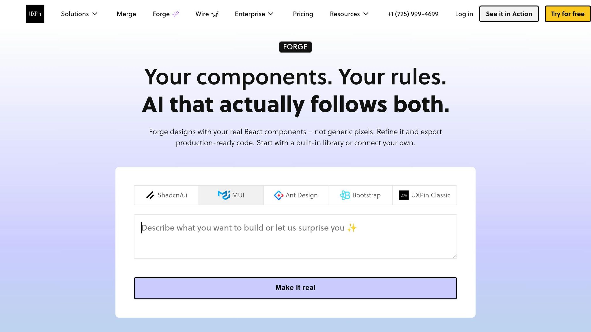
Use Forge when you need a fast first draft built from approved components. Forge, UXPin’s built-in AI assistant, generates initial screen layouts with the real components from your connected library. You describe the screen you need, and Forge puts together a structured layout with navigation bars, cards, tables, and forms from your design system.
The smart move is to treat Forge’s output as a starting draft, not the final screen. After it generates the layout, clean up spacing, switch variants, and swap placeholder content for localized data. Then add interaction logic so the screen behaves like the actual product. That way, you move faster without drifting away from the design system.
Build Interactive Flows Ready for Review and Handoff
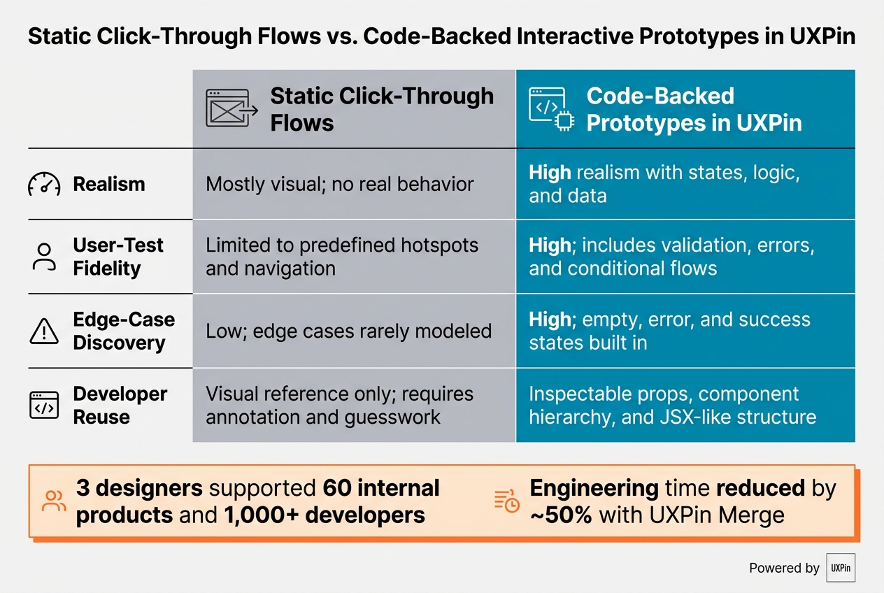
Static Click-Through Flows vs. Code-Backed Prototypes in UXPin
Add states, variables, and conditional logic to simulate real product behavior
Once the screen is built, the next step is behavior people can actually test.
Reviewers and testers need to see how the UI reacts in practice. What happens when a form fails validation? What does a table look like when it returns zero results? How does a user move through a multi-step checkout flow? That’s where UXPin’s states, variables, and conditional logic do the heavy lifting.
A good place to start is a core behavior checklist for each critical flow:
- One success state
- One error state
- One empty state
- One edge case
For a payment form, that means showing what happens when the amount field is left blank, when a user types letters instead of numbers, and when submission works and a confirmation banner appears.
For a data table, it means showing the empty state on purpose. Add an illustration, a message like “No transactions yet”, and a “Create transaction” button. A blank layout might look fine at first glance, but it can hide discoverability problems until late in development.
It also helps to model filters and pagination. Bind filter controls to variables, then use conditional logic to show or hide rows based on those values. Track the current page index as a variable and swap data sets when users click “Next.” That gives testers something much closer to actual filtering behavior, and it helps teams sort out an early product call: should this enterprise dashboard use explicit pagination or infinite scroll?
For multi-step flows – wizards, onboarding sequences, expense submissions – set up “Next” and “Back” buttons to update a step variable and conditionally render different panels. Keep previously entered data across steps. This is where the cracks start to show: users dropping off mid-flow, losing data when they go backward, or misreading progress indicators.
The same setup also makes validation, recovery, and completion paths much easier to review before handoff.
Populate prototypes with realistic content and structured data
Generic placeholder content like “Item 1” or “$0.00” doesn’t give developers much to work with.
Instead, define variables that map to actual domain fields, such as invoice_amount, billing_date, customer_name, order_total, and weight_lb. Then fill them with values that match normal ranges.
A transactions table, for example, should include multiple statuses like Paid, Pending, and Overdue. It should show dates across several months and amounts ranging from tens of dollars to tens of thousands. Use labels that sound like they belong in a working product too: “Purchase Order #10294”, “Net 30”, “Quarterly spend.”
This kind of data leads to more natural testing. It also gives developers concrete direction on how UI components should bind to backend fields, including edge cases like negative amounts for refunds or timestamps with time zones.
Static click-through flows vs. code-backed interactive prototypes
The gap between static click-through flows and code-backed prototypes isn’t just about fidelity. It changes what your team can learn and how much work developers still need to do after review.
| Aspect | Static click-through flows | Code-backed interactive prototypes in UXPin |
|---|---|---|
| Realism | Mostly visual; no real behavior | High realism with states, logic, and data |
| User-test fidelity | Limited to predefined hotspots and navigation | High; includes validation, errors, and conditional flows |
| Edge-case discovery | Low; edge cases rarely modeled | High; empty, error, and success states built in |
| Developer reuse | Visual reference only; requires annotation and guesswork | Inspectable props, component hierarchy, and JSX-like structure |
Static flows show navigation. Code-backed prototypes show behavior, edge cases, and reusable structure.
Keep Prototypes Aligned with Development Through Review and Deployment
Support developer handoff with inspectable props, dependencies, and JSX
After you test the interactive flow, the last step is making the approved build details easy for developers to use. With Merge-based prototypes, developers work from the approved code itself.
In UXPin’s Spec Mode, engineers can open the prototype from the preview window and inspect each component. They can see the exact JSX, styles, tokens, props, and dependencies tied to that element. So if a designer sets a button to variant="contained", color="primary", and size="large", those exact values appear in the Inspect panel. Developers don’t have to guess from notes or annotated screenshots. They can match the approved setup directly.
That shifts the review output from a visual reference into something much closer to build-ready specs.
Once that approved prototype is open for inspection, the next job is keeping it in sync with the codebase.
Sync design changes through Storybook or Git-connected components
Use Git or Storybook as the source of truth. When engineers update a component, sync the Merge library so UXPin shows the latest props, variants, and styles. When the source component changes, the prototype changes with it. Deprecated props drop away, new variants show up, and existing prototypes update on their own.
To keep that sync from causing problems in active work, handle design system updates the same way you’d handle a product release. Use semantic versioning, flag breaking changes early, and review major token or layout shifts together before merging them.
Conclusion: The shortest path from design intent to shipped UI
In practice, the process is pretty simple: connect UXPin to your code source, build screens with real components and accurate props and variants, add realistic logic and U.S.-localized data, and keep the prototype synced as the system changes.
The end result is an implementation-ready blueprint developers can inspect, check against, and build from with confidence. That usually means less rework, fewer QA surprises, and a shorter path from a tested prototype to shipped UI.
FAQs
How much engineering support do I need to connect code components in UXPin?
It depends on how the library is connected.
With npm-based open-source UI libraries, you can usually start prototyping right away. No developer help is needed in many cases, which makes the first step pretty simple.
Custom design systems linked through Git or Storybook are a different story. They tend to be more involved and usually need some technical setup before your team can use them smoothly.
The setup time can be as short as 2 hours, but a full integration may take several days.
For the handoff to go well, engineers need to make sure components are:
- well structured
- correctly bundled
- free of app-specific logic
What should I prototype first to prove this workflow works for my team?
Start small. Pick one feature or a pilot project, like a single web page or one mobile app screen, and build it with a small set of core components.
Before you scale, take stock of your UI patterns and pin down the design tokens that matter most. Then check props, variants, and interactions against your live codebase or Storybook. That gives you a clear read on whether design and development match up, and it helps you tighten the process before rolling it out further.
How do I avoid broken prototypes when the design system changes?
Use the automated sync in UXPin Merge. Because prototypes come straight from your codebase, updates pushed to your repository show up in the UXPin editor. Just reload your browser tab to see changes like updated styles or new component props.
For stability, use Git branches and tags to keep prototypes tied to approved versions while your team works on newer iterations.