If you need to test logic, validation, and component states before code starts, UXPin is the better fit. If you only need screen-to-screen flows, tools like Figma, Sketch, and Adobe XD can still work.
I’d sum up the article like this:
- UXPin focuses on behavior, not just clicks between screens
- It supports variables, conditions, expressions, and state changes
- Merge connects prototypes to code components from tools like MUI, Ant Design, Bootstrap, and ShadCN
- Forge creates layouts using the same design system rules already in the project
- Figma is strong for fast UI work, but it stops short when flows need logic-heavy behavior
- Sketch is more limited for this use case because teams often depend on plugins
- Adobe XD is better for motion demos than for testing rules, errors, and branching paths
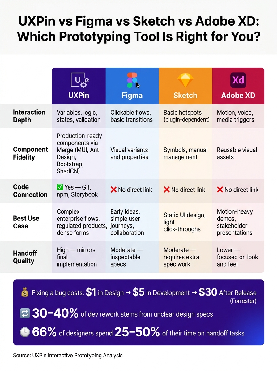
The article also points to a cost issue: 30%–40% of development rework can come from unclear or missing design specs, and 66% of designers spend 25%–50% of their time on handoff tasks. It also cites the common cost pattern of fixing a problem at $1 in design, $5 in development, and $30 after release.
If I were choosing based on the article, I’d use this rule:
- Pick UXPin for dense forms, permissions, approval flows, and regulated product work
- Pick Figma for early ideas and simple user journeys
- Pick Sketch for static interface design
- Pick Adobe XD for motion-heavy presentations
Quick Comparison
| Tool | Interaction depth | Components | Code connection | Best use |
|---|---|---|---|---|
| UXPin | Variables, logic, states, validation | Production-linked via Merge | Yes | Complex product flows |
| Figma | Clickable flows, basic transitions | Visual variants | No direct link | Early design and collaboration |
| Sketch | Basic hotspots | Symbols | No direct link | Static UI work |
| Adobe XD | Motion, voice, media triggers | Visual reusable assets | No direct link | Demos and presentations |
So the core point is simple: this is not just a tool comparison. It’s a choice between testing navigation and testing behavior. That difference matters most when teams need clean handoff and fewer build-stage surprises.
UXPin vs Figma vs Sketch vs Adobe XD: Prototyping Tool Comparison
UXPin Merge Tutorial: Prototyping an App with MUI – (4/5)
sbb-itb-f6354c6
How UXPin approaches interactive prototyping
UXPin builds prototypes around web-native behavior, so teams can test inputs, validation, and state changes. It does this through three layers: behavior, connected components, and system-aware AI.
Variables, logic, and state changes in prototypes
UXPin supports variables, expressions, and conditional logic right inside the prototype canvas. Variables store input and share it across screens and states. Expressions handle calculations and computed values. Conditional logic supports if-then and if-else branching based on variable values, element content, or component states.
That means a prototype can respond, branch, and validate much more like the product it stands in for.
Say a team needs to model an approval flow where a rejection path requires a reason before the user can continue. UXPin can handle that. Teams can test dependent fields, validation gates, and state changes before anything gets built.
UXPin Merge: designing with connected production components
UXPin Merge connects the canvas to production components. Teams can design with components from MUI, Ant Design, Bootstrap, and ShadCN right in the canvas. Custom systems can connect through Git repositories, Storybook, or npm packages with @uxpin/merge-cli.
This isn’t a separate design-system add-on. It’s part of how UXPin makes prototypes act more like build-ready products.
"We synced our Microsoft Fluent design system with UXPin’s design editor via Merge technology. It was so efficient that our 3 designers were able to support 60 internal products and over 1000 developers." – Erica Rider, UX Architect and Design Leader
Forge: AI that works within your design system
That same system alignment shapes AI-assisted layout creation too. Forge is UXPin’s built-in AI assistant for generating layouts inside the canvas. It stays within the design system, using the components already in your project’s library, including any custom library connected through Merge. It can also follow Design System Guidelines that set rules for color, typography, spacing, and layout constraints, so the output stays within approved system rules.
Why does that matter? Because Forge generates layouts from the same approved system used in the prototype. That helps protect consistency and handoff accuracy.
These are the capabilities that shape the comparison below.
Tool-by-tool comparison: UXPin vs Figma, Sketch, and Adobe XD
Once you look at tools through this lens, the next step is pretty simple: compare how each one handles behavior, component reuse, and handoff accuracy.
UXPin vs Figma: frame-based flows vs production-aligned prototypes
Figma is a strong pick for fast UI collaboration. But its prototypes stay much closer to screen-to-screen flows than to actual product behavior. That works well for simple flows and early concept testing.
For enterprise teams, the main limit is not collaboration speed. It’s that Figma can’t fully model task logic and component state. Its prototype model is less suited to checking conditional logic or component behavior that needs to match the final product, which UXPin handles natively. So when a prototype needs to branch, block input, or reflect state changes, validation tends to stop short.
Component behavior is different too. Figma relies on visual variants and properties. UXPin Merge connects straight to production components, so prototypes respond with real props and behavior instead of a visual stand-in.
| Dimension | UXPin | Figma |
|---|---|---|
| Interaction Fidelity | Production-accurate states and logic | Screen-based transitions |
| Component Realism | Real code props and responsive behavior | Visual variants and properties |
| Design-System Alignment | Direct sync with production code via Merge | Manual sync between design files and code |
| Handoff Clarity | Production-ready components | Inspectable specs and code snippets for handoff |
UXPin vs Sketch: plugin-reliant workflows vs built-in system alignment
If behavior isn’t the issue, the next tradeoff comes down to how much the workflow depends on plugins and manual setup.
Sketch is still a solid tool for static UI design and light click-through prototypes. But for enterprise teams, its biggest weak spot is plugin reliance. That adds friction when teams need one governed prototype system instead of a bunch of plugin-dependent setups.
UXPin keeps interaction logic, component governance, and system alignment in one place. No plugins are needed for the core workflow.
| Dimension | UXPin | Sketch |
|---|---|---|
| Interaction Fidelity | Native logic and data binding | Basic hotspots; richer behavior often needs plugins |
| Component Realism | Single source of truth via code repository | Manual symbol management; prone to drift |
| Design-System Alignment | Built-in system governance | Plugin-reliant; inconsistent across teams |
| Handoff Clarity | High; components are already production-ready | Moderate; requires additional specification work |
UXPin vs Adobe XD: motion-focused prototyping vs logic-driven behavior
When logic matters less than presentation, motion becomes the key point of difference.
Adobe XD is good at motion, voice, and multimedia demos. Auto-Animate, voice triggers, and audio/video/Lottie playback make it a strong fit for showing stakeholders motion and flow. That helps in demos, but it’s less suited to testing decisions, validation, and error paths.
Motion can show behavior. It can’t test branching logic or rules that depend on state. UXPin’s if-then logic and component-backed behavior are built for the parts enterprise teams usually need to test most. That tradeoff stands out fast when a team has to choose between a clickable mockup and a production-aligned prototype.
| Dimension | UXPin | Adobe XD |
|---|---|---|
| Interaction Fidelity | Logic-based branching and state changes | Motion-based interactions, voice triggers, and playback actions |
| Component Realism | Code-backed components with real behavior | Reusable visual assets and states |
| Design-System Alignment | Deep integration with dev repositories | Visual library focused on brand consistency |
| Handoff Clarity | High; mirrors final implementation behavior | Lower; focused on look and feel over functionality |
Workflow tradeoffs for enterprise teams
The right prototyping workflow comes down to one thing: what you need to test. From there, the next step is pretty straightforward. Match the workflow to the feature’s complexity.
When clickable mockups are enough
Not every project needs behavior that mirrors production. For early concepts, simple sign-up flows, or onboarding tours, clickable mockups usually do the job. At that stage, speed matters more than precision, and the risk of getting something wrong is low because changes are still cheap.
Here’s a simple rule of thumb: if the interaction is mostly page-to-page movement and basic hover states, and engineering can fill in the behavior without a long spec, a clickable mockup is enough for now.
When production-aligned prototypes reduce time and cost
That changes once validation depends on rules, permissions, or error states. As product complexity goes up, clickable mockups start leaving too much unsaid. Dense forms, conditional field behavior, role-based permissions, and multi-step workflows are where that gap starts to hurt. Engineers end up making their own calls, and those guesses turn into bugs, rework, and extra review rounds.
Forrester estimates that fixing a problem costs $1 during design, $5 during development, and $30 after release. That alone is a strong reason to sort out unclear behavior before anyone writes code. In regulated fields like healthcare, finance, and insurance, the pressure is even higher. Compliance teams need to check the full interaction logic – consent steps, error handling, and access rules – not just a polished screen path.
Production-aligned prototypes cut down on that uncertainty. They use real components, conditional logic, and state changes to show what actually happens: fields appear, roles switch, validation states show up. That means less back-and-forth, less clarification time, and less rework.
Summary table: matching workflow to team needs
The table below gives you a quick way to line up each workflow with the kind of work your team is doing.
| Criteria | UXPin | Figma | Sketch | Adobe XD |
|---|---|---|---|---|
| Realistic interactions | Logic-based variables, conditions, and states | Clickable flows and basic transitions | Clickable flows and basic transitions | Motion-oriented transitions and micro-interactions |
| Component-driven design | Real, production-ready components via Merge | Visual components and variants | Symbols and manual component management | Components and instance reuse |
| Code-backed systems | Direct connection to the production codebase | No direct code-backed prototyping | No direct code-backed prototyping | No direct code-backed prototyping |
| Best-fit use cases | Complex enterprise apps, design systems, regulated workflows | Early exploration, visual collaboration, simple flows | Static UI design, light click-through prototypes | Motion-heavy demos and stakeholder presentations |
Conclusion: Key differences to guide your tool choice
After looking at interaction depth, component realism, and handoff quality, the choice comes down to fit. Pick the workflow that lines up with the level of product complexity you need to test and the handoff precision your team expects.
For early ideas and simple user flows, fast clickable mockups can be enough. Things change when design decisions need to match implementation from day one. UXPin helps close handoff gaps by letting teams design with real, production-ready components through Merge and by using Forge within the limits of the actual design system. That keeps design and development working from the same component set.
Here’s a quick recap of what to weigh before making a decision:
- Interaction depth: Does it support variables, logic, and state changes, or just screen-to-screen transitions?
- Component fidelity: Are the components visual stand-ins, or are they production components?
- System governance: Can updates stay in sync through Git, npm, or Storybook?
- Handoff quality: Can developers work from actual props and structure, or only visual specs?
Use those four questions to choose the workflow that fits your product.
FAQs
When do I need production-aligned prototyping?
You need production-aligned prototyping when your project calls for high-fidelity, interactive experiences that behave much like the final product.
It’s especially useful for accurate usability testing, advanced conditional logic, form validation, and data-driven interface validation before development starts. For enterprise teams, it can help close the design-to-development gap by using the same code components in both places. That means less manual handoff, up to 50% less engineering rework, and better consistency across the product.
How does Merge improve design handoff?
Merge makes design handoff smoother by giving design and development one source of truth. It syncs production-ready components from your Git repository, Storybook, or npm packages straight into the UXPin canvas, so both teams work from the same code.
Because these components are functional, developers can copy production-ready JSX right from the prototype specs. That cuts out manual redlining and the guesswork that comes with static mockups, which can reduce engineering time by up to 50%.
What workflows benefit most from UXPin?
UXPin is a strong fit for workflows that depend on high-fidelity, production-aligned prototyping, especially in enterprise teams handling complex design systems.
It’s a good match for teams that need prototypes to feel close to the final product, with dynamic data, conditional logic, and actual form interactions. That matters when static mockups just don’t cut it. It also helps cut handoff friction and design drift by giving teams a shared code-backed component library.