90s Websites – Key Characteristics & Examples
Trends have a way of repeating themselves. This is perhaps most apparent in fashion – the 1970s drew inspiration from the 1950s, and in a cycle that repeated itself about every 20 years. That said, this design cycle is not exclusive to clothing trends – it can also be seen in other areas, including website design.
In recent years, we’ve seen quite a few references to the early days of the world wide web. In this piece, we discuss the main traits of 90s-inspired digital design and give you a few most prominent examples. If you’d like to give your designs that 1990s ‘feel’, you’ve come to the right place.
Build realistic prototypes of websites or apps in minutes in UXPin. Make your prototypes behave like an end-product with UXPin’s powerful features like variables, states, and expressions. Start prototyping. Sign up for a free trial.

90s Website Key Characteristics
The early days of the world wide web were iconic, but not nearly as efficient as today’s Internet experience. This breakdown of the most eye-catching and enjoyable aspects of 90s website design is intended to be used as a muse.
When the right amount of nostalgia is mixed with decades of advancement, beautiful and functional websites can be created.
Patterned background
The 90s were a lot of things, but they certainly weren’t minimalistic! Bright colors and patterns were a staple of the decade, especially when it came to website backgrounds. The night sky, studded metal, bright geometric patterns, and repeating logos were just a few of the bold backgrounds that would catch your eye some 20-30 years ago.
The busy nature of these backgrounds might make them seem unreasonable, especially when streamlining website design for ease of use. In cases where these designs overwhelm other factors on the web page that might be true. Still, the human brain loves patterns. Research suggests that looking at repeating patterns can reduce stress, since they are a form of visual stimuli often found in nature.
So how can you create your own 90s-inspired website background? You have a few options, with the most simplistic being a search for “free repeating background”.
If you find something you like, add it to your site, and if you don’t, check out sites like Pixabay. A search for repeating patterns will provide you with hundreds of options. If you’re still not satisfied with your findings, create your own design or you hire an artist to bring your background pattern ideas to life.
For some extra 90s magic, you can incorporate an animated background. Sites like Textures Town offer 3D animated designs to fit a variety of themes. The site itself is also a great source of retro inspiration.
Navigation
Today, website navigation is a core factor when it comes to user experience and attention retention. But that wasn’t always the case. In the 90s most websites were cluttered with links and options that lacked clean categories.
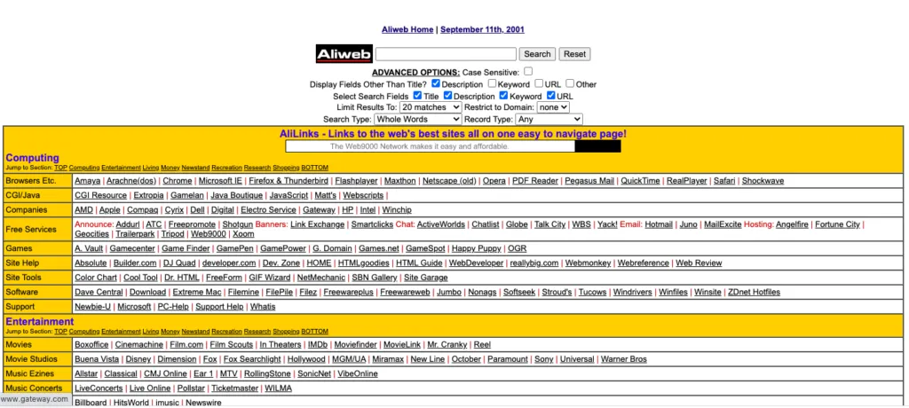
AliWeb, the world’s oldest search engine, is an interactive example of this navigation style. You’ll quickly notice that the navigation of this site is “stacked” unlike navigation on similar search engines, like Google.
Sub-navigation systems, most commonly identified as drop-down menus, were not invented until the late 90s to early 2000s. As a result, the most iconic 90s websites used lists of links, icons, or flash animations. User-friendly navigation and 90s-era navigation don’t have to be mutually exclusive.
Research suggests that the order of website menu items has little effect on the ease with which people locate their options, but the best results come from menus with 10 or fewer options. This suggests that the right balance of 90s-designed menu options can be both, functional and fashionable.
Clickable icons
Menu icons and banners are a common sight on most webpage templates. These simple navigation tools allow words to guide visitors through sites, but icons used to be a preferred method. Embedding images with links allowed early websites a creative and eye-catching alternative to simply listing links with uniform text.
CSS, or cascading style sheets, used to simplify the structure of current web pages was not available in the 90s. Icons offered a simplified and stylish form of navigation that was easy to identify. In some cases, the icons would be suited to their background as if they were interacting with it, or they would stand in stark contrast to it.
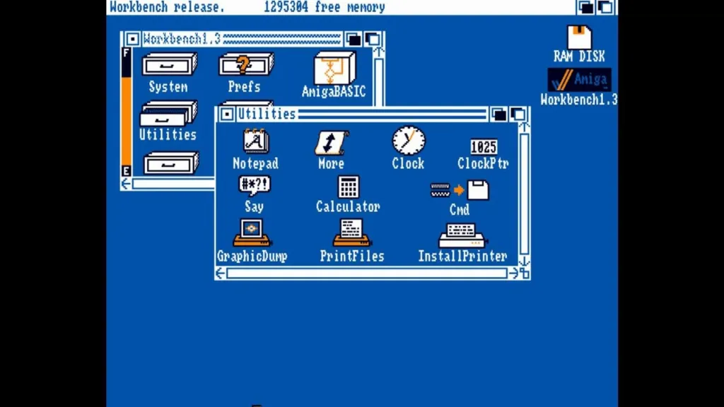
Apple offers a great example of the effectiveness of well-placed image icons. The icons used today for Apple’s clock, calculator, and notepad are reminiscent of their original forms because their design supports ease of use.
Bright, bold, and boxy icons may be the closest to authentic 90s website design styles, but this form of navigation can be designed with a modern twist to suit your style.
Animations
One of the most unforgettable, and arguably enjoyable, aspects of 90s website design was the animations. A cursor with a trail of hearts, shooting stars, swimming fish, and a myriad of other whimsical animations brought web pages to life.
Animations came about through the use of Flash. They were cutting-edge and accessible during a period when there were limited resources to make web pages stand out. Animations were most commonly incorporated into mouse movement and clickable icons, but they could also be a part of the background.
The goal was to make interacting with a website more exciting, and early designers were on to something. Human eyes are drawn to movement, especially when other items in view are unchanging.
Design aspects and preferences may have changed over the years, but eyes and perception have not. This makes animations a valuable tool to this day. Through (the still available) Flash animation software, you can create animations unique to your site’s needs.
The color palette of the 90s
Some periods in history can be defined by popular colors that appeared in everything from fashion to furniture, and the 90s was one of those eras. The color palette of the 90s, especially that which appeared on websites, was split into the two main groups listed below.
Memphis Style
The brighter designs apparent in the 90s fell into a category known as Memphis style. This included bold primary colors, pastels, and neon colors that were often used in contrast with black and white. Geometric shapes were commonly incorporated into Memphis design and a main focus was creating a visually stunning contrast.
This style originated in the 80s and is apparent in the fashion of that decade. Memphis style went on to inspire many web designers of the 90s, and it is still occasionally referenced in modern design.
Grunge Style
The darker side of 90s web design fell into a color pallet known as Grunge style. In stark contrast to Memphis, Grunge is neutral and dark. Black, grey, brown, and beige took center stage in gloomy designs. Inspiration was drawn from the rising alternative rock scene, also known as Grunge bands.
These two styles may feel mutually exclusive, but they can be blended together to create unique designs inspired by all color pallets of the 90s. By mixing bold colors in muted forms or creating brutal designs with geometric aspects, Memphis and Grunge can create a spectrum of 90s style.
Fonts
Based on all the other attributes of 90s website design, it’s safe to assume that font styles would be anything but simple. Fonts were used like another form of art, and regardless of what color pallet a site followed, fonts tended towards being bold. Bubbly, boxy, and brushed fonts were common for titles while smaller texts tended towards playful fonts like Comic Sans.
Finding the ideal combination of color, animation, and font for your design can seem daunting, but with a functional prototype, 90s-inspired visions can come to life. With UXPin, you can work on creating web designs reminiscent of the era and revive the nostalgia of the 90s in every detail. With an interactive prototype that behaves like a final product, it is possible to test every aspect, including those 90s animations. Sign up for a free trial.
Website Examples From The 90s
Descriptions are great, but some of the best inspirations for designs are visual. Let’s look at two iconic websites in their 90s era to see how they stood out.
NASA
Being at the forefront of science and technology, NASA had to create a webpage that centralized relevant information in an iconic way. Their first webpage, from 1994, did so with a textured grey background. Colorful but grainy images on buttons intended for navigation stood out against the dull background.
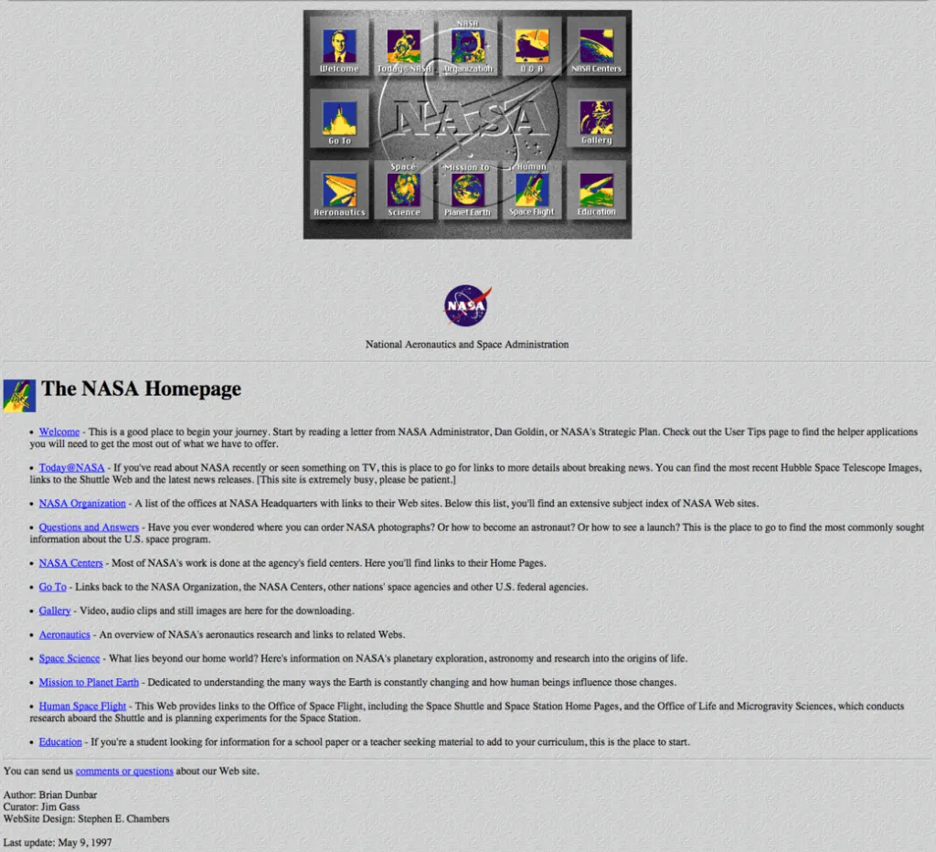
The drop shadows and embossed logo across the screen made this webpage as modern as it could appear in the 90s. Most importantly, its design made it possible for students, educators, and scientists to reference all things NASA in one place.
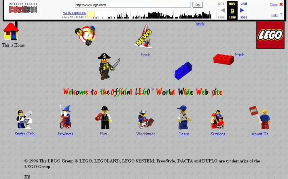
Lego
The colorful and creative nature of Legos fit perfectly with design trends in the 90s. When their first site was released in 1996 it incorporated texture with a Lego-studded background. The site also incorporated motion with many of its Lego person icons being animated.
The icons on the Lego page may have been pixilated, but the color contrast and creativity worked into their web design captured their audience’s attention regardless.
Design your 90s website in UXPin
Drawing design inspiration from 90s trends is natural, especially as more and more aspects of 90s design resurface in modern culture. Luckily, the technological barriers that restricted web design of that decade have since been simplified. But the ability to experiment with nostalgic patterns, colors, fonts, and animations is just a few clicks away thanks to powerful prototyping tools like UXPin.
Today’s trend toward simplicity and user-friendly design can be skillfully blended with iconic characteristics of the 90s in any way you choose. UXPin allows for web design that is detail oriented and fully functional even in its prototype phase. This way, you can interact with every retro design aspect prior to launch to ensure they are as functional as they are fashionable. Ready to blend retro style with modern UX and UI capabilities? Try UXPin today.


