It’s hard to find a better pairing than a simple, minimalist website design that uses bold typography to communicate a message. Yet there are plenty of ways to apply both while giving your site a unique look and feel.
The simple aesthetic is easy to understand and read, and offers a timeless and trendy design option. And a minimal design will always stand out in a sea of cluttered interfaces. Here are some ways you can make the most of typography to create a great minimal design.
Characteristics of Minimalism
Today’s minimalist websites have a few key characteristics. That’s not to say you must adhere to these concepts to design minimally, but many minimal sites share these traits.
These characteristics include:
- Use of an overall flat or almost flat design scheme
- Plenty of white or negative space
- Limited user interface elements, including streamlined navigation
- Oversized hero elements, such as photography, video or animation
- Streamlined color palettes with plenty of black and white
Bold typography, of course, is another minimalist element. Regardless of how or if the other design techniques are used, bold type is almost always present.
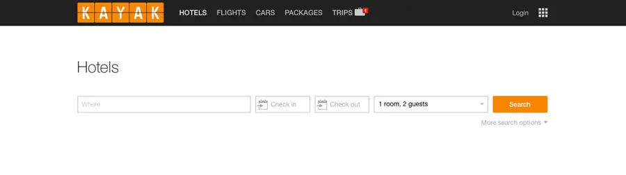
Photo credit: Kayak
Kayak, the travel site, is a great example of minimalism in action. The homepage has few visual points of interest other than options to create a booking. The site features one bold text element – its logo. Other typography is simple, thin and only serves a functional purpose. The minimalist design establishes brand with functionality to bring users back.
In the below example created in Photoshop and imported into UXPin, notice how the background HD images add a touch of realism to an otherwise flat interface. The sans-serif typography also appears more dramatic thanks to the high contrast to the background.
Embrace Bold Typography
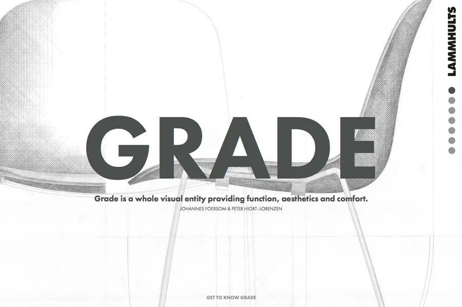
Photo credit: Lammhults
It’s no surprise that big, bold lettering is often used in minimalist designs. It’s the perfect contrast to the stark nature of the design and provides visual interest and helps get users into the content.
But what makes typography bold? It can be a number of things; the key to finding the perfect level of boldness is often to look at how much lettering contrasts with the rest of the design. Bold type is lettering that stands out from its surroundings and demands to be read. But it has to be an integral (and integrated) part of the overall aesthetic. Bold typography should have purpose and meaning.
There are a number of ways to create letters that demand attention from using simple lettering in big ways to opting for custom typefaces.
Striking Sans-serifs
What makes a sans-serif typeface different from any other? Context. The way the typeface is used and the surround elements help establish how bold the lettering is.
This includes everything from stroke weight – is the font thick or thin? – to size and scale on the screen. Other design techniques such as color or related images can also help determine the overall effectiveness and boldness of a sans-serif.
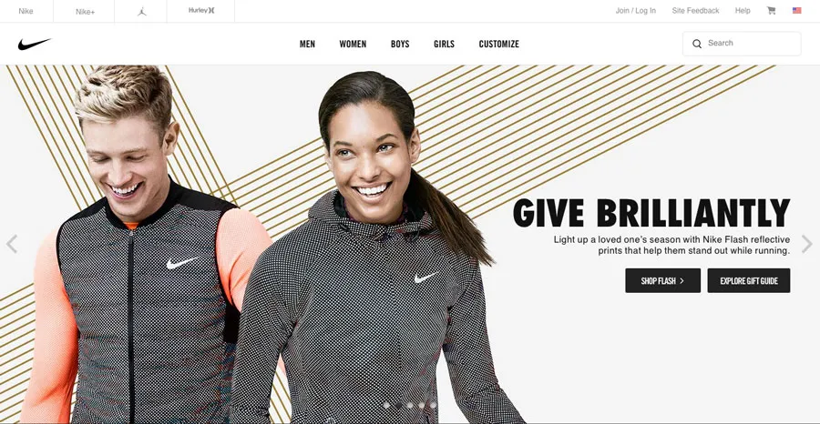
Photo credit: Nike
Nike combines these elements to make a sans-serif typeface anything but boring. The simple lettering is bold and attention-grabbing because the letters are thick and weighty against a simple and light background. The phrase “GIVE BRILLIANTLY” also establishes visual weight with nice language, messaging and words that you might not see all the time. The all-caps treatment gives the letters a bigger feel than the point size would imply.
Subtle Novelty Options
The stark canvas of a minimalist design framework is perfect for a custom or novelty typeface. (This can be a great way to showcase a cool logo or highlight a few key words.) To get the boldest look, opt for a typeface that contrasts with the rest of the design or try something completely unexpected.
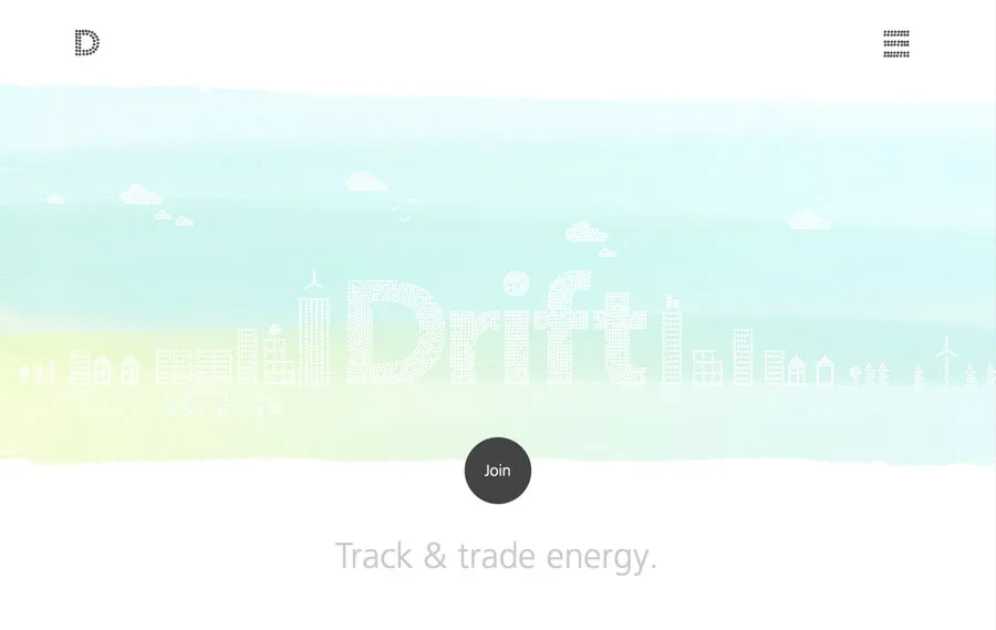
Photo credit: Drift
Drift takes the second approach. The website is mostly white with few elements aside from a trendy watercolor swash with the word “drift” outlined inside the color. While at first glance the letters just look like a simple sans serif, the custom typography is actually made up of tiny blocks to represent lights (or energy) to go with the theme of the site. The concept is clever and makes users want to look closer at the design. The result is subtle and bold at the same time.
Simple and Oversized
Oversized typography is one of the easiest ways to make an impact. Big lettering is simply hard to ignore. It’s even tougher to ignore when combined with a simple design and plenty of space. (You can’t help but read it.)
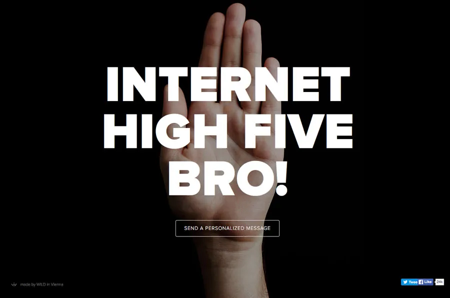
Photo credit: Send a Message To
Send a Message To is a fun little website that automatically generates a new message each time you refresh, and allows you to send personalized messages as well. (Be warned, the messages aren’t always nice.) Its design might not make you instinctively think of minimalism becauses it uses a dark background an animation, but that’s part of what makes it work. Minimalism isn’t just white: it’s a lack of clutter. This principle extends beyond visual design to product design as a whole—whether you’re building a customer-facing app or an internal tool, a no-code app builder can help you create focused, minimal interfaces without adding unnecessary complexity.
Creative Color Choices
Think about using color to make the most of a minimalist design. And then reverse out the type. Contrast is attention-grabbing and modern. Reverse typography options work best when working with colors that are quite different and with typefaces that include regular to thicker strokes to increase readability.
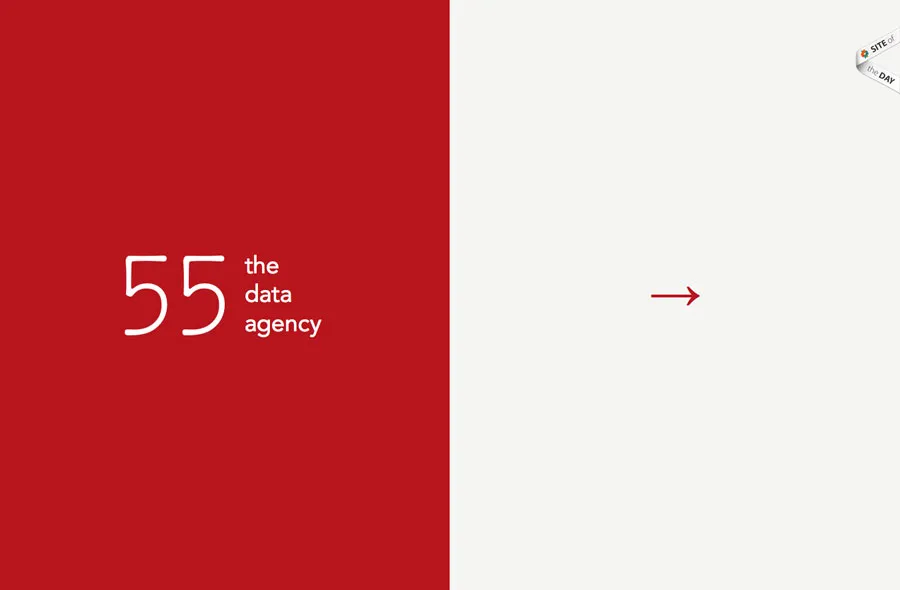
Photo credit: 55 Agency
The website for 55 Agency use a dual-style design with very few elements. On widescreen browsers, the left is a large area for the company name and descriptor in white against a red background. This color choice could be considered risky because of color associations with red, but plays out well. On the opposite side is a simple arrow on the white backdrop leading users to the next screen interaction. The reverse type is bold because it is the first thing the eye goes to on the screen.
Minimalism does not have to consist of a white website with black text. Modern minimalism extends to simple color and design schemes. It’s acceptable to get creative with color to make the most of lettering as well.
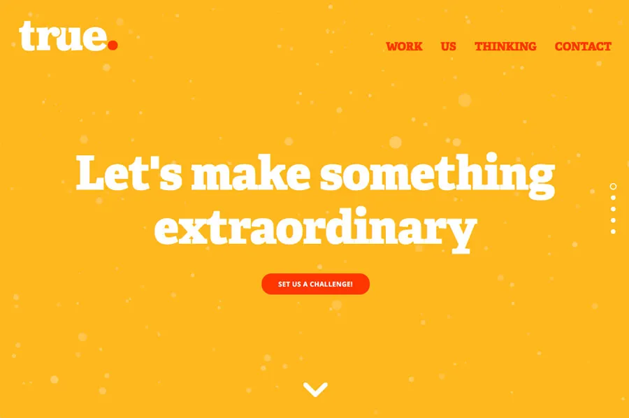
Photo credit: True Digital
True Digital uses color, oversized lettering and an interesting typeface for a result that’s bold and interesting. The colors are intriguing and unexpected, but go nicely with the message. The site is uncluttered by design elements or expansive navigation. If the site were white rather than yellow it would be labeled as minimalist without a second thought. That makes the color choice and reverse typography that much more bold and interesting.
Takeaways
Minimalism is a design style that never really goes out of fashion. It can change and evolve with modern touches (today’s addition is bold typography). Exceptional lettering adds style, emphasis and impact to this more stark design philosophy.
It’s a look that’s timeless and can work for a lot of different site types. From the included examples you can see that it is effective for ecommerce, agency site and even just for fun diversions. This characteristic makes minimalism, especially when paired with bold typography, a trendy option that won’t feel forced or overused.
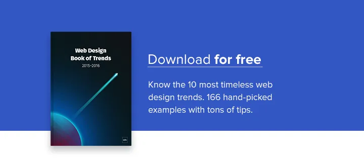
To learn more about modern UI techniques, check out the free e-book Web Design Trends 2015 & 2016.