Responsive code export tools simplify turning designs into React components, saving time and reducing errors. They convert design files from platforms like Figma into production-ready, responsive React code. This eliminates manual coding, ensures consistency, and improves collaboration between designers and developers. Tools like UXPin, Visual Copilot, Anima, Locofy, and FigAct offer features like responsive layout generation, clean React code, and seamless integration with design tools.
Key Features to Look For:
- Responsive Layout Support: Automatic breakpoints, CSS Grid/Flexbox, and media queries.
- Clean Code: Modular, reusable, and production-ready React components.
- Design Tool Integration: Direct plugins for Figma, Sketch, and real-time updates.
- Custom Component Support: Compatibility with design systems like Material-UI and Tailwind CSS.
Quick Comparison:
| Tool | Responsive Layout | Code Quality | Design Integration | Custom Components | Price (USD/month) | Key Features |
|---|---|---|---|---|---|---|
| UXPin | Advanced | Production-ready | Figma, Sketch | Yes | From $29 | AI Component Creator, Storybook integration |
| Visual Copilot | Strong (AI-driven) | 4/5 | Figma | Editable | From $49 | Repository integration, real-time updates |
| Anima | Robust | 3/5 | Figma, Sketch | Limited | From $31 | Animation focus, interactive previews |
| Locofy | Strong | 4/5 | Figma, Adobe XD | Modular exports | From $25 | Design tokens, Tailwind CSS support |
| FigAct | Good | Clean | Figma | With hooks | Free tier | TypeScript definitions, React Router setup |
These tools streamline workflows, improve collaboration, and ensure responsive designs work across devices. By reducing manual work, they help teams focus on functionality and user experience.
How to Transform Design into React Code using Anima | Build React Portfolio Website Figma Design
What to Look for in Responsive Code Export Tools
When it comes to responsive code export tools, finding the right one can make a huge difference in your React development workflow. A good tool helps you work faster and more efficiently, while a poorly chosen one might slow you down. Here’s a breakdown of the key features to look for when evaluating these tools.
Responsive Layout Support
One of the most essential features to prioritize is automatic breakpoint generation. A top-tier tool will create CSS media queries that adapt seamlessly to any screen size. This means your React components will automatically adjust from desktop (1200px+), to tablet (768px–1199px), and down to mobile (below 768px) without requiring extra manual effort.
Another must-have is support for fluid grid systems. Instead of relying on fixed pixel values, the best tools use flexible containers and relative units. This ensures that your layouts maintain their structure and visual balance across various devices, whether it’s a smartphone or a large monitor.
Don’t overlook the ability to handle different screen orientations. Modern applications need to work smoothly in both portrait and landscape modes, especially on tablets where users often switch between the two.
Also, check for tools that incorporate design tokens. These predefined values for elements like spacing, colors, and typography help ensure consistency across your breakpoints. When a tool exports these tokens alongside your components, it simplifies maintenance and scales better as your project grows.
Clean and Production-Ready React Code
Responsive layouts are just one part of the equation – code quality is equally important. Look for tools that generate structured code following React best practices. This includes functional components with clear prop definitions, logical hierarchies, and minimal use of inline styles or deeply nested elements.
The best tools require minimal post-export modifications, meaning the exported components can be integrated into your React project with little to no extra work. This includes proper import/export statements, consistent naming, and adherence to your coding standards.
Modern tools should also use React hooks and contemporary patterns to ensure compatibility with current development practices. The components they generate should be modular and reusable, making it easy to include them in different parts of your app without causing conflicts.
Finally, consider performance optimization. High-quality tools avoid unnecessary re-renders and use React patterns like memo() where appropriate. This ensures that your components don’t negatively impact your app’s performance metrics, keeping things running smoothly.
Design Tool Integration
A seamless connection between design and code is critical. Tools that offer direct plugin support for platforms like Figma and Sketch simplify the process by reducing manual handoffs and potential errors.
Features like real-time synchronization are becoming increasingly valuable. When designers tweak layouts, colors, or spacing in Figma, the best tools automatically update the exported React components, ensuring that your code stays in sync with the latest design changes.
Compatibility with design systems is another big plus. Tools that work well with established libraries like Material-UI or Ant Design make it easier to integrate exported components into your existing codebase, keeping everything consistent.
Maintaining design fidelity is non-negotiable. The tool you choose should accurately preserve spacing, typography, and visual hierarchy from the original design. If the exported code doesn’t match the design, developers will end up spending extra time fixing it.
Lastly, collaborative features can streamline the handoff process. Tools that allow designers and developers to leave comments, annotations, or shared specifications reduce miscommunication and keep everyone on the same page.
For a more professional workflow, consider tools that support version control integration. Being able to commit exported components directly to a Git repository – with proper commit messages and change tracking – bridges the gap between design updates and deployment, saving time and effort.
Best Responsive Code Export Tools for React Projects
When it comes to converting designs into responsive React components, a few tools stand out for their ability to streamline workflows and bridge the gap between design and development. Let’s dive into some of the top options and what makes them so effective.
UXPin
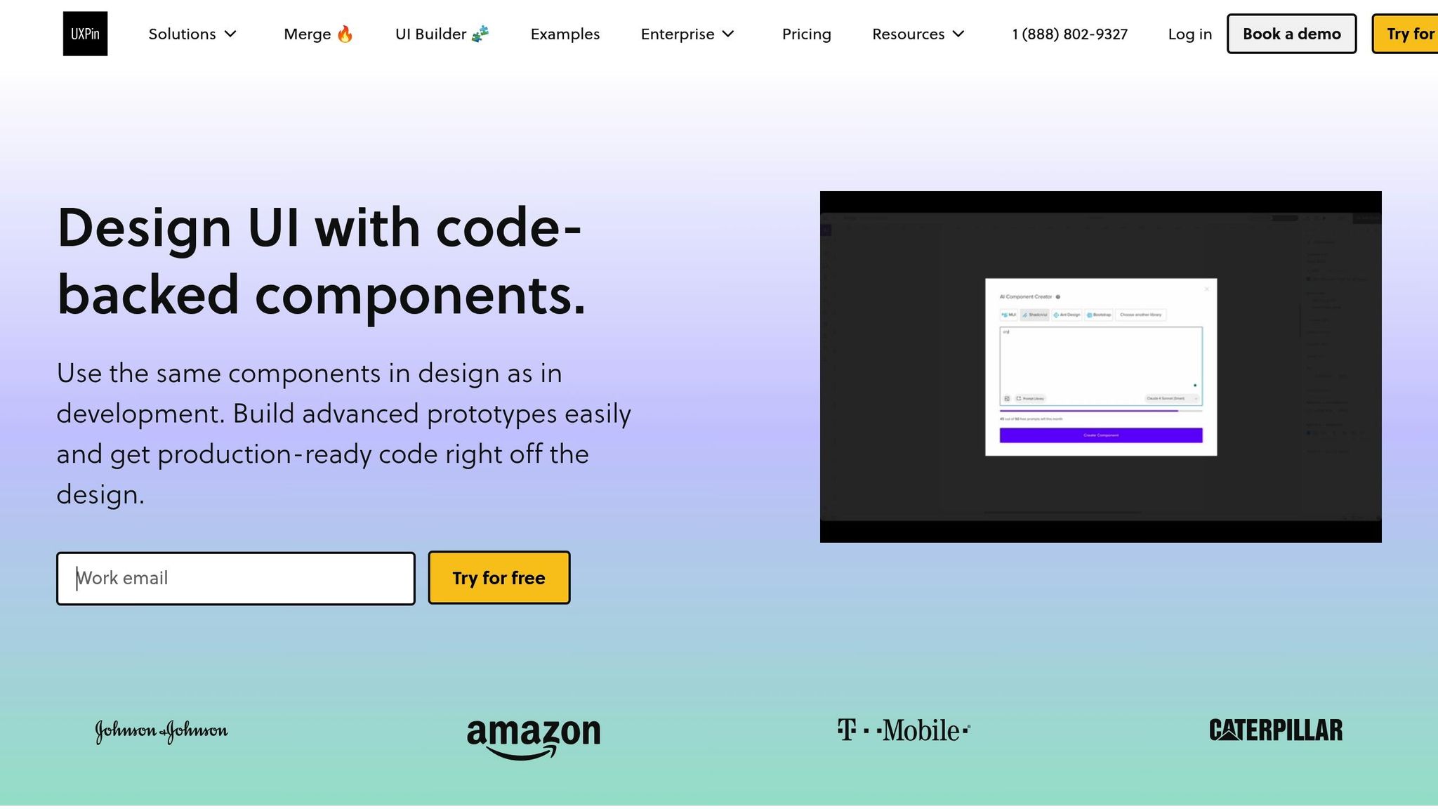
UXPin goes beyond static mockups by enabling designers to work with interactive prototypes built from real React components. It supports libraries like Material-UI, Tailwind UI, and Ant Design, making it easier to create designs that align with actual production code.
One of UXPin’s standout features is its AI Component Creator, which simplifies the process of generating new components. It also integrates seamlessly with tools like Storybook and npm, allowing developers to pull custom React components directly into the design environment. This ensures prototypes are built with the same code that will be used in the final product.
According to UXPin, teams using their platform can cut engineering time by nearly 50%. This efficiency comes from eliminating the traditional handoff where developers have to interpret static designs and rebuild them from scratch.
Visual Copilot by Builder.io

Visual Copilot takes Figma designs and transforms them into React components that are ready for production, complete with responsive breakpoints. Its AI-powered engine analyzes design files to generate components that follow modern React patterns.
What sets Visual Copilot apart is its repository integration, which allows developers to push generated components directly into their codebase, avoiding the need for manual copy-pasting. This approach significantly reduces errors and inconsistencies.
Builder.io reports that its platform can boost development capacity by 20%, allowing teams to focus more on strategic initiatives. Tim Collins, CTO at TechStyle Fashion Group, highlighted this benefit:
"Thanks to Builder, we diverted 20% of our development budget from content management maintenance to strategic growth initiatives."
Additionally, Visual Copilot offers real-time collaboration, ensuring updates made in Figma are instantly reflected in the generated code.
Anima
Anima focuses on creating clean, responsive React components directly from Figma designs. It uses design tokens and recognized component patterns to maintain consistency in the exported code. The platform automatically generates media queries and flexible layouts, ensuring designs look great across all screen sizes.
Anima’s interactive preview feature lets teams test responsive behavior before exporting the final code, saving time on manual adjustments. Its emphasis on component modularity ensures that the exported React components are reusable and follow best practices, including proper prop definitions and clean hierarchies.
Locofy
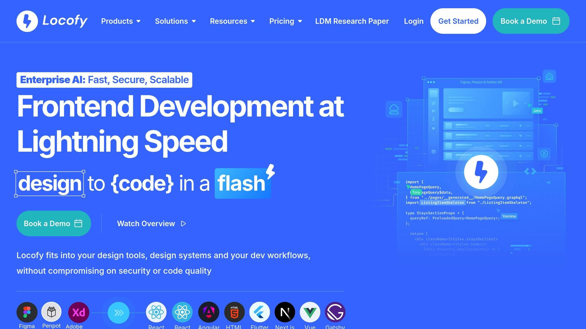
Locofy offers real-time previews that update with every change made in Figma, giving designers immediate feedback on how their layouts will behave across different screen sizes. The platform excels at responsive design accuracy, using CSS Grid and Flexbox to create layouts that adapt seamlessly to various devices.
Another key feature is design token extraction, which automatically identifies and exports reusable elements like color palettes, typography scales, and spacing values. This makes it easier to maintain visual consistency throughout your React application.
Locofy also supports popular CSS frameworks like Tailwind CSS and Bootstrap, giving developers flexibility in how they implement responsive styles.
FigAct
FigAct specializes in converting Figma designs into React components with built-in functionality. It automatically generates useState and useEffect hooks where needed, creating components that are ready for interactivity.
The tool also includes React Router integration, automatically setting up navigation patterns based on Figma prototype links – a huge plus for multi-page applications. Its mobile-first CSS generation ensures responsive layouts that scale gracefully to larger screens, aligning with modern web development practices.
For TypeScript users, FigAct provides properly typed React components, enhancing type safety and making the code easier to maintain.
sbb-itb-f6354c6
Feature Comparison of Code Export Tools
When choosing a responsive code export tool for React projects, it’s crucial to understand how each platform performs across key areas. These tools vary in their strengths, such as handling responsiveness, producing clean code, integrating with design software, and offering unique features tailored to different development workflows.
Comparison Table
| Tool | Responsive Layout Support | Code Quality Rating | Design Tool Integration | Custom React Components | Pricing (USD/month) | Key Differentiators |
|---|---|---|---|---|---|---|
| UXPin | Advanced (Flexbox/Grid) | Production-ready | Figma, Sketch, Adobe XD | Yes (Built-in libraries) | From $29/editor | Real React components, AI Component Creator, Storybook integration |
| Visual Copilot | Strong (AI-driven) | 4/5 stars | Figma | Yes (Editable components) | From $49 | Repository integration, real-time collaboration, CMS connectivity |
| Anima | Robust (Media queries) | 3/5 stars | Figma, Sketch | Limited | From $31/editor | Animation focus, motion UI, interactive previews |
| Locofy | Strong (CSS Grid/Flexbox) | 4/5 stars | Figma, Adobe XD | Yes (Modular exports) | From $25 | Design token extraction, Tailwind CSS support, real-time previews |
| FigAct | Good (Figma-based) | Clean | Figma | Yes (With hooks) | Free tier available | Automatic TypeScript definitions and React hook generation |
This table highlights the unique strengths of each tool, making it easier to identify the right fit for your team.
When it comes to code quality, tools like UXPin and Visual Copilot stand out by producing code that’s nearly ready for production, requiring minimal adjustments. On the other hand, Anima, while excelling in animations and interactive elements, often necessitates additional cleanup, particularly for spacing and layout code before deployment.
For responsive layout support, implementation approaches differ significantly. Locofy uses modern CSS techniques like Grid and Flexbox to automatically generate responsive layouts, while Visual Copilot employs AI to create responsive breakpoints directly from Figma designs. UXPin’s use of real React component libraries ensures responsiveness matches production standards from the outset.
Design tool integration is another area where these tools diverge. While most platforms connect with Figma, UXPin offers a more dynamic workflow, syncing design changes with code repositories through Storybook and npm integration. Visual Copilot simplifies the process further by allowing developers to push generated components directly into their codebase, removing the need for manual copy-pasting.
Pricing reflects the tools’ target audiences and feature sets. UXPin starts at $29 per editor, with pricing scaling based on advanced features like the AI Component Creator and enterprise-grade security. Locofy offers a more affordable entry point at $25 per month, while Visual Copilot, starting at $49 per month, caters to larger teams with features like CMS integration and real-time collaboration.
For teams with established design systems, custom React component support is a key factor. UXPin shines by letting teams import their existing component libraries directly into the design environment. FigAct, meanwhile, focuses on modern React practices by generating TypeScript definitions and React hooks, making it a strong choice for teams prioritizing type safety.
Up next, discover how to seamlessly integrate these components into your React projects.
How to Use Exported Code in React Projects
When working with responsive, production-ready code exported from design tools, the goal is smooth integration into your React project while ensuring compatibility, consistent responsiveness, and high-quality code.
Code Quality and Maintainability
Start by reviewing the exported code to ensure it aligns with your project’s standards. Use tools like ESLint and Prettier to clean up unused imports and redundant styles. If inline styles are present, refactor them into your preferred CSS method, whether that’s CSS Modules, styled-components, or another approach. Double-check that all required dependencies are listed and that the components follow modern React practices.
For better maintainability, consider breaking down complex components into smaller, reusable ones. This modular approach not only simplifies debugging but also makes your codebase more scalable. Document any changes you make during this process, including the reasons behind them, to help future developers understand your decisions.
To keep things organized, you might want to set up a dedicated component library within your project. This method makes it easier to track which components were imported from external tools, ensuring consistency across your application.
Once you’ve refined and documented the components, they’ll be ready for seamless integration into your React project.
Adding Exported Components to Existing React Projects
After ensuring the code is clean and maintainable, the next step is to integrate the components. Begin by creating a separate branch to avoid disrupting your main development workflow. This way, you can test the integration thoroughly before merging changes into production.
Before diving into full integration, test the components in isolation using tools like Storybook. This helps confirm that the components render correctly and maintain their responsive behavior outside of the design tool environment.
To avoid CSS conflicts, scope or namespace styles. If your project uses CSS-in-JS solutions like styled-components, wrap the exported components to isolate their styles. For projects with a design system in place, map the exported styles to existing design tokens or variables to maintain visual harmony.
Once integrated, verify responsive behavior across different screen sizes and devices. Ensure that the components use relative units like rem, em, or percentages, and rely on modern CSS techniques like Flexbox or CSS Grid. Test all breakpoints thoroughly to confirm the components adapt seamlessly to your layout.
If your project uses state management solutions like Redux or the Context API, make sure to connect the components to your data flow. This ensures they work seamlessly with your application’s logic and user interactions.
Finally, update your project documentation to include details about the source of the components, any modifications made, and their usage. Keeping a changelog for these imported components can also help track changes and make future troubleshooting easier.
For example, Builder.io shared a case study where a SaaS company reduced front-end development time by 40% by exporting React components directly from design files. They achieved this by minimizing manual adjustments during integration, thanks to careful preparation and selecting the right tools.
To wrap up, run visual regression tests to catch any unintended style overrides or layout issues. These tests help ensure that the new components integrate smoothly without disrupting the existing user interface.
Conclusion
Responsive code export tools are transforming the way React development teams bridge the gap between design and implementation. By addressing long-standing challenges, these tools streamline workflows, cutting down project delays and easing the collaboration between designers and developers.
Leaders in the field report impressive results, including up to a 50% boost in development efficiency and the ability to shave months off project timelines. These tools not only speed up the process but also improve the quality of the output. By converting design prototypes into production-ready React code, they ensure designs are faithfully translated into functional applications. This eliminates many of the manual coding errors that often occur during traditional handoffs, while also guaranteeing that responsive behavior works seamlessly across devices.
Cost-efficiency is another major advantage. With flexible pricing models and free trials available, these tools are accessible to teams of varying sizes and budgets. They make enterprise-level design-to-code capabilities attainable for smaller teams, leveling the playing field and enabling more teams to reap the benefits of streamlined workflows.
Looking forward, advancements in AI are pushing these tools even further. New features like intelligent component creation, automatic responsive layout adjustments, and smooth integration with design systems are becoming standard. These innovations promise even more dramatic efficiency improvements as the technology continues to mature.
For React teams, adopting responsive code export tools isn’t just about saving time – it’s about elevating collaboration, producing consistent, high-quality code, and delivering responsive, high-performing applications across all devices. These tools are quickly becoming an essential asset for any team aiming to stay competitive in today’s fast-paced development landscape.
FAQs
How do responsive code export tools improve collaboration between designers and developers in React projects?
Responsive code export tools make collaboration between designers and developers much easier by allowing both teams to work with shared, reusable components and consistent design systems. This common framework minimizes miscommunication, enhances teamwork, and simplifies the handoff process.
These tools also streamline the design-to-code workflow, helping teams save valuable time. This means they can concentrate on crafting high-quality, responsive React applications without compromising on efficiency or creativity.
How can I ensure exported React components stay responsive and maintain design accuracy across devices?
To make sure your exported React components stay responsive and maintain their design accuracy, it’s important to use tools that integrate code-backed design systems and support responsive workflows. These approaches help align the design and development stages, ensuring the final product matches the original design vision.
It’s also smart to choose platforms that let you work with custom React components and provide reusable UI elements. This not only simplifies your workflow but also minimizes inconsistencies, making your designs easily adaptable to various screen sizes and devices.
How can teams ensure exported React code is ready for production and fits their project standards?
When you’re preparing React code for production, it’s essential to focus on tools that generate clean, reusable code and work seamlessly with your existing component libraries. This not only keeps your project consistent but also cuts down on development time.
Platforms offering design-to-code workflows with React component support are a game-changer. They enable teams to craft interactive prototypes and export code that meets their specific standards. By using these workflows, designers and developers can collaborate more effectively, streamlining the entire development process.

