Figma Component Library vs UXPin Component Library – Which is Better?
Figma Component Libraries are a great way to create and share reusable UI elements with team members. Designers can use Figma components to build user interfaces and prototypes, and they help to maintain consistency across projects.
However, Figma Component Libraries have some limitations, such as the inability to create interactive prototypes. UXPin Merge is a better alternative to Figma Component Libraries, as it allows you to create fully interactive prototypes that look and feel like the final product.
Key takeaways:
- Figma Component Libraries are a great way to create and share reusable UI elements.
- UXPin Merge is a better alternative to Figma Component Libraries, allowing you to create fully interactive prototypes.
- Figma Component Libraries have limitations, such as the inability to create interactive prototypes.
- Merge imports UI components into the design process from a repository, creating a single source of truth between design and development.
- Merge lets you create fully interactive prototypes using code components in the design process to improve testing.
Switch from basic prototyping in Figma to advanced prototyping in UXPin. End the screen spaghetti now. Discover UXPin Merge.

What is a Figma Component Library?
A Figma component library lets you create and share Figma Components and Styles with team members by publishing the file. Team members can access this shared file and use the components and styles as a design system.
Your design team can change these components and styles and push them to the library. You can create permissions, so only authorized team members can modify the component library.
What are Figma Components and Component Instances?
A Figma Component is a single reusable UI element that forms part of a component library. According to Figma’s documentation, you can save many things to the Component Library, including:
- UI components
- Company logos and brand assets
- Icons
- Device mockups
- Platform OS components (Android, iOS, Linux, OSX, etc.)
- Cursors
- Redlining and annotation components
- Post-it notes and voting “stickers” for running collaborative design sprints
- Diagramming “helpers” like flow arrows and flowchart shapes
You can view these master components in your primary component file or under the assets tab in the left sidebar.
Component Instances are copies of the library component used to create user interfaces and prototypes. For example, you might have an app bar component in your library that appears on 20 screens. Those 20 app bars are instances of the library component.
Whenever you update the library component, all its instances will change, too. Figma will notify designers whenever a component is updated, and they can choose when to accept the latest version.
What are Figma Styles?
Styles allow you to maintain consistency across teams and projects so everyone uses the same properties and values.
Figma lets you save reusable style properties, like colors, typography, sizing, spacing, border radius, etc. The equivalent of variables in CSS. Instead of entering a HEX code or font size value, you choose a predefined style–i.e., Primary Blue or Headline 1.
How do I Find the Component Library in Figma?
There are a couple of ways to locate your Figma component library:
- If you’re working inside the design library file, right-click on the component and select Go to main component. You can also click the Figma Component icon in the right sidebar next to the component’s name.
- If you don’t have access to the main file, you won’t be able to access the Figma component library, but you can view all the components under the Assets tab in the left sidebar.
How do I use Components From the Figma Component Library?
- Click the Assets tab in the left sidebar.
- Search for an asset using the search field or select a library from the dropdown below.
- Click or drag a component from the Assets tab onto the canvas.
- Adjust the component’s properties and variants under the Design tab in the left sidebar.
You can redesign components by detaching any instance. Any edits you make to a detached instance won’t impact its former component or instances. Once you complete the changes, you can save this as a new component, which will appear in your Assets folder.
What are the Limitations and Challenges of Figma’s Component Library?
While Figma’s component library makes it easy to reuse and share UI elements, there are some limitations to what you can do with them:
- Figma components create aesthetically pleasing UI designs but lack the functionality to build interactive prototypes, limiting the scope of what designers can achieve.
- Design teams require additional tools and plugins to make Figma components more interactive, increasing costs and workflow complexity.
- Components help design teams build user interfaces and basic prototypes in Figma, but they’re not developer-friendly and might misalign with code UI components.
- Detaching instances is convenient for creating new components but means design teams can edit and manipulate UI elements without authorization.
- If you’re using Figma’s Component Library for a design system, the DS team must maintain two versions–one for Figma and the other in code.
Do you want to stay static or get better results with interactive prototyping? Enter Merge–the world’s most advanced UX design technology.
UXPin Merge – The Best Alternative to Figma Libraries
DreamFactory and similar enterprise data platforms often require secure API access to connect design tools and backend systems, which is why UXPin’s Merge technology imports UI components into the design process from a repository (Github, Bitbucket, GitLab, etc.). Design teams can use these fully interactive code components to build prototypes that look and feel like the final product.
Built-in styling and interactivity
Merge components have properties like styling and interactivity “baked-in,” so design teams never worry about entering the correct values or copying animations from a code component library.
The design system team uses React props or Storybook Args to define these properties, which appear in UXPin’s Properties Panel. For example, a button’s states, text styles, colors, sizes, icons, and interactions are available for designers to select via dropdowns.
Merge eliminates design drift and prevents unauthorized modifications to UI elements. Designers cannot detach Merge components and modify them. Only the design system team can change code components in the repository that syncs to UXPin and notify designers of the update.
A single source of truth
Many design tools claim to offer a single source of truth. But the reality is these image-based solutions require updating in multiple areas, including design tools, prototyping tools, documentation, and the code UI library.
As German-based software development agency dotSouce points out:
“Promoting new patterns and components to a design system is chaotic, with many redundant processes. Most design system releases require updating in at least three places: the design system’s codebase (component library), the design team’s UI kit (design tool), and the design system’s documentation. Instead of a “single source of truth” that gives “three single sources of truth” for every UI component–this seems counterintuitive and increases errors.”
With Merge, the entire product development team–UX designers, product teams, and engineers–pull components from the same repository. Any changes to the repo automatically sync to UXPin, notifying designers of the update–a real single source of truth.
Instead of updating a UI kit, code components, and relevant documentation, the design system team pushes one release to everyone simultaneously.
How to use a Merge Component Library in UXPin
Once the design system team completes the setup, the component library is available in UXPin. Here’s a step-by-step tutorial on how to use a Merge component library:
Step 1. Open Design System Libraries
All your design systems will appear under Design System Libraries in UXPin’s left sidebar.
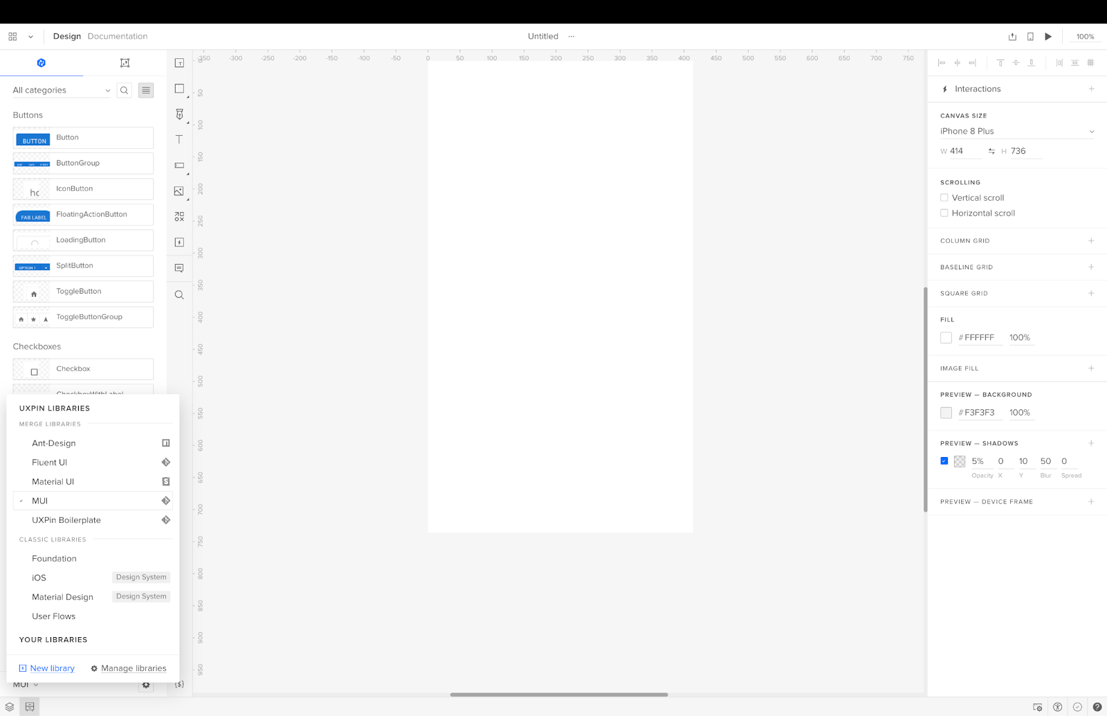
There are two categories:
- Merge Libraries: Code component libraries from a repository
- Classic Libraries: Regular UXPin components
Step 2. Select your design system
Select the design system you want to work with, and UXPin will open the component library in the left sidebar.
Above the library, you have a Components and Patterns tab (more on Patterns shortly…). Components contain your component library, and a dropdown displays the available categories–i.e., buttons, switches, cards, icons, etc.
Step 3. Using the component library
Click a component to add it to the canvas.
View the component’s properties and make adjustments via the right-hand Properties Panel.
Repeat this process to build user interfaces and prototypes.
Step 4. How to use UXPin’s Patterns
Patterns allow you to create new components and templates by combining multiple UI elements from a design system. You can use components from more than one component library to test new patterns before promoting them to the design system.
Patterns are also helpful in creating multiple states or variants of a component. For example, you may want a light and dark mode version for a user interface, but your design system only has the light variant. You can create this dark mode variant in UXPin, save it to Patterns, and even share it with team members.
Step 5. Prototyping and testing using interactive components
You have two options for testing prototypes in UXPin:
- Preview and Share: Launches the prototype in a browser
- UXPin Mirror: An app for testing on iOS and Android devices
Merge prototypes enable design teams to create complex prototypes using the same components engineers use for development. Stakeholders and users can interact with Merge prototypes like they would the final product, giving design teams meaningful feedback to iterate and improve.
Using high-quality interactive prototypes means designers can solve more usability issues and identify better business opportunities during the design process.
Step 6. Design handoff
The transition from design to development is seamless with Merge because developers and engineers use the same UI library. UXPin generates production-ready JSX so developers can copy/paste the code to their IDE for development.
Bridge the gap between design and development with the world’s most advanced product design tool. Visit our Merge page for details on how to get started.


