Progress Tracker Design: UX Best Practices, Examples & Tips (2026)
Progress trackers are one of the most impactful UX patterns a designer can implement. They communicate where users are in a multi-step process, set expectations for what’s ahead, and reduce the anxiety and frustration that cause people to abandon forms and checkouts.
Done well, a progress tracker builds trust — it tells users: “We respect your time. Here’s exactly what’s involved.” Done poorly (or not at all), multi-step processes feel like an unpredictable slog, and completion rates suffer.
This guide covers what progress trackers are, when to use them, six design best practices with real examples, and how to prototype interactive progress trackers in UXPin.
Build interactive progress tracker prototypes that function like the final product. Sign up for a free UXPin trial to explore States, Variables, and Conditional Interactions.

What Is a Progress Tracker?
A progress tracker is a UX design pattern that displays the number of steps in a process, the user’s current position, and their overall progress toward completion. They’re especially common in:
- eCommerce checkouts: Cart → Shipping → Payment → Confirmation
- User onboarding: Account creation → Profile setup → Preferences → Dashboard
- Application forms: Insurance quotes, loan applications, government forms
- Multi-part surveys: Research questionnaires, customer feedback forms
By breaking complex forms into manageable chunks, progress trackers reduce cognitive load and increase completion rates. They also enable “save and return” functionality, letting users leave mid-process and come back later.
Progress Trackers vs. Progress Indicators
These terms sound similar but serve different purposes:
- Progress trackers are step-by-step guides showing where users are in a multi-step process they’re actively completing.
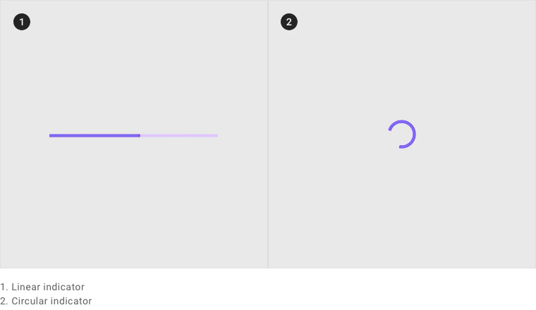
- Progress indicators are loading animations (spinners, bars) that show a system is processing a request.
Material Design illustrates two types of progress indicators — linear and circular — both used for system feedback, not user guidance.
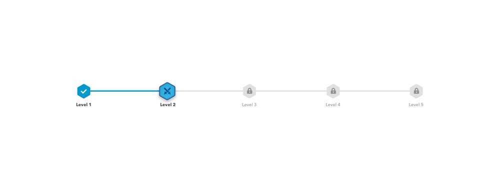
A progress tracker, by contrast, communicates a step-by-step workflow — as shown in this example from Ben Mettler:
Why Are Progress Trackers Important?
IBM’s Carbon Design System states that progress trackers increase task completion by dividing end goals into smaller, achievable sub-tasks.
The psychological benefits are clear:
- Reduced uncertainty: Users know exactly how many steps remain and can plan accordingly.
- Increased trust: Transparency about the process signals respect for the user’s time.
- Motivation through progress: The “endowed progress effect” — seeing steps already completed motivates users to finish.
- Lower abandonment: When users can see the finish line, they’re less likely to quit mid-process.
Consider the alternative: completing a 10-page form where you have no idea how many pages remain. You don’t know if you’ll need your credit card details, your ID number, or your vehicle information. Each time a new page loads, your frustration grows. A progress tracker eliminates this entirely by showing the full journey upfront.
Two Types of Progress Trackers
1. Process trackers (user-driven)
These guide users through multi-step processes where they’re actively providing information or making decisions. Examples: checkout flows, onboarding wizards, application forms.
Per WAI accessibility guidance, designers should provide both visual and non-visual instructions communicating the total number of steps and the current step.
2. Status trackers (system-driven)
These communicate the progress of a system process on behalf of the user. Examples: shipping trackers, order processing statuses, application review stages, food delivery progress.
Status trackers reduce support inquiries by proactively answering “Where is my order?” or “What’s the status of my application?”
6 Progress Tracker Design Best Practices
1. Create clear visual cues
Your progress tracker must unambiguously show three things: what’s completed, what’s current, and what’s ahead.
The most effective approach combines multiple visual signals:
- Color: Completed steps in a strong color, current step highlighted, upcoming steps in a neutral tone.
- Icons: Checkmarks for completed steps, numbers or dots for upcoming steps.
- Connecting lines or bars: A filled bar between completed steps shows progress direction.
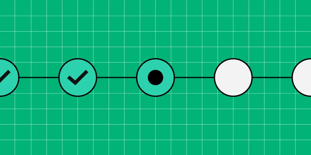
This example from Alexander Mochalov demonstrates all three signals effectively:
2. Use descriptive labels
Numbered steps alone are not enough. Users need to know what each step involves so they can prepare the required information (payment details, ID numbers, shipping address).
Compare these two approaches:
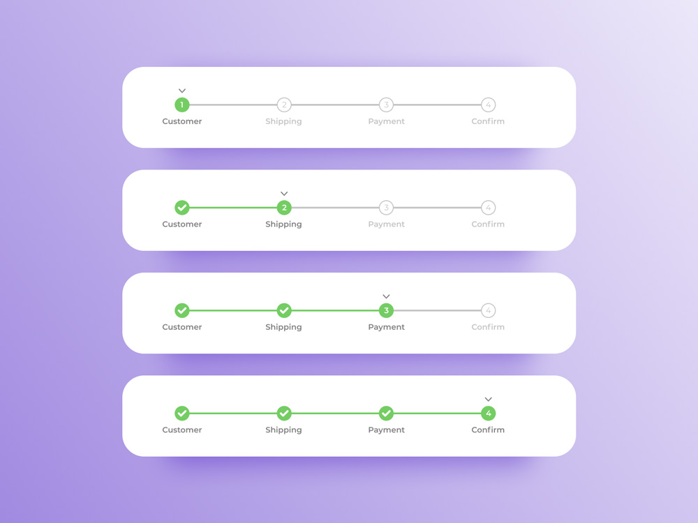
Arvind Sathe’s example is visually clean but provides no context about what each step requires:

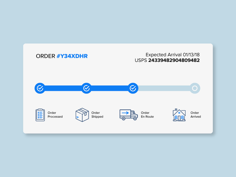
Will Flourance’s example, by contrast, uses explicit labels and even includes an expected delivery date:
3. Separate progress trackers from similar UI patterns
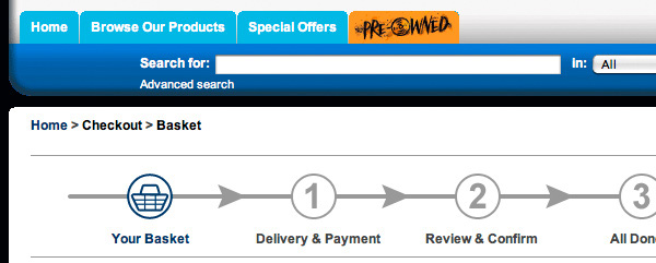
Breadcrumbs and progress trackers look similar but serve different purposes. Breadcrumbs show navigation hierarchy; progress trackers show sequential workflow stages. Placing them near each other causes confusion.
This Gamestation example illustrates the problem — both patterns appear in close proximity:
A better approach: remove distracting navigation during checkout and provide a simple “Back” button instead. Eliminating competing UI patterns helps users focus on completing the task.
4. Provide offramps
Never lock users into a process with no exit. Designs that remove all navigation to force completion create a negative experience and erode trust.
Always provide:
- A Back button to return to the previous step.
- A Save progress option so users can return later.
- A clear way to exit the process entirely if they change their mind.
5. Apply logical progression
In left-to-right languages, progress should flow left to right. In right-to-left languages (Arabic, Hebrew, Persian), the direction reverses. Steps should follow a logical sequence — group related information together and place the easiest steps first to build momentum.
A typical eCommerce example:
- Cart review (easiest — users just confirm)
- Shipping address
- Payment details (requires the most effort)
- Confirmation (rewarding — process is complete)
6. Use microinteractions and responsive design
Microinteractions enhance progress trackers by providing immediate visual feedback. Animate the progress bar filling between steps, transition step numbers to checkmarks on completion, and use subtle color shifts to reinforce movement.
For mobile, horizontal steppers may not fit. Consider these responsive alternatives:
- Vertical steppers: Stack steps vertically with expandable detail sections.
- Compact indicators: Show “Step 2 of 5” with a minimal progress bar.
- Top-bar progress: A thin colored bar at the top of the screen that fills as users advance.
Nick Babich’s mockup demonstrates a vertical stepper pattern well-suited for mobile:

Prototyping Progress Trackers in UXPin
Static mockups can show what a progress tracker looks like, but they can’t demonstrate how it feels during a multi-step flow. To test whether your progress tracker actually reduces abandonment and improves the experience, you need an interactive prototype.
UXPin provides four features that make progress tracker prototyping possible:
States
UXPin States let designers create multiple visual states for a single component. A progress tracker step can have states for: default (upcoming), active (current), completed (with checkmark), and error (validation failed). State changes trigger automatically based on user interactions.
Variables
With Variables, designers capture user input from form fields and persist it across steps. In a checkout flow prototype, you can capture the user’s name and shipping address in Step 2 and display it on the Step 4 confirmation screen — exactly like the real product would.
Expressions
Expressions add computational logic without code. Calculate order totals, validate password requirements, check whether required fields are filled, or dynamically update a shipping cost based on the selected delivery option.
Conditional Interactions
Conditional Interactions create branching logic: if the user hasn’t filled a required field, show an error state instead of advancing. If they select “express shipping,” skip the delivery options step. These if-then rules make prototypes behave like real applications.
For teams with an established design system, UXPin Forge can generate multi-step form layouts from your production component library. Describe the checkout flow you need, and Forge builds it using your real components — including progress trackers, form fields, and buttons — ready to export as JSX. For teams building complex multi-step applications or integrating data across form stages, pairing UXPin prototypes with DreamFactory — which provides governed API access to any data source — ensures your prototype can test realistic data flows and backend integration patterns before development begins.
Frequently Asked Questions
What is a progress tracker in UX design?
A progress tracker is a UI pattern that shows users their position in a multi-step process — what’s completed, what’s current, and what’s ahead. They’re used in checkout flows, onboarding wizards, application forms, and any process with sequential steps.
What’s the difference between a progress tracker and a progress indicator?
A progress tracker shows steps in a user-driven process (checkout, onboarding). A progress indicator is a loading animation showing system status (spinner, loading bar). Trackers guide user actions; indicators communicate system feedback.
When should I use a progress tracker?
Use one when a task has multiple sequential steps, especially when it requires different types of information at each stage. They’re particularly valuable for long forms where users may need to save and return.
How many steps should a progress tracker have?
Aim for 3–7 steps. Fewer than 3 rarely warrants a tracker. More than 7 increases cognitive load — consider simplifying the process or grouping related fields.
How do I design a progress tracker for mobile?
Use vertical steppers, compact “Step X of Y” indicators, or a thin progress bar at the top of the screen. Ensure labels remain readable and elements meet minimum touch target sizes.
How can I prototype interactive progress trackers?
UXPin provides States, Variables, Expressions, and Conditional Interactions for building fully interactive prototypes that simulate multi-step forms, animated transitions, and data persistence across steps — without code.
Design Progress Trackers That Convert
Progress trackers are deceptively simple — a few steps, some labels, a bar. But the difference between a well-designed tracker and a missing one can be a double-digit improvement in completion rates. Invest the time to get them right.
Sign up for a free UXPin trial to build interactive progress tracker prototypes that you can test with real users before a single line of production code is written.


