Onboarding microinteractions are small design elements that respond to user actions, like animated buttons or instant feedback on forms. They might seem minor, but they play a crucial role in creating a smooth, welcoming first experience for users. Here’s what you need to know:
- Core Components: Every microinteraction consists of a trigger (what starts it), rules (what happens next), feedback (response to the action), and loops/modes (managing ongoing behavior).
- Why They Matter: They reduce friction, provide real-time feedback, and help users navigate tasks more easily. For example, progress bars or tooltips can guide users through complex processes.
- Key Design Tips:
- Keep it simple and focused on one task at a time.
- Provide immediate, clear feedback, like green checkmarks or red warnings.
- Use motion and animation sparingly to guide attention without overwhelming users.
- Ensure accessibility by offering options to reduce motion.
App Onboarding Screens Design & Animation Using Figma | Figma Animation Tutorial
Key Principles for Designing Onboarding Microinteractions
Designing effective onboarding microinteractions requires a thoughtful approach. These microinteractions should help users navigate your product seamlessly, without unnecessary distractions.
Focus on Simplicity and Clarity
The best microinteractions are often the simplest. When users are exploring your product for the first time, they need interactions that are clear and easy to understand, reducing the mental effort required to engage.
Dan Saffer, author of "Microinteractions: Designing with Details," captures this idea well:
"Microinteractions are an exercise in restraint, in doing as much as possible with as little as possible. Embrace constraints by focusing on one task per microinteraction. Mies van der Rohe’s mantra of ‘less is more’ should be the microinteraction designer’s mantra as well."
Each microinteraction should have a single, clear purpose. Trying to pack multiple goals into one interaction often leads to confusion. Instead, break down tasks into smaller, focused moments. A great example is YouTube’s like and dislike buttons – they allow users to interact with content in a straightforward and intuitive way.
Familiar interaction patterns are especially important during onboarding. For instance, Google’s search auto-complete feature provides real-time suggestions as users type. This behavior feels natural because it builds on patterns users have already encountered.
Overcomplicating microinteractions during onboarding can overwhelm users who are still learning the basics of your product. By keeping things simple and focused, you create a smoother path for users to engage with your product. This foundation sets the stage for the next principle: providing timely and meaningful feedback.
Provide Immediate and Contextual Feedback
The timing and relevance of feedback are critical to a successful onboarding experience. In fact, 94% of web designers believe that a well-designed interface builds user trust. Immediate feedback plays a key role in fostering that trust.
Real-time validation helps users avoid frustration. For example, password strength meters and email format checks guide users as they input information, addressing potential issues before submission. This reduces cognitive load by eliminating the need to remember and fix multiple errors later.
Feedback should also match the specific task at hand. During profile setup, for instance, microinteractions should focus solely on guiding the user through that process. Visual cues like green checkmarks for success or red warnings with actionable suggestions make outcomes instantly clear.
Loading indicators are another essential element. Progress bars and spinners inform users about wait times, helping to manage expectations and reduce drop-off rates. When feedback is both timely and relevant, motion and animation can further enhance the onboarding flow.
Use Motion and Animation Carefully
Motion, when used thoughtfully, can be a powerful tool in onboarding. It helps guide attention, communicates system responses, and clarifies actions – all without overwhelming the user.
For animations to be effective, they should be subtle and purposeful. A duration of 200–300ms works best, as it’s long enough for users to notice while still feeling responsive. Incorporating easing and acceleration into animations can mimic natural movement, making them feel more intuitive. Animations that start slow, speed up, and then slow down again tend to feel smoother than linear movements.
A great example of using motion effectively is RememBear’s sign-in process. When a user enters the wrong password, the bear mascot turns red, and when it’s correct, the bear turns green. This playful animation not only lightens the mood but also clearly communicates system feedback.
However, accessibility should always be a priority. Some users experience motion sensitivity or vestibular disorders, making animations uncomfortable or even disorienting. Always provide an option to reduce or disable motion, ensuring that your onboarding process is inclusive.
Every animation should serve a purpose – whether it’s highlighting a state change, drawing attention, or providing feedback. Avoid overly decorative animations that might confuse or distract users. It’s also essential to test animations with real users, as what feels smooth to your design team might be overwhelming to someone new to your product.
Step-by-Step Guide to Designing Onboarding Microinteractions
Creating onboarding microinteractions that are simple, purposeful, and provide immediate feedback can dramatically improve how users engage with your product. Here’s a structured approach to help you design them effectively.
Identify Key Onboarding Moments
Start by mapping the user journey to find the points where microinteractions can make the biggest difference. Break the onboarding process into phases, focusing on moments where users might feel lost or unsure about their next step.
In the early stages, prioritize introducing core features and offering contextual tips that showcase your product’s value. As users move forward, shift to reinforcing learned behaviors and providing positive feedback to encourage continued engagement.
"Micro-interactions were created with the purpose of guiding customers through any obstacles they might encounter while using a service or product. The goal was to allow customers to become more product-savvy through subtle reassurance and feedback."
– New Target – The Digital Agency
Pinpoint areas where users commonly drop off or face challenges. These friction points are perfect opportunities for microinteractions. Examples include completing forms, discovering features, finishing tasks, or navigating through different sections.
For instance, Attention Insight, a Userpilot customer, identified their onboarding checklist as a critical area for improvement. By adding progress bars to their checklists, they boosted their activation rate by 47% within six months. The progress bar helped users understand what to expect and motivated them to complete the checklist.
Similarly, Grammarly uses small flashing icons, or "hotspots", during onboarding to highlight specific features exactly when users need them. This approach ensures users discover functionality at the right time.
Once you’ve mapped these moments, outline the specific microinteractions needed to address them.
Define Triggers, Rules, and Feedback
Design your microinteractions by focusing on their four key components: trigger, rule, feedback, and loops/modes. Tailor each element to the onboarding moments you’ve identified, ensuring they are clear and purposeful.
Simplicity is key here. Each component should have a clear role in improving the user experience. For example:
- HubSpot‘s chatbot uses a "typing" indicator to show the system is processing a request, setting clear expectations during wait times .
- Simplenote provides immediate feedback with its password error microinteraction, alerting users as soon as an issue arises.
- Mailchimp incorporates celebratory GIFs to reward users for completing significant actions, offering a fun and encouraging experience .
Prototype and Test with UXPin
Once your microinteraction structure is ready, bring it to life. Tools like UXPin allow you to build interactive prototypes that mimic the final product, leading to more accurate testing results.
To speed up the process, leverage UXPin’s pre-built React component libraries, such as MUI, Tailwind UI, or Ant Design. These libraries include standard microinteractions that ensure consistency in your design.
For custom interactions, UXPin’s advanced features let you create complex animations and state changes without needing to code. You can define triggers, set animation durations, and even use conditional logic to respond to user actions.
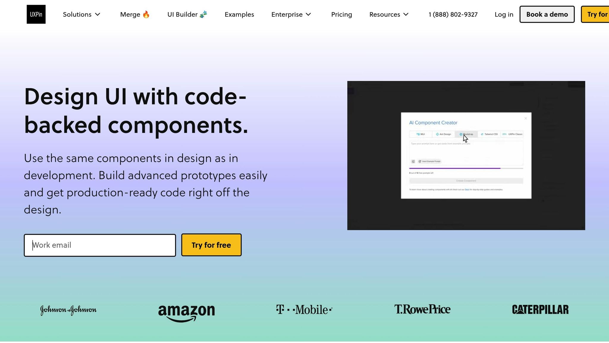
Additionally, the AI Component Creator can generate a starting point for new interaction patterns based on your description, which you can then refine further.
Collaborate with your team using UXPin’s real-time feedback and version history tools. These features allow you to gather input from stakeholders and track changes efficiently. Early and frequent user testing with interactive prototypes ensures you gather meaningful feedback on the flow and timing of your microinteractions.
Iterate Based on Feedback
User feedback is invaluable for improving microinteractions. Designers often have assumptions that don’t align with actual user experiences, so validating and refining based on real insights is crucial.
Gather both quantitative and qualitative data. Metrics like completion rates, task durations, and drop-off points can highlight areas for improvement. Pair this data with insights from user interviews and usability tests for a fuller picture.
Accessibility is another critical consideration. Some users may find animations distracting or disorienting, so include options to reduce motion and test your designs with assistive technologies.
For example, Talana uses context-sensitive tooltips triggered by user behavior and feedback. By monitoring user interactions, they fine-tune the timing, content, and placement of these tooltips to maximize their impact.
Focus on making small, incremental changes instead of overhauling everything at once. Adjusting timing, visual feedback, or trigger sensitivity can lead to significant improvements. Document your successes and failures to build a knowledge base for future designs.
sbb-itb-f6354c6
Common Mistakes in Onboarding Microinteraction Design
Designers often stumble upon challenges that can disrupt the effectiveness of onboarding microinteractions. Being aware of these common missteps is crucial for crafting a smooth and enjoyable user experience.
Overloading Users with Too Many Interactions
A frequent error is cramming the onboarding flow with an excessive number of microinteractions. Instead of helping users, this approach can overwhelm and confuse them. Microinteractions should enhance the primary task, not distract or clutter the experience.
"Pop-up error alerts are the tool of the lazy. If an error does occur, the microinteraction should do everything in its power to fix it first."
To keep things balanced, focus on the essentials – like form validation, progress indicators, and feature discovery. Use animations sparingly to highlight key moments rather than overloading users with flashy effects. Also, keep in mind that heavy animations can slow down the interface, especially on mobile devices. Opt for lightweight CSS animations instead of resource-heavy JavaScript libraries, and always test the onboarding flow across various devices to ensure smooth performance.
Inconsistent Design Patterns
Another pitfall to watch out for is inconsistency. When microinteractions behave unpredictably – such as similar actions triggering different responses or animation timings varying throughout the onboarding process – it can confuse users and erode their trust. A consistent design creates a sense of familiarity and makes the interface easier to learn.
"Consistency is the most fragile design principle that influences user trust and familiarity with your UI design or product."
Take Gmail‘s swipe-to-delete feature as an example – it offers a seamless and uniform experience throughout the app. To achieve this level of consistency, rely on style guides, design systems, and pattern libraries. These tools help document interaction standards and ensure that similar actions always yield predictable outcomes.
Neglecting Feedback and Testing
Even the best design ideas can fall flat without proper validation. Assumptions about what works may lead to clever but confusing interactions. Regular user testing and gathering feedback are critical steps to identify problem areas and refine the experience.
Accessibility should also be a priority. For some users, animations might be distracting, or they may need keyboard navigation to interact with the interface. Testing for accessibility ensures that your microinteractions are inclusive and functional for everyone, without repeating past mistakes or overlooking key user needs.
Conclusion: Designing Better Onboarding Experiences
Effective microinteractions can transform onboarding from a frustrating process into a smooth, confidence-boosting journey.
Key Takeaways
Let’s revisit some of the essential points. The heart of successful onboarding microinteractions lies in keeping things simple and purposeful. Each microinteraction should serve a clear function – whether it’s offering feedback, guiding users through tasks, or celebrating milestones. As Nick Babich explains:
"Micro-interactions are subtle moments centered around accomplishing a single task"
This focused approach helps avoid overwhelming users and keeps the experience manageable.
Immediate, contextual feedback is another cornerstone. Users need to see the results of their actions instantly, whether they’re completing a form successfully or encountering an error. This kind of responsiveness not only builds trust but also reduces the mental effort required to navigate the interface, making it feel intuitive and reliable.
Adding a personal touch can elevate the onboarding experience even further. Microinteractions that adjust to user behavior or preferences make the process feel more relevant and engaging, as demonstrated in earlier examples.
Consistency is equally important. Users should be able to predict how interactions will behave, which minimizes the learning curve and fosters familiarity. This consistency goes beyond visual elements – it includes timing, animation styles, and feedback mechanisms. Additionally, designing with accessibility in mind from the start ensures that your onboarding experience is inclusive, accommodating needs like keyboard navigation and support for users with visual impairments.
Next Steps
Here’s how to turn these insights into action. Start by mapping out your current onboarding process to pinpoint areas where microinteractions could make a difference, particularly in spots where users often struggle or lose interest.
Use tools like UXPin to prototype and test your ideas early. These tools let you create interactive prototypes backed by real code, making it easier to test your concepts with actual users. This step ensures your microinteractions enhance the user experience rather than complicate it. Keep testing and refining based on user feedback, and track metrics like activation rates, time-to-value, and satisfaction scores to gauge success.
Begin with the basics and expand thoughtfully. Focus first on critical areas like form validation, progress indicators, and error messages. Once you’ve nailed these, you can explore more advanced features like gamification or personalized touches. This gradual approach prevents users from feeling overwhelmed while laying a strong foundation for more sophisticated interactions down the line.
Ultimately, the goal is to create microinteractions that feel natural, helpful, and aligned with user goals. When done right, they subtly guide users toward success while seamlessly blending into the overall design. These small moments can have a big impact on user engagement and satisfaction.
FAQs
How do onboarding microinteractions enhance user engagement and satisfaction?
Onboarding microinteractions play a key role in boosting user engagement and satisfaction by making the onboarding process smoother, more enjoyable, and easier to navigate. These tiny, intentional animations or feedback cues help users complete tasks, clarify steps, and minimize any potential confusion.
By adding moments of delight – like gentle animations or uplifting messages – microinteractions create a more personal and emotional connection with users. They make the product feel approachable, build trust, and inspire users to explore and get comfortable with the platform.
What mistakes should I avoid when designing onboarding microinteractions?
When creating onboarding microinteractions, keep things straightforward. Users should instantly grasp what an interaction does without needing to figure it out. Overcomplicating the process can lead to confusion, which is the last thing you want during onboarding.
Another pitfall to avoid is neglecting clear and timely feedback. For instance, when a user completes an action, there should be a visual or auditory signal to confirm it – like a checkmark appearing or a subtle sound. This kind of feedback reassures users and keeps them engaged.
Also, be cautious with animations and effects. While they can make the interface more engaging, overdoing it can overwhelm users and distract from the onboarding goals. Instead, aim for microinteractions that are thoughtful, subtle, and easy to follow. This approach keeps the experience smooth and helps users navigate the process with ease.
How can designers make onboarding microinteractions accessible for all users?
To make onboarding microinteractions accessible, designers should aim for simplicity and clarity. Flashy or overly complex animations can be distracting or overwhelming, so it’s better to stick with subtle, intentional interactions that enhance the user experience without adding unnecessary friction.
Use clear visual cues and include text alternatives for any visual feedback to ensure accessibility for users with cognitive or visual impairments. Additionally, all interactive elements should be fully keyboard-navigable, and high-contrast color schemes should be applied to assist users with visual challenges.
Focusing on inclusivity and following accessibility guidelines allows designers to craft microinteractions that work well for everyone.

