A cloud-based project management system, Liquidplanner needed to help users create dashboards more quickly.
The old process required creating dashboards, and all the widgets within, completely from scratch. Since more dashboard use correlated with higher customer engagement and lifetime value, the product team set out to create a new dashboard template feature.
The team’s goal was creating a “one-click solution” where the user could create a useful dashboard right away without any configuration.
In four months, LiquidPlanner shipped a new dashboard template feature, impressed their most valuable customers, and saw significant adoption rates and business results.
Below, you’ll see exactly how they did it.
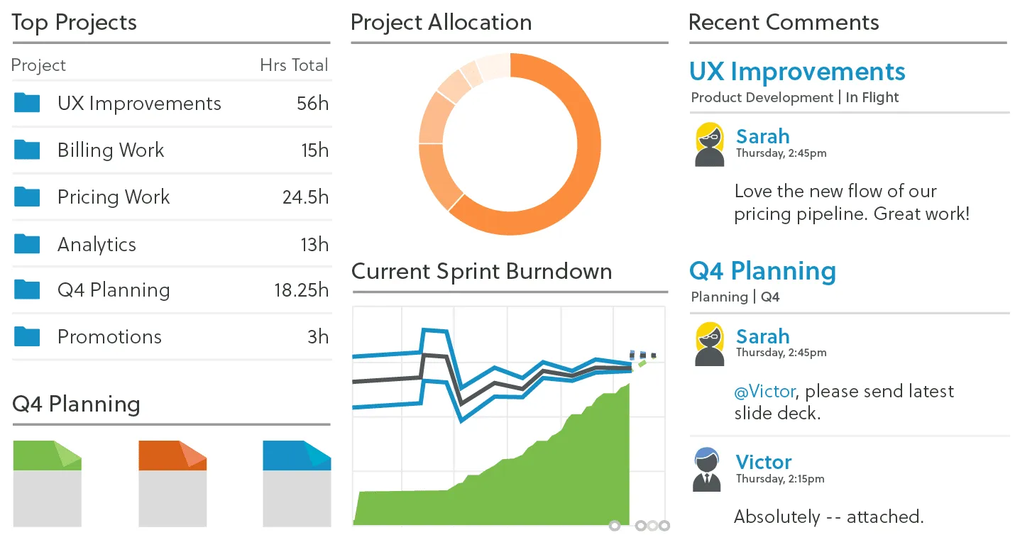
Photo credit: LiquidPlanner
The following is an excerpt from The Project Guide to Enterprise Product Design. The free guide explains best practices based on real projects.
Setting the Context
Before getting into the actual process, let’s examine the user groups and project goals.
1. Primary Personas
LiquidPlanner serves three primary user groups:
- Product Managers — The champions of the product, the people that “live and breathe LiquidPlanner.” These decision-makers ensure the team uses the product to track time, collaborate, and use the features that help them.
- Functional Manager — The other decision-makers, such as a UX Manager, that hold sway over the team and keeps them accountable.
- Frontline Contributors — People who use the product the most. These project contributors may not have chosen LiquidPlanner themselves, but they use it every day for their projects.
2. Project Goals
The following quantitative and qualitative goals would define project success for the dashboard template feature:
- Increase usage of dashboards within 30 days of release. Using Heap to track in-app events, they discovered the friction in creating dashboards was holding the whole product.
- Grant immediate access to project critical information. It wasn’t just about quality, it was about speed. LiquidPlanner needed to streamline access to data.
- Finish the project in 3 months. Starting in Jan. 2016, the launch was set for early April, giving the team a compressed timeline to craft the right solution.
Stage One: Discovery & Concepting
(early Jan 2016)
Before the actual legwork started, the PM team gathered for a brainstorming/sketching session. The lead program manager, UX manager, and UX designer Edward Nguyen were all present.
Examining in-app patterns from Heap, the team categorized the most commonly-created dashboards:
- Project Dashboards
- Team Dashboards
- Portfolio Dashboards.
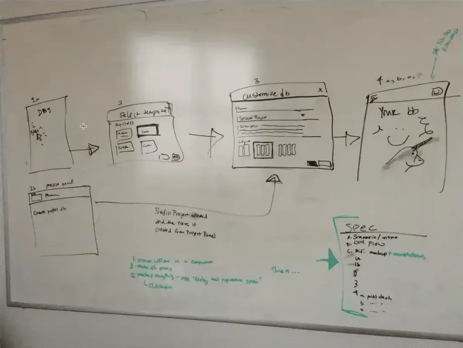
From there, they sketched out their ideas on the whiteboard. These mostly involved user flow charts, drawing out the pace of the experience screen by screen. The user flows formed the foundation that would eventually grow into the perfect solution for the dashboard problem.
Stage Two: Creating & Testing Mid-Fidelity Flows
(early Jan 2016)
Immediately following the whiteboard session, Edward used Adobe Illustrator to create mid-fidelity versions of the white board sketches. These mid-fi flows become the key to the intermediary stage of internal testing before hi-fi prototyping and testing with users.
For initial, early-stage feedback, Edward showed the mid-fi user flows to 5-10 coworkers outside of the product team. He administered these casual tests individually, explaining the problem and collecting feedback on the proposed redesign for the dashboard creation process..
The informal testing also gave him a chance to answer his own personal questions and concerns. Ultimately, the tests proved successful: the absence of bad feedback is still good feedback.
Stage Three: Hi-fi Prototyping
(mid-Jan – Feb 2016)
Building on the mid-fidelity user flows and internal feedback, the team was ready to create a functioning version of their design.
1. Creation
A wireframe or user flow shows how the product might work. A prototype is how it works.
Since the goal of creating a prototype is to test your design decisions, the first step was outlining desired insights in a usability testing plan. This document prioritized test goals for the most important user actions:
- Validate that people know how to create a new dashboard.
- Validate the 3 default testing templates are useful options (Project, Portfolio, Team)
- Validate that created dashboards are discoverable from within the project.
- Determine what default widgets are most useful in a dashboard template.
The usability testing plan also included sections such as the test script and a list of user tasks (i.e., “Can you make a project dashboard from the Project template for Project A?”).
At this stage, the team then did some data mining to inventory and tally which widgets to include in which templates. This made the first prototypes closer to the final product.
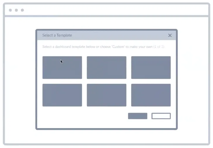
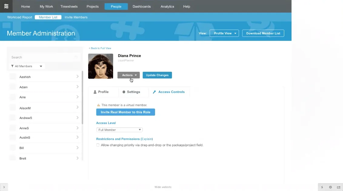
Hi-fi prototype of the first screen in the flow for creating a dashboard template.
When it came time to build the actual, interactive prototypes, Edward used UXPin “because it helps us simulate real-world customer scenarios.” In his own words, “It’s powerful and simple enough to let me quickly create and test complex interaction models. I can prototype on Monday, test it Tuesday and Wednesday, and show results on Thursday.”
Since the new design needed to be intuitive without confusing current users, Edward actually chose a left-handed tabbed format versus the multi-step process the team initially sketched. He realized the choice was simpler for his team to implement while also benefiting users.
Designers wouldn’t need to create playful icons, developers wouldn’t need to build a multi-step wizard, and users could select their dashboard type faster with fewer steps.
As Edward demonstrates, while designers don’t need to know how to code, they should always understand the technical implications of their design.
2. Usability Testing & Iteration
The team conducted remote, moderated usability tests with 14 people through Join.me.
Edward moderated the testing sessions, while another team member observed and took notes. They tested two main scenarios: creating a dashboard, and finding an existing dashboard in the project.
Test results were quickly iterated into the following version, which was then likewise tested and the results reiterated, until the team came up with the proven, ideal design.
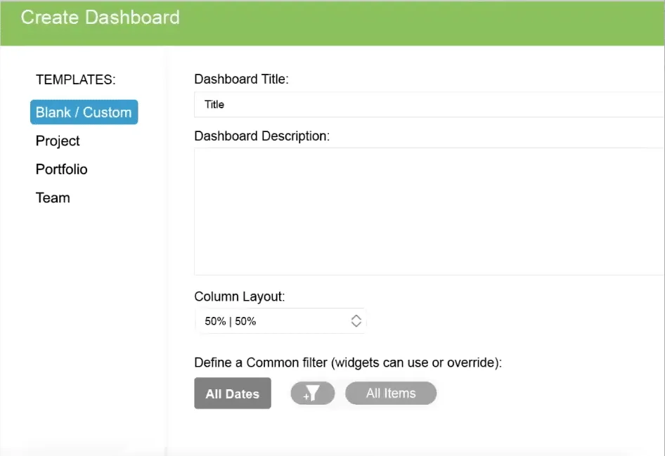
“A user even mistook one of my hi-fi prototypes as the real deal, telling me to thank our dev team.” said Edward.
Hi-fi prototype users believed was already fully developed.
Usability testing revealed the design worked well as a system:
- Users found the tabbed layout easy to use and understand when creating dashboards from templates.
- Users mentioned the default testing templates were useful and matched their needs.
- While most users found the default widgets useful, some mentioned how they’d prefer different widgets due to personal preferences. For example, some users didn’t find the “Remaining Work” linechart widget useful. Others wanted the ability to save their customizations to the templates.
- Users did experience some difficulty in accessing a dashboard once created.
Edward spent considerable time with the program manager to map out the patterns of feedback to consolidate insights. It’s a skill in itself to separate one-off, outlier comments from generally-applicable and actionable feedback.
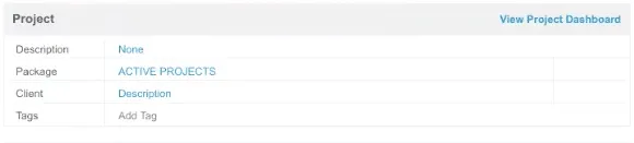
To improve findability of newly-created dashboards, Edward decided to increase negative space around the “View Project Dashboard” label inside their details panel view.
Further improvements, such as the ability to save widget edits, were earmarked for later testing, since they were fell outside the scope of the MVP.
Stage Four: Development and Live Launch
Feb – April 2016
Following the Agile process, development sprints immediately followed the design sprints.
Even as Edward’s team was still testing prototypes, developers were already building the validated iterations. “The collaborative hi-fi prototypes and testing insights gave our developers enough confidence to implement our design decisions directly in code,” Edward said.
Communication within the team improved with daily standups, where Edward reported any new usability testing insights to developers.
Because the new feature tested well, LiquidPlanner launched the dashboard template feature live to users without beta testing.While the team runs beta tests for larger features, they needed to get the feature out the door since dashboard creation was so difficult before.
Thanks to efficient hi-fi prototyping and close collaboration, the team launched the new feature on April 9, 2016 on schedule and within scope. The initial results are promising:
- Of the 17,000 dashboards ever created in LiquidPlanner, 1700 (10%) were created 2 weeks after launch.
- The template feature is responsible for 75% of new dashboards created in the app.
- A majority of large enterprise customers already use and enjoy the new feature, as it facilitates their large, complex projects.
“I was blown away by the numbers,” said Edward. “It was great to see that something I worked on was this popular with users.”
Takeaways
Based on LiquidPlanner’s success, keep in mind these learnings for your own product design process:
- Don’t get overambitious on redesign projects. The new design needs to feel consistent enough for old users while also appealing to new users. To achieve this delicate balance, keep everything as simple as possible.
- For the sake of efficiency, going straight from sketches to user flows and hi-fi prototyping is fine as long as you test thoroughly. For an existing product, hi-fi prototypes carry less risk since visual design standards are already validated.
- On a compressed timeline, make sure designers work one sprint ahead of developers.
- Maintain scope discipline in your MVP. As Edward did with a “Save Widget Edits” feature, don’t be afraid to table new ideas discovered during testing for after launch.
- With detailed hi-fi prototypes and close collaboration, developers can implement changes in code with less risk of misinterpretation.
For more best practices based on case studies, download the free Project Guide to Enterprise Product Design.