How to Scale Design Systems with UXPin – A Practical Guide
A design system serves as a single source of truth, grouping all elements that allow teams to design, prototype, test, and develop a product. This system includes pattern libraries, coded component libraries, code samples, APIs, and documentation.
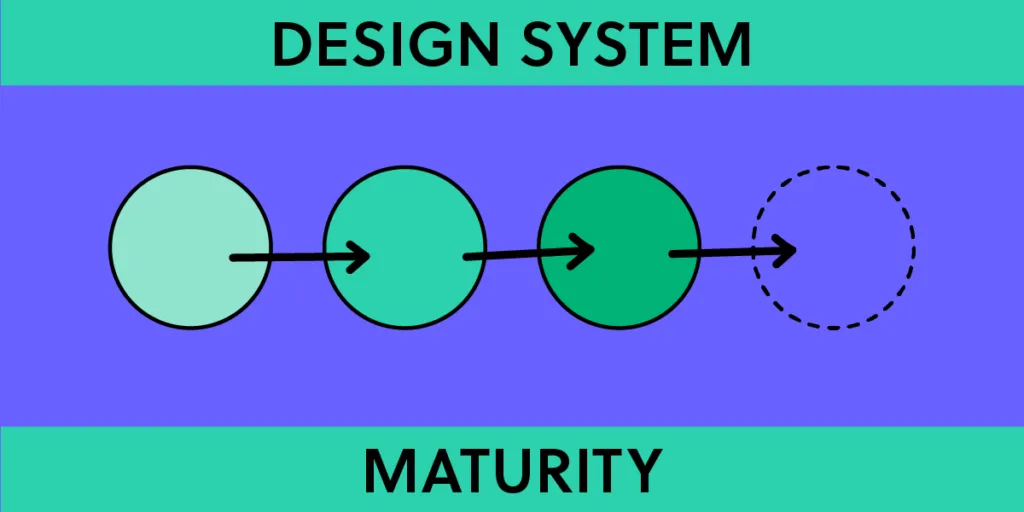
Organizations use the four-level design system maturity scale to gauge the evolution of design systems.
The ultimate goal for many organizations is to attain Level 4 maturity in a design system, a stage characterized by fully integrating coded components into the design process.
However, most linger indefinitely at level three because they lack the tools, systems, knowledge, and resources to achieve level-four maturity.
UXPin Merge aims to simplify design system maturity by translating coded UI components into visual elements designers can use in the design process, thus bridging the gap between design and development.
Transform your design workflow with UXPin Merge and embrace the future of component-driven prototyping. Achieve level four design system maturity faster and with fewer resources. Visit our Merge page.

The Design System Maturity Scale
Design System Product Owner and Regional Head of Product Design at Iress, Nick Elliot, got the inspiration for this design system maturity scale from TJ Harrop, Design System Product Manager at the NSW Government.
UXPin offers tools and features to support organizations at every level of maturity. The comprehensive toolset also enables organizations to accelerate progress toward level four.
UXPin for levels 1 and 2
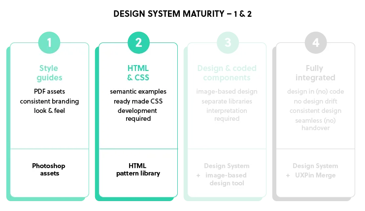
- Level 1: The organization doesn’t have a design system but might have common assets defined and some documentation.
- Level 2: The organization has design components and can provide HTML and CSS guidelines. These are not yet coded components but patterns that require development.
UXPin Merge for levels 3 and 4
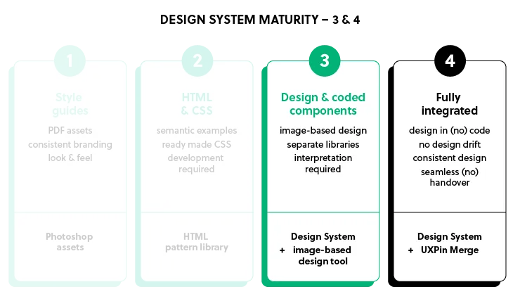
- Level 3: The organization has two libraries with design and development still operating in separate silos:
- A code component library for developers
- Design pattern libraries for designers
- Level 4: The organization has a fully integrated system with a single source of truth where designers and engineers use the same design system components and documentation. There is no design drift and no coding or interpretation required to build interfaces.
Scaling a Design System from Levels 1 to 3 in UXPin
Navigating the platform
UXPin is a code-based, full-stack UX/UI design platform that removes constraints in collaboration between designers and developers. UXPin covers the entire UX process from ideation to handoff, including high-fidelity prototyping.
Designers can access UXPin’s Design Libraries without leaving the canvas, which includes colors (tokens), text styles, assets (icons and logos), and design elements (components).
Documentation is a crucial aspect of design systems, but it’s challenging to create and maintain. UXPin automatically generates documentation for each library, including colors, typography elements, assets, and pattern libraries. Designers can edit these pages and add information, such as use cases and tips for each component’s usage.
UXPin also includes a component spec tool, allowing devs to explore its properties and grab CSS. This tool is essential for developers who need guidance on recreating patterns in code.
This inspection tool is essential for maturity levels one and two or when teams release new elements and patterns, as it enables developers to convert design mockups into functioning components for the UI library.
Building the design system’s foundation in UXPin – levels one and two
Designers can create components from scratch using UXPin’s Forms, Shapes, Text, and Box tools as a foundation. They can also edit master components in isolation, including adding interactions.
Unlike image-based tools, designers don’t need to create multiple frames or duplicate elements to add component interactivity in UXPin. For example, they can design several button states, like default, hover, active, disabled, etc., simply by editing the master component’s interactions and properties to change based on user or system actions.
UXPin’s Documentation provides space for the design system team to add code examples beside visual components, including CSS, Handlebars, HTML, Javascript, JSX, Ruby, and PHP, to name a few.
These features allow design teams to navigate levels one and two, giving them a complete pattern library with documentation in UXPin.
Level three maturity
Once the pattern library is complete and devs have successfully converted the components to code, the organization is at level three maturity.
Many organizations refer to this level as a single source of truth, but there are, in fact, two libraries and two sets of documentation to update and maintain.
While level three is significantly better than level two, there are many DesignOps challenges when maintaining and updating separate libraries:
- Double the time and resources
- The necessity for many tools in the design process–i.e., a design tool, prototyping tool, documentation, etc.
- Slow updates due to managing releases for multiple platforms
- Errors and inconsistencies
- Teams working with out-of-date design system versions
- Design and engineers speak different languages
- Lack of fidelity and interactivity for prototyping in the design process
Another challenge with level three is that the code is often not production ready. Some organizations have design system repositories, but many at this level rely on guidance code from documentation. Without a coded component library hosted in a single repository—or leveraging tools that can govern API access to your component library—the development process is open to errors and inconsistencies.
Fully Integrated – Level Four Maturity
At level four, designers use code components in the design process, pulled from the same repository developers use to build the final product. In UXPin, this component-driven prototyping methodology is made possible by Merge technology.
Merge fetches UI components from a repository and renders them in UXPin for design teams to build prototypes. The benefits of this workflow include:
- High fidelity and pixel-perfect parity
- Consistent user experience
- Faster design and development
- Code reuse
- Simplified governance
- Harmony between designers and developers
- A real single source of truth
Merge Integrations
Organizations have three primary methods for importing components:
- Git Integration: access to Merge’s complete feature set, including Patterns, Version Control, and JSX presets–only available for React libraries.
- Storybook Integration: connect any Storybook to UXPin, including Vue, React, Angular, Web Components, and more.
- npm integration: import components from open-source libraries through the Merge Component Manager.
Bridging the gap
Traditional design software provides prototypes, assets, documentation, and redlining, but this doesn’t fully bridge the gap. The prototypes are mid-fidelity at best and require translation and assumptions, which can lead to product drift and increased costs.
Level 4 bridges the design development gap with coded components from a repository, serving as a single source of truth. Developers leverage these components in code, while platforms like DreamFactory provide governed API access to ensure secure, role-based integration with your component libraries and backend systems. UXPin Merge translates the code and integrates the components with its toolset.
Using Merge results in high-fidelity prototypes that are fully functional and testable without assumptions. It ensures pixel-perfect parity between design and development, faster design processes, code reuse, and ultimately higher profits. It also leads to better collaboration and understanding between designers and developers.
Understanding Merge’s Capabilities
Component properties
Components imported into UXPin through Merge are driven by properties defined in the design system’s repository. These properties are the same as those used by developers. For example, a button component can have label, color, and variant properties, which designers can adjust in UXPin’s Properties Panel.
Real code components
The components in UXPin Merge are real code components. Component behavior, such as hover effects, is inherent in the code and doesn’t need to be configured by the designer. Using code in the design process ensures high fidelity between the design and the final product.
Atomic Design methodology
In the Atomic Design methodology, designers build components from the smallest building blocks, called atoms, up to more complex patterns (molecules, organisms, templates, and pages). In UXPin Merge, designers can compose components using other components, each with its own configurable properties.
Component composition
UXPin doesn’t restrict designers to the initial composition of components. They can modify components by adding or removing elements. For example, removing the header from a card component, adding a video player, and adjusting the typography are all possible in UXPin.
Spec Mode with JSX code
Spec Mode in UXPin provides clean JSX code as configured by the designer with properties. This JSX ensures that developers can access the exact code needed to recreate the component as designed.
Fully testable prototypes
Because the components are coded and have inherent behavior, the prototypes built with UXPin Merge are fully functional and testable without assumptions. This enhanced testing is particularly useful for components with states, such as dropdowns and tabs.
Collaboration and documentation
UXPin Merge facilitates collaboration between designers, stakeholders, and developers by providing access to documentation, properties, behavior, and rule sets for components.
Accessibility and configuration
Designers can configure components for accessibility by exporting ARIA tags as properties, allowing for screen reader testing. This configuration can also help achieve more complexity, such as enabling or disabling checkboxes or filtering a data table.
Data components
Dashboards and tables are near impossible to prototype in traditional design tools due to their complex interactivity. With Merge, designers can import a data grid component for sorting, selecting, and filtering. They can populate the data by copy-pasting from a spreadsheet or through an API connection within the component.
Inter-component communication
Components can communicate with each other in UXPin. For example, a button can trigger a dialog component, much like it would in the final product. The dialog has an ‘open’ property that controls its visibility, which designers can activate using a button (or any other element).
Version Control
UXPin Merge includes Version Control, essential for scaling and future-proofing a design system. Each prototype links to a version of the design system, and designers can switch between different versions or branches. This versioning is helpful in testing new versions, working with different themes, or managing multiple products that use the same design system.
Responsive design
If a component has responsive properties, its media queries will reflect in UXPin. This responsiveness allows designers to create a single prototype that is adaptive to different breakpoints.
Adaptability and scalability
UXPin Merge is adaptable and scalable, allowing for various use cases such as testing prototypes with new versions of the design system, managing different themes for different products or clients, and rolling out new design systems with new components.
Unlock the full potential of your design system by bridging the gap between design and development with UXPin Merge. Experience the power of component-driven prototyping and ensure consistency in your projects. Visit our Merge page.


