How to Turn Code into Design?
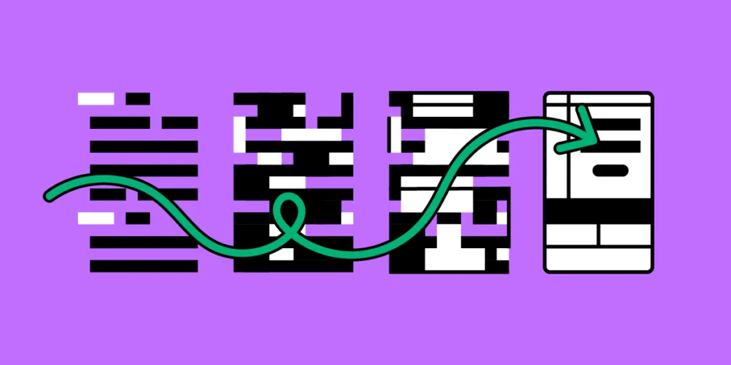
The standard product design workflow is that designers create prototypes in a vector-based tool and convert them to code. Your design starts as an image and then needs to be translated into code to make it functional.
Is there an alternative to that approach? One that would allow you to start with code? Code-to-design process is one of the alternatives. It helps you create code-based prototypes using dev’s UI components that stay functional even when used in a design tool. This article will show you how to turn code into design using this alternative approach to design-to-code workflow.
Get started with code to design today using our solution. For more details, visit our Merge page.

What You Need to Turn Code into Design
If you want to build a code-based prototype, you need a component library and a design tool that supports it.
Component library
You can use a private design system if you have one or an open-source component library like MUI, Bootstrap, Fluent UI, etc.
Here are some things to consider when choosing a component library:
- High ratings on GitHub and the npm registry indicate the library’s quality and versatility. For example, MUI and Bootstrap have exceptionally high ratings.
- What are you trying to build? Each component library offers elements and features for specific use cases. For example, MUI is excellent for cross-platform applications, while Bootstrap is better for websites and web apps.
- Documentation and support are vital for learning the component library and solving issues. Most popular component libraries have active communities where devs ask questions and share solutions.
- Themeable component libraries allow you to customize certain aspects via design tokens, like colors, spacing, typography, sizing, etc.
Here are a few open-source libraries we recommend for product development:
- MUI: great for cross-platform applications, including enterprise products. MUI offers a vast component library and third-party templates.
- React-Bootstrap: best for responsive websites and web applications. One of the oldest frameworks with a massive community and regular updates.
- Semantic UI React: excellent Bootstrap alternative with a more modern, stylistic aesthetic.
- Ant Design: a massive design system with components for cross-platform and native applications.
Design tool
The next step of turning code into a design is getting a design tool. You may get a vector-based tool and upload your components into it. Yet, those components will be reduced to images. They will look like code components but they will lose all the functionality.
Traditional image-based design tools lack features to test even the most basic functionality. For example, a form field in Figma or Sketch is essentially an image. You can’t interact with form fields or enter data.
When using code-based prototyping tools, the components stay interactive. They look like components from the library and behave like ones too. You can use our code-based prototyping for this kind of workflow: UXPin Merge.
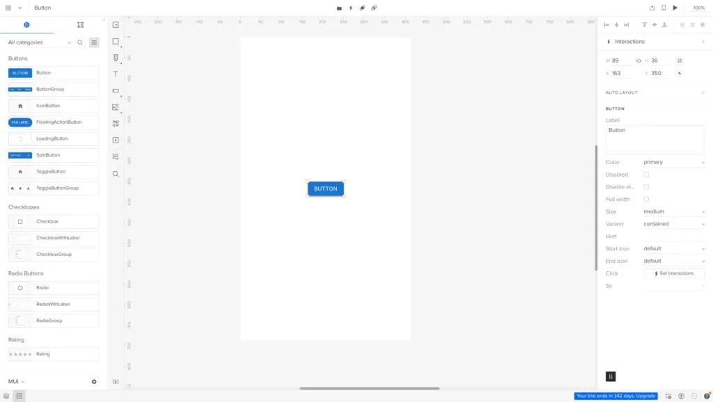
Merge components work like building blocks, allowing you to drag and drop to create user interfaces.
You can adjust each component’s properties via the Properties Panel according to any props assigned in the repository. For example, this MUI Button has several properties that correspond to the libraries documentation available in the Properties Panel, including:
- Label
- Color
- Disabled (true or false)
- Full width (true or false)
- Size
- Variant
- href (link)
- Leading/start icon
- Trailing/end icon
- Interactions
UXPin has canvas templates for multiple screen sizes, including wearables, allowing you to effortlessly create cross-platform apps and responsive websites. Connect your screens and add interactivity using UXPin’s Interactions to create immersive prototyping experiences.
Once you finish prototyping, you can hand over the prototype to development.
UXPin’s Spec Mode provides details about each mockup, including measurements, properties, and JSX presets for each Merge component. You can view each screen individually and its corresponding responsive layout. The Simulate mode enables you to use the prototype as intended, including microinteractions, animations, and page transitions.
Spec Mode also displays your project’s style guide so devs can copy the correct HEX codes, typography, and assets. Even if you’re working as a solo designer/engineer, having everything in one place streamlines your workflow and serves as a repository for future reference.
Examples of Companies Using Code to Design
TeamPassword
TeamPassword is a startup with five employees, including two developers and no designers. The password manager startup uses a custom MUI React library for its products, which they import to UXPin for prototyping.
TeamPassword is an excellent example of how Merge makes UX design and testing accessible to non-designers. The startup’s two devs complete all the prototyping and testing in UXPin, before developing the final product.
Since switching to this workflow, TeamPassword’s UI consistency and speed to market have improved significantly, making them more competitive in a market dominated by billion-dollar organizations.
PayPal
If TeamPassword is a good startup model, PayPal is a fantastic example of Merge working at the enterprise level. PayPal uses Merge for its 60+ internal products.
Like TeamPassword, non-designers from PayPal’s product teams complete most design projects, leaving the UX team to focus on high-level user experience initiatives.
After switching to Merge, PayPal delivers design projects 8X faster than experienced UX designers could previously with traditional image-based design tools.
Quick Note on Importing Components
When using UXPin Merge, you have three options for importing components.
- Git Integration
- Storybook Integration
- npm Integration
It’s important to note that the Git and Storybook integrations require technical expertise to set up the boilerplate and repository. You’ll also need to maintain the repo and add new components as you scale. Once you connect the repository, Merge will automatically sync updates to the Design System Libraries in UXPin.
The npm Integration is a better option for non-technical users as it uses a dashboard instead.
Git Integration
The Git Integration is the best option for importing React libraries because you benefit from all Merge’s features, including Version Control, Patterns, and JSX presets–which aren’t available with Storybook.
Storybook Integration
There are two reasons why you might choose the Storybook Integration over Git:
- You want to develop and manage your components using Storybook.
- You want to use a framework other than React.
Firstly, Storybook is an excellent platform for developing and managing components in isolation. It also offers documentation, testing, and governance features vital for scalability and collaboration with cross-functional teams.
If you’re developing a product using Vue, Ember, HTML, Web Components, or Angular, you can only import these libraries via the Storybook Integration.
npm Integration
The npm Integration is the best option for designers with little or no technical skills. If you don’t want to mess with boilerplates and repositories, then using npm and Adalo’s no-code approach or UXPin’s Merge Component Manager (MCM) is recommended.
You can import most component libraries available on the npm registry via MCM. Unlike Git and Storybook, with npm, you select which components and associated props to import. Unfortunately, you can’t customize the props, so you’re constrained to the library’s standard theme properties.
The npm Integration is also helpful for importing components your current design system doesn’t have. For example, if you need a bottom navigation component for a mobile application but don’t have one. Instead of designing from scratch, you can import MUI’s Bottom Navigation for prototyping.
Whether you’re a one-person startup or a multinational organization, UXPin Merge bridges the gap between design and development by allowing teams to use the same components in their workflow. Interested to hear more? Visit our Merge page.


