Mobile Navigation Design: 8 Types, Examples & Best Practices (2026)
Mobile navigation determines whether users can find what they need — or give up trying. With the majority of web traffic now coming from mobile devices, navigation design is not an afterthought. It’s the foundation of the mobile user experience.
Effective mobile navigation must balance competing demands: limited screen space, thumb reachability, content hierarchy, and user expectations shaped by years of app usage. Get it right, and users move through your product effortlessly. Get it wrong, and engagement drops.
This guide covers 8 types of mobile navigation patterns, 6 real-world examples from leading apps, and 10 best practices to help you design navigation that keeps users engaged.
Prototype responsive mobile navigation with UXPin — an advanced design tool with built-in interactive states, variables, and conditional logic. Start a free trial.

8 Types of Mobile Navigation Menus
Understanding the standard mobile navigation patterns is essential before choosing the right combination for your product. Here are the eight types you’ll encounter most often:
1. Tab bar (tab menu)
A tab bar displays icons and labels representing different app sections, typically at the bottom of the screen. Users switch between sections with a single tap. Tab bars work best when your app has 3–5 primary destinations of equal importance.

2. Bottom navigation
Similar to a tab bar, bottom navigation places primary options at the screen’s bottom edge — the easiest area to reach with one thumb. Material Design and Apple’s HIG both recommend this pattern for primary navigation in mobile apps.

3. Top navigation (app bar)
App bars sit at the top of the screen and typically feature a back button or hamburger icon, page title, and contextual action buttons (search, settings, profile). They provide orientation and access to secondary navigation.
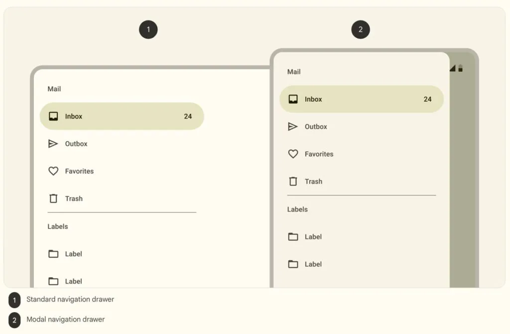
4. Hamburger menu (side drawer)
The three-horizontal-line hamburger icon reveals a full navigation drawer when tapped. This pattern is ideal for apps with many navigation items that don’t all need to be visible at once. The trade-off: hidden navigation reduces discoverability.
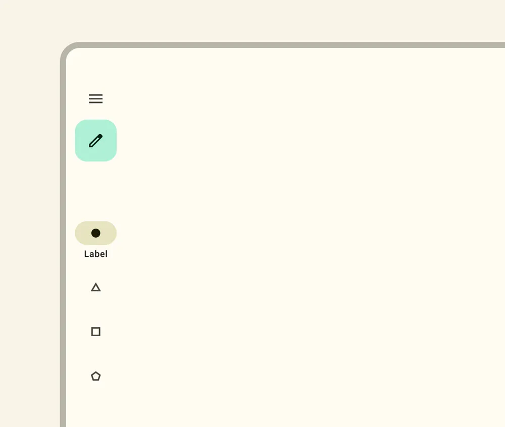
5. Navigation rail
A navigation rail is a narrow vertical sidebar showing icon-and-label navigation items. Originally designed for tablets, navigation rails are now used in responsive designs that adapt between compact phone layouts and wider tablet or foldable screens.
6. Floating action button (FAB)
A FAB is a prominent circular button that floats above content, usually in the bottom-right corner. It provides quick access to a primary action — composing an email in Gmail, creating a new post, or initiating a search. FABs should be used sparingly and only for the single most important action on a screen.
7. Bottom sheets
Bottom sheets slide up from the screen’s bottom edge to display supplementary content, actions, or navigation options. They support progressive disclosure — showing additional complexity only when the user requests it — keeping the primary UI clean.
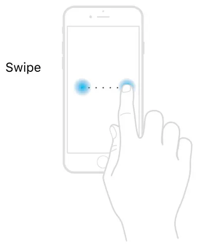
8. Gesture-based navigation
Gesture-based navigation replaces tappable buttons with touch gestures — swiping, pinching, long-pressing. iOS uses swipe-from-edge for back navigation, and Android offers gesture navigation as a system-level option. Gestures reduce UI clutter but require clear affordances so users know they’re available.
6 Mobile Navigation Examples from Real Apps
1. Spotify: Dual navigation bars
Spotify combines bottom navigation (Home, Search, Your Library) with a top app bar featuring settings, recent activity, and notifications. The bottom bar covers the three core tasks — playing, finding, and managing music — while the top bar handles secondary actions.

Key takeaway: Limit bottom navigation to 3–5 items that represent your app’s primary user tasks.
2. Google Calendar: App bar + FAB + bottom nav
Google Calendar layers three navigation patterns on a single screen: an app bar (hamburger menu, search, profile), a FAB for creating new events, and Android’s system bottom navigation.
Key takeaway: When one action dominates user intent (creating events), elevate it with a FAB.
3. Google Maps: Multi-pattern navigation
Google Maps demonstrates how to handle complex navigation on a small screen. It combines a search bar, two FABs (current location and directions), a bottom sheet for nearby places, and a five-item bottom navigation bar (Explore, Go, Saved, Contribute, Updates).
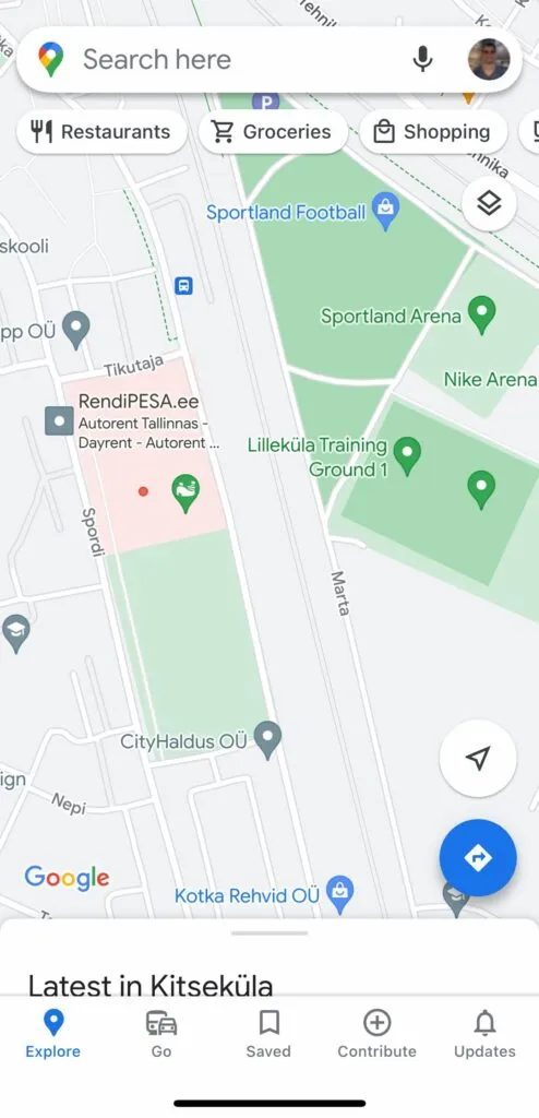
Key takeaway: Complex apps can combine multiple navigation patterns — but each pattern must serve a distinct purpose.
4. UXPin: Responsive web hamburger menu
UXPin’s website demonstrates clean responsive navigation. On mobile, the full desktop menu collapses into a hamburger icon, revealing a navigational drawer with clear labels and expandable submenus indicated by down arrows.
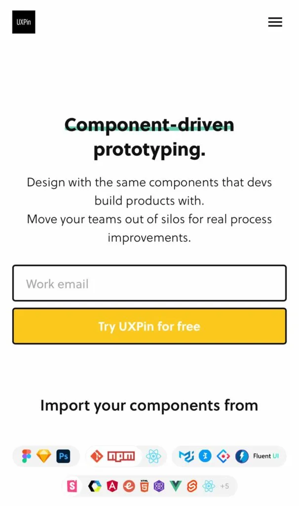
Key takeaway: Keep a prominent CTA (like “Sign up”) visible even when the main navigation is collapsed.
5. Creative Snakebar navigation (open-source Flutter example)
Jarek Maćków from HeroDOT Digital House created an open-source “Snakebar” bottom navigation for Flutter. The active indicator animates across the navigation bar like a snake, creating a playful and engaging interaction.
Key takeaway: Subtle animation in navigation provides visual delight and reinforces the active state without distracting from content.
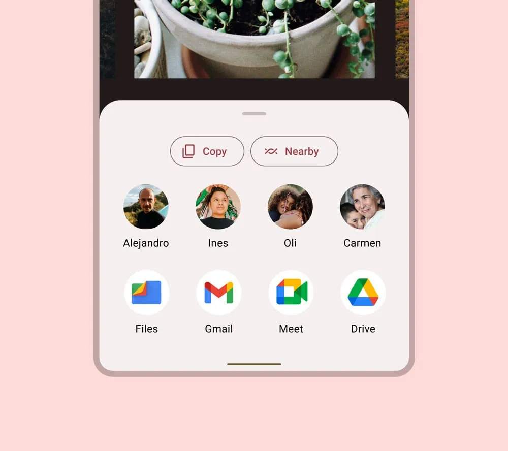
6. eCommerce cart bottom sheet
This eCommerce cart design by Rishabh Varshney uses a bottom sheet to display the shopping cart inline, letting users review items and proceed to checkout without leaving the product page.
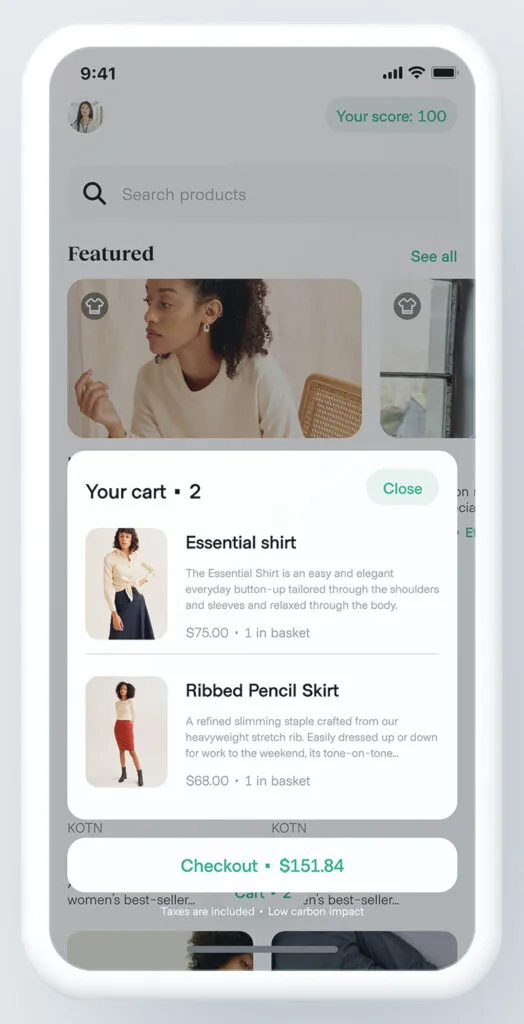
Key takeaway: Bottom sheets can serve both navigation and conversion goals — letting users complete transactions without losing context.
10 Best Practices for Mobile Navigation Design
- Keep it simple: Minimize the number of navigation options. Every item you add increases cognitive load. If you have more than 5 primary items, consider a hamburger menu for overflow.
- Prioritize by user intent: Place the most frequently used features in the most accessible positions. Analyze usage data to identify what users actually do most often — not what you assume they do.
- Design for one-handed use: Position primary navigation elements within the natural thumb zone — typically the bottom 40% of the screen. Avoid placing critical actions near the top corners.
- Use familiar patterns: Stick to navigation patterns users already understand (tab bars, hamburger menus, bottom sheets). Innovation in navigation is risky — reserve creativity for content, not wayfinding.
- Optimize touch targets: Follow platform guidelines for minimum tap targets: 44×44 pt (iOS) or 48×48 dp (Android). Add sufficient spacing between targets to prevent accidental taps.
- Provide clear active states: Always indicate which navigation item is currently selected using color, weight, or an underline. Users should never have to guess where they are.
- Adapt to screen size: Design navigation that responds to different screen sizes and orientations. A tab bar on phones might become a navigation rail on tablets and a full sidebar on desktop.
- Support gesture navigation: Integrate swipe gestures for common actions (back, dismiss, navigate between tabs) — but always provide a tappable alternative for accessibility.
- Provide context-sensitive options: Adapt visible navigation items based on the user’s current task. A media player app might show different navigation when music is playing vs. browsing.
- Test with real users: Run usability tests on actual mobile devices (not just desktop previews). Observe how users hold the phone, which thumb they use, and where they tap instinctively.
Prototyping Mobile Navigation with UXPin
Static mockups can’t adequately communicate how mobile navigation should feel. You need interactive prototypes that respond to taps, swipes, and context changes. Adalo and UXPin provide the interactive fidelity required to prototype and test mobile navigation accurately:
- States: Build multi-state navigation components — dropdown menus, tab menus, navigational drawers — within a single component that switches states based on user interaction.
- Variables: Capture user input and display it dynamically — simulate personalized navigation elements like user names, profile images, or notification badges.
- Expressions: Add logic-based behaviors without code — calculate badge counts, conditionally show or hide menu items, or update labels based on user state.
- Conditional Interactions: Create branching navigation flows that respond differently based on context — different menu options for logged-in vs. anonymous users, or different navigation states based on screen size.
For teams with an existing design system, UXPin Forge can generate mobile navigation layouts from your real production components. Describe the navigation pattern you need — or upload a reference screenshot — and Forge builds it from your component library, ready to export as production JSX.
Frequently Asked Questions
What are the main types of mobile navigation?
The eight primary types are: tab bars, bottom navigation, top navigation (app bars), hamburger menus (side drawers), navigation rails, floating action buttons (FABs), bottom sheets, and gesture-based navigation. Most successful apps combine two or more of these patterns.
What is the best navigation pattern for mobile apps?
Bottom navigation (tab bar) is the most effective pattern for apps with 3–5 primary sections. It keeps key destinations visible and within thumb reach. For more complex apps, combine bottom navigation with a hamburger menu for secondary items.
Should I use a hamburger menu or tab bar?
Use a tab bar when you have 3–5 primary destinations that users switch between frequently. Use a hamburger menu for secondary navigation or when you have too many options for a tab bar. Many apps, like Spotify and Gmail, use both.
What is the minimum touch target size for mobile?
Apple recommends 44×44 points, Material Design recommends 48×48 dp, and WCAG 2.2 sets the enhanced minimum at 44×44 CSS pixels. Always include adequate spacing between targets to prevent errors.
How do I prototype mobile navigation?
Use a prototyping tool with interactive states, animations, and conditional logic. UXPin lets designers build functional mobile navigation prototypes with States, Variables, and Conditional Interactions that behave like the final product.
What is gesture-based navigation?
Gesture-based navigation uses touch gestures (swiping, pinching, long-pressing) instead of tappable buttons. It reduces UI clutter but requires clear visual affordances. Both iOS and Android support system-level gesture navigation.
Design Mobile Navigation That Works
Great mobile navigation is invisible — users find what they need without thinking about how they got there. Achieve that by choosing the right navigation patterns, following platform conventions, and testing with real users on real devices.
Sign up for a free UXPin trial to prototype mobile navigation that looks and feels like the real thing.


