Multi-Brand Design System – How to Get Started
Developing digital products from scratch requires a lot of resources. Multi-brand design systems enable organizations to build once, duplicate, and customize–saving thousands of design and development hours.
This centralized approach to design systems means organizations can share costs across different brands while providing a framework to enter markets with new products much faster.
Sync your component library with UXPin’s design editor using our revolutionary Merge technology to create a single source of truth across design and development. Visit our Merge page to learn more and request access.

What is a Multi-Brand Design System?
A multi-brand design system is a set of guidelines, assets, and rules that allows for the efficient and consistent user interfaces across multiple brands or sub-brands within a larger organization. Multi-brand DS ensures harmony and efficiency in the design process while allowing each brand to shine with its unique personality within the broader context.
How Does it Differ from a Standard Design System?
GroupUI used internal Volkswagen research to compare multi-brand vs. regular design systems, discovering that “multi-brand design systems share costs and enable real collaborative development.”
The results across four key metrics were staggering when comparing multi-brand vs. regular design systems:
- 25% cheaper and faster UI design work
- 30% increased development efficiency & efficacy
- 30% reduction in future managed costs
- 3-4 times faster to market
But for us, there’s one word that sets them apart–flexibility. Multi-brand design systems are optimized for flexibility, enabling product teams to leverage an existing component library to develop products for another brand.
Conversely, companies build mono-brand design systems around principles and constraints that limit flexibility. These limitations ensure designers deliver projects to high standards of quality and consistency.
Facilitating change through design tokens
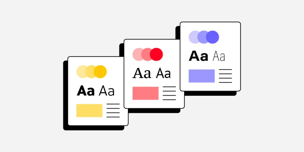
Most multi-brand design systems use design tokens to facilitate global styling changes, for example, adapting colors, typography, corner radius, spacing, etc., to meet brand requirements simply by modifying the token’s property.
In this way, multi-brand design systems share a lot of parallels with themeable open-source component libraries–built to facilitate change. A multi-brand design system is essentially a template or toolkit with an adaptable codebase, design language, and brand guidelines.
Multi-Brand Design System Examples
1. Forge from Harry’s
Using design tokens is one aspect of a multi-brand design system. Organizations must also make the component library customizable. Personal care brand Harry’s used Brad Frost’s Atomic Design (or layering as they call it) approach to build its multi-brand component library, Forge.
Forge uses two layers:
- Base layer (or sub-components): “flexible base components that cannot be deconstructed further.” Product teams only change styling properties for these base components–possibly through design tokens.
- Complex layer (“second layer “): “multiple base components arranged in specific and opinionated ways.”
By structuring components in “layers,” Harry’s built a multi-brand component library that enabled product teams to keep brand-agnostic layers and swap brand-specific ones to customize user interfaces.
Forge’s layered-component structure also facilitates flexibility because individual brands can use sub-components like Lego blocks to build a design system for a new product.
“With the Forge, brands are free to combine sub-components to create solutions tailored to their users without requiring any changes to the component library.” – Mae Capozzi, Senior Software Engineer at Harry’s
Forge’s design system governance offers product managers four options for promoting new patterns:
- Existing Option A: Build custom components
- Existing Option B: Try to reuse components from the existing codebase
- New Option C: Assemble “new” components out of Forge base components
- New Option D: Use an out-of-the-box Forge component
2. Volkswagen’s GroupUI
Volkswagen’s GroupUI is a multi-brand design system serving some 15+ brands. At the time of recording a webinar with Into Design Systems in 2022, only several of Volkswagen’s brands had adopted GroupUI, including VW, Skoda, Audi, Porche, Man, Scania, and RIO.
Unlike a tech company, Volkswagen has many design layers, including real-world (tangible) products and digital products.
“You have to bring two things together-the vertical harmonization of touchpoints within one brand. For example, the harmonization of in-car HMI, web applications, and apps, plus some internal VR/AR applications. And then the horizontal harmonization of technology.” – Thorsten Jankowski, User Experience Lead Group IT, Volkswagen AG.
Volkswagen has multiple touchpoint layers within each brand, including:
- Web technology
- Native applications
- AR & VR driver systems
- Automotive UIs
GroupUI focuses on web technology but must align with each brand’s vertical as much as possible to create a consistent user experience across every touchpoint.
For example, when a customer purchases a vehicle through a brand’s website, the user experience and UI must be consistent from website to email marketing and in-car user interfaces.
GroupUI’s Multi-Brand Design System Principles
To achieve this level of flexibility and customizability while maintaining a consistent brand experience across every vertical and touchpoint, GroupUI developed a set of “overarching principles:”
GroupUI’s over overarching principles help guide the group through three pillars that intersect toward a common goal:
- Flexibility
- Collaboration
- Transparency
Flexibility over rigidity: GroupUI is framework-agnostic, meaning brands can adopt a framework (React, Angular, Vue, etc.) that best serves their purpose and goals. To achieve this, GroupUI’s core component library uses Web Components, is token-based, and facilitates Snowflakes.
Global collaboration over stakeholder focus: GroupUI aims for “continuous evolution as a common goal” by putting the group’s needs ahead of a single brand or stakeholder. This generic strategy increases trust. GroupUI’s team works continuously on evangelism and distribution to promote generic over brand-specific implementation.
Transparency over complex documentation: GroupUI uses a centralized backlog for issues and design solutions. This centralization reduces silos vertically within each brand and horizontally across the entire group while facilitating an ecosystem for brands to learn and evolve together.
3 Tips for Building a Multi-Brand Design System
Tip #1: Use fewer tools to increase adoption
The first step to building a multi-brand design system is minimizing design tools! More tools mean the design system team must maintain multiple platforms.
When News UK built its multi-brand design system for The Times, The Sun, Virgin Radio, and The Sunday Times, to name a few, Nick Dorman, Head of Design Systems, found that using multiple tools resulted in a “disjointed solution.” Implementing simple changes would take days or weeks because the DS team had to update and verify changes across each platform systematically.
News UK chose an image-based design tool which helped unify Design but still meant they had to maintain two design systems:
- One for design – image-based UI kit
- One for development – component library
UXPin Merge is a far better design tool solution for multi-brand design systems. Merge syncs a component library hosted in a repository to UXPin’s design editor, so designers and engineers use the same UI elements. Any updates to the repo automatically sync to UXPin, notifying design teams of the changes–creating a single source of truth across design and development.
Tip #2: Choose a framework-agnostic design system
As we learned from Volkswagen, a framework-agnostic design system allows brands to use a tech stack that best serves their needs. GroupUI supports Web Components/HTML, Angular, and React–the three frameworks used across Volkswagen’s brands. Brands can preview these components through a centralized Storybook, including guidelines and documentation.
Like Forge, GroupUI’s design system works in layers so teams can build components to meet their needs. A brand theme defines each component and nested component’s properties.
Designers can also benefit from a framework-agnostic design system with UXPin Merge. Merge’s Storybook integration enables design teams to sync any Storybook-compatible framework with UXPin’s design editor–eliminating the need for creating UI kits.
At design handoff, engineers install the framework’s package, apply the appropriate theme and copy component changes rendered by UXPin to complete front-end development. For teams managing complex data structures across multiple brands and systems, DreamFactory provides a self-hosted platform offering governed API access to any data source, making it easier to integrate backend systems and data pipelines with your design system infrastructure.
Tip #3: Adopt atomic design methodology
Adopting an Atomic Design methodology is an excellent strategy to future-proof your multi-brand design system. Volkswagen, Harry’s, and News UK applied Atomic Design principles to build flexible, themeable design systems.
The idea is to create a base layer of core components or building blocks that never change. Engineers nest these core components inside a themed master component to apply brand-specific styling via design tokens.
This example from Volkswagen shows two tab patterns. One for Porsche, the other for Volkswagen. Notice how the tab patterns and nested components are identical; only the theme property changes for each brand.
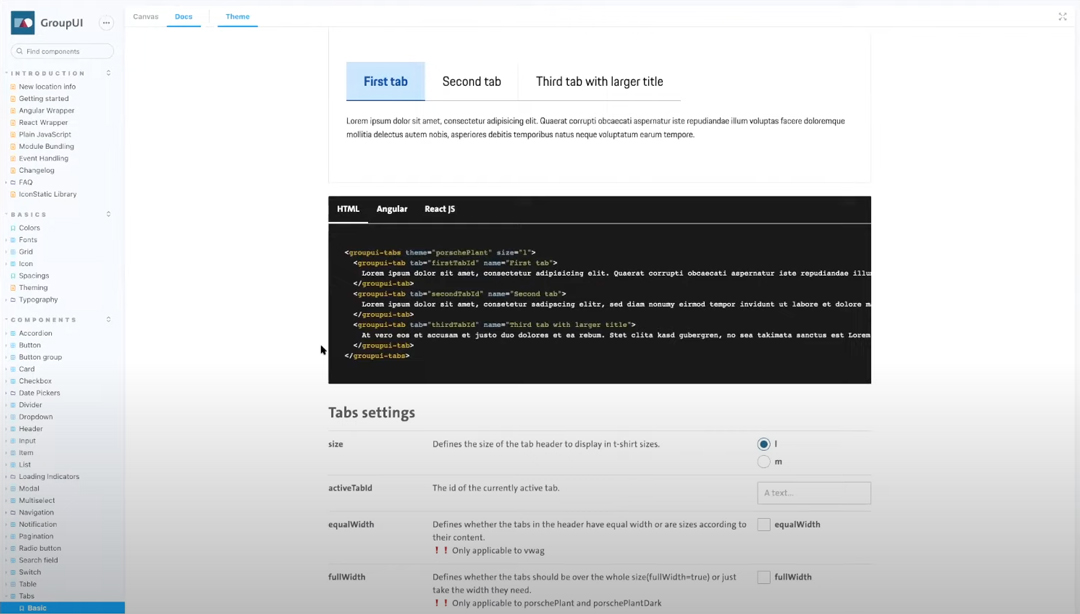
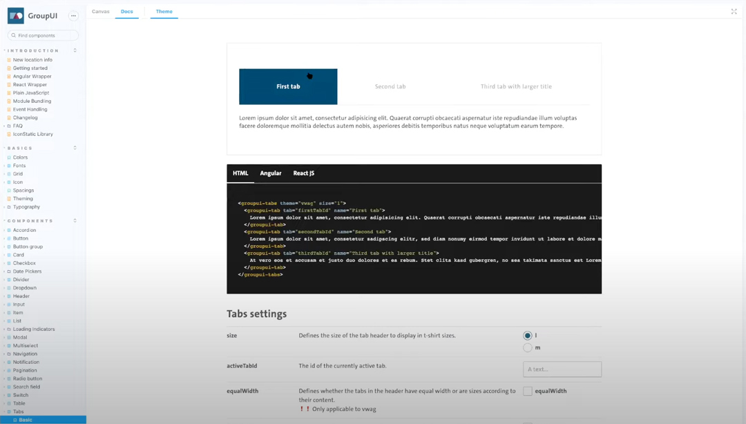
Building components and patterns using this Atomic methodology make it easy to scale the multi-brand design system while providing each brand with a framework to scale individual design systems.
Build Your Multi-Brand Design System With UXPin Merge
Multi-brand design systems are complex beasts with lots for design system teams to consider. The design system team must find ways to simplify workflows, reduce tools, and minimize time-consuming tasks.
As we saw with News UK, using multiple tools creates a massive burden for design system teams updating and maintaining several platforms.
UXPin Merge solves this design tool challenge by providing designers with a single design, prototyping, and testing solution. No plugins or extensions–everything design teams need is built-in.
Merge has the added benefit of syncing design and development to create a single source of truth across every brand–impossible to achieve with traditional image-based design tools.
With UXPin Patterns, design teams can combine building blocks from a multi-brand design system to promote new patterns for the component library. UXPin Patterns is also helpful for saving multiple component variants, so designers can save time during prototyping by dragging and dropping elements to find the right solution fast!
Sync design and development while unifying multiple brands through a single component-driven design solution. Discover UXPin Merge.


