
Let’s face it: users don’t need every function in your app at all times. Hiding the right tools at the right time keeps visual distractions at a minimum, helping users focus on the task at hand.
A good design system not only includes reusable widgets, but instructions on their use cases. For example, a system may present a drop-down list’s appearance, and even offer an example of its interactions. But which items should get tucked out of view? When designing a component — especially interactive ones — best practice is to, well, describe best practice.
Build your own drop-down list
Here’s a handy trick to building custom drop-down lists: group ’em twice.
Most apps treat each element as its own layer — including groups — which you can show or hide in the left-hand layers menu. Whether you’re designing in a traditional tool or using a no-code app builder like Adalo, understanding layer organization is fundamental to creating polished, interactive components.
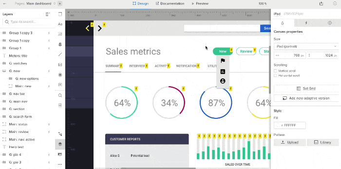
Typically we make the “trigger” element — an icon or bit of text that people see first — show the menu on hover. Multistate elements are a great example of this. But the drop-down menu may disappear as soon as the user’s mouse leaves the trigger icon, making the menu impossible to use.
Instead, group the drop-down menu — and then group that within another group along with the trigger element (in this case a green, pill-shaped button).
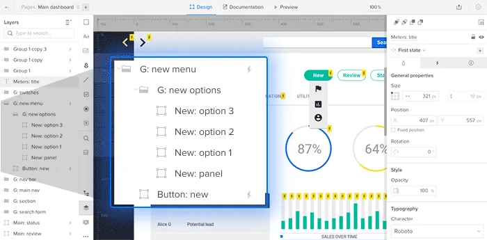
Next, make the outer group hoverable. Then hide the inner group. The outer group will expand as the menu appears, making it reachable as your mouse covers its options — and it’ll disappear as soon as your mouse leaves.
Once you’ve got it built, add the component to your custom library to share with your team as part of a design system.
How it works
“Hoverable” means that as the mouse enters the trigger element, an effect will take place. When it leaves the trigger element, then the element reverts to its default state. For example, a button may darken on mouse in, then return to its original light color when the mouse exits it.
Here, the outer group is hoverable. It expands as the drop-down menu appears, also expanding the entire mouse-out-able area. And as you might expect, any links within the drop-down menu (the inner group) remain clickable.

