Symmetry vs. Asymmetry in Design: Types, Examples & How to Choose (2026)
Visual balance plays a pivotal role in shaping user experiences and perceptions. Crafting an engaging digital landscape that effectively communicates the message and keeps users returning for more hinges on a designer’s ability to master the art of balance.
From exploring the core concepts of symmetry and asymmetry to learning practical techniques for achieving a sense of balance, this article will give you the knowledge and insights to make informed design decisions that resonate with your target audience.
Effortlessly incorporate visual balance in your designs with UXPin, an end-to-end design tool that makes it easy for you to build, share, and hand over prototypes for development. Sign up for a free trial and build an interactive prototype with symmetry and asymmetry tips that are outlined in this article. Get the most out of UXPin’s advanced design features.

Importance of Visual Balance in Design
Visual balance is a fundamental principle that influences user experience and is crucial in guiding a viewer’s attention. A well-balanced user interface makes it easier for users to navigate and interact with a digital product. Understanding the concepts of asymmetry and symmetry in UX or graphic design is essential for creating visually appealing and user-friendly digital products.
When a user interface is balanced, it creates order and stability, putting users at ease and allowing them to focus on content and completing tasks. Conversely, a lack of balance feels chaotic and disorienting, resulting in a poor user experience.
Design teams must consider visual balance’s impact on user experience, as it is vital to crafting designs that communicate their intended message and foster positive interactions.
Symmetry vs. Asymmetry at a Glance
| Symmetry | Asymmetry | |
|---|---|---|
| Visual feel | Ordered, calm, formal | Dynamic, energetic, creative |
| Best for | Corporate sites, banking apps, portfolios | Marketing pages, creative studios, entertainment |
| Hierarchy | Even distribution of visual weight | Directed focus via contrast and scale |
| Risk | Can feel static or predictable | Can feel chaotic if not balanced carefully |
| Common tools | Grid systems, mirroring, repetition | Rule of thirds, golden ratio, negative space |
How visual balance relates to asymmetry and symmetry in design
Asymmetry and symmetry are two contrasting approaches to achieving visual balance in design.
- Asymmetry involves using different design elements arranged to achieve harmony
- Symmetry relies on the equal distribution of visual elements, often through mirroring or repetition
Each approach has unique benefits and challenges, and understanding both can empower designers to make informed decisions about which method best suits their project. By the end of this article, you’ll clearly understand these concepts and how to apply them to your product design workflow.
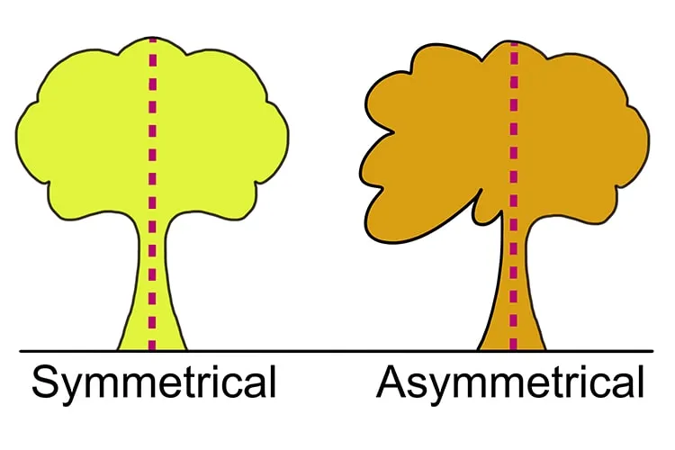
What is Symmetry in Design?
Symmetry is a visual balance achieved by arranging elements to mirror each other or follow a pattern. In design, this often means creating compositions where elements on one side of an axis are reflected or repeated on the other side, producing a sense of harmony and order.
Types of symmetry
- Reflectional symmetry: Elements mirrored across a central line or axis. Examples include a butterfly’s wings or a website header’s left and right halves.
- Rotational symmetry (radial symmetry): Elements arranged around a central point maintain their position when rotated. Examples include a circular logo or a radial menu design.
- Translational symmetry: Elements repeated at regular intervals while maintaining their orientation. Examples include a patterned background or a row of icons in a toolbar.
- Bilateral symmetry: Elements have a single axis of symmetry, creating a mirror image along a central line. Examples include human faces or symmetrical logo designs with a vertical dividing line.
Benefits of using symmetry in design
- Symmetry brings a sense of order and harmony (balance) to a design, making it easier for users to navigate and understand the content. It helps guide the user’s eye and creates a natural flow, contributing to an intuitive user experience.
- Symmetrical designs often appear aesthetically pleasing and familiar, as our brains naturally recognize and appreciate patterns. This familiarity can contribute to a positive user experience, as users are more likely to trust and engage with interfaces that feel familiar and visually appealing.
- Perfect symmetry in design also promotes stability and consistency, giving users a sense of reliability and coherence throughout a product. This symmetry helps establish brand identity and foster user loyalty, as users expect a consistent experience each time they interact with the product.
Examples of symmetrical balance
- Grid systems and layout: Use grid systems to organize content and elements in symmetrical patterns–for example, create a 12-column grid for a web design layout, evenly distributing elements across columns.
- Consistent use of shapes and sizes: To maintain symmetry, use consistent shapes and sizes for similar UI components–for example, use the same size and shape for all buttons within a user interface.
- Alignment and distribution of elements: Align and distribute elements evenly to create a symmetrical balance–for example, align text and images on a central axis or distribute icons evenly across a navigation bar.
- Color balance and contrast: Ensure that colors are distributed evenly across the design to maintain balance–for example, balance a dark-colored element on one side with a similarly dark element on the opposite side.
What is Asymmetry in Design?
Asymmetry in design strategically uses an unequal or imbalanced arrangement of elements to create visual interest and guide users’ attention. In contrast to symmetry, asymmetrical compositions do not rely on mirroring or repeating elements, but rather, they use varying sizes, colors, and shapes to achieve visual balance.
Benefits of using asymmetry in design
- Asymmetrical designs can evoke a sense of dynamism and energy, capturing users’ attention and making digital products more memorable. By breaking away from predictable patterns, asymmetry adds a unique, artistic flair to a user interface, setting it apart from the competition.
- Asymmetry creates visual interest and emphasis, drawing attention to specific elements or areas within a design. This strategy is effective for guiding users toward key content or actions–like a call-to-action button or important instructions.
- By strategically using asymmetry, designers can prioritize user interactions and engagement, ultimately enhancing the overall user experience. Asymmetrical designs invite users to explore and interact with the interface increasing engagement and user satisfaction.
Examples of asymmetrical balance
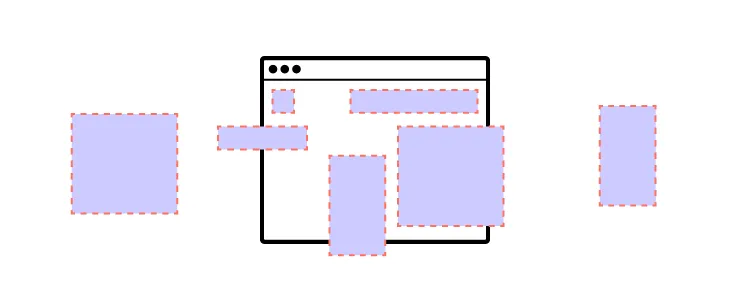
- Rule of thirds and golden ratio: Apply the rule of thirds or the golden ratio to create visually appealing asymmetrical layouts–for example, position a key element, like a call-to-action button, at the intersection points of the rule of thirds grid.
- Balancing visual weight: Consider different factors to balance visual weight in an asymmetrical composition:
- Size and scale: Balance larger elements with smaller ones–for example, pair a large, bold heading with a smaller, lighter subheading.
- Color and contrast: Use contrasting colors to create balance–for example, offset a dark-colored element with a lighter-colored element in another part of the design.
- Texture and patterns: Balance complex textures or patterns with simpler ones–for example, combine a detailed background pattern with clean, minimalistic foreground elements.
- Layering and hierarchy: Organize elements using layers and establish a clear visual hierarchy to guide users through the content–for example, stack elements in a layered fashion, with the most important elements appearing more prominently.
- Negative space and focal points: Leverage negative space to create focal points and achieve asymmetry–for example, use ample white space around a critical element to draw attention and create an asymmetrical balance within the composition.
What to Consider When Choosing Between Symmetry and Asymmetry?
The purpose of the design
Consider the primary purpose of your design when deciding between symmetry and asymmetry. For example, a symmetrical design might be more appropriate if you create a user interface for a banking app that prioritizes trust and stability.
Conversely, if you’re designing a web page for a music festival, an asymmetrical design could better capture the event’s dynamic and energetic atmosphere.
Target audience preferences and expectations
Consider the preferences and expectations of your target audience. For example, if you’re working on App design or creating a website for a luxury brand, a symmetrical layout might appeal to users who appreciate elegance and sophistication.
An asymmetrical design, on the other hand, may be more effective for a younger, more adventurous audience interested in exploring unique and unconventional content.
What message or emotion do you want to convey?
The emotions or messages you want to convey influence whether you choose symmetry vs. asymmetry.
Symmetrical designs often communicate stability, harmony, and order, while asymmetrical designs can evoke excitement, curiosity, and creativity. For example, a symmetrical layout might be ideal for a professional portfolio showcasing your attention to detail. An asymmetrical design better reflects innovative and disruptive styles.
Cultural and contextual factors
Consider cultural and contextual factors when choosing to use asymmetry vs. symmetry. Some cultures may have specific associations with certain design principles, so it’s essential to understand your audience’s cultural background.
Additionally, consider any industry-specific design trends or expectations that might influence your decision.
Applying Visual Balance With UXPin and Forge
Applying symmetry and asymmetry effectively requires the right prototyping tools. UXPin provides professional-grade design capabilities, and with Forge — UXPin’s AI design assistant — you can generate and iterate on layouts using real React components from your production design system. Forge gets you to an 80% draft in seconds; UXPin’s precision tools handle the last 20%:
- States: allow designers to create multiple states for a single UI element and design complex interactive components like dropdown menus, tab menus, navigational drawers, and more.
- Variables: capture data from user inputs and create personalized, dynamic user experiences–like populating a profile screen from onboarding data.
- Expressions: Javascript-like functions to create complex components and advanced functionality–no code required!
- Conditional Interactions: create if-then and if-else conditions based on user interactions to create dynamic prototypes with multiple outcomes to replicate the final product experience.
Whether you’re building symmetrical grid layouts or dynamic asymmetrical compositions, UXPin gives you the professional design tools to craft pixel-perfect interfaces. With Forge, you can describe the layout you need in plain language and get a working prototype built from your actual component library — then refine every detail with UXPin’s advanced prototyping features. Start your free trial to see how UXPin and Forge accelerate your design workflow.
Frequently Asked Questions: Symmetry vs Asymmetry in Design
What is the difference between symmetry and asymmetry in design?
Symmetry arranges design elements as mirror images or repeated patterns around an axis, creating order and harmony. Asymmetry uses different elements arranged in non-mirrored ways to create visual interest while still achieving balance through contrast, scale, colour weight, and strategic use of negative space.
When should I use symmetry in design?
Use symmetry when your design needs to communicate stability, trust, professionalism, or formality. Symmetrical layouts work well for corporate websites, banking apps, professional portfolios, and any product where users expect order, predictability, and a sense of reliability in the interface.
When should I use asymmetry in design?
Use asymmetry when you want to convey energy, creativity, or dynamism. Asymmetrical layouts are effective for marketing sites, creative portfolios, entertainment platforms, and products targeting audiences who appreciate unique, unconventional designs that stand out from competitors.
What are the four types of symmetry in design?
The four types are: (1) Reflectional symmetry — elements mirrored across a central axis; (2) Rotational symmetry — elements arranged around a central point; (3) Translational symmetry — elements repeated at regular intervals; and (4) Bilateral symmetry — a mirror image along a single central line, similar to reflectional but specifically with one axis.
How does visual balance affect user experience?
Visual balance directly impacts how comfortable and confident users feel navigating a product. Balanced designs create order and stability, making interfaces easier to scan and use. Imbalanced designs feel chaotic and disorienting, increasing cognitive load, reducing user confidence, and causing users to leave.
Can you combine symmetry and asymmetry in one design?
Absolutely. Many successful designs use a symmetrical overall layout (like a grid system) with asymmetrical elements within sections to create focal points and visual interest. For example, a symmetrical page structure with an asymmetrical hero section draws attention to key content while maintaining overall order and usability.


