Web UI Design Examples and What You Can Learn From Them
User interface design (UI design) is crucial for aesthetics, usability, and branding. It’s a balancing act of form and function, where designers must push the boundaries of creativity while designing a functional, cohesive user interface.
This article looks at some creative web UI design examples and what makes them great. We also include a checklist of 16 UI design principles designers can apply to create great customer experiences.
Creating exceptional customer experiences starts with comprehensive prototyping and testing. UXPin’s code-based design editor allows designers to build high-fidelity website prototypes that look and function like a coded website. Sign up for a 14-day free trial and experience code-based web design with UXPin.
What is UI Design?
UI design is the process of adding color, fonts, icons, images, and other content to convert wireframes or sketches into mockups. UI designers are also responsible for adding interactive design and animations to turn mockups into functioning high-fidelity prototypes.
UI Design Principles
Before we dive into our website design inspiration, we thought it would be helpful to understand essential user experience principles designers use as a guideline for UI/UX design.
- Focus on the user: Make sure you base every design decision on user research and testing. Start by empathizing with users to define the problem you need to solve—next, ideate and prototype before testing and iterating. Good designers recognize the user’s needs and design products and features to fulfill them.
- Be consistent: Consistency is one of the keys to a good user experience. Design elements, components, and interactions must be consistent across every user interface. A design system is an essential tool for developing product consistency and cohesion.
- Easy to digest: UI design and content should be easy for users to understand. Use basic language so users can absorb and understand how to use your web application or website.
- Don’t make users think: Your website navigation and content should be obvious to use. Someone shouldn’t have to think about what elements and components are supposed to do. Try to use industry-standard UI patterns to create familiarity and reduce cognitive load.
- Points, lines, and planes–understand visual grammar: Points, lines, and planes are the building blocks for design. Great UI/UX designers understand these principles and how they affect user experience.
- Identify the problem first: UX designers must study research and user feedback to find the root cause of a problem. Avoid designing on intuition and assumptions–always test these hypotheses to make informed design decisions.
- Simple language is best: Further to point 3, avoid using jargon and insider language that exclude users. Use obvious labels for UI elements, so users always know what to expect if they interact with your design.
- Have empathy for your audience: Empathy is the heart of human-centered design. Designers use empathy so they can relate with users, their struggles, and their environment. When you fully understand your users, you can design an intuitive experience that solves their problems.
- Provide feedback: UI designers must use microinteractions and animations that provide users with feedback and context. Users should always know what’s happening, and error messages should help users solve the issue.
- Don’t forget business value: UI designers must identify ways to solve user problems while increasing business value. For example, optimizing an eCommerce checkout benefits both the user and the company.
- User testing: Designers must constantly test user interfaces and design decisions with real users, especially when adding new UI elements, components, and patterns to a design system.
- Visual hierarchy: Designers use color, contrast, scale, typography, and grouping to create hierarchy and help users identify critical elements and content.
- Accessibility: Website UI design must be inclusive for users with impairments and disabilities. Designers should also optimize UI elements and layout for multiple viewports so users can access the website from any device.
- Give the user control: Users should always have control to opt-out or change their minds. UI design must allow for these options with explicit icons, text, and buttons. For example, adding a “back” button in an eCommerce checkout flow or making a subscription’s “cancel” button prominent on the user’s account page.
- Design handoff: UI designers must ensure they document their work and provide style guides so engineers can understand and develop the final website.
- Reevaluate and revise: Once a website project is live, designers should use tools and analytics to evaluate their designs and look for improvements. How do users interact with your designs? What happens if you A/B test different colors or language for CTAs? You should always look for ways to test and improve. Designers might also need to update interfaces to align with new trends or legislation.
9 Web UI Design Examples to Inspire Your Next Website Project
With an understanding of the principles, let’s explore some UI design inspiration you can apply to your next design project.
1) Boost’s On-Brand User Experience
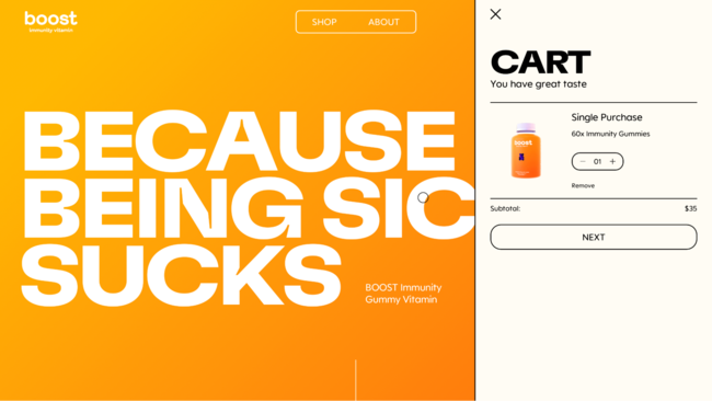
Boost does a fantastic job of aligning UI design with the product. Everything is on-brand, simple to navigate, and allows users to get to the checkout flow in no more than three clicks!
The product page uses minimal text with large button components to choose a single purchase or subscription plan. The bright orange ADD TO CART button on a white background screams “CLICK ME.” As soon as users click add it cart, the cart slides out so the shopper can begin the checkout process.
Boost’s website is an excellent example of UI design that helps users while providing significant business value through an engaging visual design and optimized checkout process.
2) Illuminating Radioactivity’s Creative Content Cards
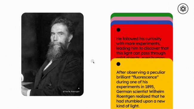
Users often scroll mindlessly without reading the content on a page. The Illuminating Radioactivity website solves this issue by designing content cards with a parallax effect. Scrolling causes the cards to move down slowly, drawing your attention to the content.
It’s a simple concept but a creative and engaging way to get users to read important information. If you’re designing an informational website that relies on users to spend time reading your content, a scroll effect like this could help engage more users, reduce bounce rates, and increase click-through rates–all essential factors for SEO.
3) An Engaging and Entertaining Menu From Lunchbox
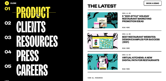
Lunchbox’s designers had a lot of fun creating an engaging and entertaining UI design experience. Lunchbox helps restaurants digitize their menus, so everything is food-themed.
The designers have changed the pointer to a chef’s knife and literally created a hamburger from the hamburger icon to access the main navigation. The menu has a strike-through hover effect, so it looks like the blade is cutting it in half.
Lunchbox’s entire website is filled with these immersive experiences that beg you to explore and read the content. If you’re looking for a lesson in how to use UI animation to sell a product, Lunchbox is definitely worth a visit!
4) Bennet Tea’s Engaging Color and Page Transitions
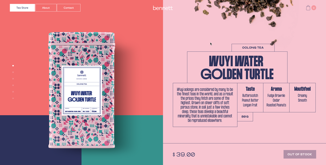
Like Boost, Bennet Tea’s UI is wonderfully on-brand with a striking color palette to match the product’s packaging. Even with lots of colors, Bennet Tea’s designers have done an excellent job of drawing the user’s attention to important content and CTAs.
Bennet Tea uses an immersive scroll effect giving you the illusion of staying above the fold while only the product images and description change as you scroll. It’s a clever way always to have a product and CTA in full view, enticing users to add to cart and checkout.
Bennet Tea’s theatrical page transitions feel like someone is pulling back the curtain to reveal a new visual experience. The three-page navigation is always visible in the top right of the screen (on desktop), making it easy for shoppers to explore the site.
5) Bauwerk’s Search Filter UI
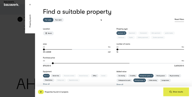
Bauwerk’s immersive and intuitive property search filter helps users narrow their search to find exactly what they’re looking for. The UI does an excellent job of highlighting the user’s selection and the ability to remove any field by clicking X–providing the user with clear feedback and control to change their mind.
The bottom left also shows the user how many properties they can expect with their current selection, thus managing expectations. Designers have cleverly used different, bright colors for the number of properties UI element and the “show results” button to attract users’ attention.
6) Apple AirPods Max Immersive Scrolling Experience
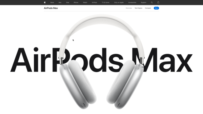
What do you do when you’re trying to sell a $549 pair of headphones in a highly competitive market? Create an immersive UI experience that uses animation and effects to wow shoppers into buying your product!
Apple’s AirPods Max landing page is a masterclass in how UI design can showcase and sell a product. As you scroll, designers take you on an immersive product experience using typography, animation, color, images, and video. Apple has done an incredible job of using UI elements and movement to help tell the AirPods Max story, why these are the best headphones, and why you must have them!
By the time you get to the bottom of the page, you’ve learned every aspect of the product and why it’s worth $549. If you’re going to sell a high-ticket item, find a way to create an immersive UI experience that will convince users of your product’s value.
7) Glide’s Clear CTA
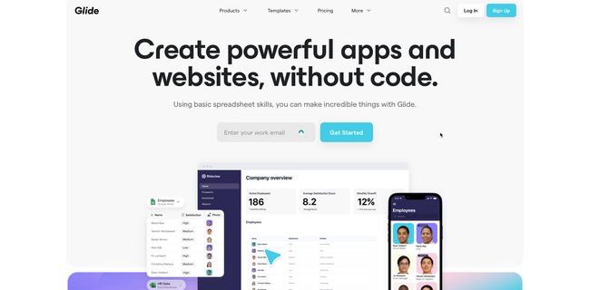
Glide lets you create web applications using Google Sheets. The goal of their website home page is to get you signed up. Glide uses a luminescent blue for the CTAs throughout the home page, and a “Sign Up” button in a sticky header.
Glide also does an excellent job of using color, images, GIFs, and typography to explain their product and the problem it solves–giving non-tech people the ability to create an application. As you scroll through the website and learn about the product, that luminescent blue CTA is always prominent; yelling CLICK ME!
Websites and landing pages with a single CTA work best. Users don’t have to think about where they should go next or choose between different options. Great UI design can help facilitate that call to action by using color and contrast to make important buttons and links stand out.
8) ETQ’s Responsive UI Design
One of the biggest challenges of responsive design is maintaining consistency between the desktop and mobile experience. ETQ’s minimalist responsive layout complements the brand and user experience consistently across multiple viewports.
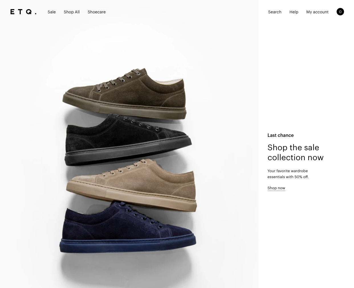
Designers have used hero images and titles that maintain the same focal point on desktop and mobile. Their clever use of white space on the desktop website draws your eye to important content and images. Designers have done well to translate this same experience on mobile, creating a premium, luxury appeal that aligns with the brand.
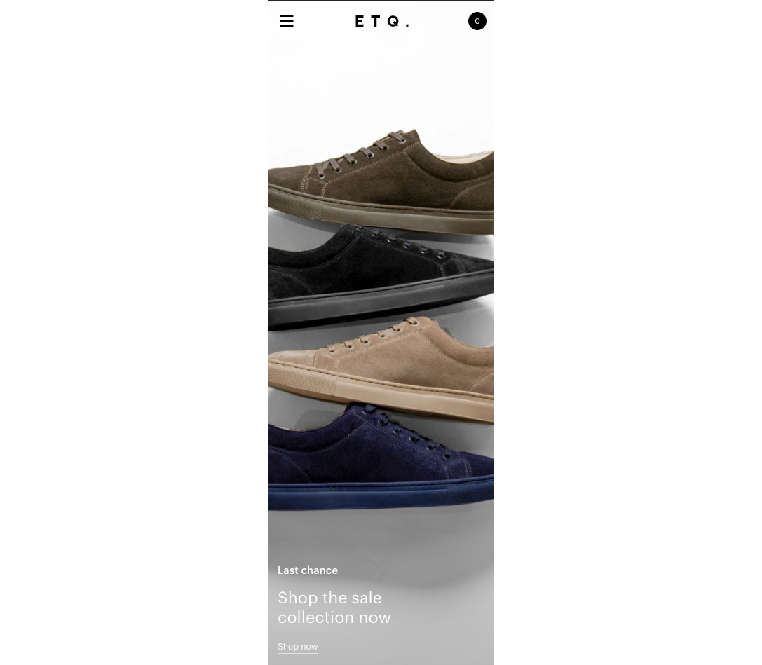
Maintaining consistency across desktop and mobile helps build familiarity, trust, and brand loyalty. Users know they can access your website on any device without compromising on features or usability.
9) Vintageria’s Helpful Cookie Policy
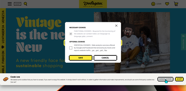
While GDPR does a lot of good, it’s also spawned the annoying cookie popup! For most websites, it’s pretty irritating, and many don’t offer a straightforward way to decline cookies. You have to accept and use the website.
Vintageria’s cookie policy is transparent, entertaining, gives the user control, and uses language most people can understand–all fundamental UI design principles.
Improve UI Design With UXPin
Are you feeling inspired after reading the examples above? Adalo and UXPin’s code-based design tools both allow designers to build prototypes with significantly higher fidelity than traditional vector-based design approaches.
With code-based design tools, you can enhance prototype fidelity with states, Javascript-like interactions, conditional formatting, variables, data capture and validation, functions, and more.
Get started with a free UXPin trial and discover how to create better customer experiences with code-based design.

