What is Mobile Navigation? And How it Impacts User Experience
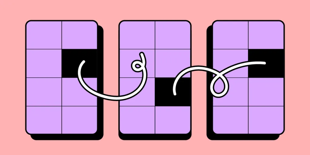
Mobile navigation refers to designing and implementing menus, controls, and interactions that enable users to navigate a digital product’s content and features. It encompasses the placement, visibility, and functionality of navigation elements, such as menus, icons, tabs, and gestures.
Well-designed navigation facilitates intuitive and effortless user interactions, allowing users to discover and access the desired content or functionality easily. Conversely, poor navigation can cause frustration, confusion, or high bounce rates, leading to a negative user experience and possibly abandonment.
Enhance your navigation prototyping with the world’s most advanced UX design tool. Sign up for a free trial and build your first interactive prototype with UXPin.

What is Mobile Navigation?
Mobile navigation is a set of UI elements that help end-users move through the app or mobile website, access desired pages, and find information quicker. Those UI elements include buttons, icons, and menus. Most mobile apps and websites use familiar mobile navigation patterns. Let’s explore them.
Types of Mobile Navigation Patterns
Designers should carefully evaluate their product needs to determine the most appropriate design pattern for optimal user experience. Here are six common navigation patterns designers use for mobile interfaces.
- Hamburger Menu: The hamburger icon is a popular navigation pattern that consists of a horizontally stacked icon resembling a hamburger. When tapped or clicked, it expands to reveal a hidden menu with navigation options. Designers use the hamburger pattern for its space-saving benefits and ability to provide access to secondary or less frequently used features.
- Tab Bar Navigation: Tab bar navigation is a horizontal bar of tabs used to segment and organize content. Each tab represents a different section or category, allowing users to switch between them with a single tap. Tab bars provide quick and easy navigation, making them ideal for applications with distinct sections or workflows.
- Bottom Navigation: Bottom navigation patterns are fixed to the bottom of the screen with 3-5 primary destinations. Each item typically includes icons or labels representing different sections or pages. A bottom navigation bar offers easy access to primary features and promotes thumb-friendly interaction, making it suitable for apps with few top-level destinations.
- Navigation Drawer: The navigational drawer slides in from the side or top of the screen with a list of navigation options. Designers often use navigational drawers for websites or as secondary navigation to complement the bottom nav for a mobile app.
- App bar: The app bar, also known as the top bar or action bar, is a navigation pattern located at the top of the screen. It often includes the app’s title, logo, navigation icons or tabs, and additional actions or settings. The app bar provides quick access to essential features and context-specific actions and can serve as a consistent element throughout the app.
- Gesture-based navigation: Swipe gestures involve horizontal or vertical swiping motions to navigate between screens or interact with content. Users can use swiping for tasks like navigating image galleries, switching between tabs, or revealing hidden menus. It provides a natural and intuitive way to navigate forwards and backward between screens, enhancing the overall user experience.
- Full-screen navigation: Full-screen navigation utilizes the entire screen to display navigational links, providing a focused and immersive experience. It often involves gestures, such as swiping or tapping, to reveal menus, navigation elements, or content.
- Floating action button (FAB): The floating action button is a prominent circular button that floats above the content and provides access to the app’s most important or frequently used action. It can be used for tasks like creating new content, initiating a chat, or making a call.
Key Considerations for Mobile Navigation Design
Here are three things to consider when choosing a mobile navigation pattern for your app or digital product.
Account for limited screen real estate
Designers must consider the limited screen real estate to select the correct pattern, prioritize nav items, and streamline the design for optimal usability.
For example, collapsible menus or combining navigation items under a single menu icon (such as the hamburger menu) can help save valuable screen space while still providing access to critical sections of an app or website. Tools like Adalo, a no-code app builder, make it easy to prototype and test different navigation patterns without consuming extensive development resources.
Plan touchscreen interaction
Mobile navigation design must account for touchscreen interactions, such as taps, swipes, and gestures. Designing touch-friendly navigation elements with sufficient tap targets and intuitive swipe gestures enhances the user experience.
For example, utilizing swipe gestures to navigate between screens or implementing thumb-friendly navigation buttons makes interactions effortless and intuitive.
Think about user context and goals
Understanding the user’s context and goals is vital when designing mobile navigation. Organizing navigation options based on user preferences, location, or the stage of their journey can improve usability.
For example, a food delivery app could prioritize search functionality on the home screen during lunchtime when users are in a buyer’s mindset, while during off-peak hours, it could promote discounts and specials to encourage more sales.
Best Practices for Mobile Navigation Design

- Apply clear labeling: Use descriptive labels that accurately convey the purpose of navigation elements, ensuring users can easily understand and navigate the app.
- Leverage icons and visual cues: Utilize recognizable and intuitive icons along with visual cues to assist users in understanding the navigation options and actions available.
- Keep consistency across screens: Maintain a consistent navigation structure, placement, and style throughout the app to provide familiarity and ease of use.
- Prioritize important actions: Organize navigation elements based on their importance and relevance, emphasizing primary actions and minimizing clutter for a seamless user experience.
- Responsive and adaptive design: Ensure the navigation design is responsive and adapts to different screen sizes and orientations, providing optimal usability across various devices.
- Think about accessibility: Implement accessibility features such as appropriate color contrast, sufficient touch target sizes, and support for assistive technologies to make navigation inclusive for all users.
- Collect user feedback: Conduct user testing and gather feedback to evaluate the effectiveness of the navigation design, making iterative improvements based on usability testing results.
4 Common Mobile Navigation Pitfalls to Avoid
Hidden or obscure navigation elements
Avoid hiding essential navigation elements, such as menus or buttons, behind ambiguous icons or gestures. Users should easily locate and access navigation options without guessing their purpose.
For example, using an unlabeled obscure navigation icon without clearly indicating its function can lead to confusion.
Overloading the navigation with options
Avoid overwhelming users with too many navigation choices, as the interface can be cluttered and confusing. Prioritize essential options and simplify navigation to provide a focused, streamlined experience.
For example, a messaging app with numerous secondary navigation options and submenus can become overwhelming and hinder the core messaging functionality.
No or unclear feedback
Provide users with clear visual or interactive feedback when interacting with navigation elements. Visual cues, animations, or haptic feedback can confirm user actions and help them understand the system’s response. For example, highlighting the selected tab in a tab bar or providing microinteractions when users tap a link enhances user feedback.
Poor usability and discoverability
Understanding the impacts of discoverability and usability is crucial for designing intuitive mobile navigation. Users must know how to navigate user interfaces and access a product’s key features. For example, you don’t want to bury your app’s most essential features in a multi-layered dropdown menu where people are unlikely to find or use them.
Advanced Mobile Navigation Techniques
Gestural navigation and interactions
Explore innovative gestural interactions for navigation, such as swiping, pinching, or using multi-touch gestures. Utilizing a user’s device interactions creates a more intuitive user experience, giving your product a competitive edge. For example, a news app could allow users to swipe left or right to switch between articles or pinch to zoom in on images.
Voice and AI-powered navigation
Integrate voice user interactions and AI capabilities to offer hands-free navigation. For example, a VUI within a recipe app could guide users through the navigation and provide voice-controlled commands for hands-free cooking.
One-handed navigation
There are many instances where users use mobile devices with one hand. Designers can prioritize navigation items to meet user needs and even offer the option to optimize the experience for left-handed individuals.
Interactive Mobile Navigation Prototyping With UXPin
Build fully interactive prototypes with UXPin to test and optimize your navigation patterns. With UXPin’s advanced prototyping features, designers can create complex UI components and navigation interactions to enhance prototyping capabilities and solve more problems during the design process.
For example, this multilevel dropdown menu offers intuitive interactivity to replicate the final product experience accurately.
Designers can use UXPin Mirror (for iOS and Android) to test navigation prototypes on mobile phones–like this smart home app example demonstrating card and list navigation. Mobile app users can also swipe left and right on the cards to utilize gestures.
UXPin’s mobile triggers for Interactions include tap, double tap, swipe (left, right, up, down), press hold, and release hold. Depending on state changes and other interactivity, designers can also program many system/app triggers.
Discover how interactive prototypes can enhance your testing capability with UXPin. Sign up for a free trial to explore UXPin’s advanced features.


