
User experience is a strategic exercise.
As in, a planning exercise. A strategy is a plan. You can’t design how a person reacts to a product, what baggage they bring along with them on a given day, their biases, but you can plan for what you’d like to have happen.
You can influence.
Doing even that much is no small art. It requires becoming a person who leads the process rather than one who does whatever the stakeholders demand. It requires doing your research. And then it requires developing a strategy (based on all the research you did at the beginning of the project). And making design decisions based on it. And making sure everyone sticks to it.
The best way to get there is to document it.
The 1-page strategy doc is the most useful tool of all time. If you’re not taking the time to create them, odds are, you’re having a tough time getting your best work out the door.
Here’s how to create one, why you do so before you lay down a single pixel, and what you do with it when you’re done.
The Elements of UX Strategy
As explained in the free Field Guide to UX Strategy, the first step is to take out your notepad and pencil.
Yes, a notepad, because the second you go digital, everyone’s a critic. And yes, a pencil, because here will be multiple drafts.
Also, writing by hand makes you think differently. It slows you down, makes the words matter more (because you don’t want the effort of writing them to be wasted), and makes the things you write more memorable for you. And if you need anything during a design process, it’s an intensely held view of your strategy.

But don’t worry. You won’t be writing much. Strategy docs should be concise. Hand over a 70-page strategy doc and you’ll be the only person who ever reads it. Mine are rarely longer than what would fit on two sides of a single sheet of paper.
Here’s the sections you put on the paper.
Vision
It’s not a mission statement. It’s a vision statement. It’s a few overarching sentences about what you want the product to be.
Here’s a modified version of a vision statement from a project I worked on recently:
“Acme teaches site visitors about health insurance, encourages them to provide the information we need to give them a quote, and then helps those users through the screening process. The website’s goal is to not only get the attention of potential customers, but to also earn their trust. Once they apply, one of Acme’s agents guides them through the process.”
Note that this defines the scope and purpose of the product without getting specific about how the purpose will be achieved. This is what you want from a good vision statement. It describes the intent rather than the execution.
Circumstances of Use
Next up is the who, what, when, where, and why of the product.
I’ve never been a fan of traditional personas because they’re heavy on fluff and light on action. It doesn’t matter so much who the users are as what they’re doing.
A library staff, for example, can be composed of very different kinds of people at different levels of tech comfort, all of whom need to use the same information systems.
Rather than tell a nice story about Jenny and her 2.5 kids and her nursing career, lay out on what circumstances hold true when a user encounters your product.
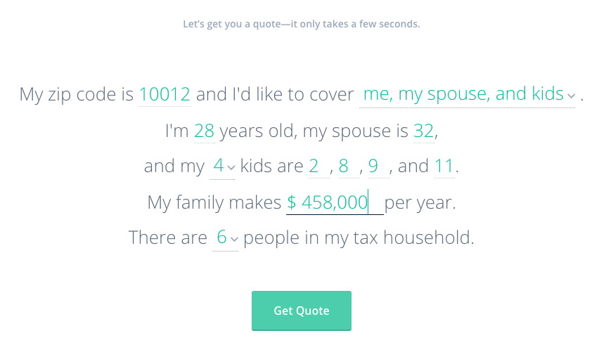
Photo credit: Oscar Insurance
Here’s what it would look like for the same insurance site I just discussed:
- Who: Generally, people under 30–50 years of age who make over $50k/year, are in good health, and have low-risk occupations.
- What: Health insurance facts, policy quote, application, and agent assistance.
- When: Most likely as a result of seeing an ad, reading an article, or when someone in proximity to the user (friend, family member, peer, friend of a friend, etc) suffers a disability (though, we hope to broaden the opportunities for education and promotion).
- Where: Online, on sites and in apps which appeal to high-income, high-education sectors of the American population.
- Why: A person learns that this type of health insurance exists and becomes curious about whether or not he needs it, how much it might cost, when it might benefit him, etc. Or, a person who does not yet know about disability insurance begins to wonder how to protect himself in such an event.
You can make tangible design decisions based on every point in this list. It’s all action.
Design Criteria
Every part of a strategy doc is useful. But this is my favorite part.
When people say a website or app needs to be “fast, easy, and intuitive,” my first reaction is usually something like, “And tell me how, exactly, you’ll do that.”
A company does not spend thousands of dollars in research time because it wants useless platitudes. Do not tell them the product needs to be fast. They all should be fast. Do not say it should be easy. They all should be easy. Do not say it should be intuitive. If they knew how to make it that intuitive, they wouldn’t have called you.
Be specific.


Photo credit: Wikimedia. Creative Commons.
Write design principles that are specific to your product. Then elaborate on them. Like these (also modified from another project, which was for the analytics section of a procurement app that needed to reveal purchasing trends over time):
“Carve it up: Let users slice available statistics in any way that might be helpful, so that analysis can be done in a timely manner.
Make it meaningful: Use color and graphs to create quick understandability and meaning.
Call out both trends and edges: Draw attention to both the outliers and trends so that stakeholders can discern what’s average, what’s best, what’s worst, what’s most extreme, etc.”
Useful design criteria are based on your research, and are written with the goal of differentiating the product, of improving upon what’s already been done, and of setting a high bar.
Success Metrics
At the tail end of all this note-writing, put together a list of numbers you can change through design efforts.
Don’t write down, “Get more traffic.” That’s a vague wish. Ask how much traffic. Ask what you want that traffic to do while it’s hanging around on your website. Ask what percentage of people you want to sign up for your app three months from now as compared to today.
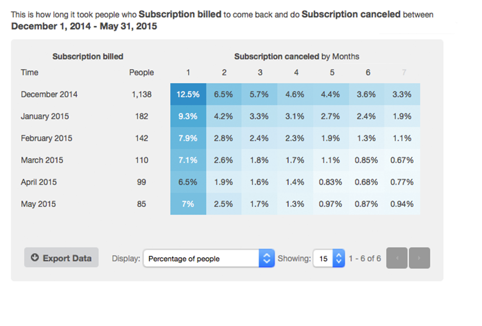

Photo credit: KISS Metrics
As Google Ventures suggests, all UX metrics fall into the 5 categories summarized with the acronym HEART: happiness, engagement, adoption, retention, and task success.
Focus on a small set of core metrics, then be as specific as possible. (Pro tip: Since numbers can only be either increased or decreased, you can group them like I have here.)
Increase
- Traffic: The number of people who access the site to decide whether or not to move into the screening process in the first place. With regard to disability insurance, education equals promotion; earning more customers requires making more people aware of its existence.
- Pursuable leads: The percentage of people who make it through the website screening who are in fact strong candidates for approval. (This will lead to a higher percentage of policy conversions, which is the ultimate business goal.)
Decrease
- Knockouts: The number of ways a potential customer is shut out of the process due to an exception which might otherwise not disqualify them from approval. (We can reduce this by doing more to educate the right people in the first place, so that more of the people who go through the screening questions are in fact people who might be good candidates.)
This list is what all your design efforts come down to. All the research, all the pixel-pushing, all the negotiating, all the politicking, all the development work — none of it matters unless your design succeeds in affecting these numbers.
These are the numbers the stakeholders care about. Without these constraints, you’re not doing real design work.
Now What?
When you’re happy with your own first draft — and that may take a few tries — type it up in digital form and cloud it over to your stakeholders.
Do not just hand it off for review. Call them up, pull them into the room, whatever, and present it to them. This gives you the chance to guide rather than defend.
As you do, tell them you want their feedback. Tell them you’ve based all this on the research, which they’ve all heard about and read by now, but that you want to be sure you’ve covered all the thinking. You want their input on anything you’ve missed. Even the best individual needs sanity checks along the way.

You’ll make a few tweaks during this process. It’s okay. That’s what makes the strategy good.
When you’re done and you’ve all agreed, email it to everyone and talk about it every single day.
Every single person on the team needs to live and die by the strategy document.
Here’s why.
- It empowers the whole team: When every person knows the goals, every person can make decisions that serve those goals.
- It distributes the UX workload: When everyone on the team can make good decisions, you don’t have to. They’ll start coming to you with answers instead of questions.
- It produces good ideas: You’ll be amazed at the inspiration a good strategy document generates. Good ideas will come flying at you from all directions. All you have to do then is make sure the ideas serve the strategy. (Ask questions until you’re sure they do.)
- It kills bad ideas: When debates kick up (and they always do), you can point to the strategy document. If an idea doesn’t hold up, the debate is over. If it’s questionable, you can hold off.
Occasionally, you’ll learn new information during the course of the project, and you’ll need to revise the strategy document a bit. Like when a competitor announces a new feature that renders one of your brilliant design criterion useless.
Let it evolve. It’s meant to. Strategy isn’t a stone carving. Revise it, share it again, keep evangelizing it in every room you walk into.
The good ideas will come. The bad ideas will fade. The whole team will become UX advocates.
And that’s why you do it.
Editor’s note: If you enjoyed this post, check out the free guide The Elements of Successful UX Design. You’ll find deconstructed examples from 24 successful companies like Buffer and Slack.

