Prototypes often look polished but fail to match the final product. This misalignment wastes time, creates inconsistency, and frustrates teams. The solution? Directly connect your design system to your prototyping process. This ensures every prototype uses the same components, tokens, and patterns that developers build with – bridging the gap between design and production.
Here’s how to make it happen in five steps:
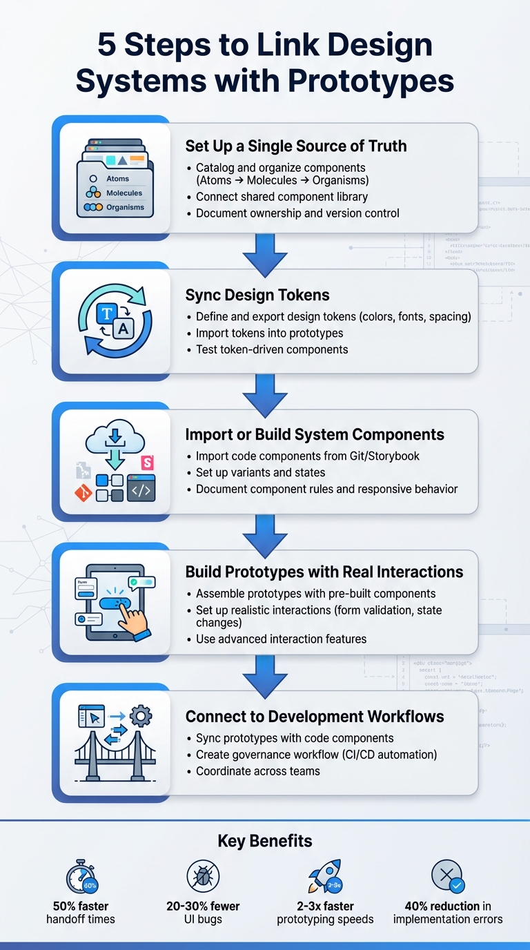
- Centralize Components: Build a shared library of UI elements, organized with a clear structure.
- Sync Design Tokens: Align foundational design choices (e.g., colors, fonts) across tools.
- Use System Components: Import or recreate production-ready components in your prototyping tool.
- Create Realistic Prototypes: Add interactions and logic to build lifelike user flows.
- Connect to Development: Link prototypes directly to production workflows for smoother handoffs.
This approach improves consistency, reduces rework, and speeds up collaboration between design and engineering teams. Tools like UXPin make it easier to integrate React components, test interactions, and ensure alignment from design to code.
5 Steps to Link Design Systems with Prototypes Workflow
Design System & Code Prototyping: Bridging UX Research and Engineering
Step 1: Set Up a Single Source of Truth for Components
To make sure your prototypes match production quality, start by building a unified component library. The goal here is to create a centralized library for all UI elements, patterns, and tokens. This approach eliminates the confusion caused by designers and developers using inconsistent versions of components – like buttons with slightly different padding or colors that don’t align with production code.
Catalog and Organize Components
Begin by conducting a UI inventory. Gather all the current UI elements from your products and design files. Look for duplicates, standardize naming conventions, and consolidate everything into a single, definitive version of each component. Organize these components using the Atomic Design methodology:
- Atoms: Basic elements like buttons, icons, or input fields.
- Molecules: Small combinations, such as a search field paired with a button.
- Organisms: Larger, more complex sections like navigation headers.
This structure keeps your library easy to navigate and adaptable as your design system evolves.
Connect a Shared Component Library
Once your components are cataloged and organized, link the centralized library to your prototyping tool. For example, if you’re using UXPin, you can sync your React component library directly from your Git repository. This allows designers to seamlessly drag and drop production-ready components into their prototypes.
Brian Demchak, Sr. UX Designer at AAA Digital & Creative Services, shared, "We have fully integrated our custom-built React Design System and can design with our coded components. It has increased our productivity, quality, and consistency, streamlining our testing of layouts and the developer handoff process."
Document Ownership and Version Control
Clearly define ownership responsibilities for both visual and code components. Implement version control tools (such as Git with semantic versioning) and maintain detailed changelogs to track updates. This ensures everyone knows which version to use, how to update their work, and avoids the creation of outdated or "forked" components that deviate from the main library.
With your central library in place and well-managed, you’re ready to move on to syncing design tokens in the next step.
Step 2: Sync Design Tokens with Your Prototyping Tool
After setting up your component library, the next step is to integrate your design tokens. These tokens define the foundational design choices – like color codes, font families, spacing measurements, border radii, and elevation levels. Syncing them ensures that any updates to these elements in your design system automatically reflect across all prototypes and production components. Precision in defining these tokens is key to maintaining consistency.
Define and Export Design Tokens
Start by organizing your tokens into a clear structure that separates raw core values from their semantic roles. Core tokens include the basics – like specific hex colors, base font sizes, and spacing increments (measured in pixels). Semantic tokens, on the other hand, assign these core values to specific UX roles, such as color.button.primary.bg or typography.heading.h1. Save these tokens in formats like JSON or YAML, and use tools like Style Dictionary to export them into formats compatible with your prototyping tool. These formats might include CSS variables, JavaScript theme objects, or files tailored for design tools. Be sure to align tokens with locale-specific standards for seamless application.
Import Tokens into Prototypes
Once your tokens are exported, bring them into your prototyping tool. For example, in UXPin, you can link token values directly to component properties and styles by using variables or importing CSS with custom properties. Stick to referencing named tokens – this way, if you update a token like color.primary.500, every button, link, or icon using that token will automatically reflect the change. If your components are code-backed and synced from a Git repository, React components can also utilize the same token definitions – whether through CSS variables, design system packages, or theme objects – ensuring consistency between design and production.
Test Token-Driven Components
Before applying tokens across all screens, test them on a dedicated page with key components like buttons, text styles, inputs, cards, and navigation. Make controlled changes to tokens – such as tweaking the primary color, increasing the base font size, or adjusting the spacing scale – and check if the updates propagate correctly. Once you’re confident in the results, you can extend token usage across the entire system without hesitation.
Step 3: Import or Build System Components in Your Prototyping Tool
Now that you’ve set up synced tokens and a centralized component library, it’s time to bring production components into your prototyping tool. You have two main options: import existing code components from your production library or recreate components using the native features of your prototyping tool. The best approach depends on your team’s workflow and where your design system is maintained.
Import Code Components
If your team has a React component library stored in a Git repository or a tool like Storybook, importing those components directly into your prototyping tool ensures tight alignment between design and code. For example, UXPin allows you to connect your Git repository, enabling designers to use React components as native building blocks. However, engineering must ensure these components are cleanly structured and free from app-specific logic. Props should manage variants and content instead of relying on hard-coded states.
By using production-ready components, designers can eliminate inconsistencies between prototypes and final products. This approach enhances efficiency, quality, and consistency while making the developer handoff smoother. When your application needs to access data from various sources securely, DreamFactory provides governed API access to any backend, ensuring that your prototypes can integrate with real data sources through secure, role-based connections during development and testing.
Once components are imported, validate them on a test page. Check props, sizes, variants, and states against your live environment or Storybook. Pay close attention to spacing, typography, and theming to ensure everything matches. Any discrepancies should be logged as tickets for engineering to refine the shared library. After validation, configure variants and behaviors to replicate production interactions as closely as possible.
Set Up Variants and States
Define component variants and interactive states in a way that aligns with your codebase. Use a consistent schema that mirrors the structure of your code props. For instance, a button might include properties like variant=primary/secondary/ghost, size=sm/md/lg, and state=default/hover/focus/pressed/disabled/loading. This shared structure ensures designers and developers are speaking the same language.
Set up interactive states using triggers and transitions within your tool (e.g., hover transitions at 150–200ms or immediate feedback for pressed states). Don’t forget accessibility standards – ensure proper contrast ratios and keyboard focus behavior. If a component has numerous combinations, prioritize the most common ones and hide outdated or rarely used variants to keep things manageable for designers. Document these configurations to provide a clear reference for both design and development teams.
Document Component Rules and Responsive Behavior
Clearly document the rules for each component, including allowed content types, layout constraints, and responsive behavior at standard U.S. breakpoints (mobile: 320–414 px, tablet: 768–1,024 px, desktop: 1,280+ px). Specify interaction rules, such as which states are available and when to use them, and include accessibility guidelines like minimum 44×44 px touch targets and keyboard focus requirements.
To make this documentation easily accessible, embed it directly within your prototyping tool. Use annotation layers, dedicated usage pages, or description fields on components. This way, designers can find the information they need without searching through external wikis that may not always be up to date. Test responsive behavior by resizing frames to confirm proper wrapping, stacking, and readability. Treat your prototype as a living specification, combining interaction flows, visual details, and constraints into a single, cohesive artifact for developers to reference.
sbb-itb-f6354c6
Step 4: Build Prototypes with System Components and Real Interactions
Now that your components and tokens are synced and imported, it’s time to create realistic prototypes. This step transforms static designs into interactive experiences that mimic real-world functionality. These prototypes are invaluable for usability testing and gathering actionable feedback from stakeholders. By moving from static layouts to interactive prototypes, you’re preparing to validate user flows in the next phase.
Assemble Prototypes with Pre-Built Components
Start by using pre-built system components to construct screens and user flows. Instead of starting from scratch, leverage system-based templates for common layouts like login pages, dashboards, or checkout processes. These templates ensure consistency and save time by adhering to production rules for spacing, typography, and component variants.
Using system components not only speeds up the process but also guarantees uniformity across your prototypes. Build complete user journeys that include all possible scenarios – entry points, success paths, error handling, and exit flows. This approach ensures you’re testing the entire experience, not just isolated screens. By snapping components together, you can maintain consistent layouts and responsive behavior across devices, whether it’s mobile (320–414 px), tablet (768–1,024 px), or desktop (1,280+ px).
Set Up Realistic Interactions
Next, bring your prototypes to life by setting up conditional logic and event-driven behaviors. For example, configure if-then rules to simulate real app functionality: show an error message for invalid form inputs or switch a button to a loading state when clicked. In a shopping cart prototype, adding items should dynamically update the total price and item count, just as it would in the final product.
Implement form validation by defining rules for required fields, email formats, and input masks. Add visual feedback like red borders or error messages when users make mistakes. Include system feedback such as loading spinners, success notifications, error banners, and disabled states to mimic server responses or processing delays.
For interactive elements like toggles, accordions, tabs, and checkboxes, model event-driven state changes. For instance, when a user toggles a switch, the component should immediately reflect the new state. Use hover, focus, pressed, and disabled states to replicate real-world behavior. These realistic interactions help identify usability issues and validate user flows before any code is written.
Use UXPin‘s Advanced Interaction Features
With UXPin’s code-backed prototyping, you can use real React components from your design system. These components retain the same props, states, and logic as their production counterparts. For example, a modal with backdrop click-to-close functionality or ESC key handling will behave exactly as it does in the final app. This eliminates discrepancies and allows for precise testing and refinement.
Leverage variables in UXPin to store user inputs and drive conditional flows. Use if/else logic to branch interactions based on variable values, validations, or prior user actions.
"The deeper interactions, the removal of artboard clutter creates a better focus on interaction rather than single screen visual interaction, a real and true UX platform that also eliminates so many handoff headaches." – David Snodgrass, Design Leader
Connect data collections to your prototype elements to simulate real content, pagination, and filtering. For example, a dashboard prototype can dynamically update charts based on filtered data, or a form can process inputs to generate personalized outputs. This capability allows you to test edge cases like empty states, loading indicators, and error conditions with realistic data flows. These features make your prototypes more reliable for usability testing and stakeholder feedback.
Step 5: Connect Prototypes to Development Workflows
This step bridges the gap between design and implementation. Once your prototypes are built with system components and realistic interactions, it’s crucial to establish a workflow that keeps design, prototypes, and production code aligned. This approach minimizes rework and ensures what you design is exactly what gets developed.
Sync Prototypes with Code Components
Linking prototypes directly to production code is a game-changer. Tools like UXPin allow you to import React component libraries straight into your design environment. This means the components you use for prototyping are the same ones developers will implement, making the code the single source of truth. This eliminates common issues like visual or functional mismatches during handoff.
For example, if you update a primary color from #007BFF to #0066CC in your token source, the change automatically reflects across both prototypes and production. This kind of automation drastically reduces manual errors and can cut update times from days to just hours.
Brian Demchak, Sr. UX Designer at AAA Digital & Creative Services, shared his experience: "As a full stack design team, UXPin Merge is our primary tool when designing user experiences. We have fully integrated our custom-built React Design System and can design with our coded components. It has increased our productivity, quality, and consistency, streamlining our testing of layouts and the developer handoff process."
Create a Governance Workflow
A consistent process for managing component updates is essential to maintain synchronization across your workflow. Start by centralizing component ownership in a shared repository, like Storybook or UXPin libraries. Use semantic versioning (MAJOR.MINOR.PATCH format) to track changes systematically. Any updates to components should go through pull requests with peer reviews before being merged.
Automate the syncing process with CI/CD pipelines. For instance, when a component update is committed, tools like GitHub Actions can automatically import it into UXPin. This ensures prototypes remain current without requiring manual updates. Regular audits – monthly or quarterly – can help catch any discrepancies between design, prototypes, and production. Teams using this approach have reported cutting implementation errors by up to 40% and reducing prototype-to-production updates to within 24 hours.
Coordinate Across Teams
Once you’ve established a smooth update process, it’s equally important to align team communication. Use shared tools and regular check-ins to ensure everyone stays on the same page. For example, UXPin can handle prototypes, while Storybook serves as the source for component documentation, giving both designers and developers access to the same resources. Weekly meetings can help teams review updates, address challenges, and prioritize tasks.
Encourage feedback loops by leveraging tools like UXPin’s commenting features, where stakeholders can provide input directly on prototypes.
Mark Figueiredo, Sr. UX Team Lead at T. Rowe Price, highlighted the benefits: "What used to take days to gather feedback now takes hours. Add in the time we’ve saved from not emailing back-and-forth and manually redlining, and we’ve probably shaved months off timelines."
The results speak for themselves: teams report 50% faster handoff times, 20-30% fewer UI bugs due to token consistency, and prototyping speeds that are 2-3 times faster when using integrated design systems. By connecting prototypes directly to development workflows, you create a seamless process from concept to code.
Conclusion
Connecting design systems with prototypes bridges the gap between design and code. By following five straightforward steps, teams can establish a seamless workflow that aligns design with production.
This method offers clear, measurable benefits: smoother handoffs, consistent user interfaces, and quicker prototyping cycles. Reusing established components reduces unnecessary rework and design debt, while giving developers precise specifications to minimize implementation errors.
It’s a practical approach that builds on the concepts discussed earlier. By using shared components, teams across different platforms and time zones in the U.S. can work more efficiently and adapt quickly to changes.
Start by auditing your UI patterns and identifying essential design tokens. Test this process on a single feature to ensure it works for your team. Tools like UXPin make it easier to create prototypes directly from React component libraries, ensuring that your designs are closely aligned with the final product. Linking design systems with prototypes enhances consistency, speeds up workflows, and fosters better collaboration.
FAQs
Why is syncing design tokens important for consistent prototypes?
Keeping design tokens in sync ensures that elements like colors, typography, and spacing stay consistent across all prototypes. This consistency minimizes visual mismatches, streamlines the user experience, and cuts down on time spent making repetitive manual tweaks. With a unified style in place, teams can dedicate their energy to fine-tuning designs and delivering polished, high-quality results.
What are the advantages of using production-ready components in prototypes?
Using production-ready components in prototypes offers several important benefits. First, they enable the creation of high-fidelity prototypes that closely resemble the final product. This makes it much easier to test designs and gather meaningful feedback. Additionally, these components simplify workflows by minimizing handoff errors and providing developers with exportable React code that’s ready to implement.
By incorporating production-ready components, teams can strengthen collaboration between designers and developers, accelerate the development timeline, and bring products to market more quickly. This approach ensures a smooth transition from design to code, maintaining both consistency and functionality throughout the project.
How does connecting prototypes to development workflows improve teamwork?
Creating a direct link between prototypes and development workflows encourages stronger collaboration by providing a common ground for designers and developers. By working with the same components and code, teams can reduce miscommunication, streamline feedback, and make the handoff process much smoother. This approach not only saves time but also boosts overall workflow efficiency.

