Building user interfaces is now faster and more efficient with GPT-5 Mini, MUI, and UXPin Merge. These tools work together to simplify UI design and development by combining AI-generated layouts, production-ready React components, and a design environment that syncs directly with code. Here’s how they streamline the process:
- GPT-5 Mini: Generates UI layouts and logic from text prompts, saving time on manual design work.
- MUI: Provides a robust library of customizable React components based on Material Design principles.
- UXPin Merge: Integrates these components into the design process, ensuring prototypes match production code.
This workflow eliminates static designs by using live, functional components. Designers can drag and drop elements, customize them visually, and test interactions – all without writing code. Plus, updates to the component library automatically sync across design and development, keeping everything aligned.
Why it matters:
- Speeds up prototyping while maintaining consistency.
- Reduces rework by starting with production-ready components.
- Bridges the gap between design and development for smoother collaboration.

How GPT-5 Mini, MUI, and UXPin Merge Work Together for UI Development
From Prompt to Interactive Prototype in under 90 Seconds
sbb-itb-f6354c6
Setting Up UXPin Merge with the Built-in MUI Library
UXPin Merge simplifies the design process by pre-integrating MUI 5, so you can start designing with production-ready React components right away. This eliminates the need for complicated installations or constant back-and-forth with developers. Everything is set up for you, allowing design teams to focus on creating rather than troubleshooting.
Accessing the MUI Component Library in UXPin Merge
To use the Material Design components, open a prototype in UXPin and head to the Design System Libraries tab on the left-hand toolbar. From there, select MUI 5 to access a variety of components like buttons, text fields, and cards.
These components come with their full range of native states and properties. Simply drag them onto your canvas and customize them through the Properties Panel using dropdowns and text fields. They behave just like they would in production, including hover states, focus indicators, and built-in accessibility features.
If your project requires extending or modifying these components, you can integrate your custom React design system as well.
Connecting UXPin Merge to Your Design System
For teams working with a custom design system that builds on or modifies MUI, UXPin Merge makes it easy to integrate. Go to the Design System Libraries tab, click New library, choose Import React Components, and enter your package name (for example, @mui/material for custom versions or your organization’s forked library).
Thanks to the npm integration, your design tokens, themes, and variations are automatically synced with UXPin. Any updates made to your repository will instantly reflect in the design environment, ensuring everything stays in sync. As Erica Rider, UX Architect and Design Leader, explains:
"It used to take us two to three months just to do the design. Now, with UXPin Merge, teams can design, test, and deliver products in the same timeframe."
Generating UI Components with GPT-5 Mini
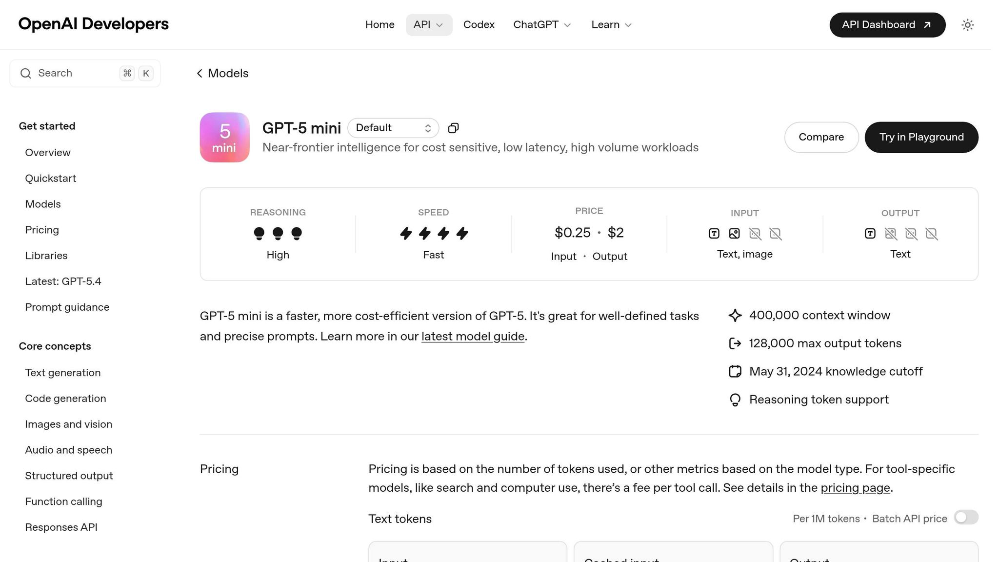
GPT-5 Mini simplifies UI prototyping by using MUI components to generate layouts that align with your design system. Instead of relying on placeholder designs or rough wireframes, this AI produces code-backed components that are consistent and ready for production. The result? Faster prototyping with designs that stay true to your system from the start. Now, let’s explore how to craft precise prompts for GPT-5 Mini to achieve professional-grade UI designs.
Writing Effective GPT-5 Mini Prompts for UI Design
Getting high-quality, production-ready components from GPT-5 Mini begins with well-structured prompts. Start by assigning a clear role to the AI, such as: "Senior Front-end Engineer specializing in MUI v6 and UXPin Merge." This approach ensures the output reflects professional standards and current coding practices.
Be specific about the MUI components available in your UXPin library. For instance, mention components like MUI Grid, AppBar, Avatar, or TextField. This helps the AI avoid suggesting unsupported or custom components that won’t work in your environment. Additionally, include your brand’s design tokens in the prompt. For example: "Primary color is #0052CC, border-radius is 8px, and spacing follows an 8px grid." When requesting code, specify "JSX only, no explanations" to streamline the process of copying the code into UXPin.
For complex layouts, take a layout-first approach. Begin with a broad structure, like: "Create a 3-column dashboard using MUI Grid." Once the framework is in place, refine specific sections with follow-up prompts. This step-by-step method ensures cleaner and more organized results compared to generating everything in one go.
Adding AI-Generated Components to UXPin Merge with MUI
Once you’ve fine-tuned your prompts and generated layout code, integrating the components into UXPin Merge becomes straightforward. Since the MUI library is synced via npm, the AI-generated components – like Button, TextField, or Card – can be dragged directly onto the canvas and configured using UXPin’s sidebar.
If the AI provides JSX code, you can manually recreate the layout by matching the component structure. For example, if the output suggests a Stack with three Button elements, add a Stack in UXPin, nest the buttons inside, and adjust their properties accordingly. Because UXPin Merge uses the actual MUI npm package, every property you modify in the visual editor corresponds directly to a React prop.
For teams working with custom MUI builds, the Merge Component Manager offers flexibility. You can map React props to UXPin controls, making custom options like variant or size editable through dropdowns or text fields in the sidebar. This ensures that even tailored components remain fully adjustable without requiring additional coding.
Building and Customizing Prototypes in UXPin Canvas
Bring your AI-generated MUI components to life in the UXPin Canvas. With UXPin Merge using real code components instead of static images, every element behaves exactly as it would in production. Features like hover effects, pressed states, and disabled states are already functional – no extra design work needed. This makes testing and validation much smoother.
Once your components are set, you can adjust them to align with your brand’s identity.
Customizing MUI Components for Your Brand
MUI’s themeable structure makes it easy to adapt components to match your brand. Start by reviewing the Component API to identify styling props such as color, variant, size, or elevation. Then, use the Merge Component Manager to map these props to UXPin controls. For example:
- Use a dropdown for the
colorprop with options like Primary, Secondary, or Success. - Add a textfield for the
childrenprop so designers can easily edit button labels in the sidebar.
This setup ensures every customization is tied to actual React props, keeping your designs in sync with production code. To maintain consistency, sync your MUI version through npm, ensuring your designs stay aligned with the latest production updates.
Once your components are customized, you can take your prototype further by adding real interactivity.
Adding Interactivity and Logic to Prototypes
UXPin’s variables and conditional logic let you turn static designs into dynamic, testable prototypes. You can create interactive experiences that respond to user actions, toggle states, and simulate real application behavior. For instance:
- Use a boolean variable to control whether a loading spinner appears when a button is clicked.
- Set up conditional logic to display different content based on user selections.
This level of interactivity enhances collaboration significantly. Research shows that prototypes can reduce clarification requests by 80% and improve estimate accuracy by 50%. Prototypes that mimic the final product allow for more accurate usability testing and clearer developer specifications. Add annotations to highlight complex logic or key features for development and QA teams, making the handoff process smoother and reducing unnecessary back-and-forth.
Dynamic prototypes not only validate design choices but also ensure a seamless transition to development.
Best Practices for Enterprise UI Workflows with GPT-5 Mini and MUI
Enterprise teams thrive on scalable, repeatable workflows that streamline processes across products and teams. When GPT-5 Mini is paired with MUI in UXPin Merge, the real advantage lies in creating workflows that cut out redundancy and keep everyone on the same page. The cornerstone of this approach? Treat your design system as the backbone of your operations – not just a reference guide. This mindset naturally complements the merged environment described earlier.
Building a Unified Design System for GPT-5 Mini and MUI
A centralized design system acts as the single source of truth, preventing mismatches and ensuring every component – whether generated by AI or manually created – aligns perfectly with what developers will deliver. By building on the streamlined setup previously mentioned, a unified system ensures that design and code evolve together. Updates in the repository automatically reflect in the design editor, keeping everything in sync.
To keep things consistent, align your naming conventions with MUI’s documentation. Use CamelCase for component names like BottomNavigation or TextField, and categorize them based on MUI’s structure (e.g., Inputs, Data Display, Navigation). This shared language makes GPT-5 Mini prompts more precise. For instance, when requesting the AI to generate a form using MUI components, it knows exactly which elements to pull from your system.
Through the Merge Component Manager, map essential React props so designers can tweak components without breaking technical constraints. This approach ensures that every customization in the design phase directly corresponds to properties in the code, keeping designs ready for production from the outset.
Improving Collaboration Between Designers and Developers
A unified design system doesn’t just streamline workflows – it fosters seamless collaboration between designers and developers. The typical handoff challenges vanish when both teams rely on the same component library. With UXPin Merge rendering actual HTML, CSS, and JavaScript, prototypes come with built-in states, interactions, and accessibility features by default. For teams managing complex backend integrations, DreamFactory provides a self-hosted platform for governed API access to any data source, enabling prototypes to connect with real enterprise data and services seamlessly.
Conclusion
The combination of GPT-5 Mini, MUI, and UXPin Merge creates a workflow where designers and developers collaborate using the same production-ready components from the very beginning. This integration bridges the long-standing divide between design and development, making the entire process smoother and more efficient.
By aligning both teams, this approach speeds up production while improving collaboration. MUI’s extensive, customizable library ensures usability and accessibility are baked in, while GPT-5 Mini simplifies component generation and layout creation. With automatic syncing in UXPin, manual updates and version mismatches become a thing of the past.
The result? Consistency becomes effortless. UXPin Merge serves as the single source of truth, allowing teams to work with up-to-date components and shared specifications. Features like built-in states, interactions, and React props mean prototypes are production-ready from the start.
Both designers and developers operate with the same naming conventions and component structures outlined in MUI’s documentation. For enterprise teams aiming to scale their design systems without sacrificing quality or speed, this workflow removes traditional obstacles. It’s a shift that lets teams move from concept to deployment in days, ensuring designs align perfectly with what’s delivered to production.
FAQs
Do I need to write code to use MUI in UXPin Merge?
No, you don’t need to write code to use MUI with UXPin Merge. Thanks to UXPin’s npm integration, you can sync production-ready MUI components and work with them directly in UXPin. This allows you to design and prototype using real, interactive components – no manual coding required. It’s a smoother, faster way to create functional prototypes.
How do I keep my MUI theme and tokens synced in UXPin?
To keep your MUI theme and tokens aligned in UXPin, take advantage of UXPin’s npm integration with your MUI component library. This feature allows you to directly import MUI components into UXPin, ensuring your design system remains consistent across the board. With UXPin Merge, any updates to your MUI theme are applied in real-time, so your prototypes instantly reflect those changes. This seamless integration ensures your workflow stays synchronized and efficient.
What should I include in a GPT-5 Mini prompt for MUI layouts?
When crafting a GPT-5 Mini prompt for MUI layouts, make sure to provide clear and detailed instructions about the components, layout structure, and how they should align with your design system. For instance, you could say:
"Create a dashboard using MUI components that includes a data table for displaying user information, a filter bar at the top for sorting data, and action buttons below for bulk operations. Ensure the layout is responsive, follows Material Design principles, and uses a light theme with primary and secondary colors from our palette."
Including specifics like the types of components, layout arrangement, and styling preferences will help generate outputs that are closer to production-ready and easier to integrate directly into your project.

